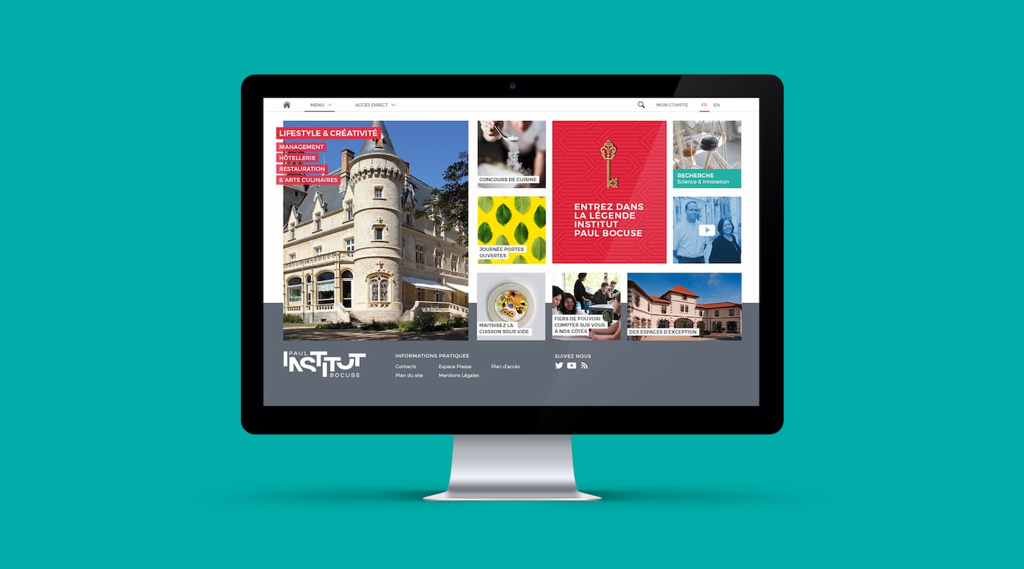
Daring and Innovation since 1990
Founded in 1990, Institut Paul Bocuse is a management and training school that prepares students for careers in hospitality and the culinary arts. True to its founders’ values of boldness and innovation, over the past 25 years, the Institut has continually developed and proposed creative approaches to these professions and the way of teaching them. Institut Paul Bocuse approached the CBA agency for assistance with defining its philosophy and how best to transmit this to its different audiences.

At a time when the hotel and restaurant industries are undergoing major change, CBA was faced with a number of challenges:
- How to show the rich diversity of an institute which encompasses different disciplines, diverse skill sets and an increasingly international culture?
- How to propose a different, more human and more creative set of values in a sector in which excellence prevails?
- How to promote all of the knowledge and expertise found at Institut Paul Bocuse?
- How to bring together the institute’s heritage and its vision for the future?
“Let’s learn to dream big” a new signature in two languages
In the fields of hospitality and the culinary arts which are so detailed and precise, the transmission of knowledge, high standards and excellence is key nowadays. But the latter alone are not enough. Rather they should serve one purpose only: to unlock creativity and enable every individual to excel and mould the job to fit them. This was the basis for the Brand Essence defined by CBA: Your imagination can take you beyond excellence.
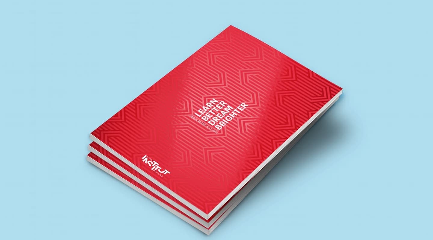
This Brand Essence is expressed in a new slogan available in two languages: Learn better, Dream Brighte
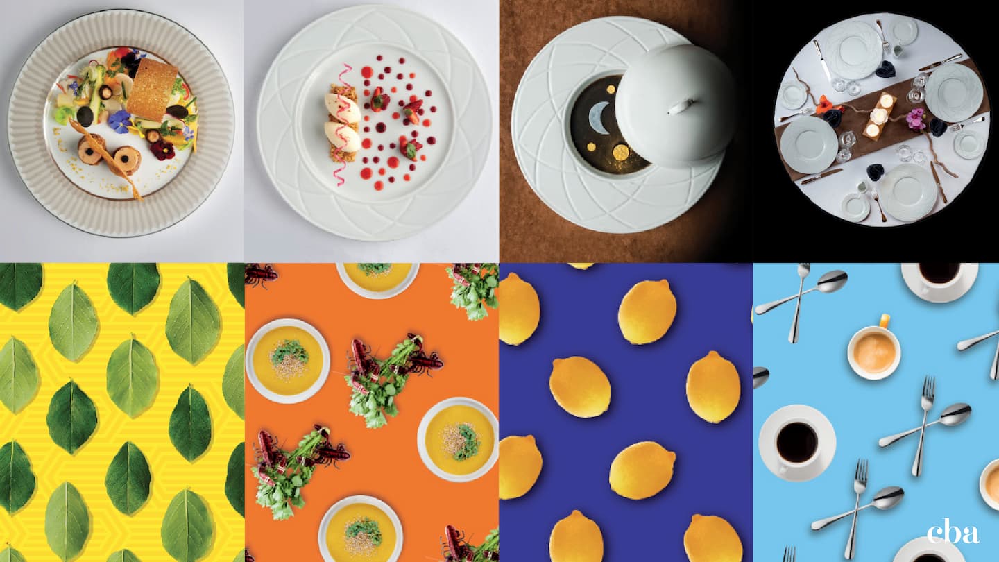
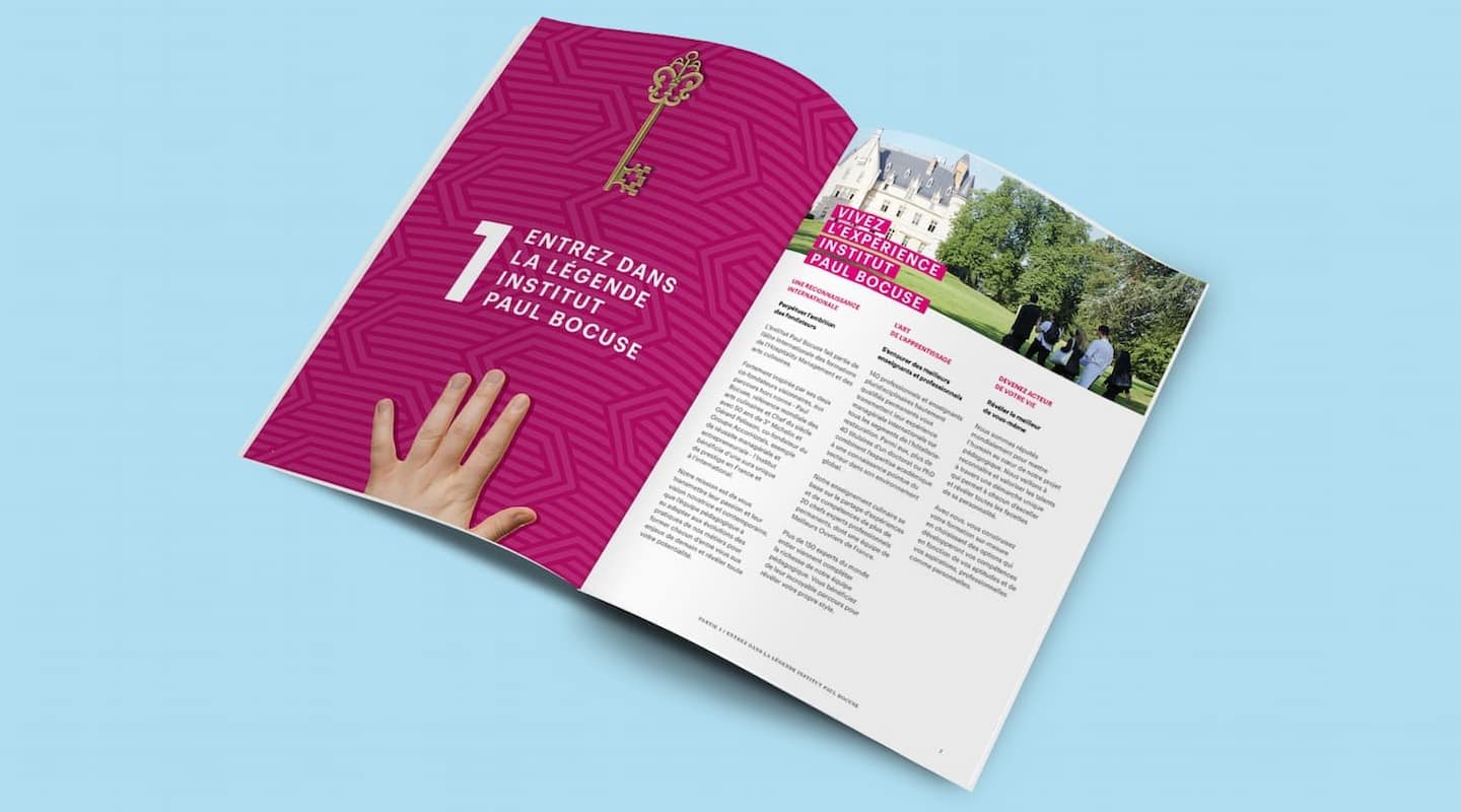
It is also embodied in a new creative concept, built around the idea of combining elements and reflected in:
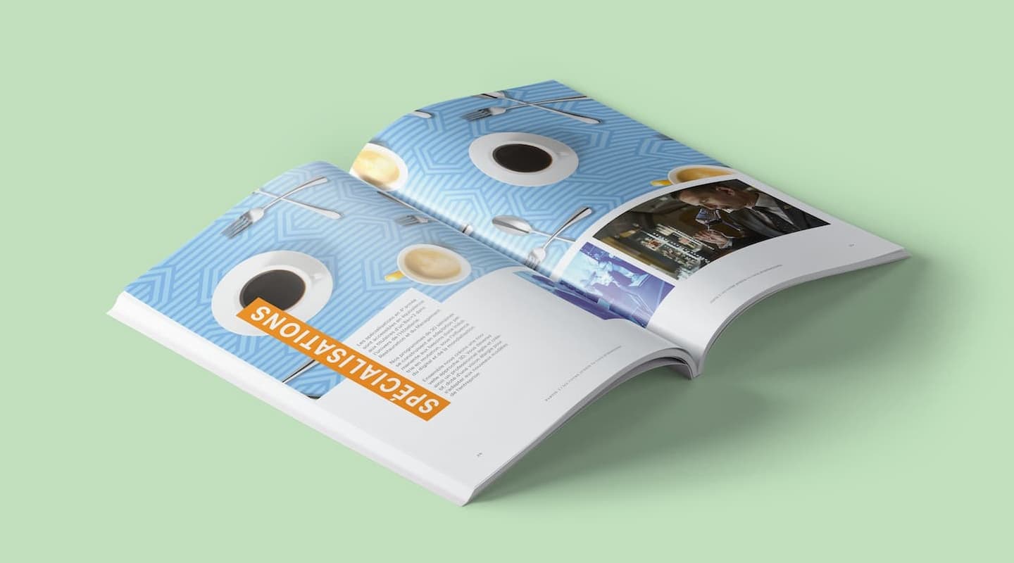
- a new visual identity that associates and combines knowledge, energy, culture, experience, dreams and ideas, to enable each and every individual to identify their own potential and shape their future.
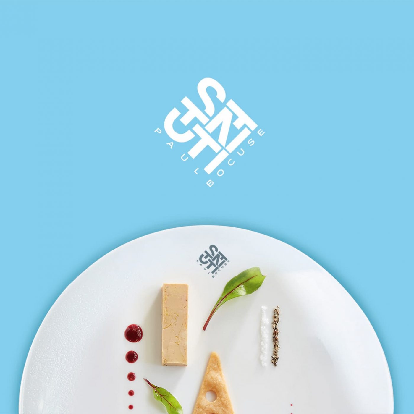
- a new logo with the name of the original founder now given less weight than the word ‘Institut’ in a design that is highly spontaneous, collaborative and contemporary
The brand architecture has been reworked around 3 key areas and the colour of the logo varies depending on the area: blue for continuing education, red for higher education and green for research.
Lastly, CBA delivered a brand book sharing, in addition to the design guidelines, all the work carried out in terms of philosophy and positioning, personality and visual identity, and communication and tone.
Through this approach, CBA has given the Institut Paul Bocuse brand a new edge and the modern image that it deserves by highlighting its diversity and creativity. The unveiling of this new identity took place at the Sirha Trade Exhibition (international exhibition for the catering and hospitality industries) on 21st January 2017 and was very well-received by students and staff, as well as by all representatives of the industry.
