The refreshing power of its forest
Nestlé Waters called on CBA Benelux to review Valvert‘s brand’s platform -its positioning, its baseline as well as its brand identity-, packaging design and communication territory.
Here’s how CBA brought awareness to the Belgian brand’s incredible history and assets.
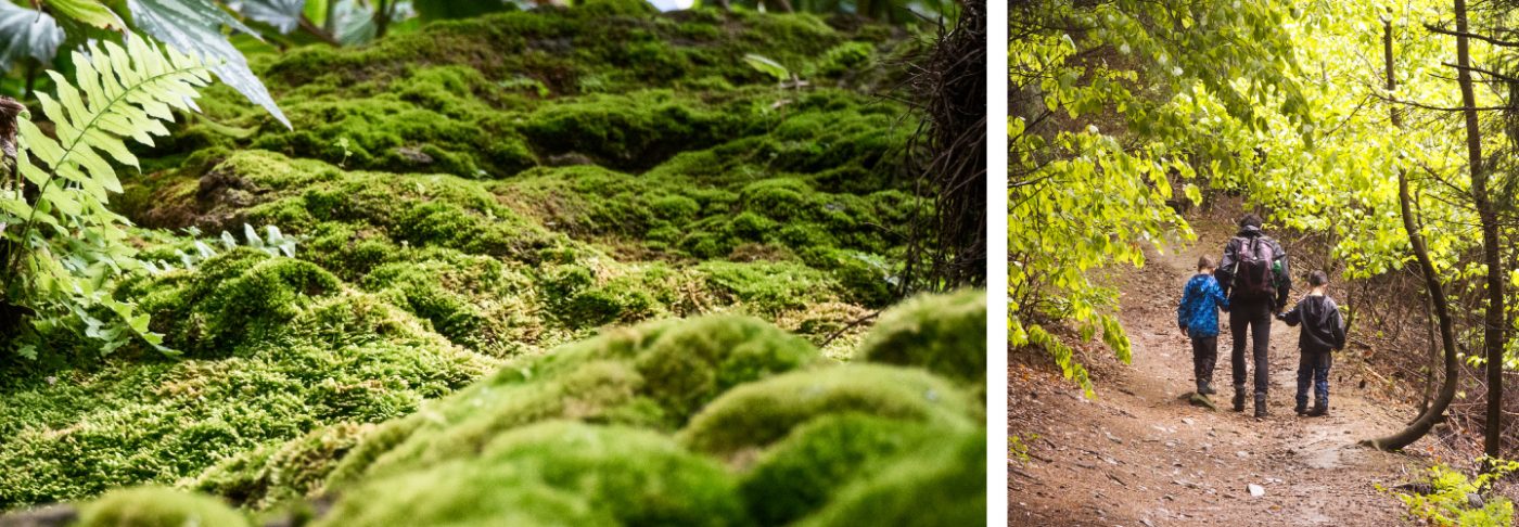
Valvert: A belgian spring water sourced in the Etalle forest, in the Gaume region.
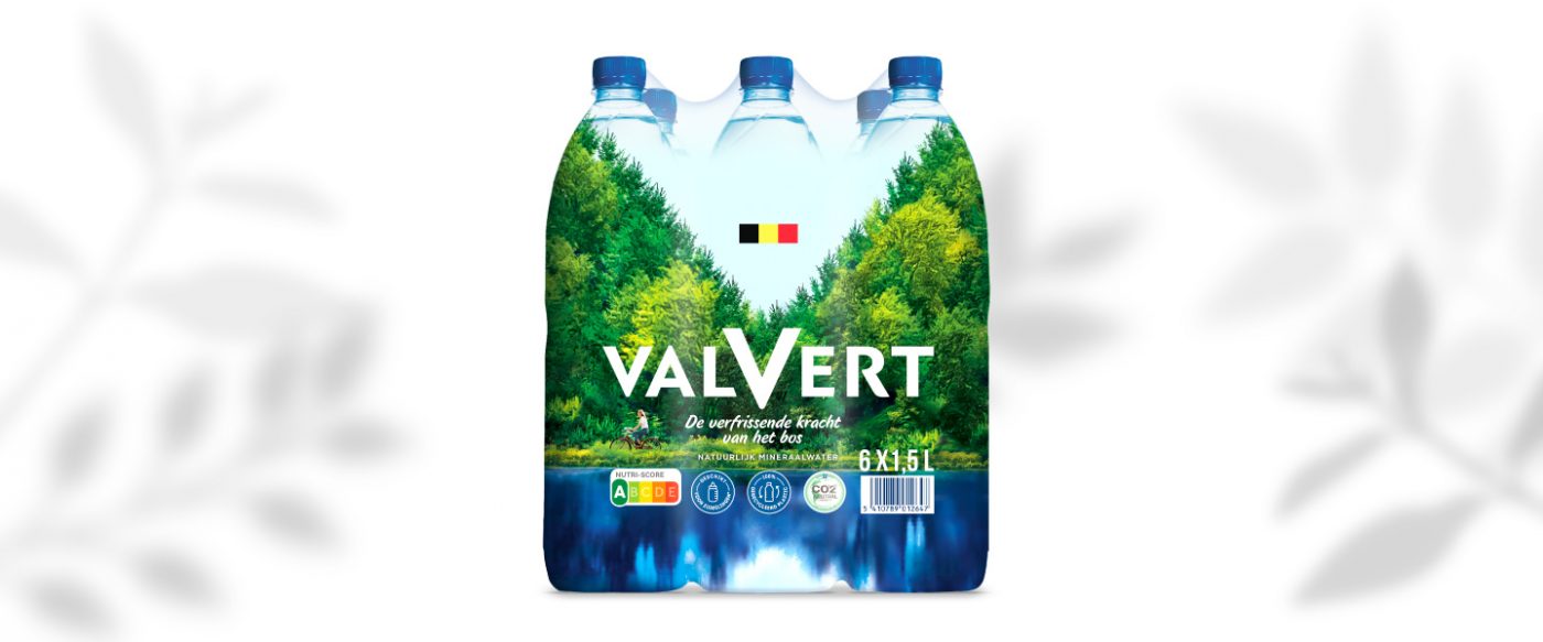
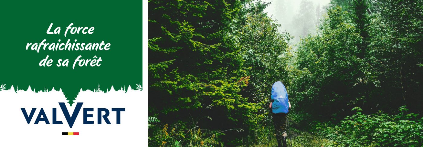
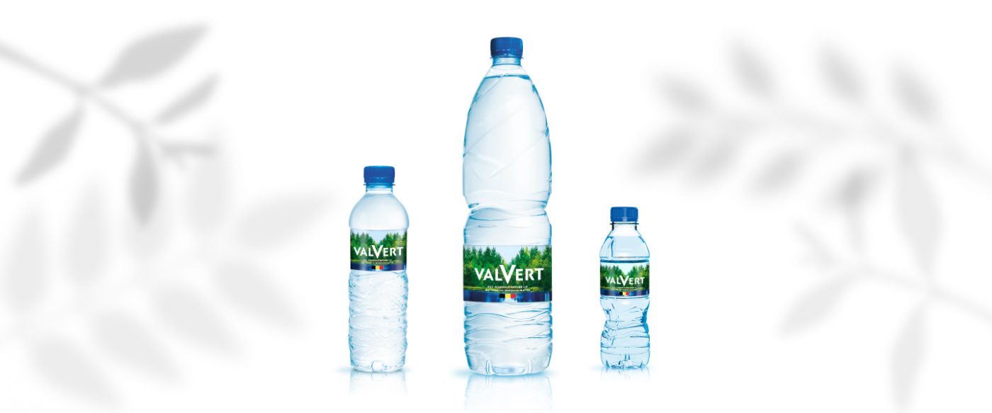
For this global redesign, we imagined a new brand positioning as well as a new baseline “Valvert, the refreshing strength of its forest”, allowing to emphasize the benefits of this natural Belgian mineral water.
We iconised the Vallée Verte from which Valvert water was drawn thanks to the V from which the V is cut into the forest treeline.
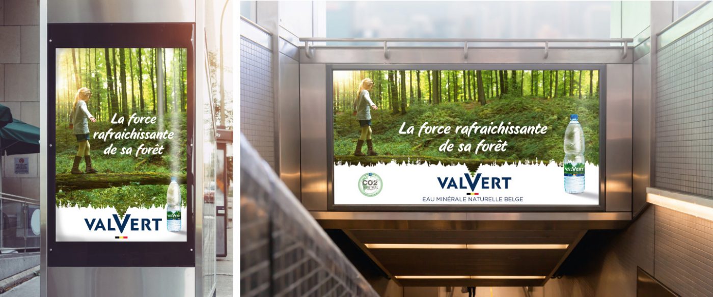
The logotype was reworked with an emphasis on the ‘V’ as well as the use of a strong V-shaped graphic structure to iconise the Vallée verte.
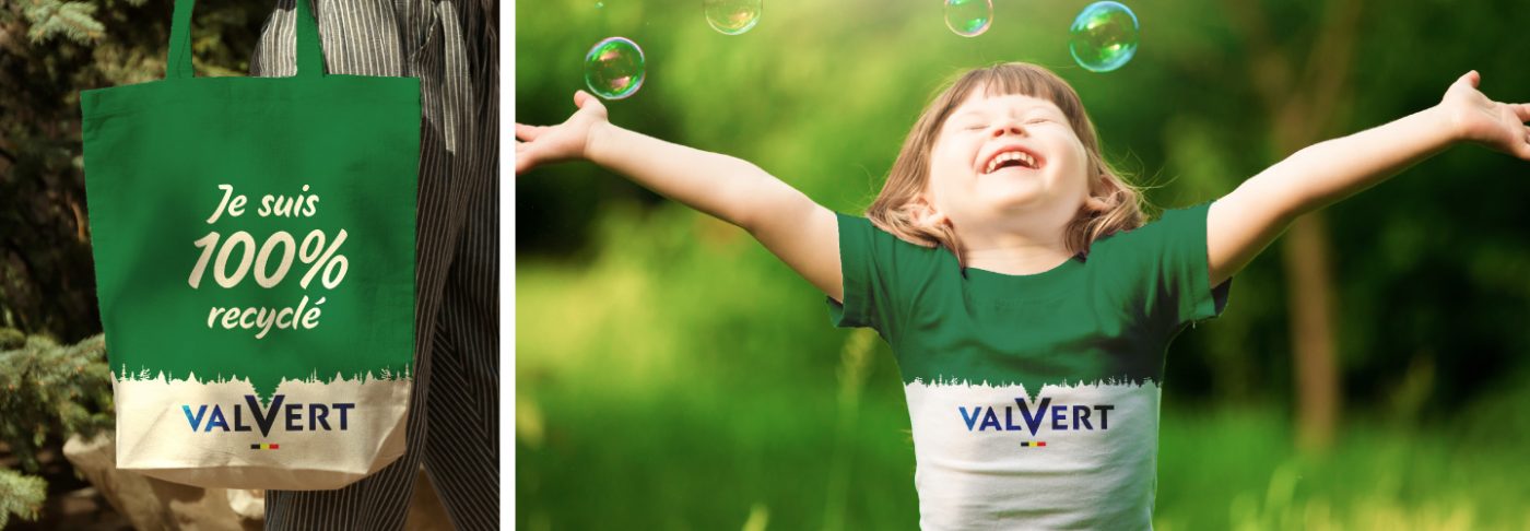
For the communication territory we used the principle of a treeline, representing the Gaume forest, and thus symbolizing the forest source of Valvert water.
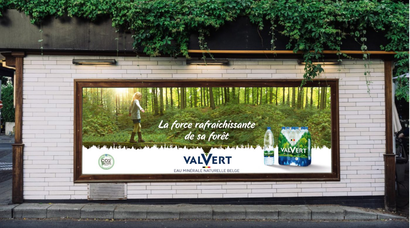
We allowed the brand to communicate to its consumers on its eco-responsible actions with one of the first bottle made of recycled RPET in Belgium; as well as their neutral CO2 impact on the environment.
