France
Paris
Switch to your local agency
Retour au menu
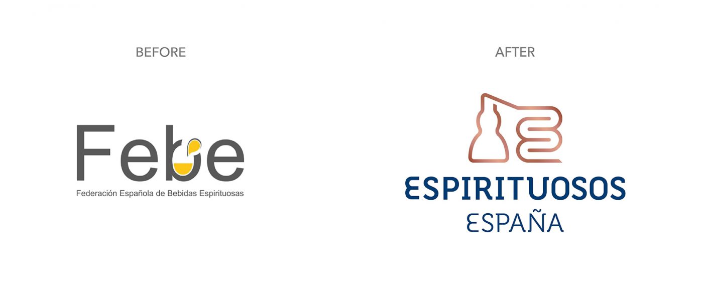
On the occasion of its twentieth anniversary, FEBE decided to relaunch its brand image with the aim of reinforcing its role as an organization, conveying the vision of a united sector, and enhancing the visibility of its mission.
A unique opportunity to build an efficient and lasting identity that capitalizes on the main values and attributes representing the federation. Commitment, responsibility and dialogue are identified as the main pillars of its brand positioning and, therefore, key drivers for strategic and creative thinking. In this sense, the first step is based on the optimization of the naming; going from “FEBE” as an acronym of “Federación Española de Bebidas Espirituosas” to “Espirituosos España”. An evolution in the naming that seeks to improve its readability, pregnancy and quick identification to the purpose of the organization.


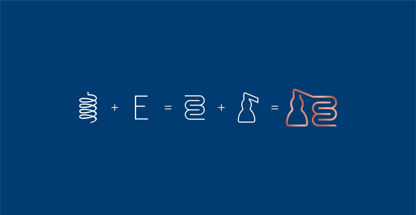
New graphic codes that flow elegantly over any communication support, configuring a forceful and flexible image that empowers conversation and establishes a significant connection between the organization and its different audiences.


An elastic identity, which extends to the various committees of the federation, for which a vivid palette of colors and complementary icons has been developed, allowing its easy identification.
A new territory for Espirituosos España, coherent with the essence of the organization and consistent in its expression and scope.


Privacy Overview