We have created a brand that redefines the
role of the workplace in society.
This project has unified the brand identity of eight office buildings distributed between Madrid and Barcelona under the same brand. This way, we have represented them consistently and redefined their role as workplaces in a new social moment where people seek to connect and interact.
The COVID-19 pandemic, which burst into our lives in 2020, brought about a radical change in the way of understanding what it was like to work in an office; thus, the new definition we came up with focused on shaping a new feeling. Workspaces would become, due to this global event, “a place to meet, to connect and interact”. We needed to show this shift in mindset toward empathy and flexibility to foster a mindful balance between work and play. Our proposal has focused on communicating these values, focusing on people, emotions and relationships.
/ STRATEGY
To reflect this new way of understanding the workplace, the first step was to define its positioning, values and personality as a brand. We established a solid strategy and identified our territory of expression to create a narrative that reflected a change in the social paradigm and an idea of the future.
/ NAMING & ARCHITECTURE
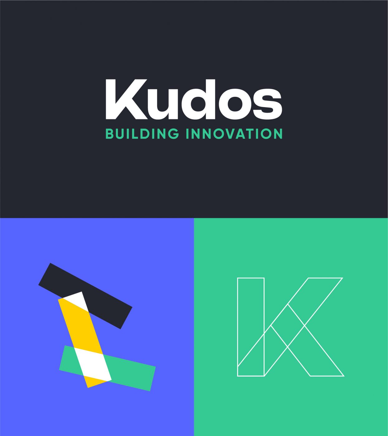
This is how Kudos was born.
Kudos means “the recognition received for an achievement”. In other words, it is a positive message used to congratulate the members of a professional team and represents dialogue and appreciation between colleagues. That was the name we chose for this brand; this is how we reflect the importance of collaborating to build.
In this way, we make Kudos a motivating place where people can support each other, come together to co-create projects, share ideas and collaborate to grow. We gave it a feeling of belonging, turning it into a community.
Based on this new name, we worked on a hybrid brand strategy to differentiate and organise the assets in the portfolio: on the one hand, we had the Innovation Campus, groups of buildings located on the outskirts of cities with already assigned names and, therefore, with a history that we had to preserve and, on the other, the Urban Buildings, located in city centres and that have an excellent location in the business and technological places of reference.
/ VISUAL LANGUAGE
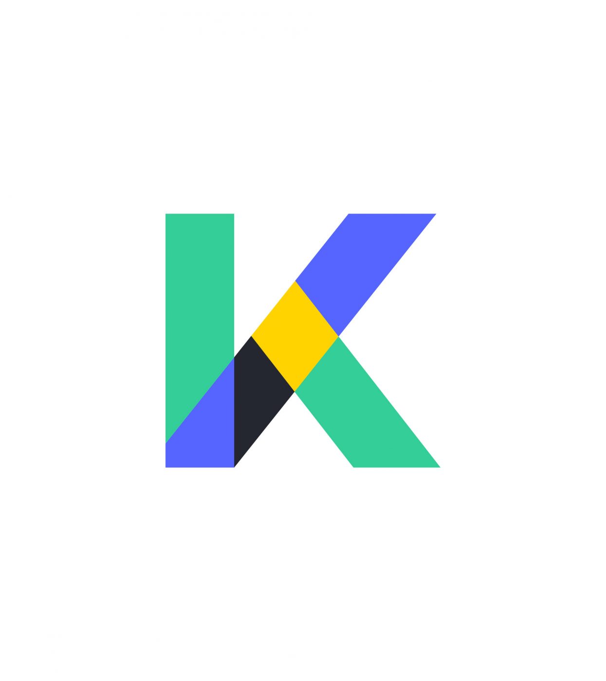
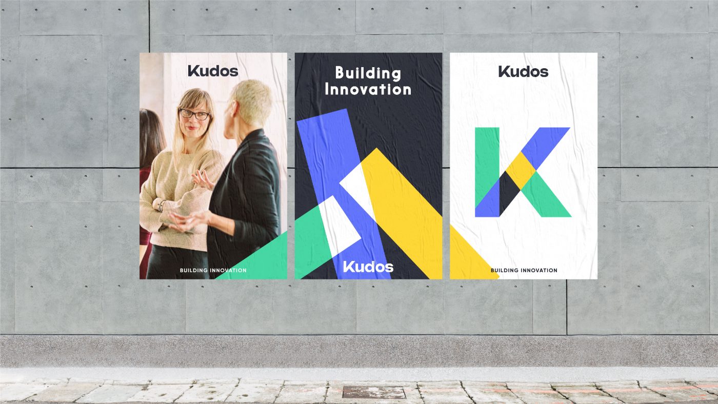
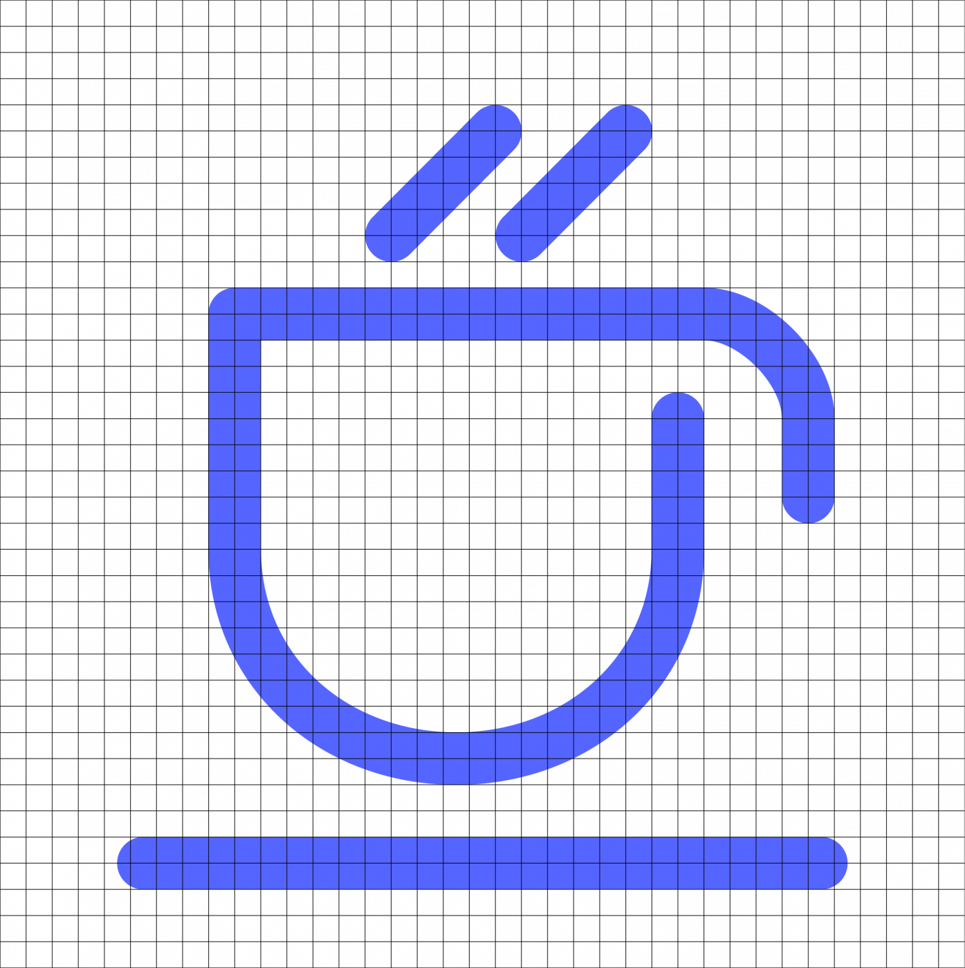
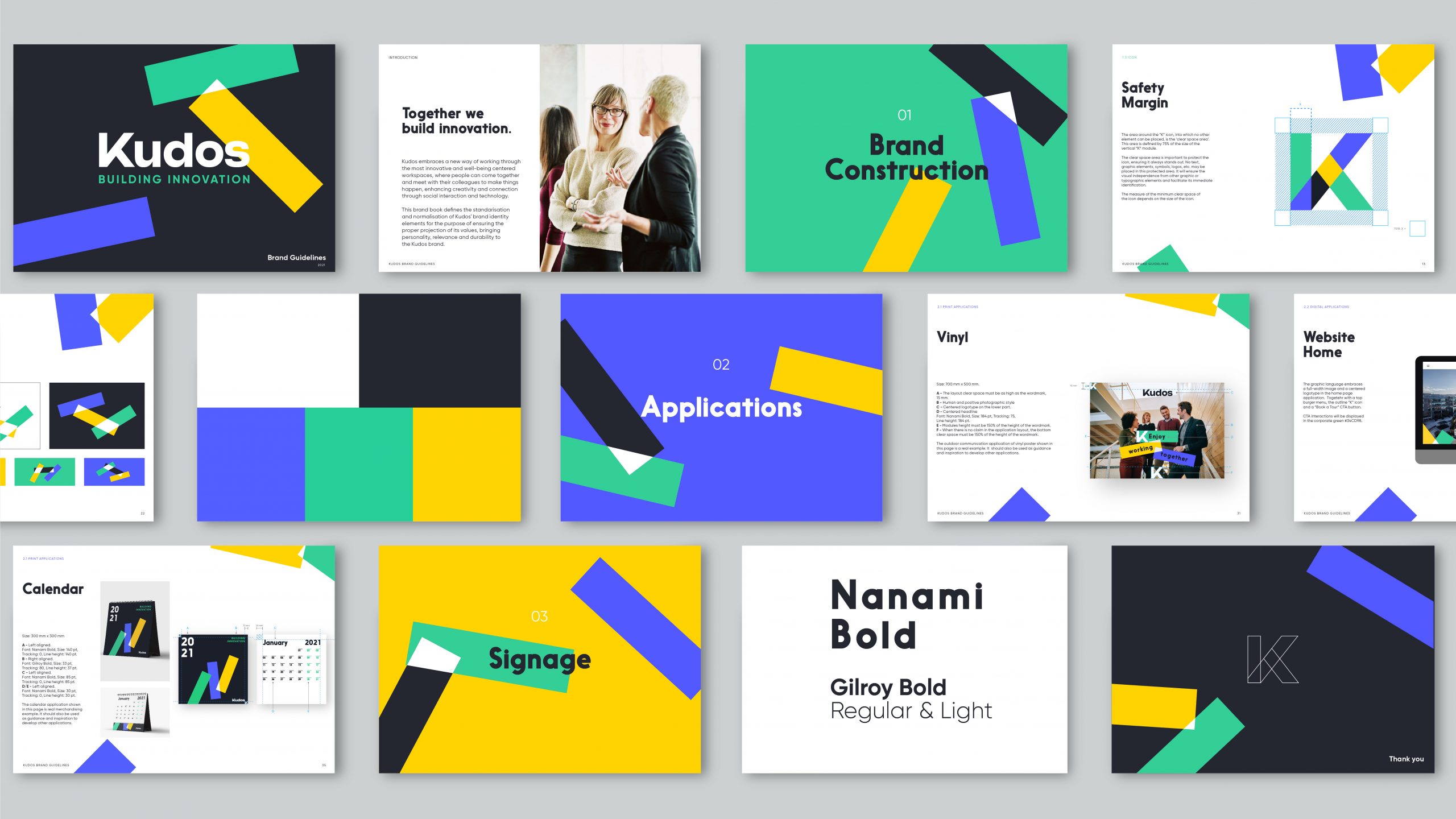
The “K”, our protagonist.
When designing, we took the K of Kudos as an architectural icon from which we gave birth to the entire graphic system; this is made up of three dynamic modules that symbolise connection, interaction and collaboration. We designed a composition in constant movement that reflects the different brand expressions with a human and emotional tone.
We used a bright colour palette to convey these positive values visually; green refers to a commitment to sustainability, blue to innovation and yellow to warmth.
The photographic style is a fundamental piece of this new imaginary. To stage this feeling of coming together, we pursued a balance between the buildings’ brightness and users’ presence.
We gave Kudos an identity that simplifies messages to make the brand and its users discover each other.
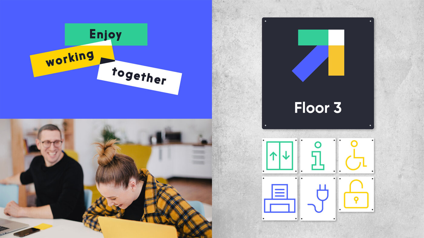
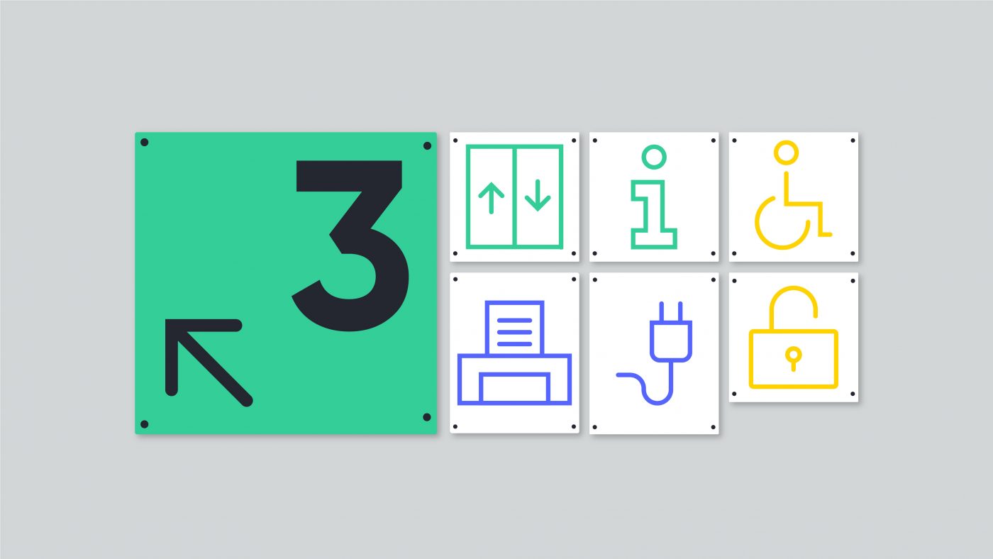
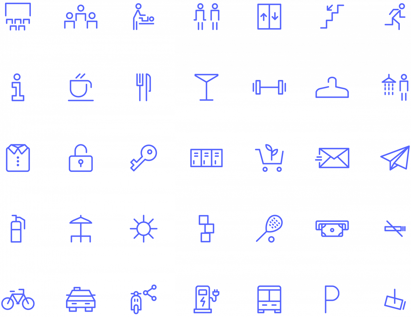
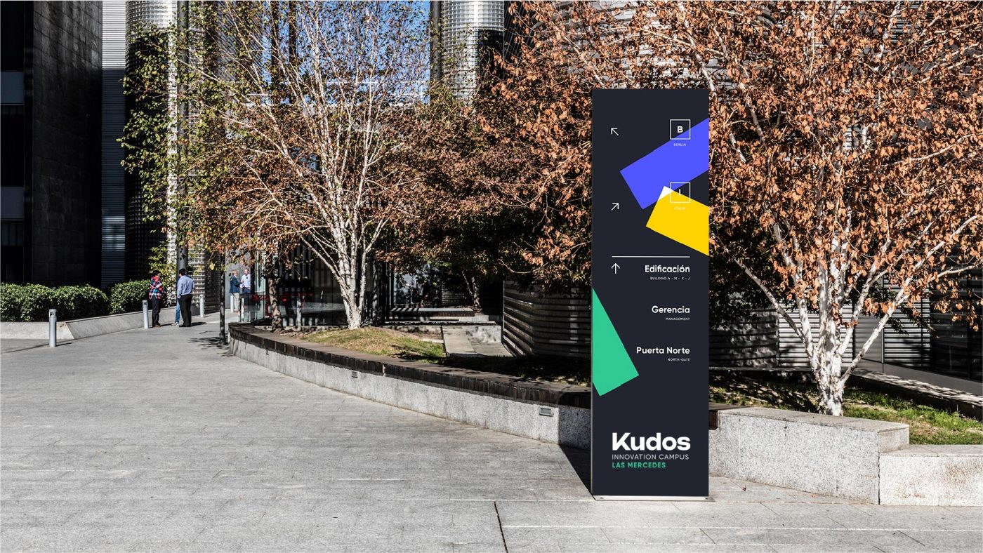
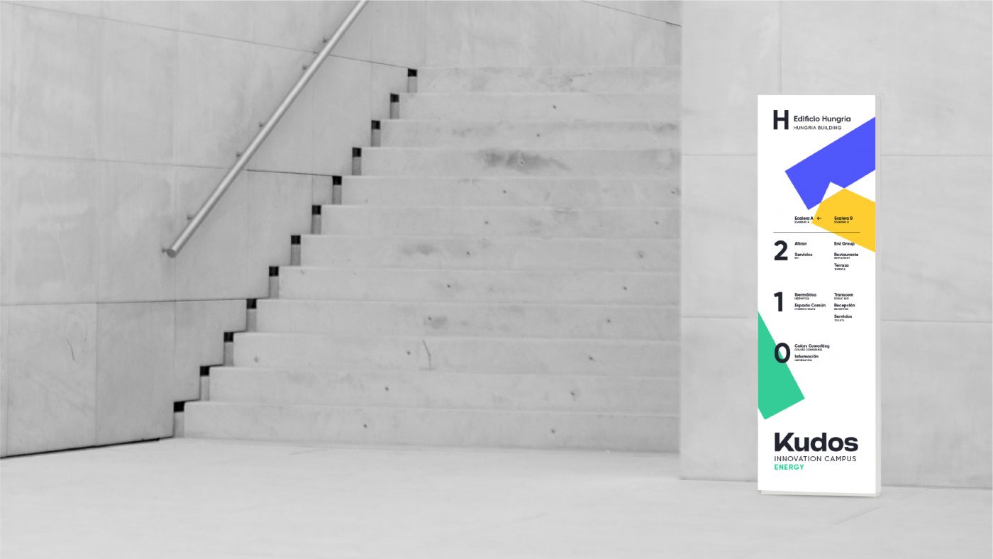
/ SIGNAGE
The project needed efficient signage with a unique iconographic language that would provide functionality, comfort and practicality to navigate the space; we worked to achieve clarity and openness so that co-creating and meeting is a priority.
For its design, we took the line as a constructive element, linking the icons to the “K”, the main component of the brand. In addition, we expanded the use of modules; we wanted the brand to be recognisable in its applications and to bring light and movement to the installations through the use of bright colours.
/ DIGITAL
By transferring the experience to the digital environment, we sought a simple and accessible website. We opted for a modular design to facilitate finding information and its adaptation to different devices. It was essential to achieve intuitive and flexible navigation that would optimise the content; this way, we would allow people who use Kudos services to find what they need quickly.
/ RESULT
Kudos came to life with a dynamic and
flexible visual identity, a unique
narrative, and a humane and
conciliatory vision of the future of work.
Workspaces have become places where people want to promote their development and well-being; we seek to relate, share and connect to build tomorrow.
We use cookies on our website to give you the most relevant experience by remembering your preferences and repeat visits. By clicking “Accept”, you consent to the use of ALL the cookies.
This website uses cookies to improve your experience while you navigate through the website. Out of these, the cookies that are categorized as necessary are stored on your browser as they are essential for the working of basic functionalities of the website. We also use third-party cookies that help us analyze and understand how you use this website. These cookies will be stored in your browser only with your consent. You also have the option to opt-out of these cookies. But opting out of some of these cookies may affect your browsing experience.