/ context
Bilbao’s iconic beer returns.
Following its relaunch in 2014, the iconic beer of Bilbao has opted to renew its identity and consolidate its positioning as one of the national references in the market. A new image that raises La Salve’s perception of quality and boosts its commitment to the local community.
To this end, we built a narrative that genuinely connects with people and reinforces its bond with the city of Bilbao. A story that honors the resurgence of its brewing soul.
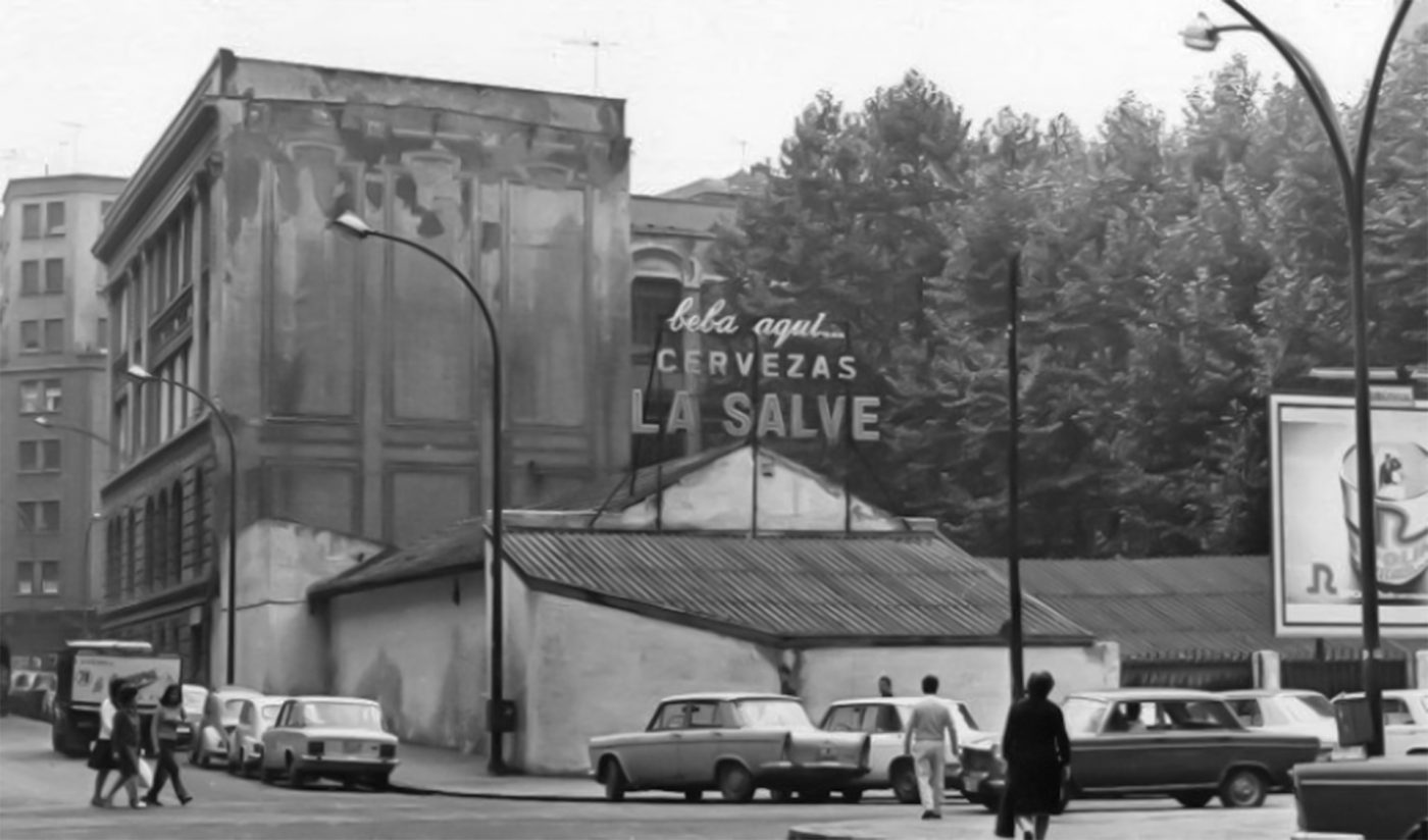
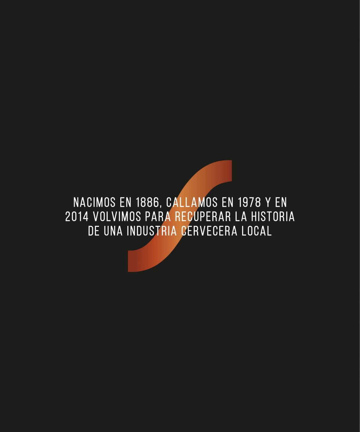
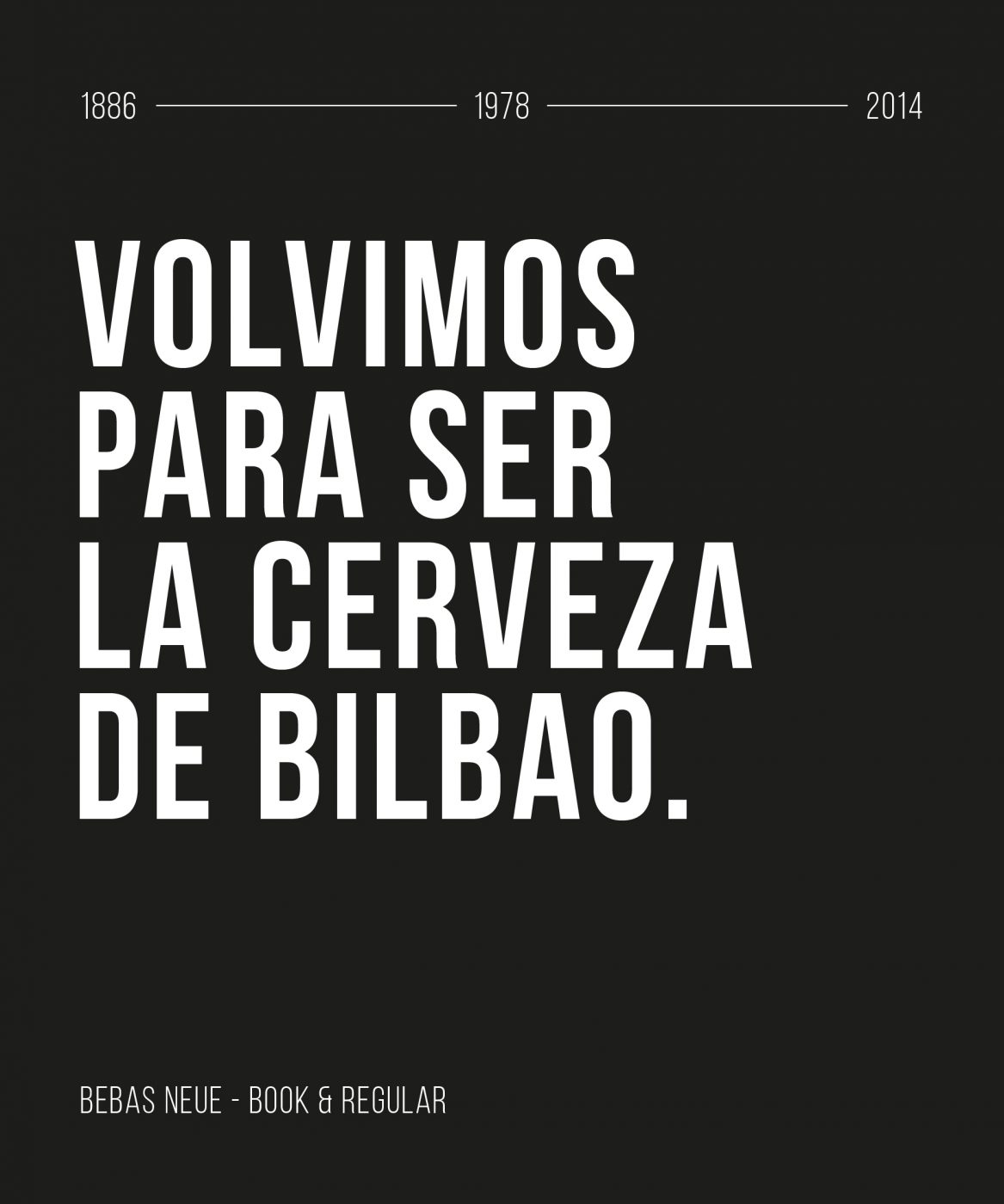
La Salve was born in 1886 and became the authentic brewery of Bilbao. After closing its doors in the 70’s, it reawakened thanks to its resilience and entrepreneurial spirit when it came to adapting to the changes and transformations of the city.
/ VISUAL IDENTITY
A legacy that becomes the foundation of the new identity.
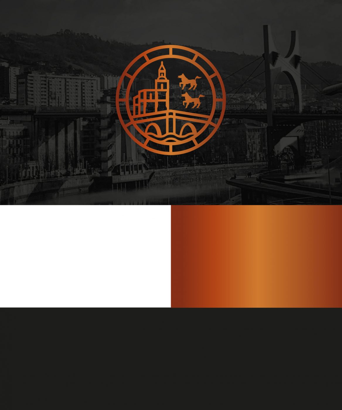
Using its past as a starting point, it recalls the story of the place where the sailors used to sing to the Virgin of the Basilica of Begoña: the emblematic La Salve bridge.
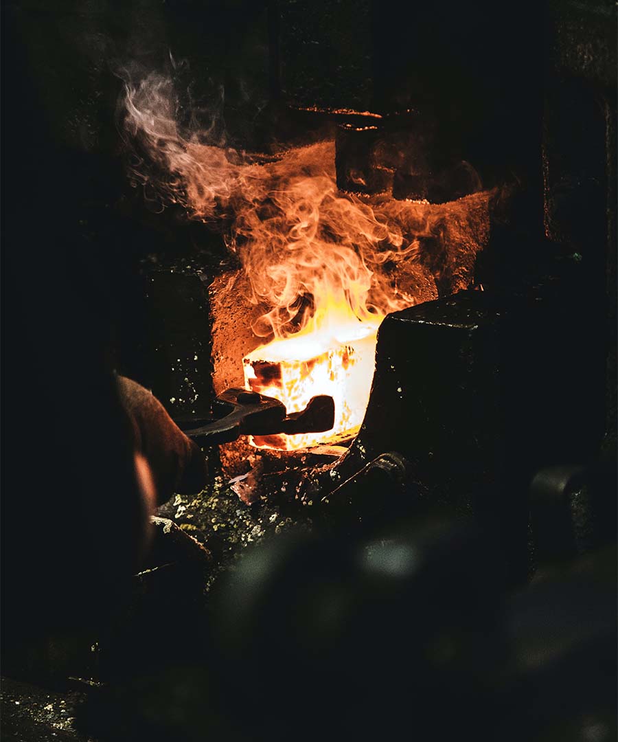
On the other hand, it rescues the imaginary and materiality of the factory, steel, fire, and coal of the Blast Furnaces and Shipyards through the use of black and metallic colors that reinforce the character and personality of La Salve. An ode to its industrial roots and its brewing soul.
/ GRAPHIC CODES
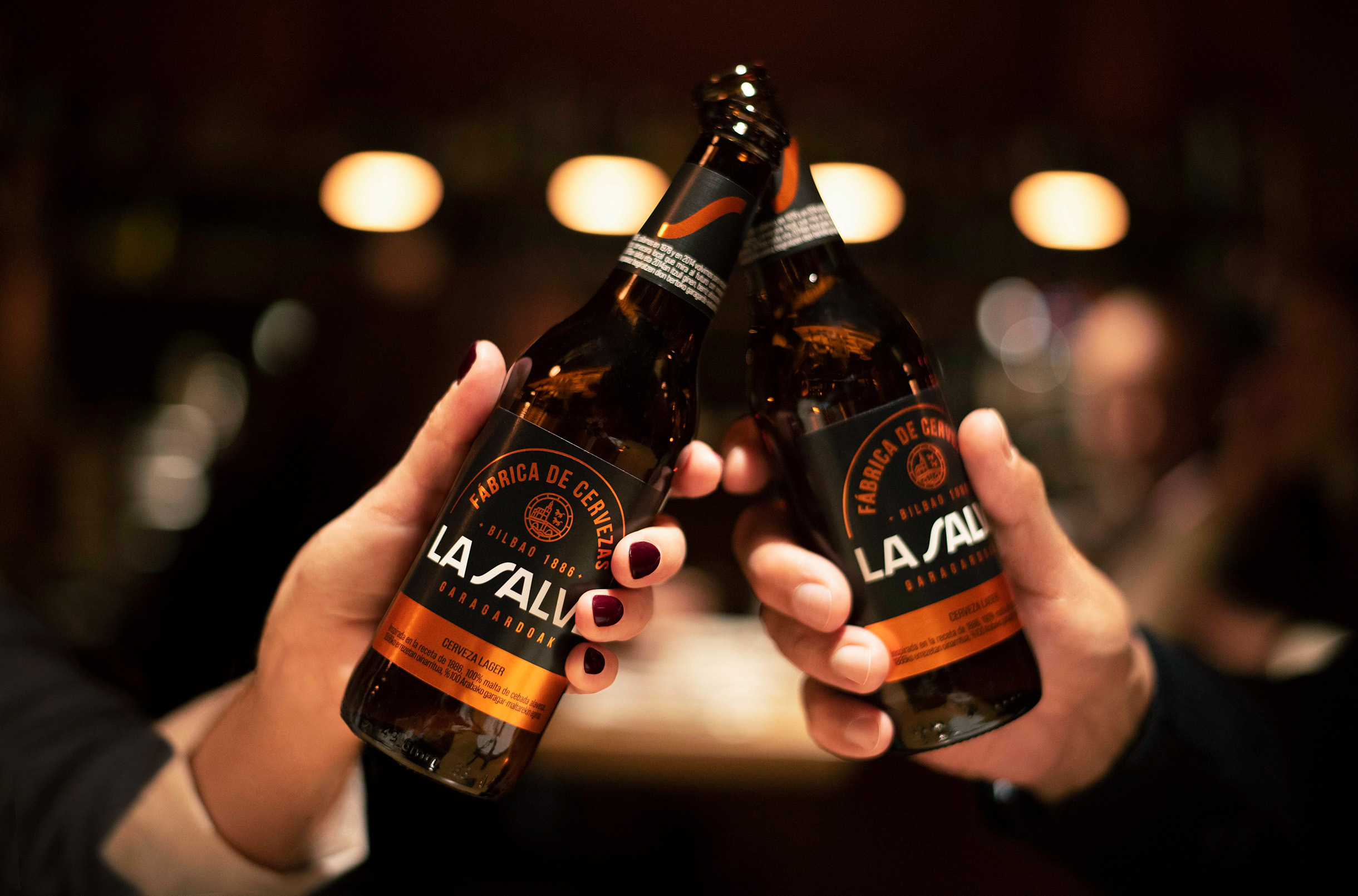
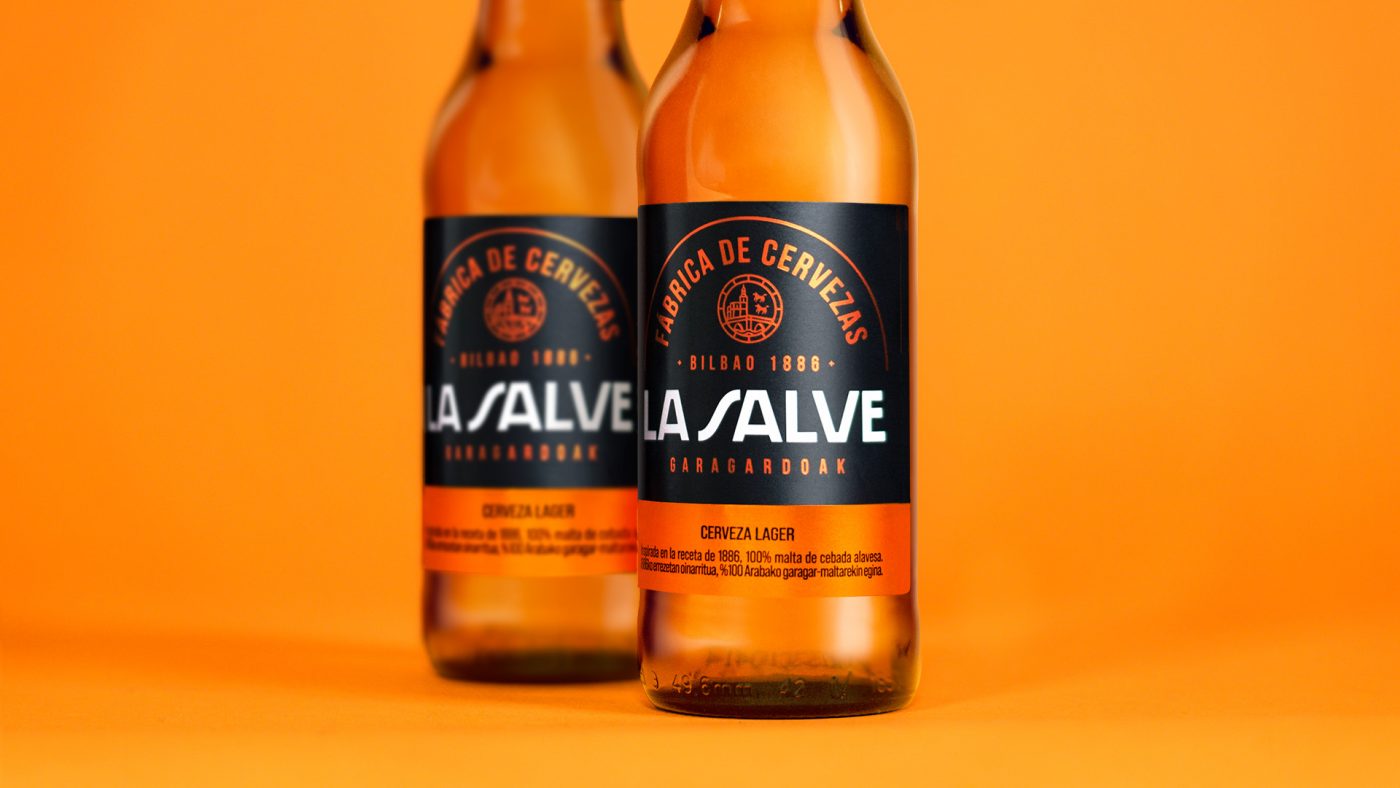
With subtle changes in the logotype, it evolves slightly to gain strength, impact, and visibility. Furthermore, the role of the “S” of Salve is highlighted as a new space of expression, which seeks to capitalize distinctively on the iconicity of the brand, evoking the Estuary of Bilbao.
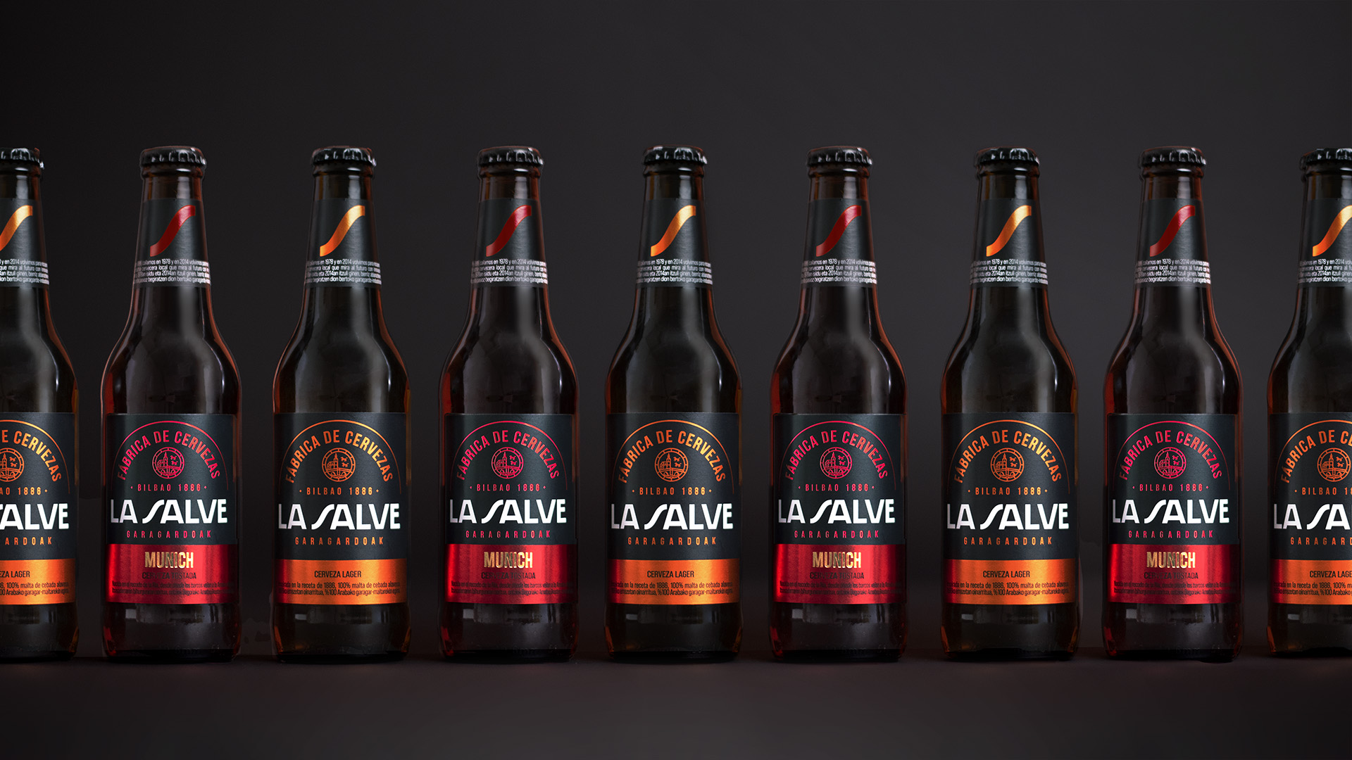
A strong and consistent structure where the new brand identity codes make a clear impact through the packaging design, generating great recognition that promotes the pride of La Salve Brewery.
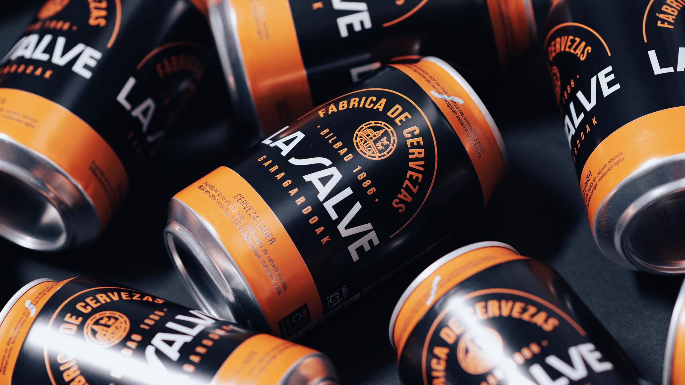
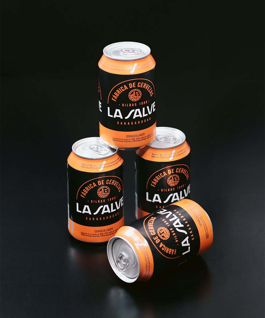
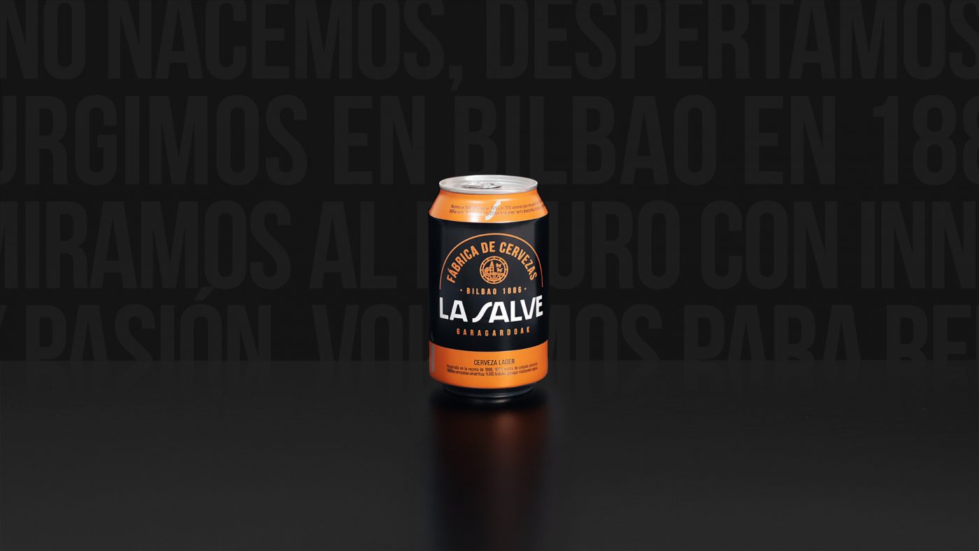
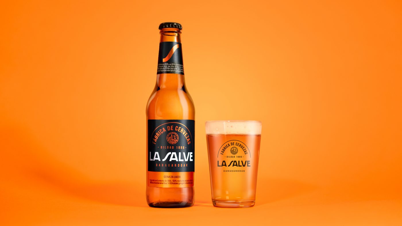
A new chromatic language formed by black, white and metallic orange as the primary pillars of the identity.
The new typography and iconography generate a stronger bond with the category codes. At the same time, they allow the new image to expand, creating an authentic beer experience that highlights the committed, collaborative and human character of La Salve. A new identity that now reflects the tale of a historic brand, its values and personality told from a contemporary perspective.
In short, a new awakening for La Salve that reclaims its personality, giving power to the origin, tradition and know-how that define it. Creating a territory of a unique, memorable and enduring expression, speaking clearly about the authentic beer of the north.
A tribute to the growth of a long-established brand, respecting its history and looking towards the future.