Reinvigorate the Haagen-Dazs brand to hold its market position against encroaching competitor brands
/ the idea
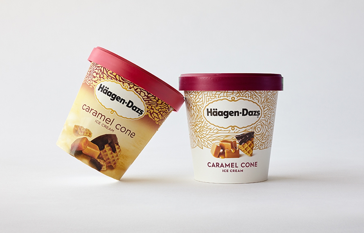
Inspired by Häagen-Dazs’s heritage and its enthusiasm for global ingredients, we approached this refresh by balancing old and new. Taking overlooked equities and infused them with modernity.
Telling new stories
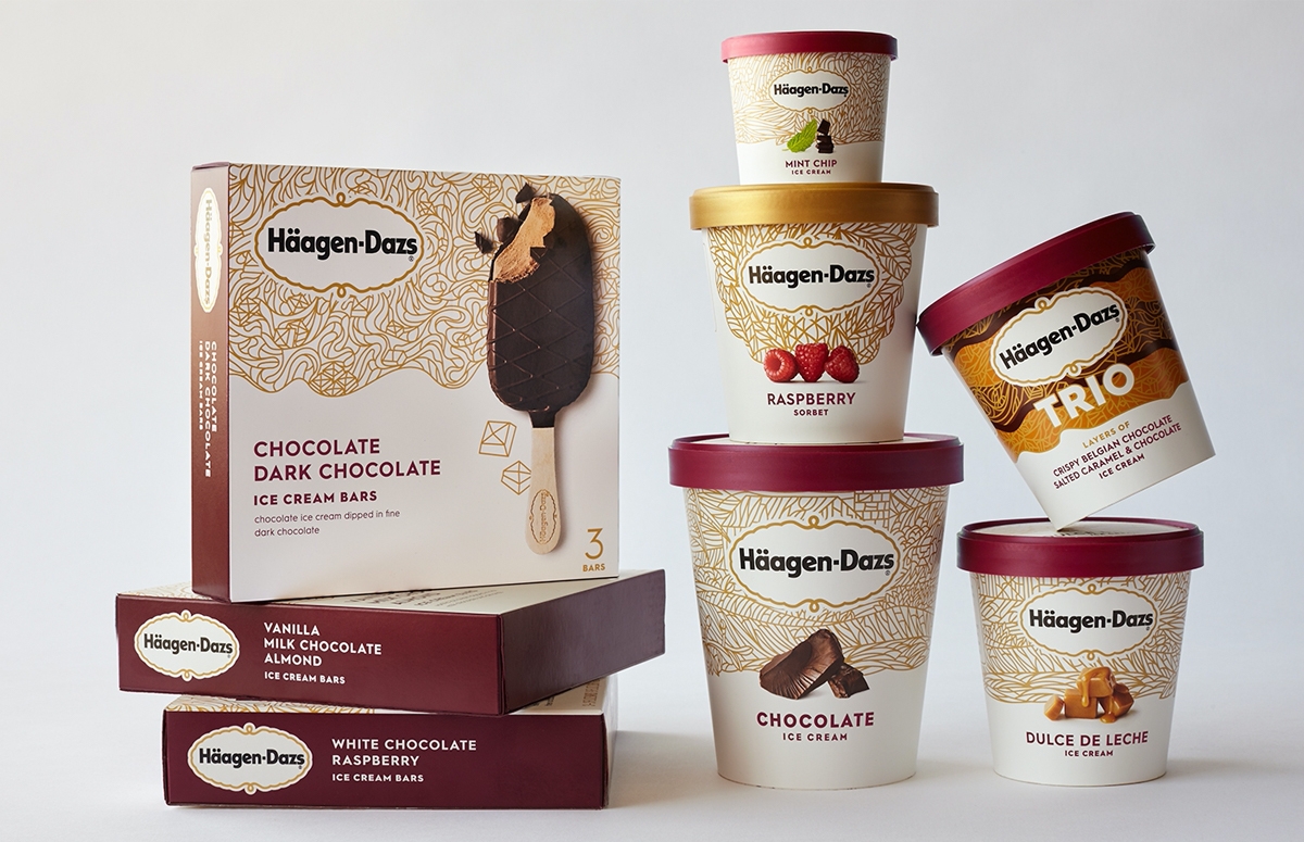
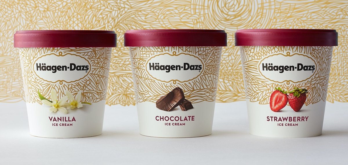
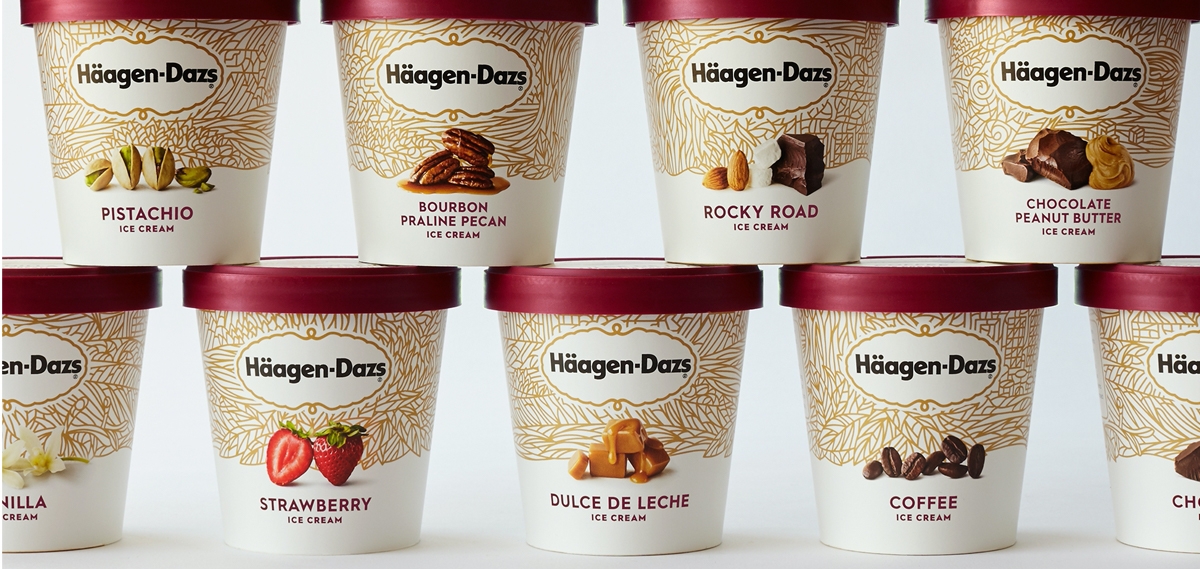
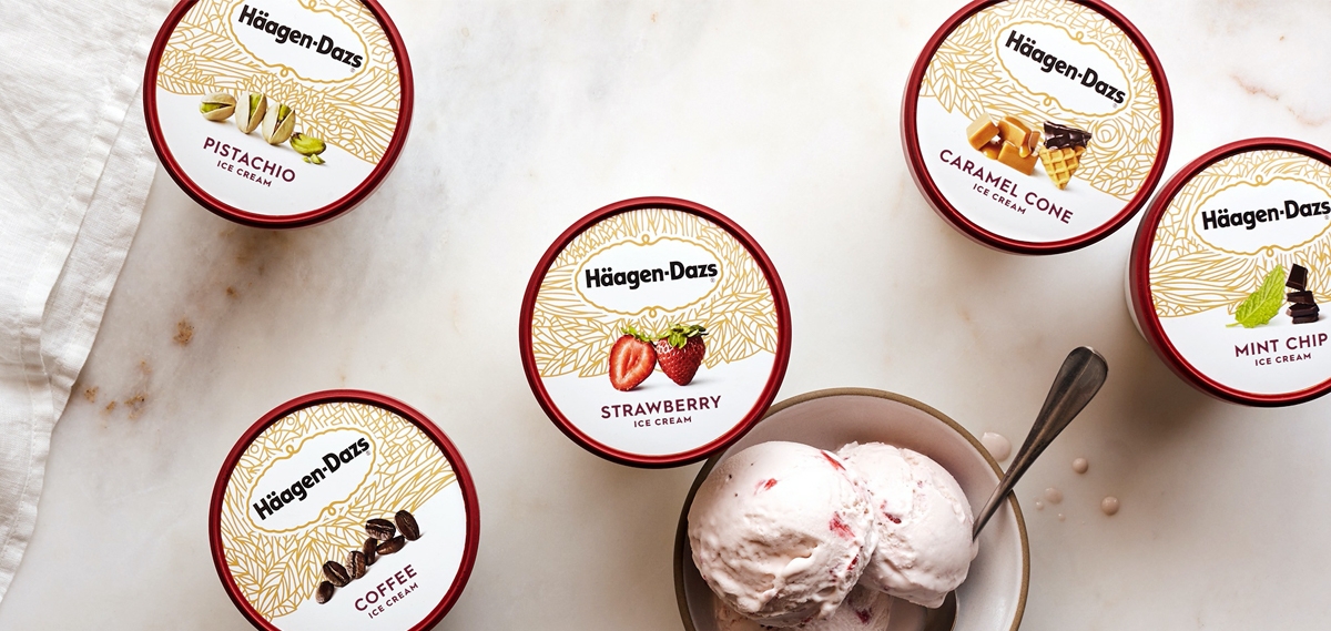
An old doily motif had, over the years, been slowly disappearing from the cartons. This overlooked equity infused with modernity served as inspiration for a visual identity system. We called it the Tapestry as it recounts the full story of the entire brand, from source to spoon.
The Häagen-Dazs tapestry visual identity system tells a tale that is tailored, adventurous, and premium, a combination befitting this sumptuous brand.
/ Results
CBA won many price for this project:
- The Best Packaging at the Transform Awards 2017
- The Packaging Price from the HOW
- The Best Brand Experience at the Transform Awards 2016
- The GD USA in the Packaging Category at the American Package Design Awards

