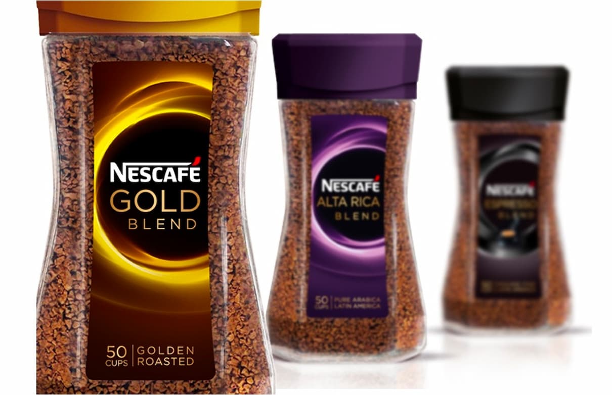
CBA London was given the responsibility for interpreting the new Nescafe brand identity and applying it to Nescafe’s brands in the UK. A key part of the identity’s development was a built-in flexibility that would allow local market needs to be recognised, whilst at the same time maintaining a strong and clear global identity. This would be put to the test in the UK as many Nescafe brands here are unique expressions: Gold Blend only uses the iconic gold bean in the UK; Nescafe Original is Nescafe Classic/Classico in other markets; and Azera was originated in and for the UK.
The key to navigating this rather tricky coastline, with potentially conflicting signals being received from the local market and from the international brand team was communication and transparency. CBA London and the CBA International Nescafe team in Paris worked closely together to ensure that the strategic imperatives of the new brand identity were clearly understood and that local needs could be recognised. Both sides of CBA’s Nescafe team kept their clients (UK and International) up to date with creative development and rationales so there were no surprises and the desired consistency in approach.
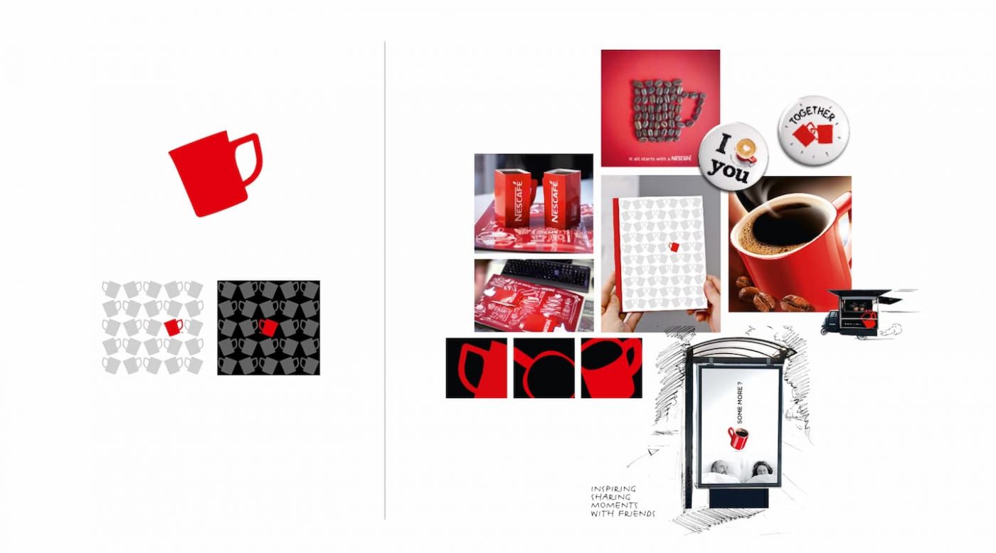
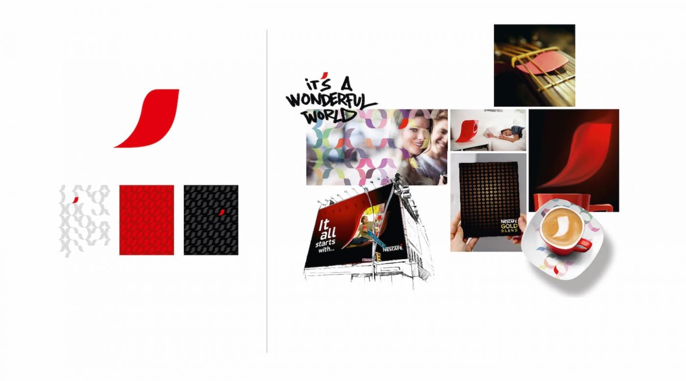
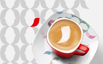
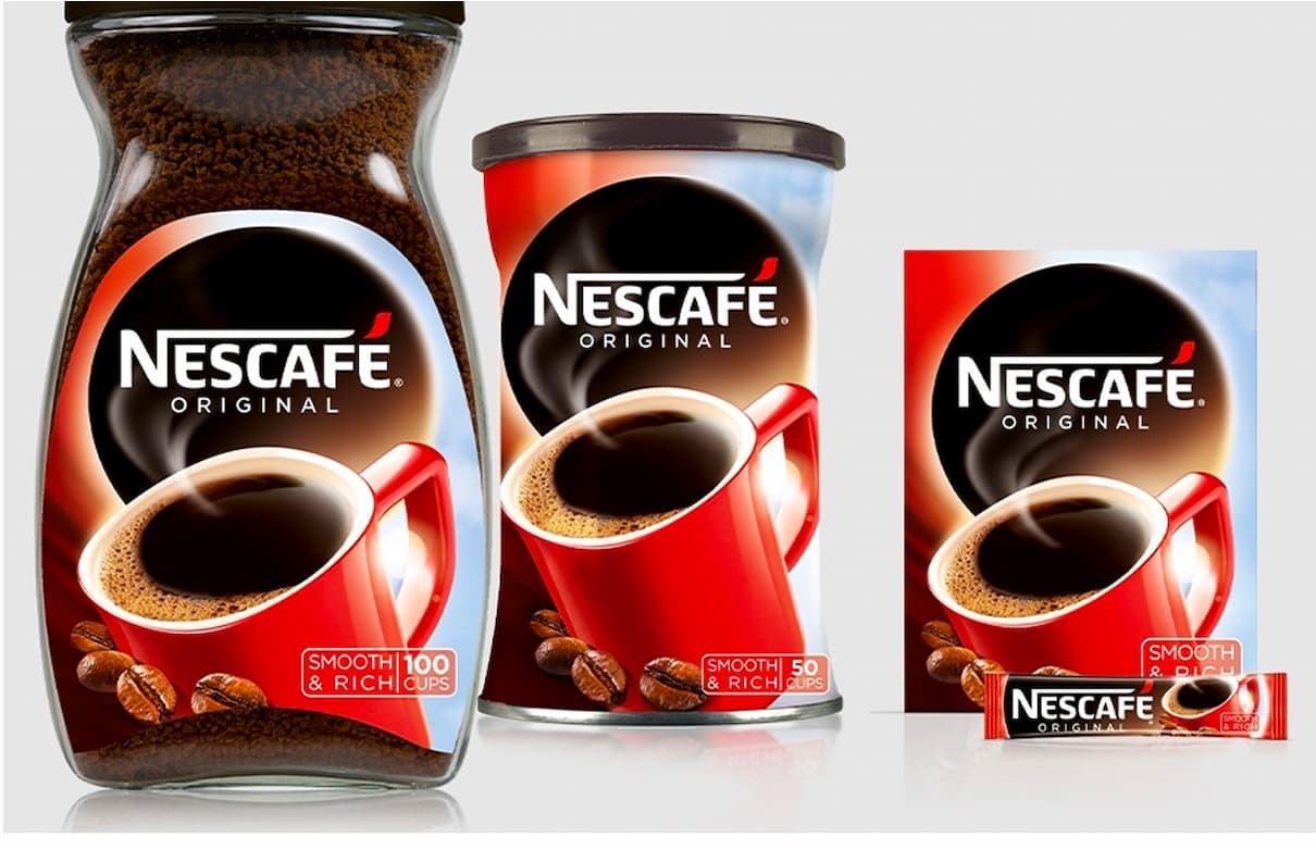
Nescafe’s new identity has now been implemented across all of Nescafe’s UK brands, consumer facing and also professional formats. The partnership between local and international has resulted in packaging solutions that are both clear expressions of UK variants, and distinct expressions of Nescafe’s global brand identity.


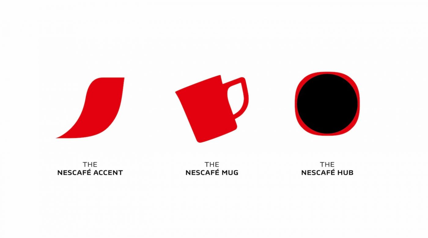
We live in a more globalised, social world and we realised that we needed a more unified, powerful umbrella for a brand like Nescafé ‑ a single personality that could also be expressed differently in each country.
Patrice Bula
Nestlé's Global Head of Marketing
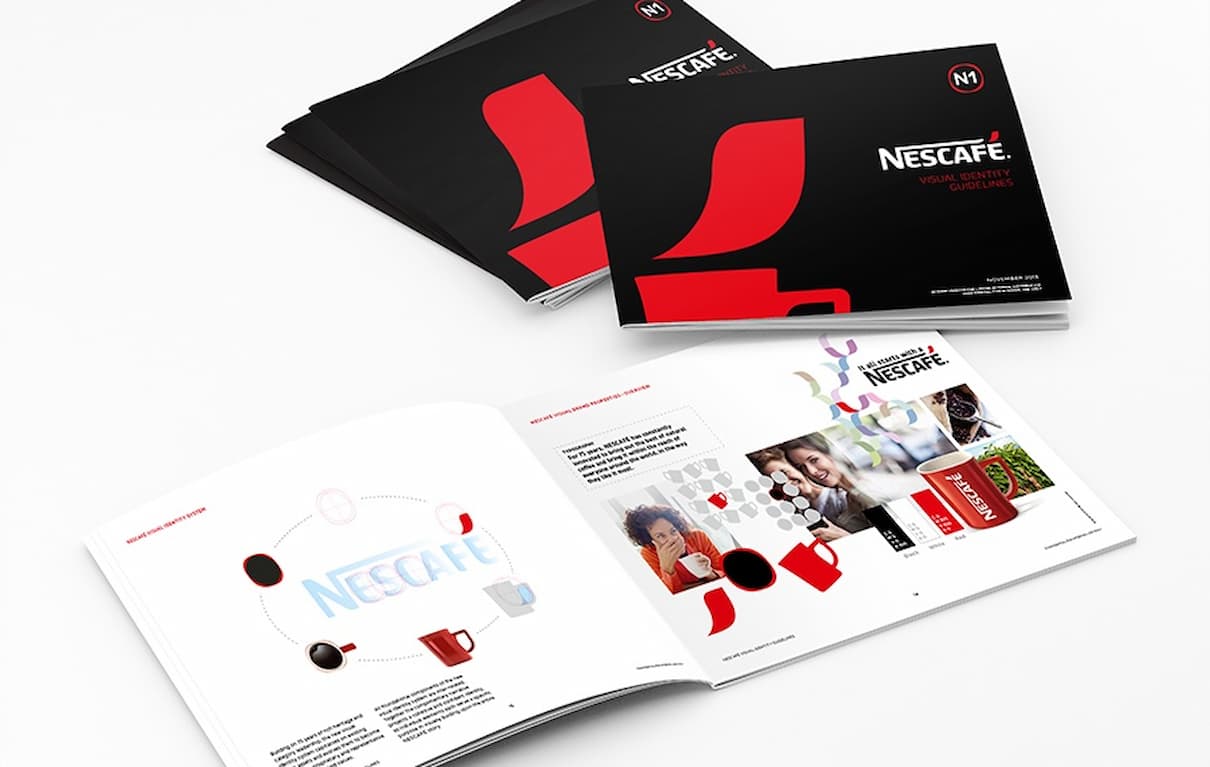
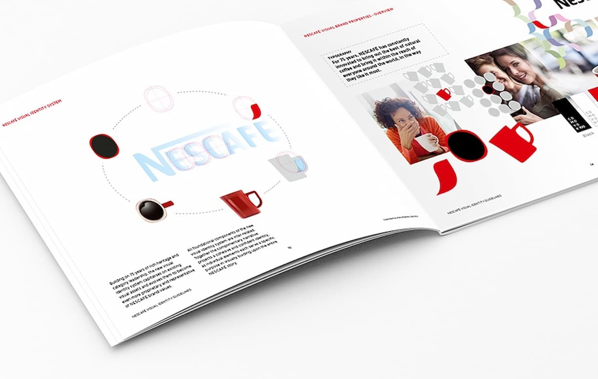
The packaging is beginning to appear on shelf now and so we can start to see how the new masterbrand identity is pulling together what had been a disparate family of unrelated product brands. And, critically, we can begin to see how the Nescafe brand can consistently add value to sub-brands across the instant coffee category.
A personalized, rich, stimulating and connected consumer experience.
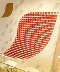
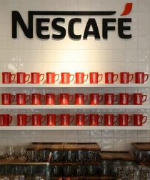
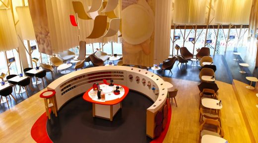
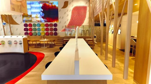
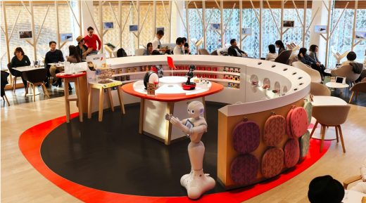
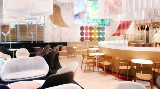
The REDvolution Sensperiences represents a physical environment and activities that act on all 5 human senses to emotionally bond with consumers. It is not only a place that fosters exchanges and discoveries but also a place to consume the product itself, a reflection of everything the brand stands for, that promotes brand advocacy.

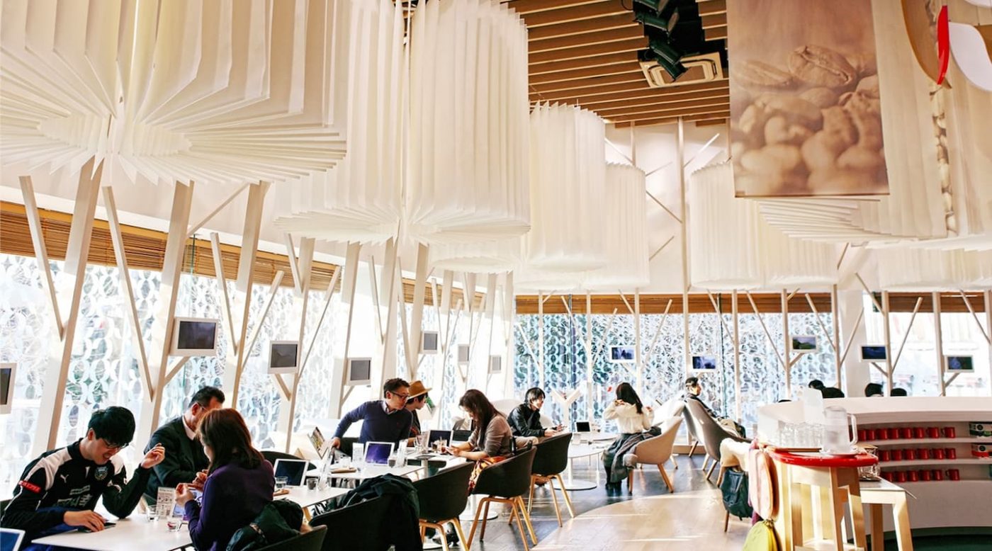
6 months after its opening in February 2015, in the heart of Tokyo’s student quarter, Nescafé Harajaku is already part of the top 5 Tokyoite coffee shops according to Tripadvisor.
The same can be said about the 600 m2 Seoul flagship that opened in November 2015. It perfectly embodies the values imagined by CBA for the brand: the 3 thematic floors (Interactivity – Lounge – Festivity) are associated with a glass façade for an Ice Cube effect, and give to Nescafé a strong footprint in the trendy quarters of the Korean capital city.
The different spaces and the culinary, recreational, connected and interactive activities are made to welcome the young Korean population all day long, specifically used to live in this kind of coffee shops as they often lack of private space. The environment of the Nescafé’s points of sale allow to live a different experience at each visit, and strengthen at the same time the product and leisure offer of the brand on its own market.
