Croustipate : A 100% kneaded Made in France dough brand with impeccable ethics
Croustipate, an expert pastry dough brand belonging to the Cérélia group, has been selling a range of high-quality pastry doughs for over 20 years. Croustipate stands for expertise and know-how, and all products are 100% kneaded in France. The brand has impeccable ethical standards which include a strong commitment to sustainable and organic farming and a traceability process that can be applied to each of its products.
In 2018 the brand decides to review its market positioning to reach a younger age target and asks CBA for support with its branding strategy and packaging design.
Following an in-depth audit of the company, the brand and its competitive environment, as well as a collaborative workshop, CBA develops the new Croustipate brand platform, which focuses on the Atelier of Croustipate and the expression of collective pride: The French bakers of fabulous happy dough.
For CBA, it is important to highlight quite how extraordinary the pastry dough is, and hence to overcome the boring perception of this “commodity” product category.
The agency creates a new personality for the brand based on 4 major values: optimism, sincerity, relaxedness and playfulness. This also allows to create a new tone of voice, illustrated by a new brand manifesto which proudly flies the colors of the born to bake makers’ ambitions.
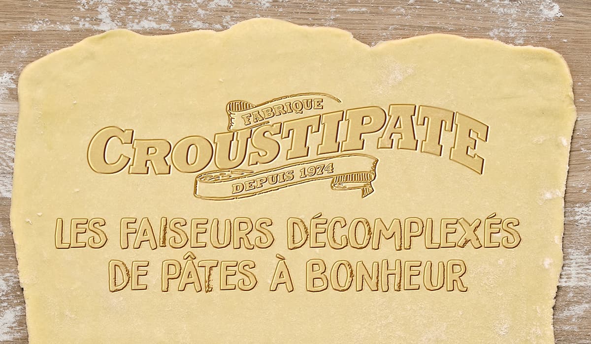
/ Creative expression
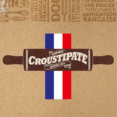
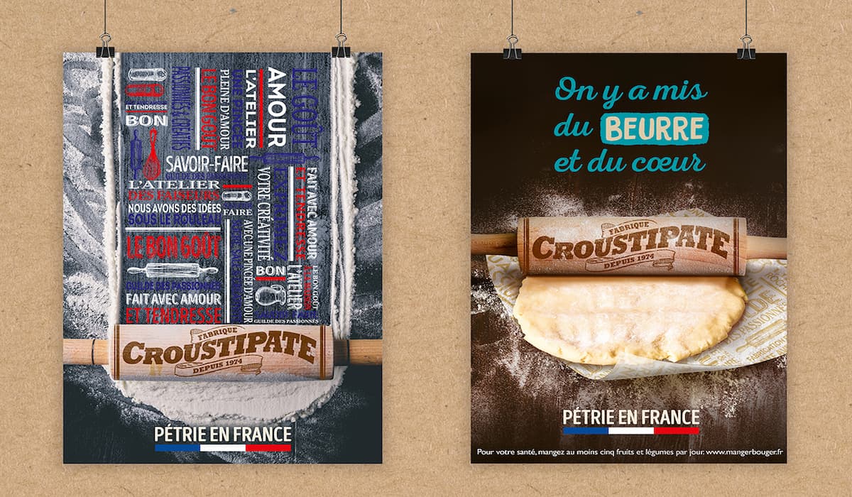
To embody the new brand platform, CBA has completely reworked the brand’s look & feel and creates a new and meaningful visual brand identity. The rolling pin, as a strong symbol to express the baking experience, takes a special place at the heart of the brand, enabling Croustipate to position itself as an expert in its category.
This is reinforced by the addition of the “Fabrique” wordmark (which means “Atelier”) and the brand’s creation date within the brand bloc. The brown colour code used in the logo, as well as the consistent kraft background also support the positioning based on the avid bakers concept.
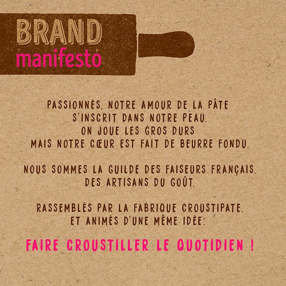
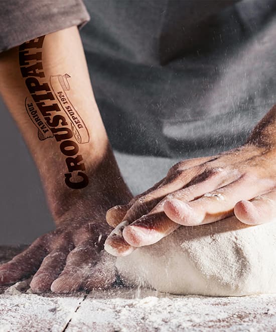
CBA creates a system of unique patterns to the brand, evoking tradition and know-how. These patterns are a key part of Croustipate’s new visual identity and are used across all of the brand’s touch points.
The Kneaded in France claim, illustrating the brand’s pride, is displayed via a French flag on and off packaging.

A more colourful packaging concept
In a further attempt to rejuvenate the brand, the agency introduces vibrant colour codes on pack to counterbalance the traditional baker image. In the light of this, a lively colour palette is created to add a quirky and unexpected element to each variant of the range.
In a further attempt to rejuvenate the brand, the agency introduces vibrant colour codes on pack to counterbalance the traditional baker image. In the light of this, a lively colour palette is created to add a quirky and unexpected element to each variant of the range.
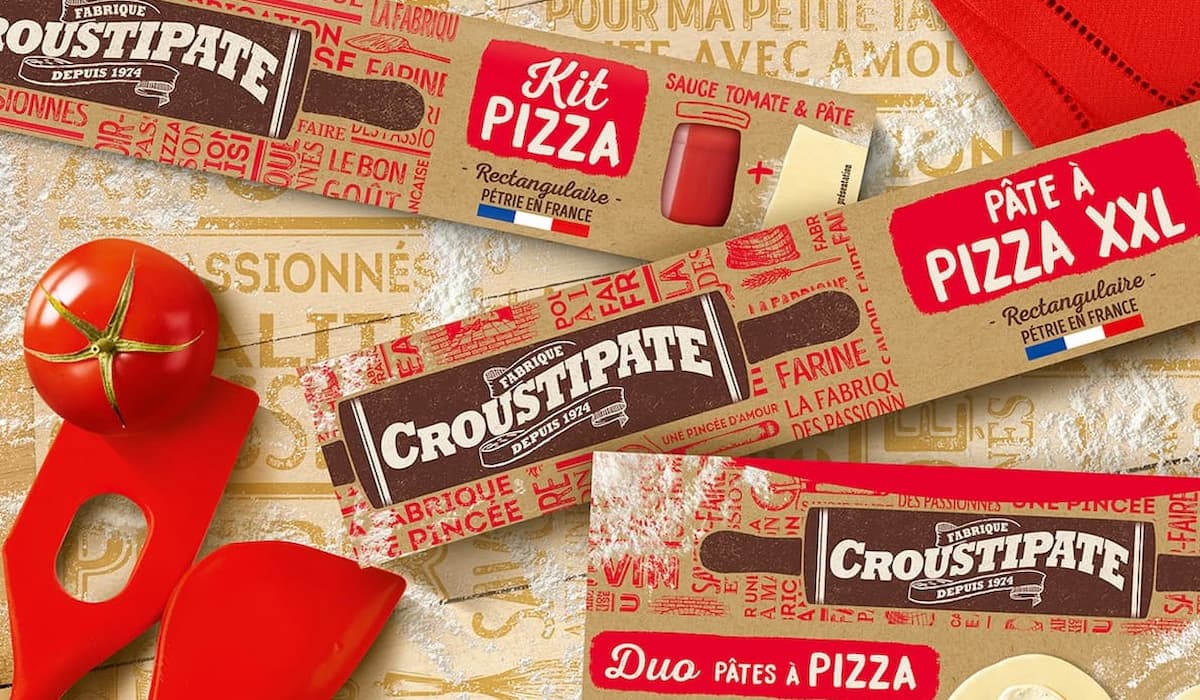
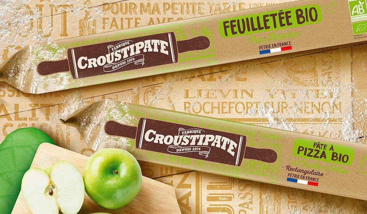
A specific tone of voice as well as a specific iconographic language is developed on pack, to emphasize the relaxed aspect of the brand. CBA also creates the illustration of a fun baker kneading pastry dough, embodying the Croustipate makers’ guild.
RESULTS
Following the launch of Croustipate’s new identity in France, CBA has been asked to design the packaging for the German range and to develop further product innovations.
