The ancient Egyptian symbol for exactitude was the image of a feather placed on the balance scale used for the weighing of souls. The name of the feather was Maat and its hieroglyph also represented a unit of measure, the 33 cm of a standard brick, and the fundamental note of the flute. We can define exactitude as the antithesis of the vagueness of approximate language.
“we are constantly bombarded with images; the most powerful media merely transforms the world into images and multiplies it through a kaleidoscopic phantasmagoria”
Many years before the explosion of the Internet, Calvino brought the crucial problem that faces us today into sharp focus: information overload and the infinite multiplication of irrelevant images, which create deaf-ending background noise and make the search for meaning in every element of human communication quite urgent.
Born in the late Seventies, the brand created by Milton Glaser for New York City used the pictogram of the heart in a vivid, innovative logo. The clarity of the sign and its message make it one of the best-known and most-imitated brands in the world today.

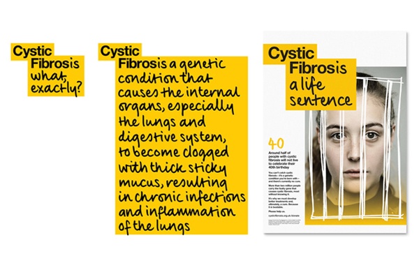
The non-profit association Cystic Fibrosis Trust chose to use brief, incisive messages as its logo, which explain what the illness is, what afflicted people have to face and what the association’s goals are.

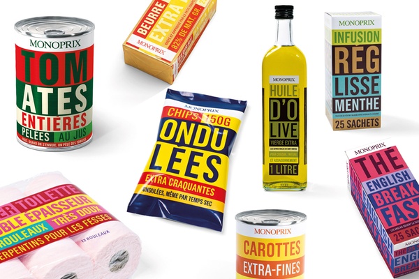
Monoprix, French emblem of large-scale retail, created the image of its products by reducing them to an exact description. The final look and feel, which is very colourful and pop, balances out the minimalist communication style.


