A casual style
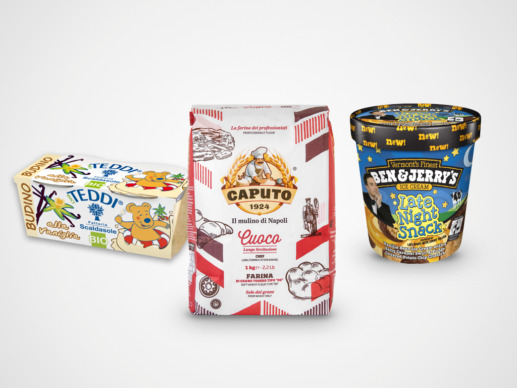
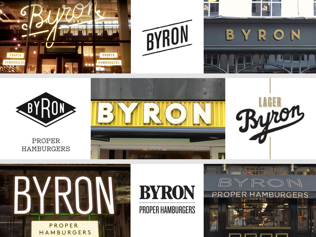
One of the rules we always apply when planning any kind of communication tool – whether a manifesto, product packaging or a magazine – is that the information has to be clear, legible and stick to a certain order. This rule applies to each individual element: logos, text and images. This creates a reading order that begins with the main elements and continues through to those of secondary importance. But like all rules, there are exceptions: products with a disorganised appearance where the different elements seem to have been arranged at random and confusion seems to prevail over order. You might think that this kind of approach is only suited to niche or avant-garde products or markets – craft beers perhaps or ultra-contemporary fashion brands – but you’ll find such examples in your local shops too.
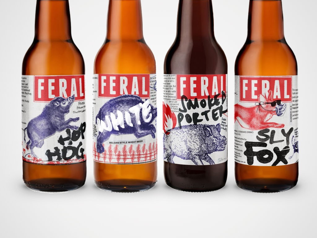
Moving into the retail world, the case of English hamburger chain Byron is worthy of note. It was created with an entirely random approach to visual identity: each of its first 35 restaurants had a different logo and completely different communication tools and materials. The only constant was the name and the hamburger. Launched in 2007, Byron grew with this random identity and was sold in 2013 for £100 million. Not bad for a brand ‘without a real logo’.
When a defect becomes a strength
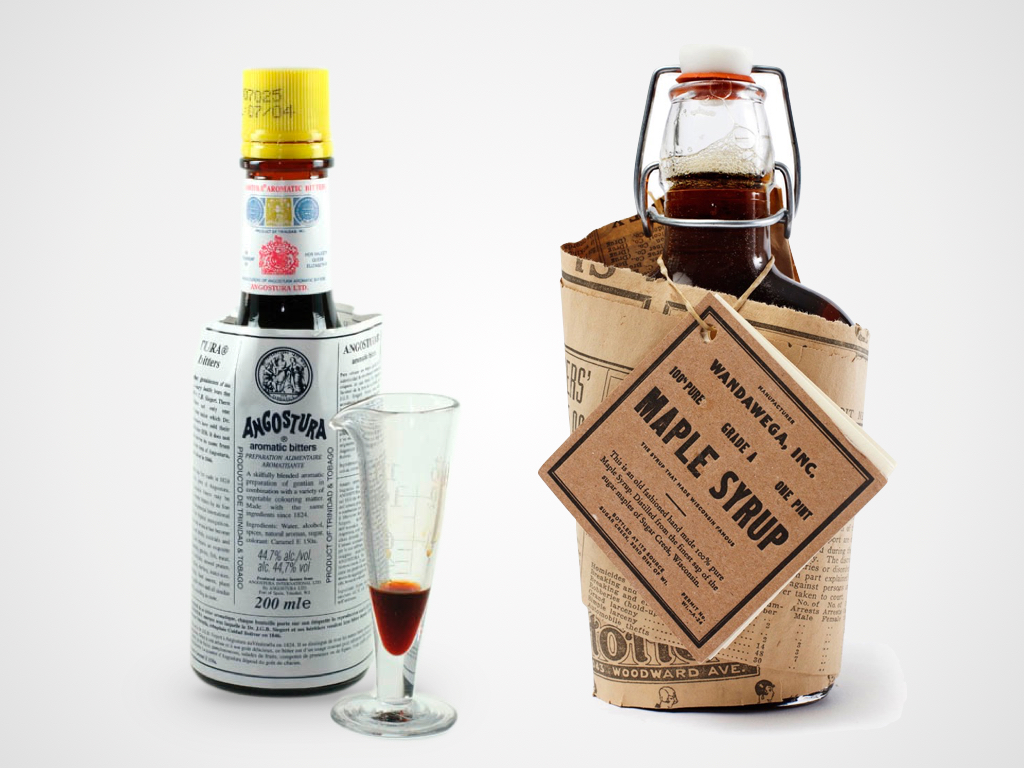
Have you ever found yourself saying “oh don’t take any notice of my clothes, I just threw on the first thing that came to hand”? I certainly have and that’s the impression I have every time I open a bottle of Angostura bitters, where the label is clearly the wrong size for the bottle. But this defect has become the most memorable element of its identity.
When spontaneous rhymes with iconic
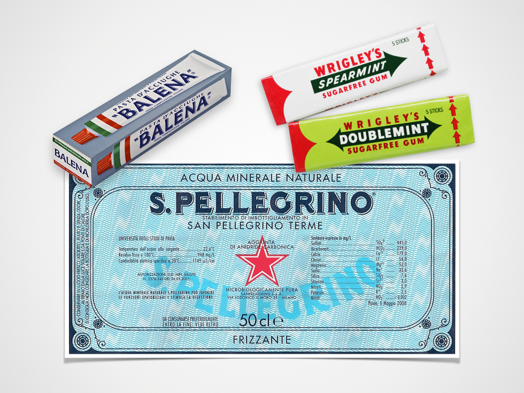
Then there are a host of brands whose identity has never changed – overcoming trends and generations to become highly iconic. The fascination I feel when confronted with this sort of brand is not only due to the historic value of their visual expression but also because often I am bearing witness to a genuine and naïve approach to marketing. In fact, if somebody asked me what I thought of a label where the logotype was repeated twice and in two different forms no less, where the legal information was on the front and overlapped the
logotype and where the entire composition was barely legible, I would reply that it were ridiculous. Without realising of course that they were describing the San Pellegrino label. And what would I say if somebody told me they wanted to use the four sides of a pack to reproduce exactly the product inside? I would say they were missing an opportunity, without reflecting that this strange approach might be an opportunity to become iconic, as happened for Balena pasta to an extent. And when I think of Wrigley’s, a company that has 35% of the global chewing gum market and whose products are definitely iconic, where the ‘spearmint’ flavour is represented by a spear and the ‘doublemint’ flavour by two arrows, I can only conclude that being naïve can be of great value.
Giacomo Cesana
Creative Director
