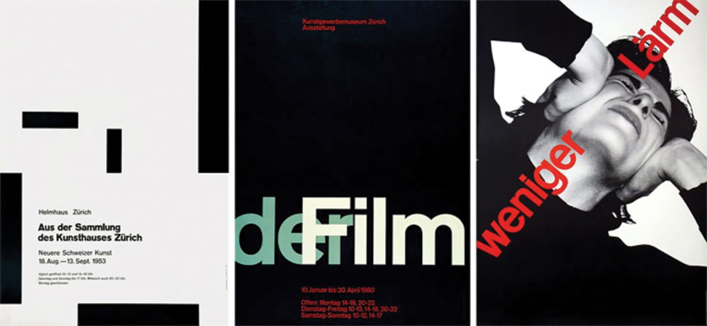
The timeframe is the late 1950s, and more precisely, 1957. The economic boom had reached its zenith, Russia was about to launch Sputnik, Jack Kerouac’s book On the Road was published, and in Italy, the Fiat 500 was enjoying its debut on the automobile market. In this climate of progress and development, typography was also in one of its golden ages. Up until then, visual communications were expressed using the lines of Akzidenz-Grotesk, emblematic of the International Typographical Style (more commonly known as the Swiss Style). That year saw the market appearance of three typographical milestones: Helvetica, Folio and Univers, the latter designed by Adrian Frutiger, one of the most influential and prolific 20th-century typeface designers.
Drawing inspiration from Akzidenz, Frutiger created Univers, one of the first typeface families with different weights, widths and obliques, for the Deberny & Peignot type foundry.
The intention behind this project was to create a single system that would enable designers to create graphic layouts using a single typeface, in its different variants.
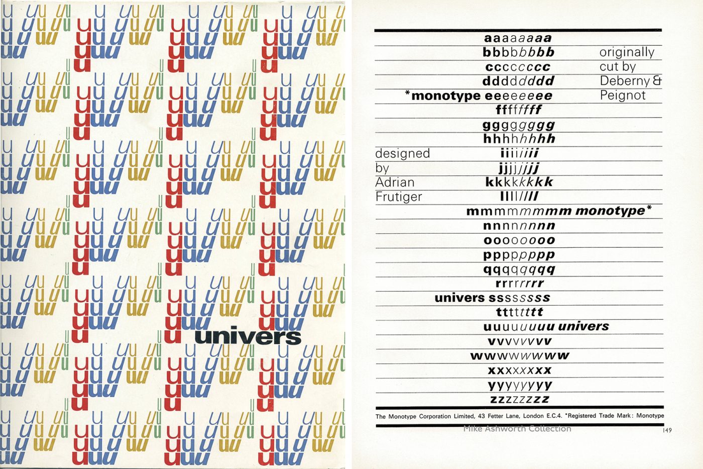
In addition to being a true masterpiece in terms of lettering design, Univers also introduced a system of classification and recognisability that was revolutionary at that time: the two-digit classification system.
Up until then, the font nomenclature system included, in addition to the name, the weight and width, all in the typeface’s original language. By way of example, in Germany a semi bold italic was named “halbfett kursiv”, in France a bold typeface was called “gras”, while in Italy it was “grassetto” or “neretto” and so forth. This system gave rise to – and still does today – a lot of misunderstandings regarding a font’s identification. An emblematic example is the difference between “thin” and “ultra light” which does not immediately clarify which weight is the lightest.
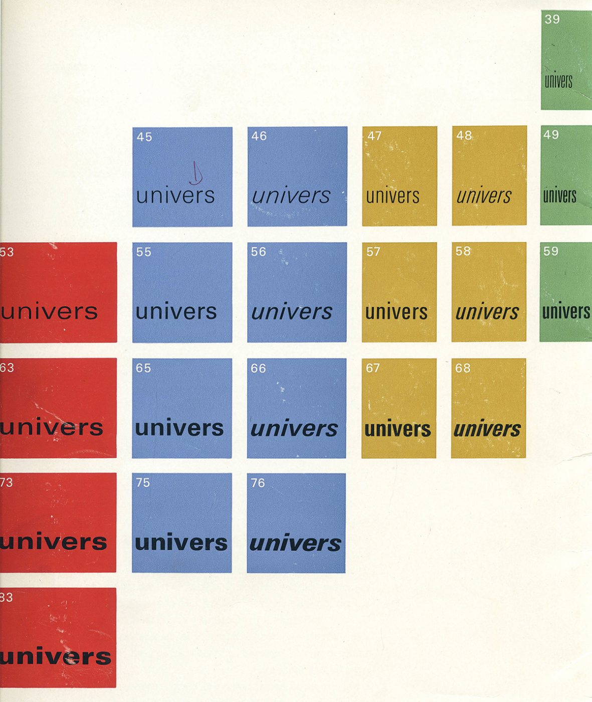
With the introduction of Univers, this classification method was superseded by a far simpler approach. The two-digit system consists of a prefix (the first digit) which defines the weight, and a suffix (the second digit) which defines the width and style (Roman or oblique).
For example, Univers 39 defines a light font (3) with ultra-narrow width (9), while Univers 83 specifies an ultra-black (8) extended (3) font. When the suffix is an even number, it refers to the oblique variants. This system is used still today in families of typefaces which, like Univers, have many internal variants.
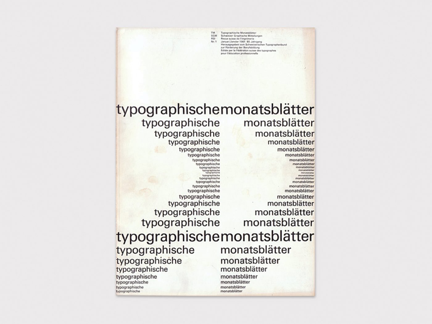
By means of this tool, graphic layouts were able to attain a remarkable degree of simple hierarchic uniformity, making Univers one of the most influential typeface families of all time.
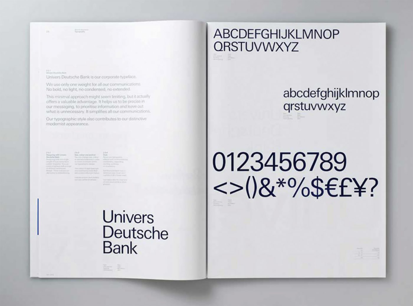
However, this Swiss style is not used just in that country. For many years, gigantic companies such as Deutsche Bank and General Electric have used modified (but always easily recognisable) versions of the typeface for their visual identity.
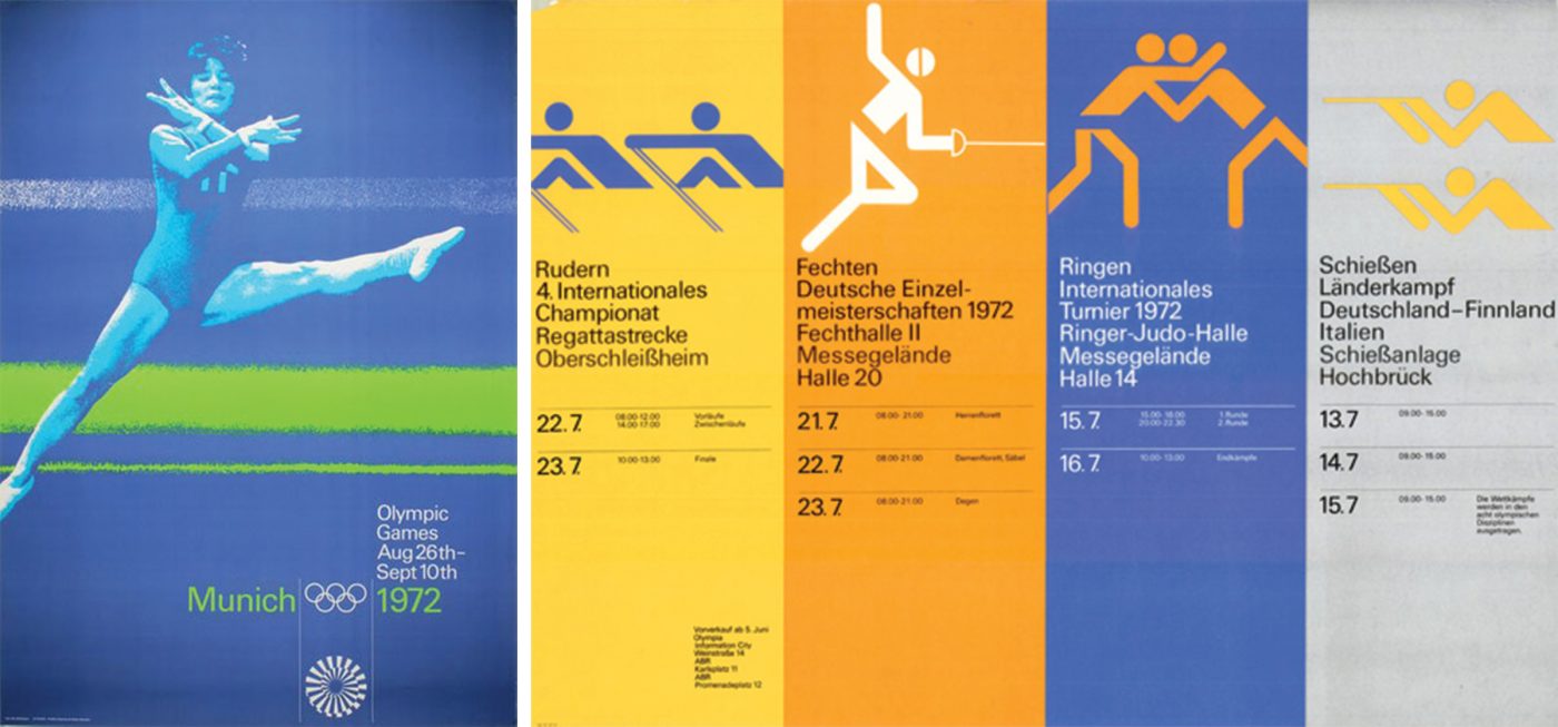
Univers was also the typeface used for the 1972 and 1976 Olympics. More specifically, Otl Aicher’s work on communications for the 1972 Munich Games represents one of the most important and successful communication projects in the history of design, in part due to the typeface’s elegance and linearity.
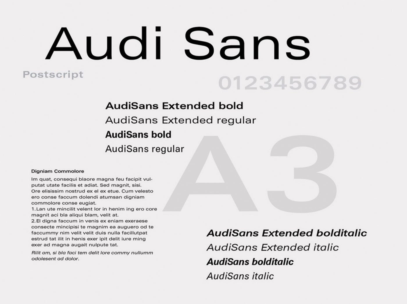
Other examples of its use by famous brands include the visual identities and logos of Unicef, ebay and Audi.


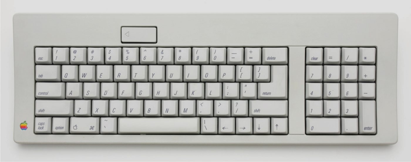
Apple itself, which has always dedicated a great deal of attention to typographical aspects, used a Univers font for the keys of its computers up until 2007, before changing initially to VAG Rounded and later, San Francisco.
The fascination of Univers has continued unchanged up until the present, now that grotesque typefaces are enjoying remarkable popularity and are widely used by designers all over the world.
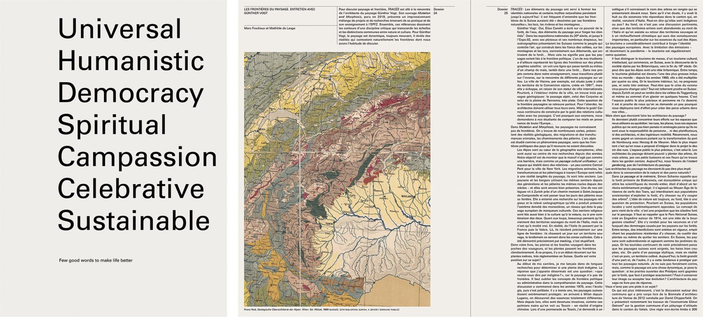
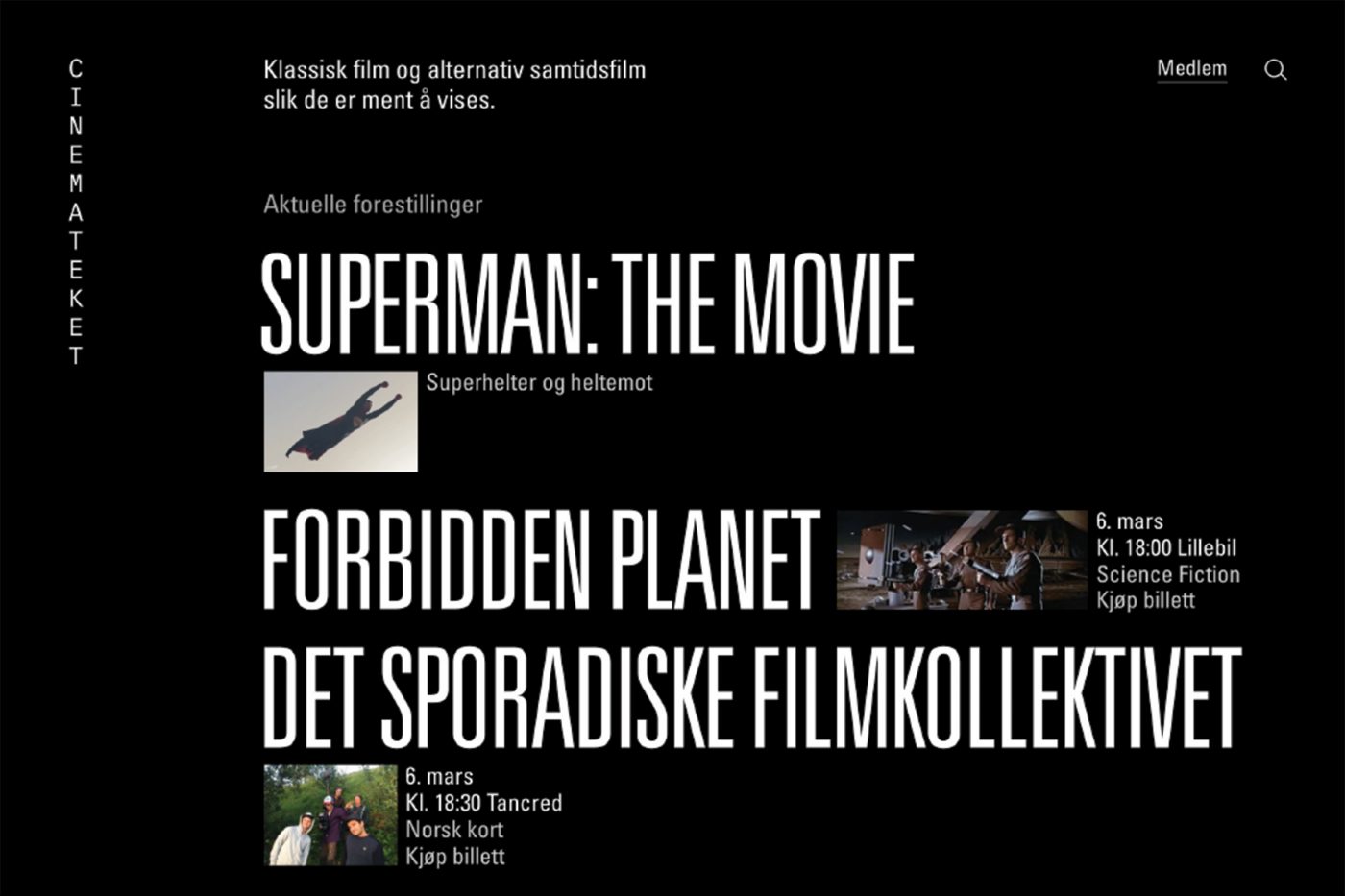
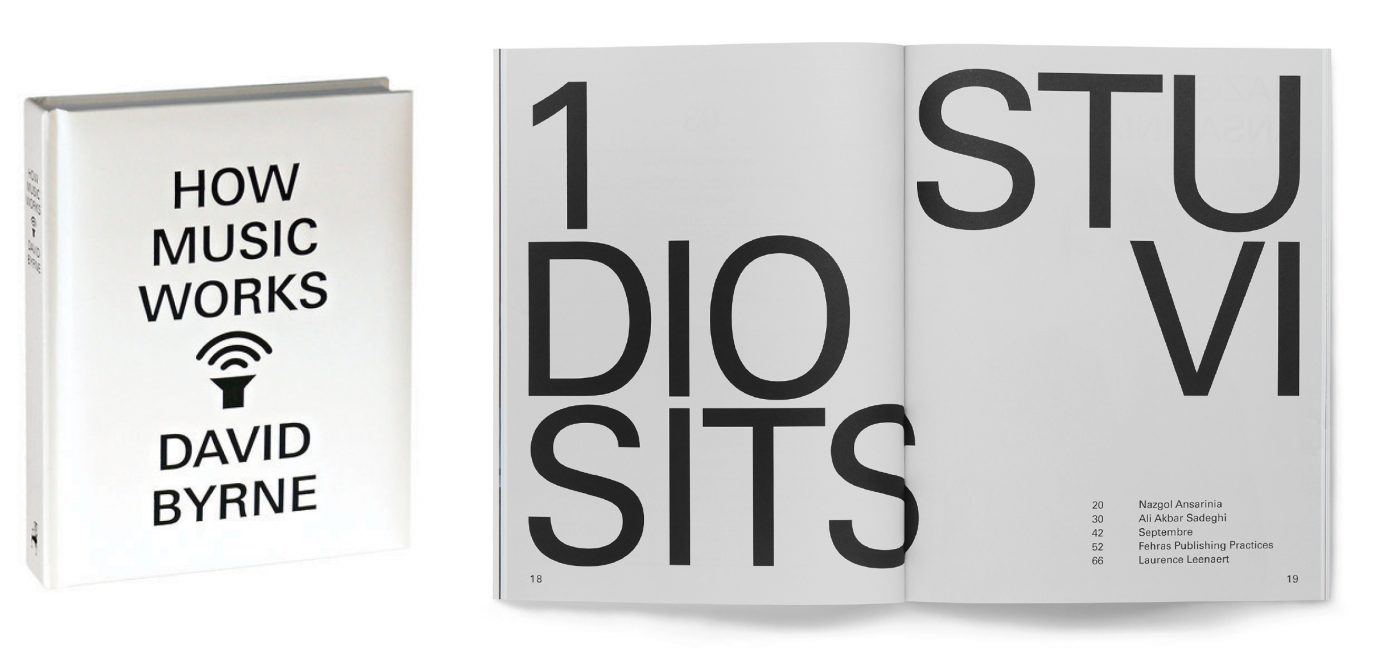
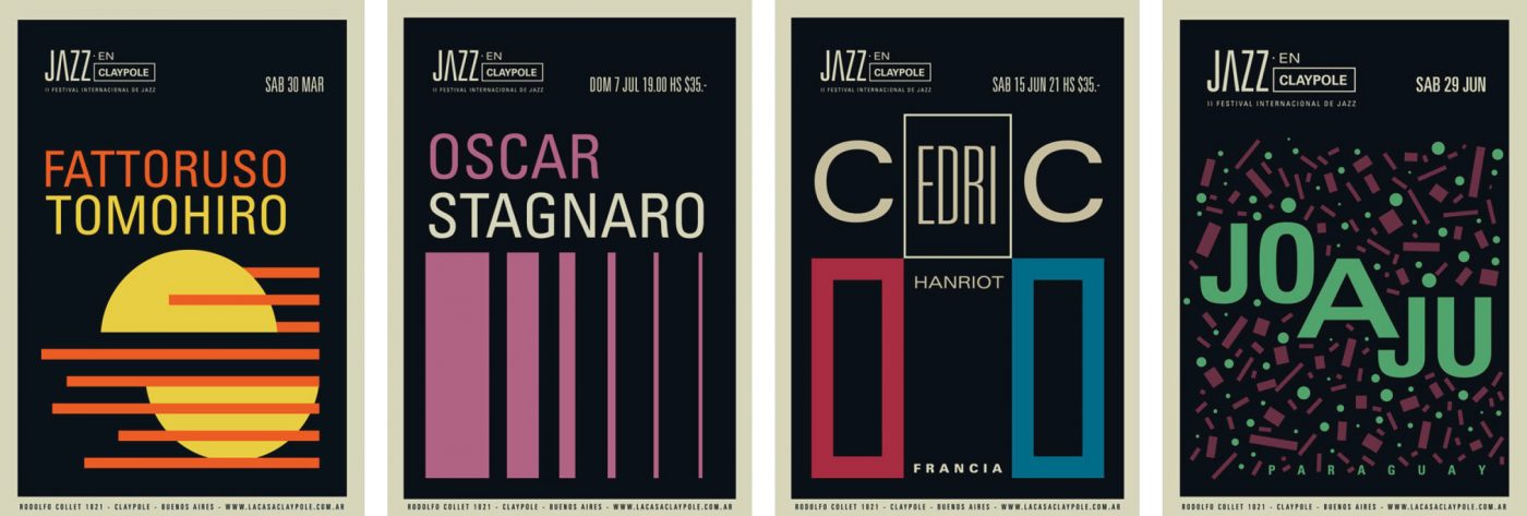
In one of his last interviews, Adrian Frutiger described the origin of the typeface’s name, saying that his original idea was to call it Le Monde. But Charles Peignot, owner of the Deberny & Peignot type foundry, blocked the idea right from the start, categorically saying: “No, no. Univers”. In other words, the world was not large enough for Univers.
Davide Molinari, Senior Visual Designer at CBA

