A distinctive product innovation
Daddy has been working with CBA for almost 15 years to “unbanalize” sugar by reimagining the product into everyday life. The objective? Break away the sugar from its image of a commodity product by giving it real added value.
As a brand that crosses generations, that speaks to everyone and that gathers people, it is important for Daddy to think about future generations. Whether it’s about respectful beet cultivation, fair remuneration of producers for their products or intelligent reuse of wastewater, the exemplary brand had to be able to demonstrate its virtuous behavior to its consumers.
Then, Daddy decided in 2019 to offer packaging that is more in line with an ecological approach. To do so, the brand aims to reduce its environmental impact while allowing its consumers to act with it.
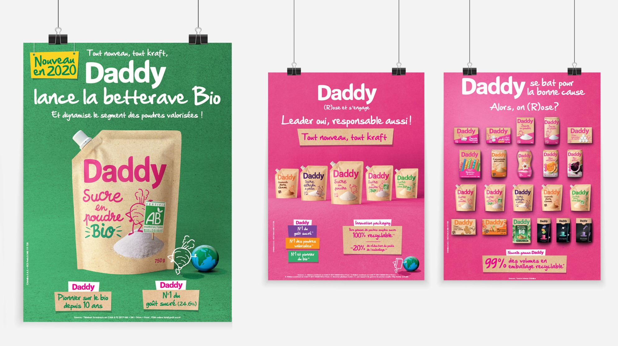
For this, the brand chose CBA to revamp its packaging. The real challenge for the agency was to bring this sustainable and eco-responsible dimension to “La vie en rose“; a peppy and dynamic brand DNA carried out by Daddy’s fun and quirky personality.
Thus each packaging has been redesigned, not only to be recyclable, but also to highlight the responsible behavior of the brand, without compromising its unique and original personality that makes it sparkle on the shelves.
A radical change: the switch to kraft
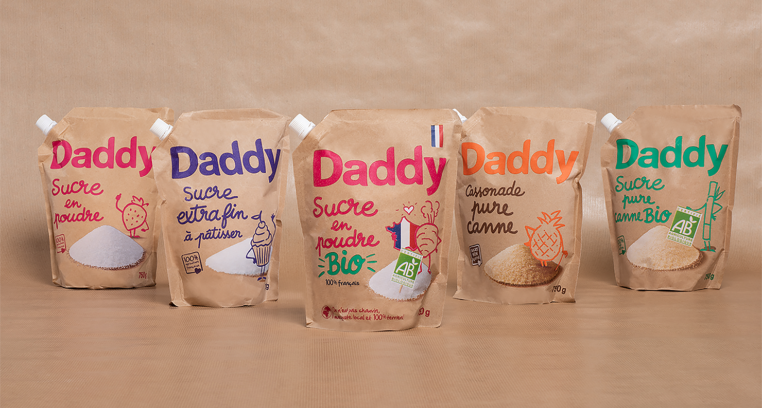
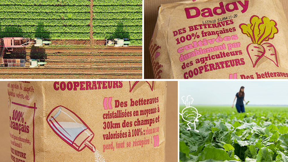
For its flagship powdered sugar range, the agency opted for a radical product innovation by using kraft paper; a 100% recyclable packaging that drastically reduces the user’s impact on the environment while remaining resistant to the most extreme baking conditions.
With this innovation, Daddy offers to its consumers the possibility to be positive towards the company.
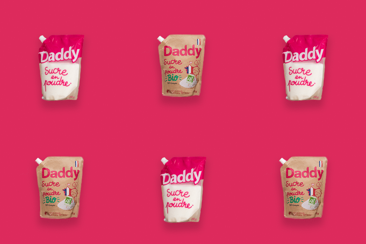
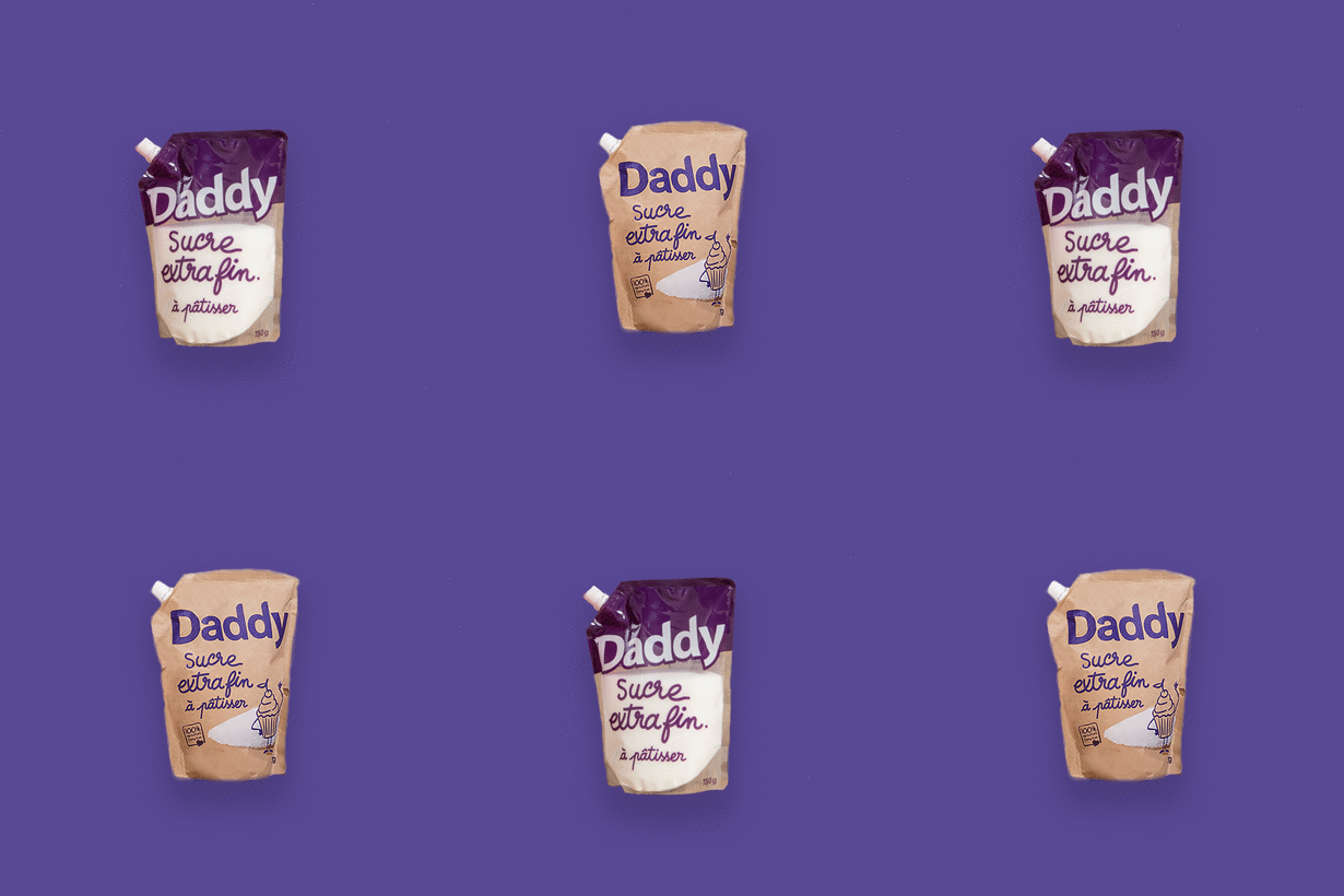
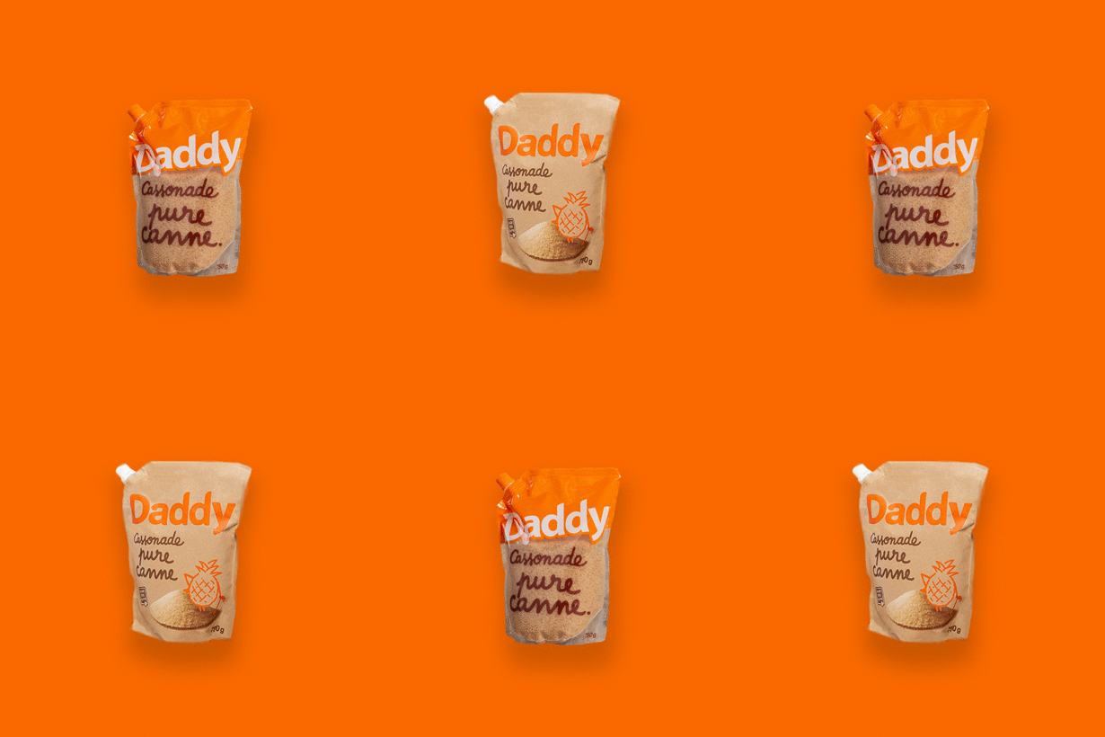
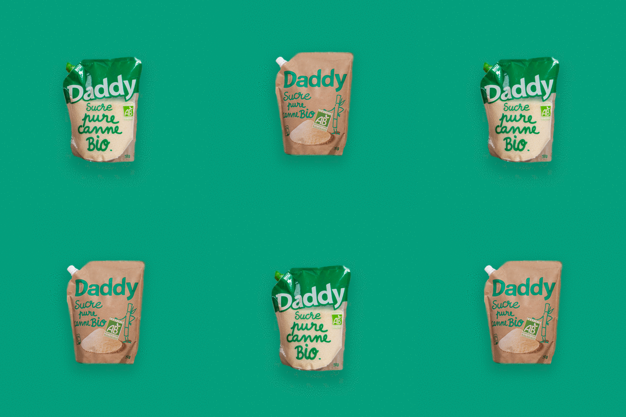
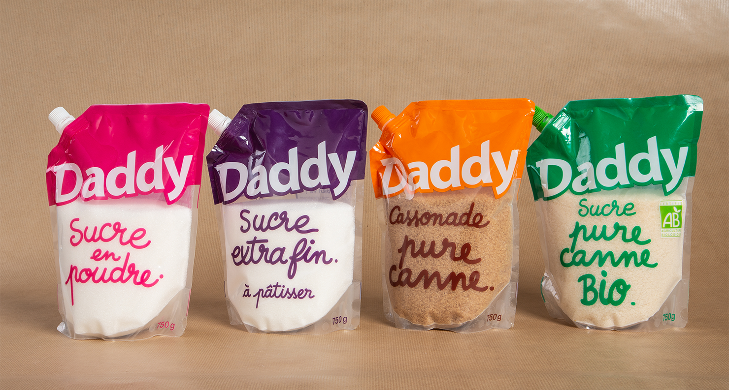
These new packs also reveal the sugar in its raw state, the objective being to allow consumers to see the contents of the product before purchase, even if the packaging is not transparent.
Finally, to go further in its commitment, Daddy also offers an organic version of these sugars and thus meets the expectations of its consumers who want to use products that are more respectful of the environment.
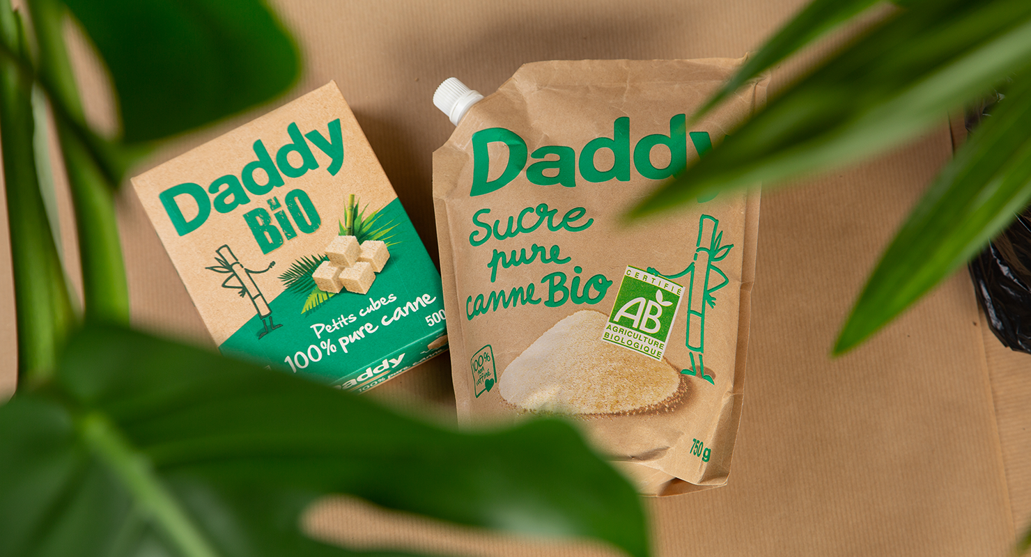
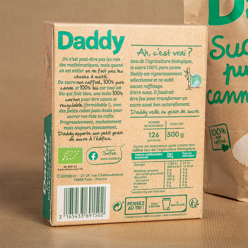
Bringing the brand and its iconic identity to life on its packs while using new material
The idea was to pull the threads of the brand’s iconic identity to evolve its promise and bring Daddy’s commitments to life; allowing the brand to be more deeply rooted in the daily lives of consumers and committed foodistas without altering its nature.
To do so, the agency extended the Daddy’s tone of voice by taking up its conniving, slightly offbeat brand language, an integral part of its identity. The objective was to prove that Daddy can tackle serious issues while cultivating the mischievousness that defines it so well. It is also a way to address all targets while maintaining the close relationship it has built with them over the years.
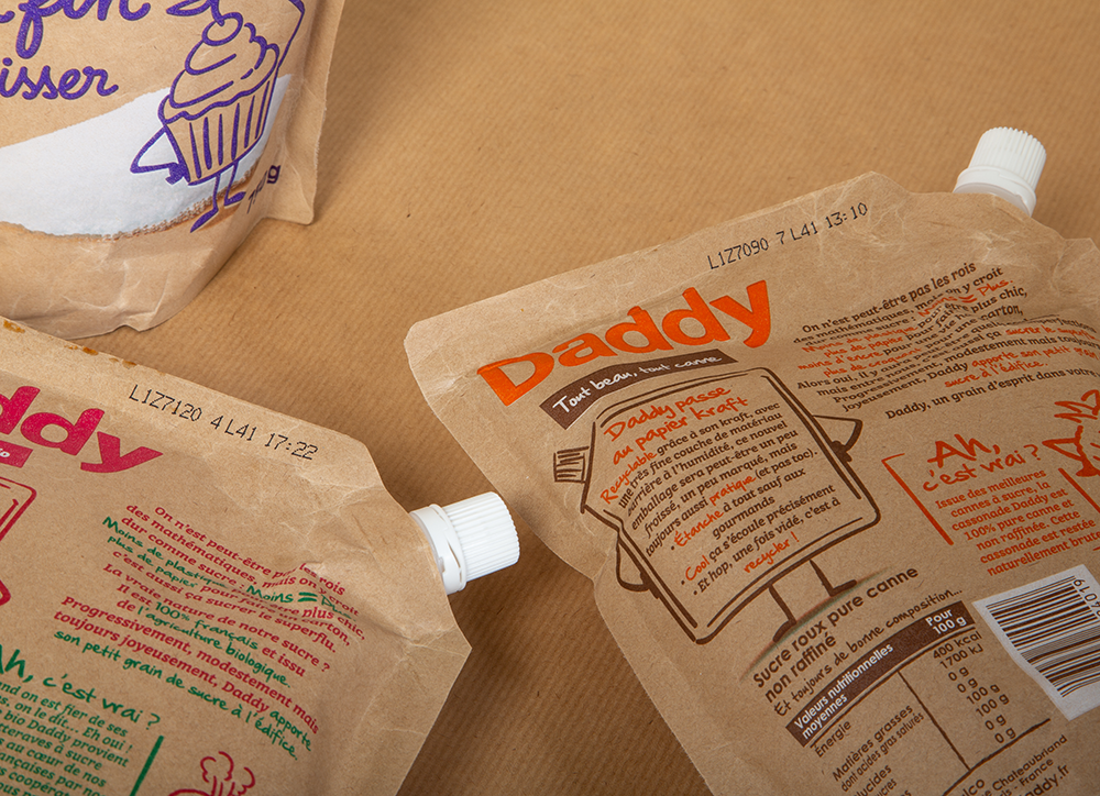

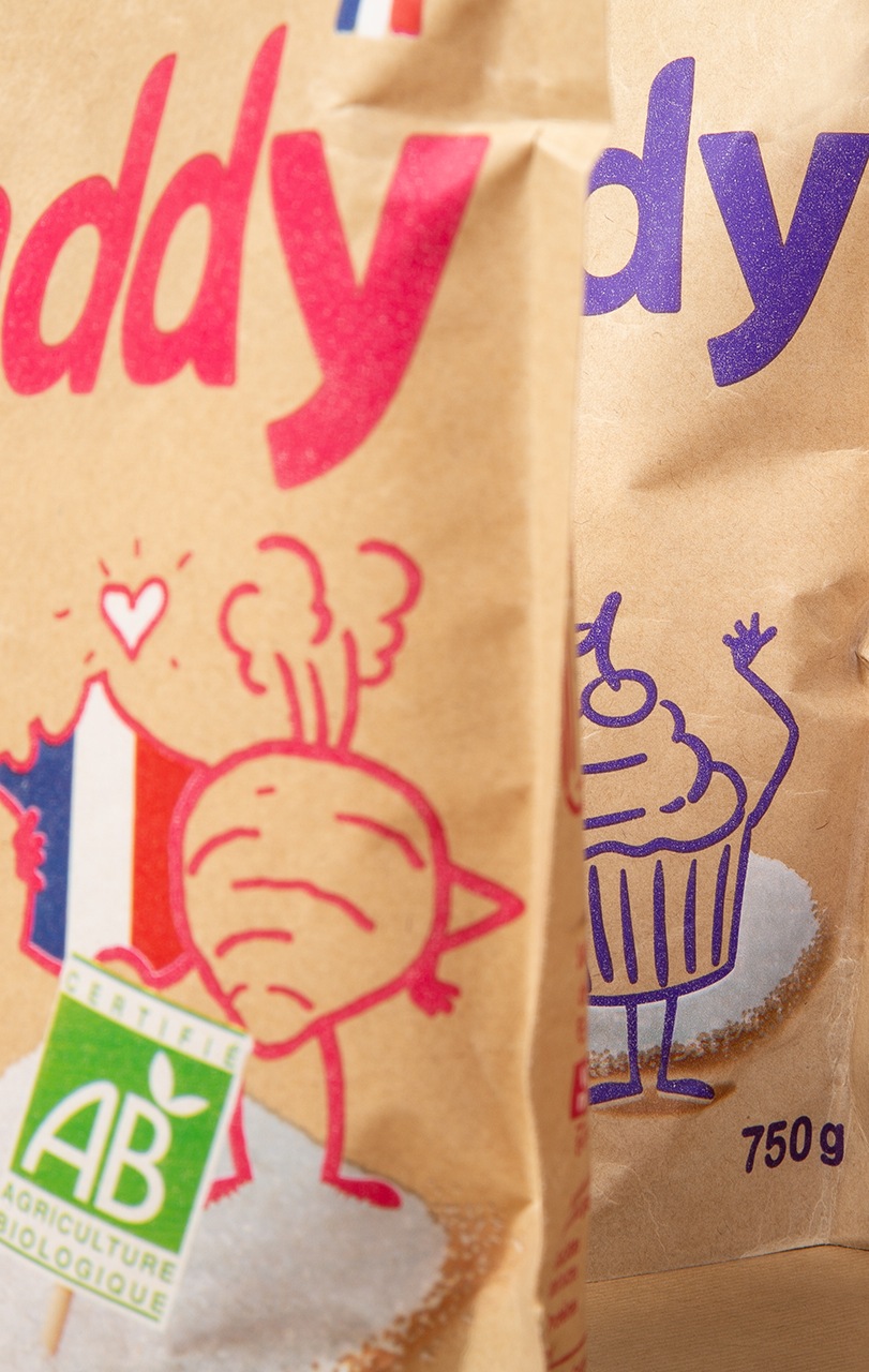
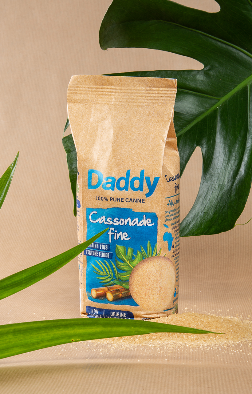
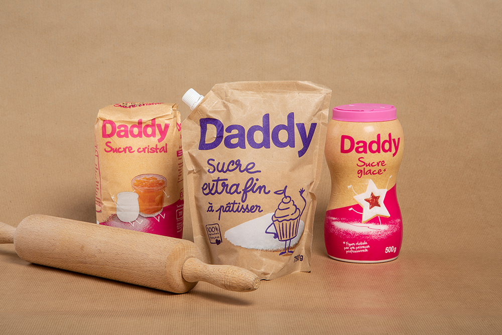
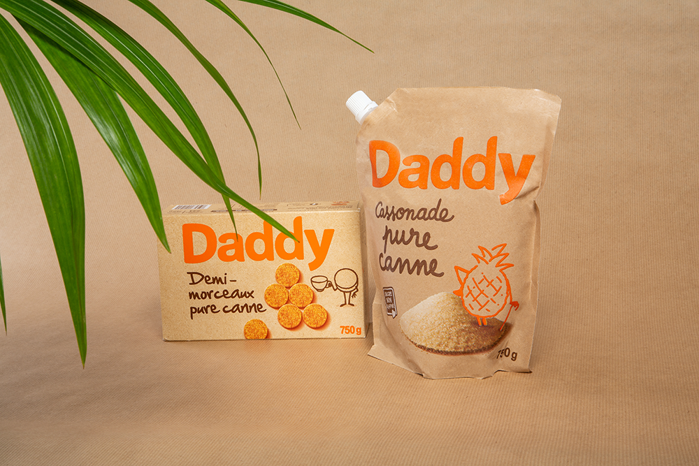
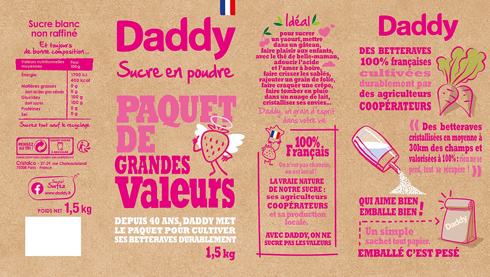
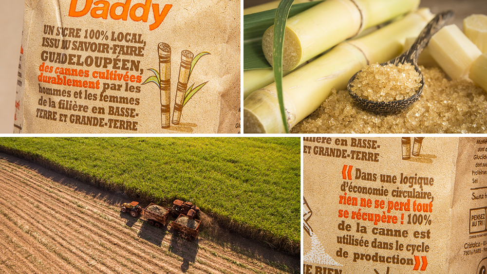
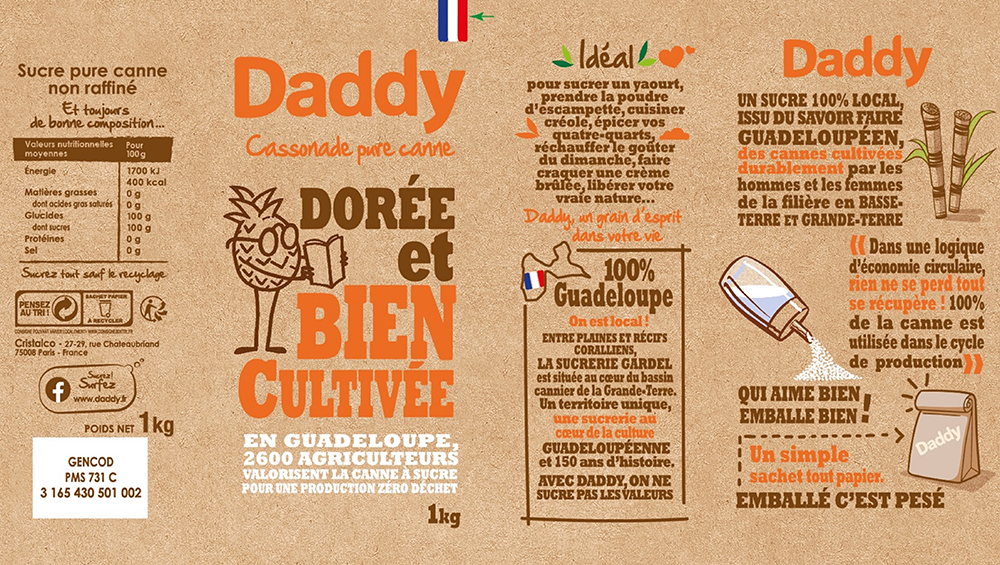
The new packaging uses the brand’s graphic codes and tone of voice. We can still see the proprietary typography and the famous illustrations that bring to life the origins or uses of the products, such as beet and cane for white sugar and brown sugar or cake for extra-fine sugar. To get closer to the brand’s new promise, the illustrations are now drawn, giving a more authentic and human expression.
The rise of color, a key element of the brand’s identity, is also reflected in these new packs. Daddy pink for the white sugar range, bright orange for cane sugar, green for organic sugar, purple for extra-fine sugar and azure blue for fine brown sugar… So many shades that allow the brand to keep its strong color impact while maintaining the same product differentiation codes, so as not to upset consumer habits. These new packaging offer an emergence through color and brightness counterbalanced by the use of kraft which sets them apart with modernity.
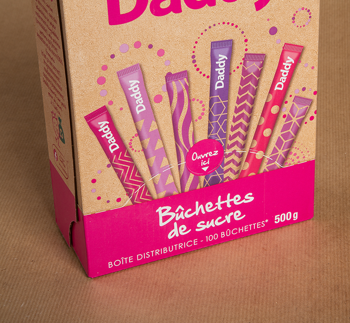

A capsule range to confirm the brand's commitment
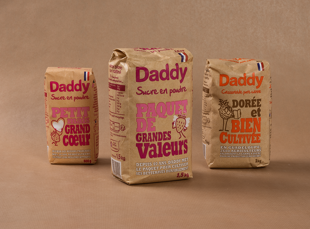
To support the brand’s commitments, Daddy also offers the Chest range; a completely revamped 1.5kg powdered sugar capsule range symbolizing the brand’s ultimate commitment to the planet and future generations. Indeed, still in kraft packaging, this one allows the brand to highlight all the positive actions of Daddy on the different types of sugar, with claims present on the entire packaging. Finally, the products of the range are 100% French, the flag is therefore revealed at the top of each packaging to highlight the origin and recognize it at a glance.
Results.
A great proof that committed action and responsible behavior can always make you see “la vie en rose”.
