France
Paris
Switch to your local agency
Retour au menu
When it was launched in 2000, Silicon Sentier’s goal was to support the growth of the digital economy by helping startups establish themselves in an innovative and challenging market. In late 2013, they invited CBA to develop a more meaningful brand in order to increase its international visibility and inspire greater French innovation.
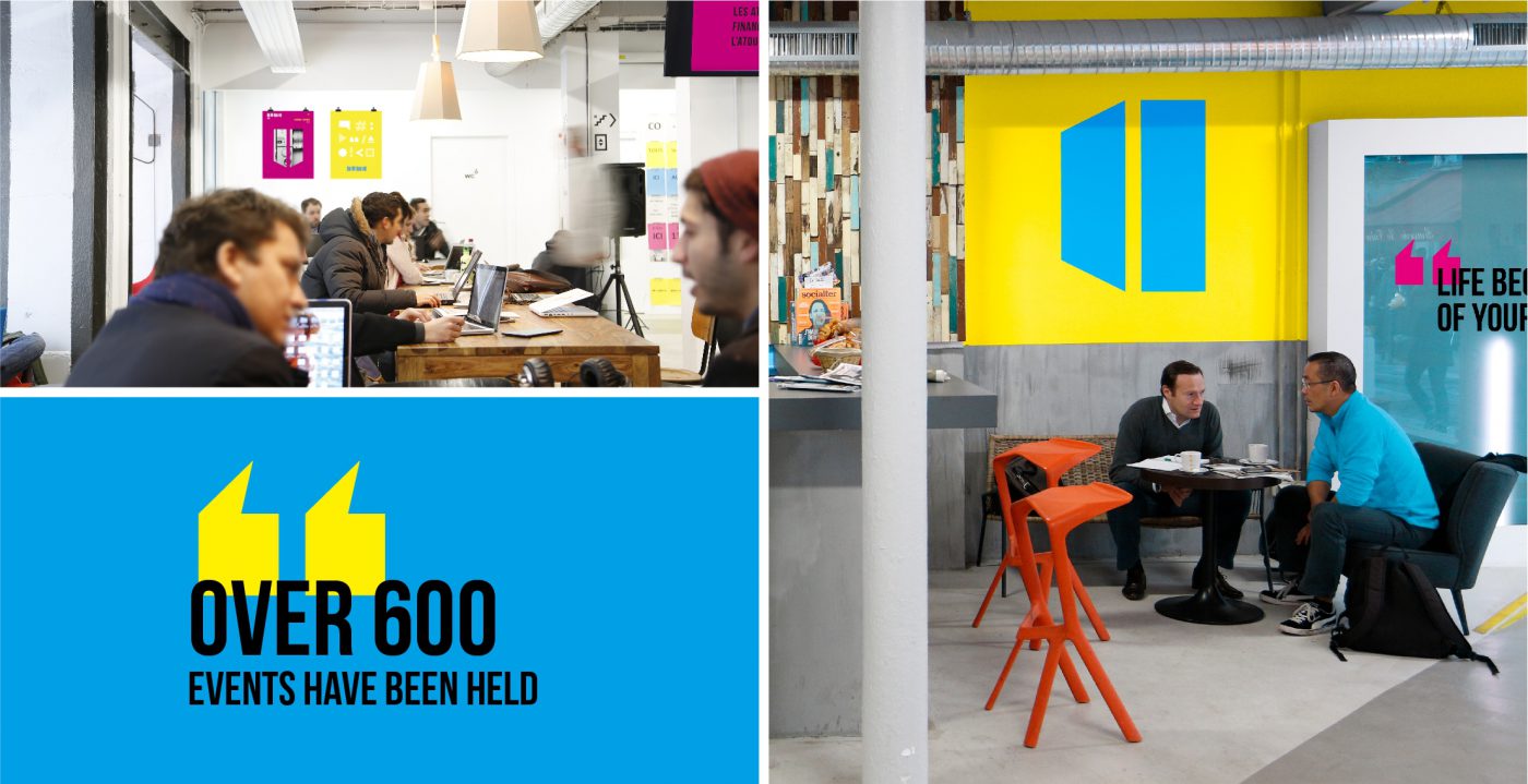
Together with Ogilvy Red, we defined Silicon Sentier’s new naming and visual identity through a solid strategy capable of effectively communicating its objectives, as well as a brand culture that expresses the company’s commitment to digital communities. That is how Numa was born, a name that connects the digital (numérique in French) and the human association with the environment.



We also opted for a lively chromatic palette that adds personality to the brand and refers us to a digital environment that expresses the characteristic vitality of startups and their entrepreneurial spirit.
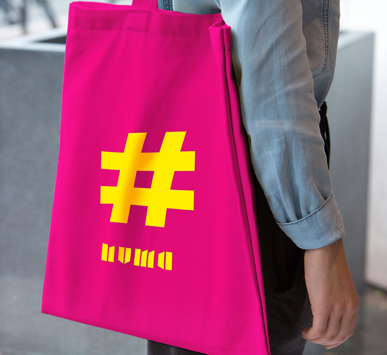
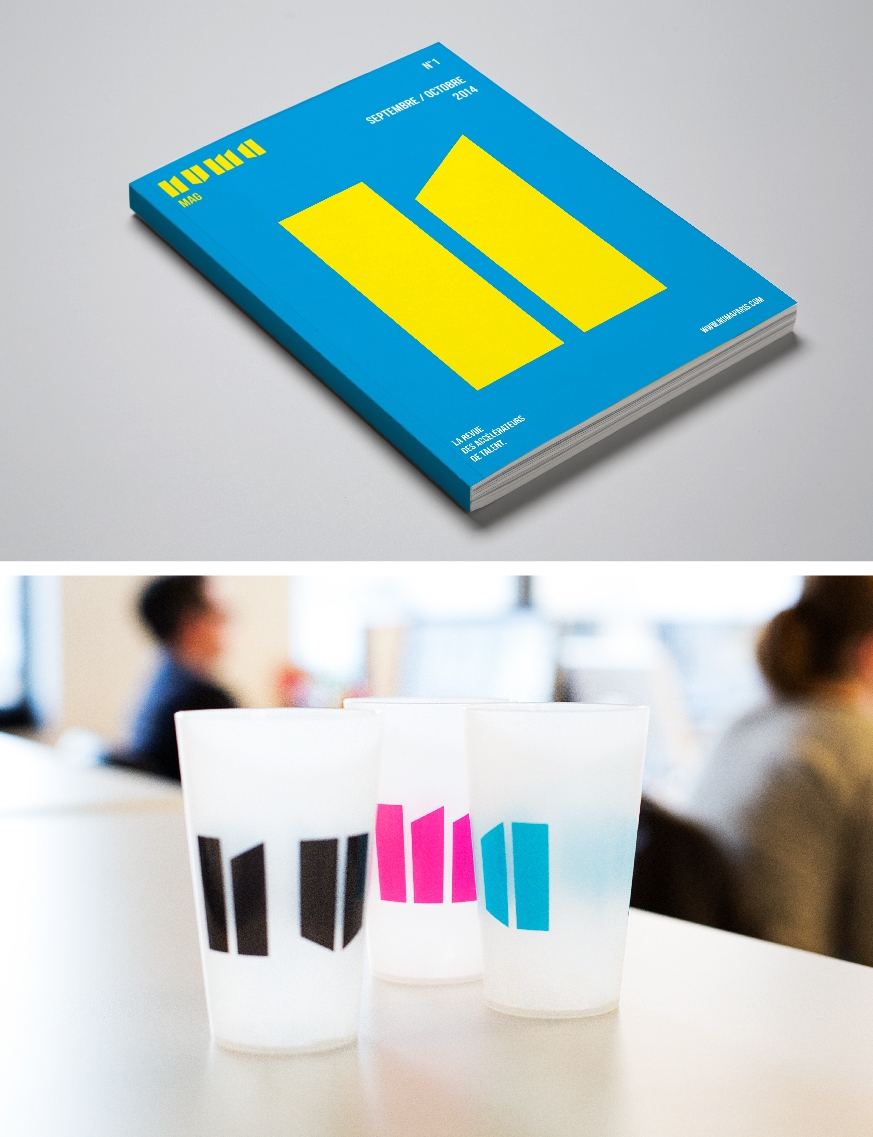
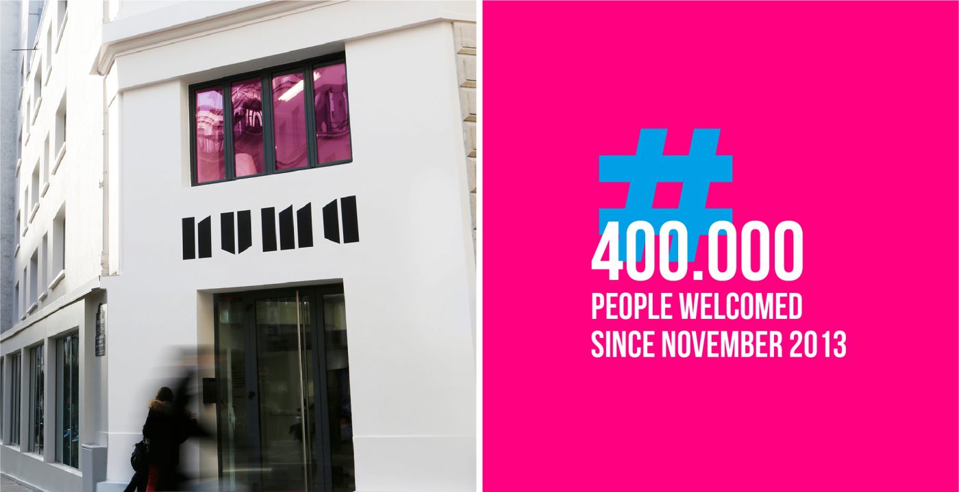
A proposal that capitalizes on the four letters that make up the name to transform them into icons that give rise to new spaces of representation. In short, an innovative brand that has had great repercussion and influence on design trends, having been awarded the Grand Prix Stratégies du Design in France.
Privacy Overview