In line with global consumer trends, Nestlé EKO has decided to build a renewed brand platform and relaunch its image with the aim of positioning itself in a relevant way in its category. A commitment to evolve the brand’s visual identity and narrative, building more contemporary codes that reflect its territory of expression basing it on naturalness and wellness.
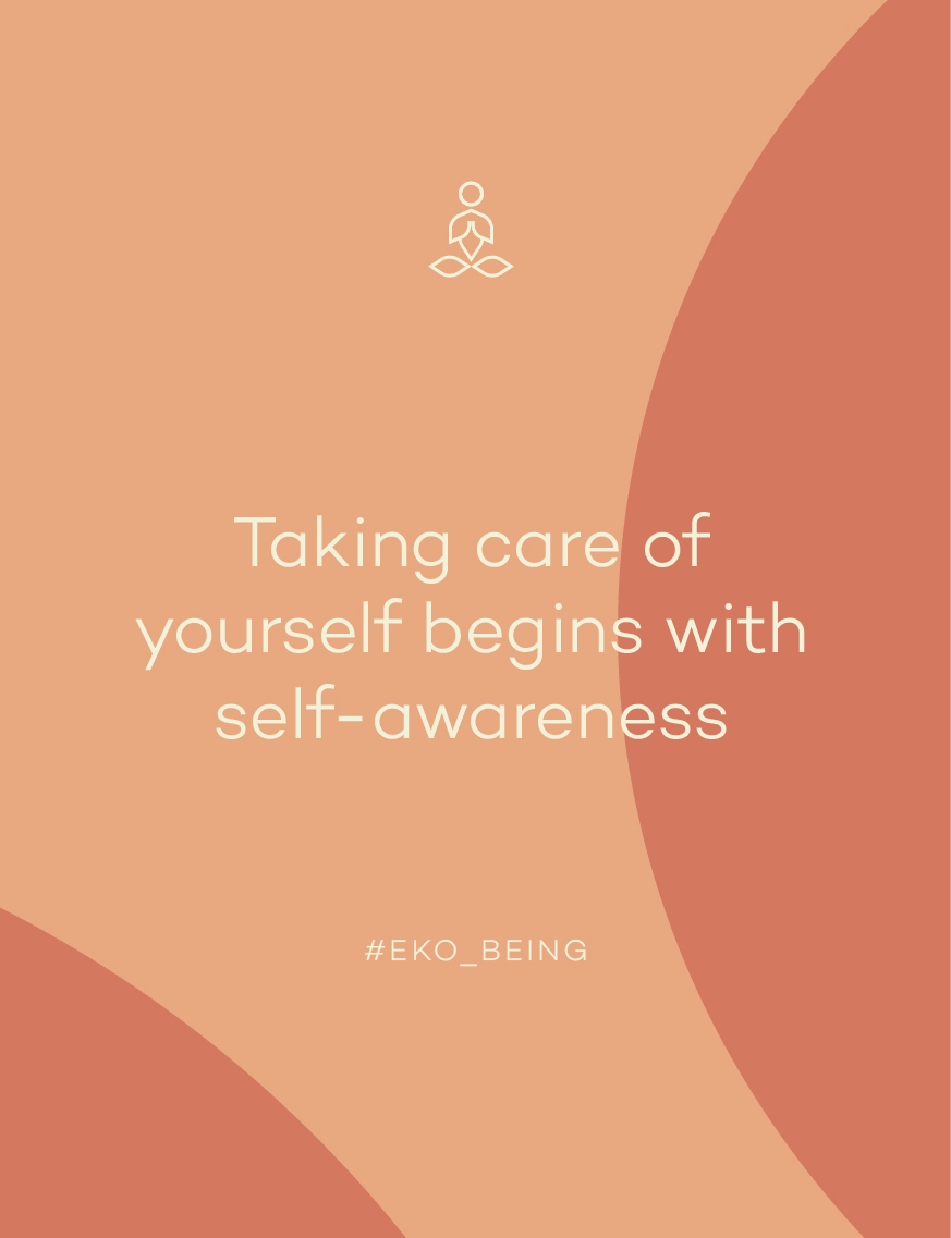
Based on the new brand purpose “Taking care of yourself starts with self-awareness”, we carried out a collaborative exercise between Nestlé and our strategic team, which allowed us to co-design the visual imagery of the brand
A workshop designed to discover how Eko should be expressed through the five senses in order to jointly design the visual imagery of the brand. The starting point for the creation of the new identity, seeking an evolution of its expression towards contemporaneity without losing the essence and credibility that the brand has achieved throughout its history.
/ visual language
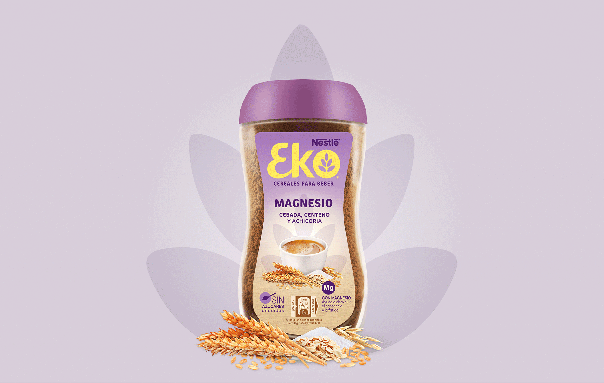
Balance, calm and harmony are the pillars of the new image.
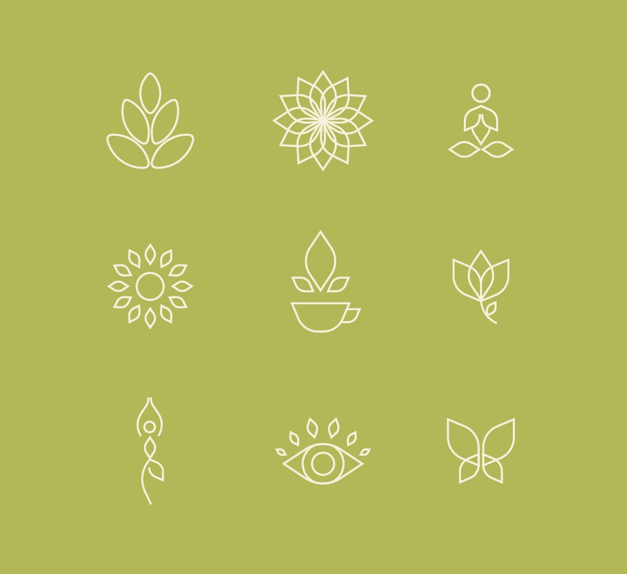
A territory where the naturalness of the movements, the warmth of the shapes and the luminosity of the cereal become the protagonists of the design. The graphic expression represents the emotional link between the brand and its consumers, projecting the benefits of the new positioning through the logo and the iconographic, chromatic and typographic codes developed for the project.
/ communication
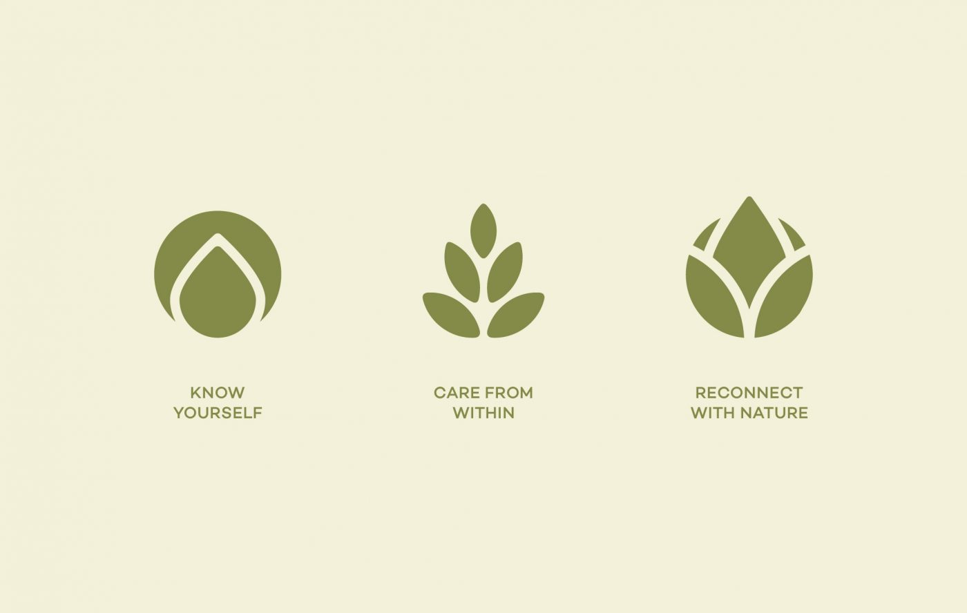
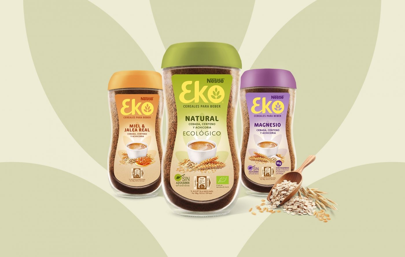
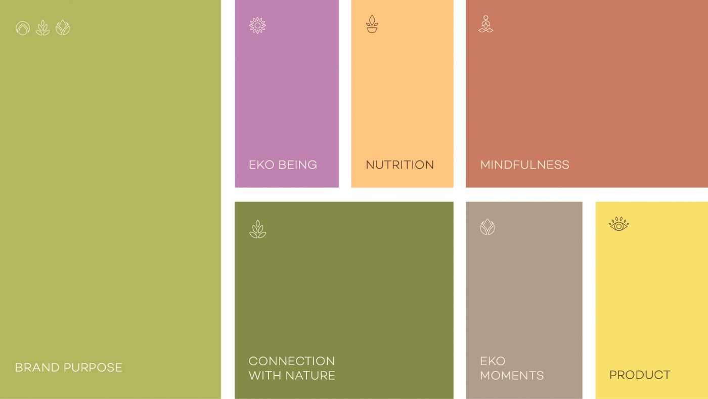
A visual narrative that chromatically encodes the brand's communication pillars accompanied by versatile and recognisable iconography.
A design exercise that efficiently communicates Nestlé EKO’s content at all points of contact with consumers: mindfulness, wellness, healthy lifestyle, nutrition and connection with nature.
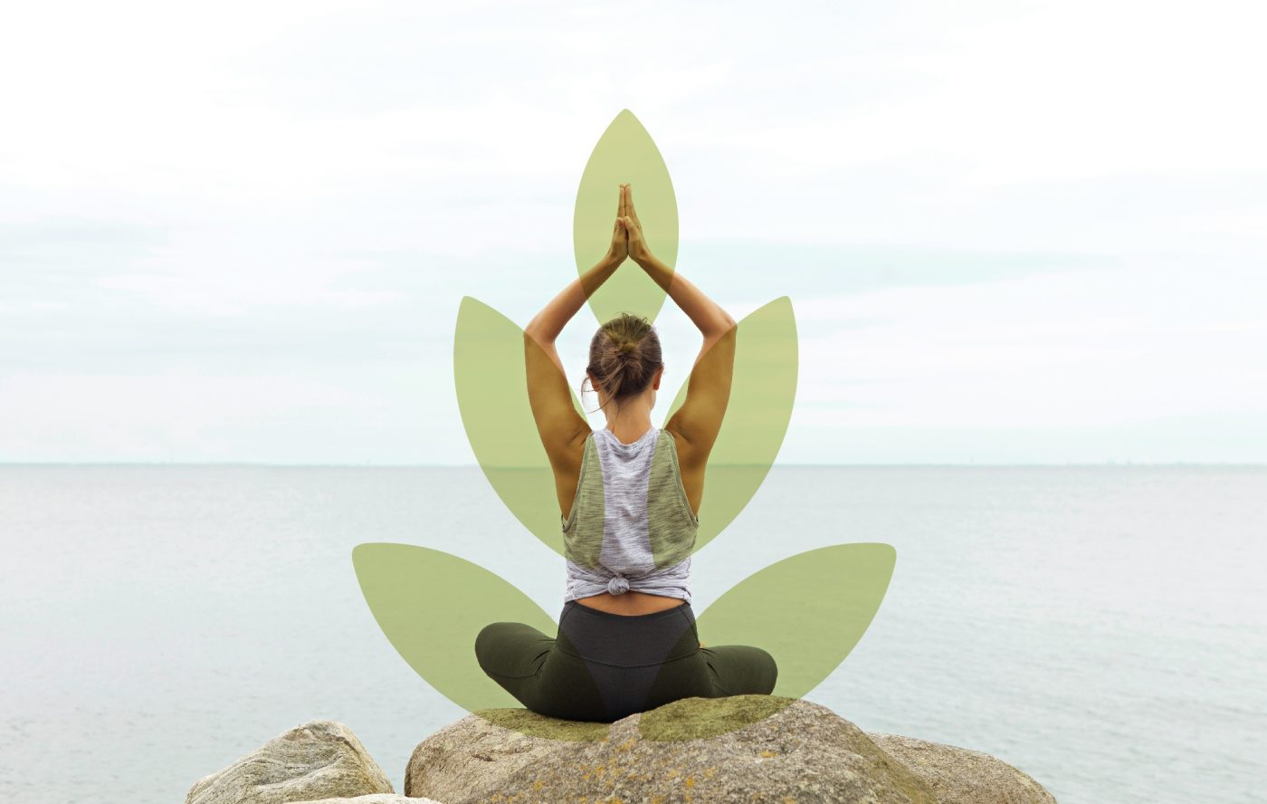
/ photographic style
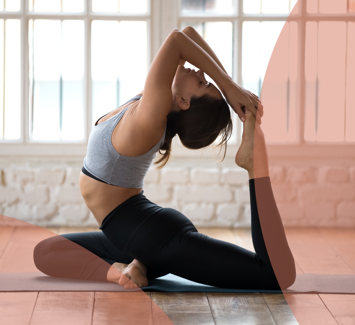
The photographic style is also redefined, creating different environments where the connection with nature, wellbeing and harmony reflects the new lifestyle that the brand represents.
A new vision that enriches the brand imagery with organic and dynamic shapes configured from the iconicity of the new logo.
/ result
In short, a new identity with which Nestlé EKO takes on a key role in the representation of conscious wellness, through a holistic vision of a healthy lifestyle. An invitation to find the perfect balance between body and mind to be calm and in harmony with everything around us.
We use cookies on our website to give you the most relevant experience by remembering your preferences and repeat visits. By clicking “Accept”, you consent to the use of ALL the cookies.
This website uses cookies to improve your experience while you navigate through the website. Out of these, the cookies that are categorized as necessary are stored on your browser as they are essential for the working of basic functionalities of the website. We also use third-party cookies that help us analyze and understand how you use this website. These cookies will be stored in your browser only with your consent. You also have the option to opt-out of these cookies. But opting out of some of these cookies may affect your browsing experience.