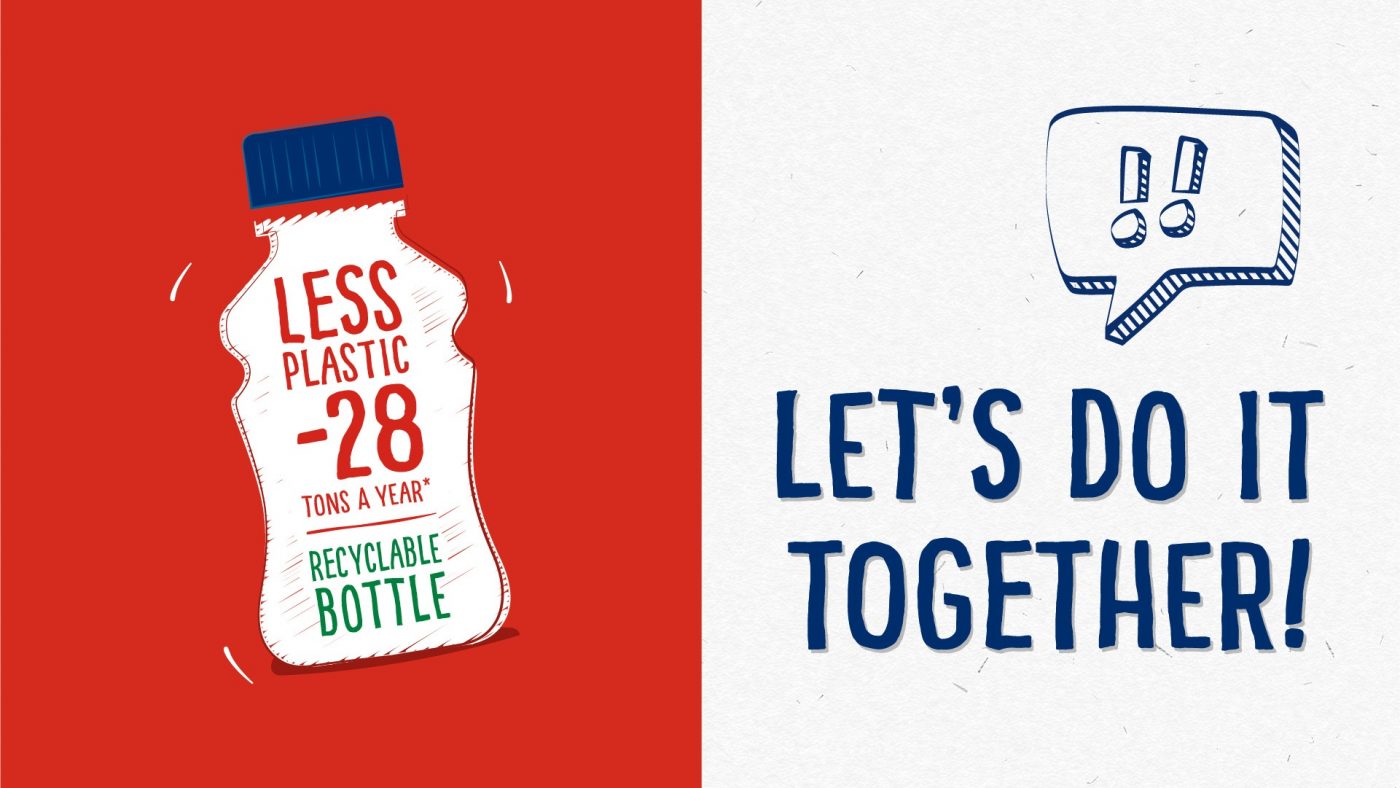
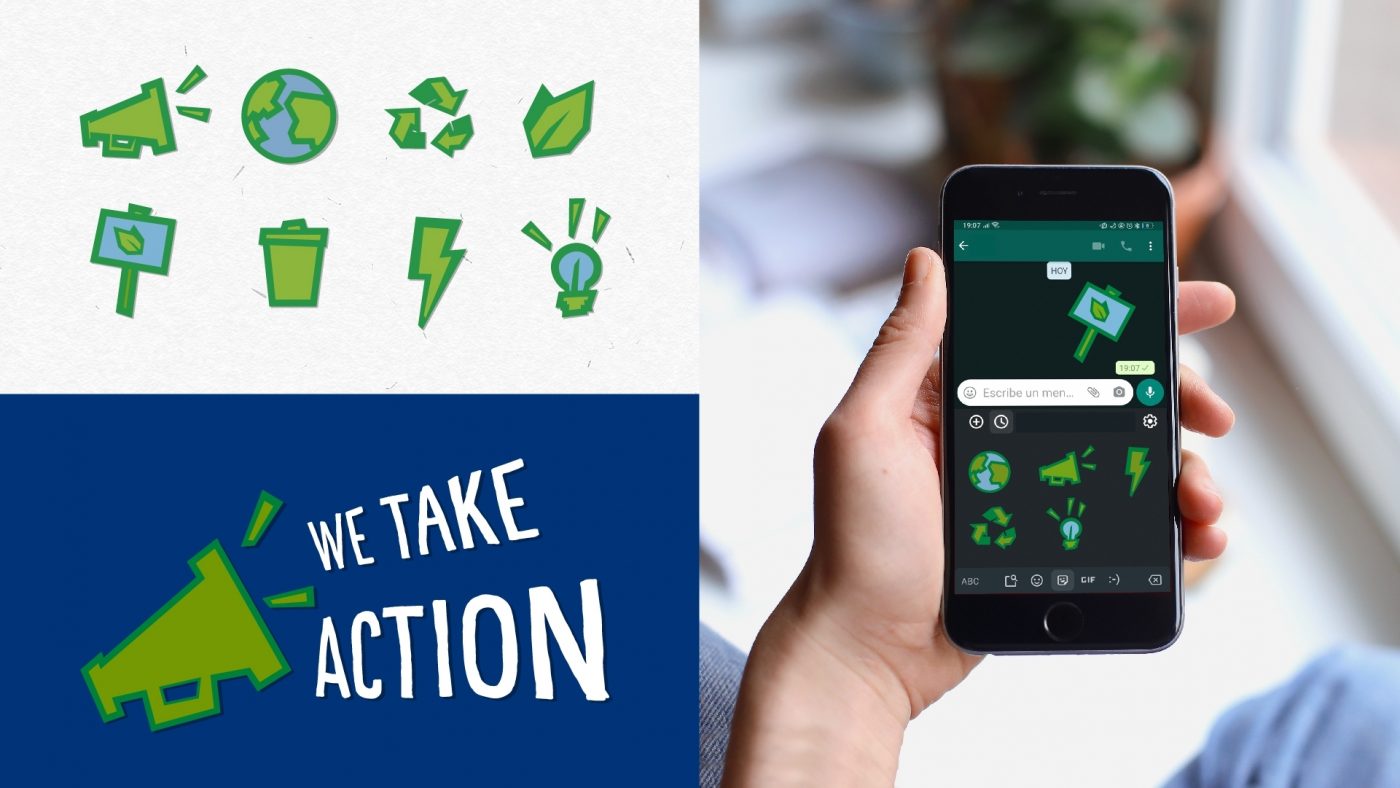
Nestlé Yoggi, the iconic Portuguese liquid yogurt brand, has been proactive, optimistic and challenging since its origins in 1985. As a leader in the dairy industry, the brand has decided to take on its share of commitment and challenge both its consumers and itself to actively care for the planet. On this path towards a more sustainable future, with actions such as reducing the use of plastic in the production of its bottles, the optimization of transportation and the use of 100% natural ingredients, the brand calls on us to shake up the world together. A commitment that is reflected in its new brand claim “Shake Yoggi, Shake the world!”, which promotes sustainable progress through small everyday decisions that lead to meaningful change.
Together we have designed the strategic evolution of the visual identity system to reflect this new vision and brand purpose towards sustainability.
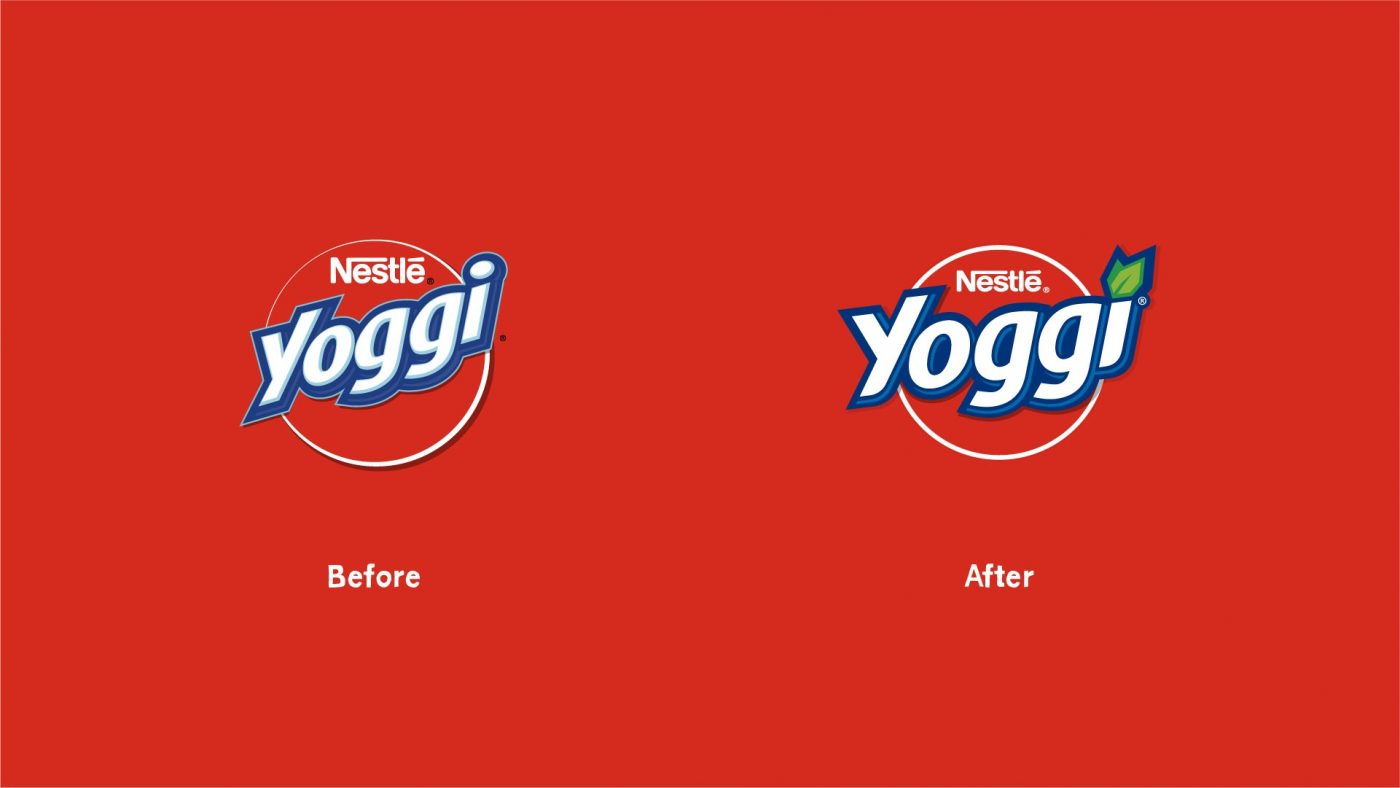
After a collaborative workshop with the Nestlé Yoggi and CBA team in Lisbon, and the definition of the brand’s new strategic positioning, we got down to work to create its new image, preserving key brand elements such as its iconic red color. We updated the logo with contemporary codes, simplified shapes and the integration of leaves as a symbol of commitment to the environment.
/ visual language
From there, we designed a visual ecosystem with its own codes that reinforces the brand's commitment to create community and foster a movement that goes beyond the product itself.
Commitment, honesty and respect are the pillars of this new image.
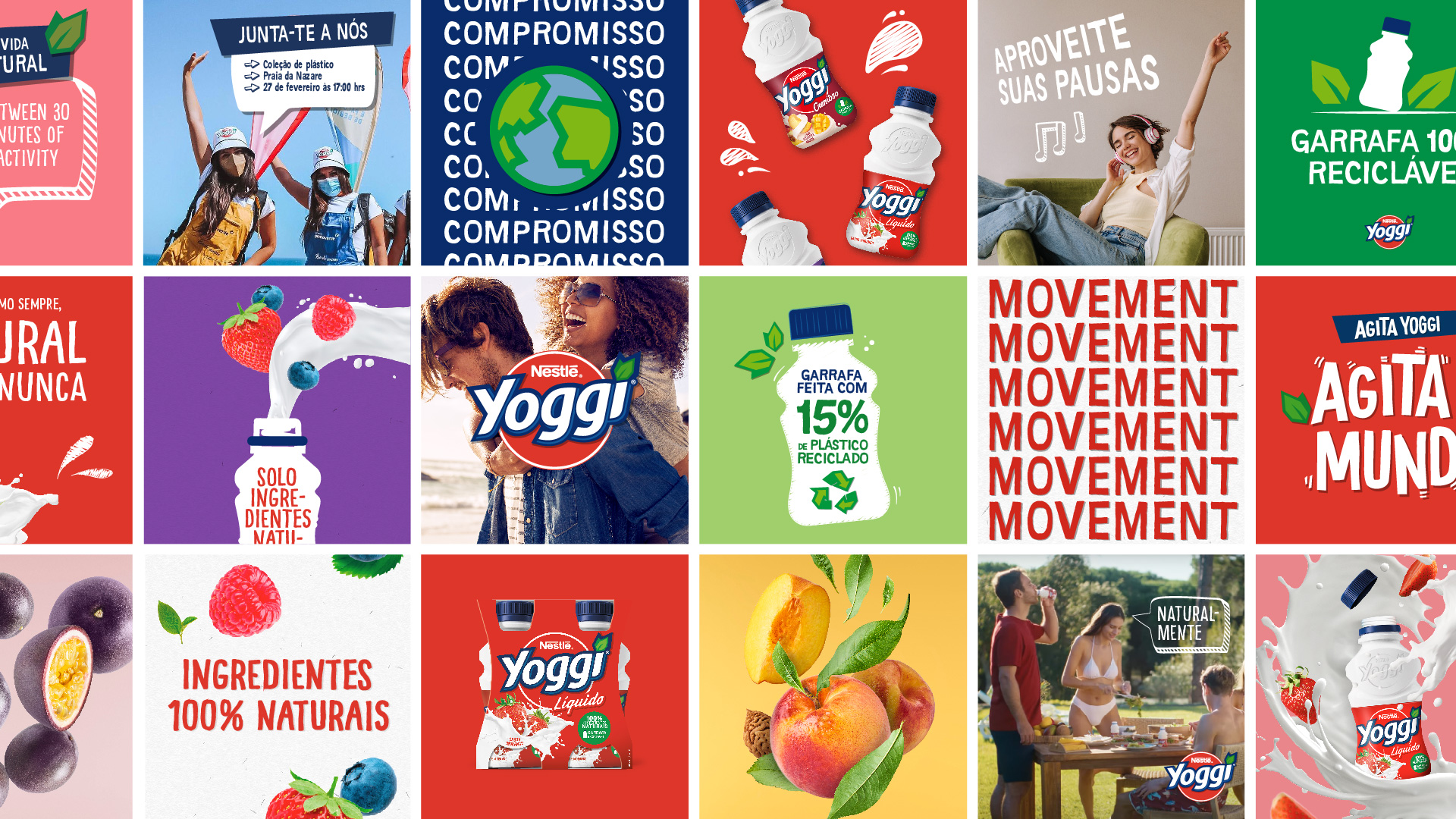
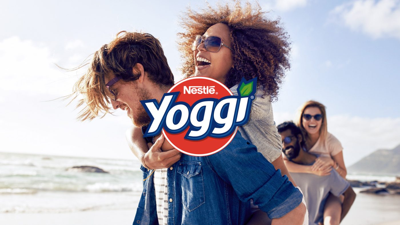
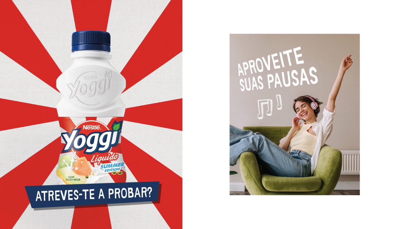
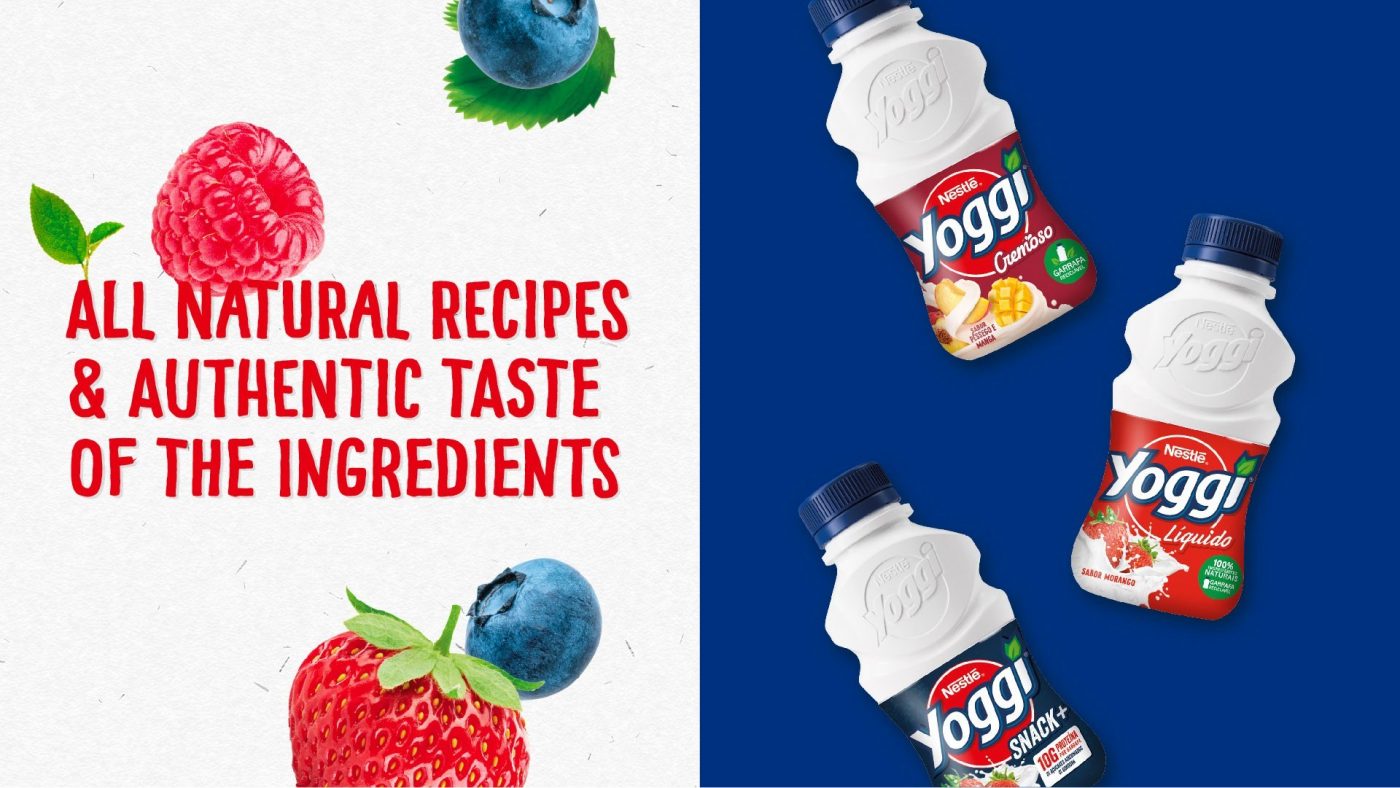
The brand language is built from all the graphic elements that conform it, with a typography that calls to action from a human and close approach. The iconography is inspired by the leaves of the logo, reinforcing the bond with the planet. In terms of color, we bring brightness and freshness, enriching the palette with bright hues that combine with white, without losing the iconic red as the main protagonist of the brand. The new photographic style also aligns with the brand’s personality, representing the Yoggi lifestyle with an optimistic and motivational look.
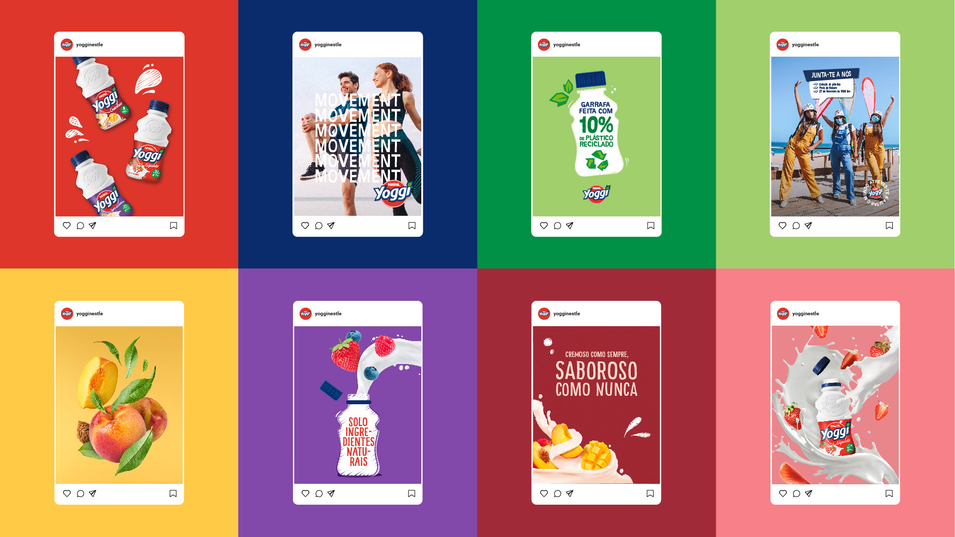
This new graphic language is also reflected in the design of the portfolio range, which places the logo in the center as an emblem of cohesion that enhances brand recognition.
The structure of the packaging makes it recognizable and at the same time flexible enough to assign background colors to each of the families in the range. We worked on the product’s images to enhance the tastiness and creaminess of the yogurt, as well as the naturality and freshness of its fruits.
The result is a visual identity with an overall look and feel clearly that is aligned with the brand positioning and becomes an active call towards building a more sustainable future together.
We use cookies on our website to give you the most relevant experience by remembering your preferences and repeat visits. By clicking “Accept”, you consent to the use of ALL the cookies.
This website uses cookies to improve your experience while you navigate through the website. Out of these, the cookies that are categorized as necessary are stored on your browser as they are essential for the working of basic functionalities of the website. We also use third-party cookies that help us analyze and understand how you use this website. These cookies will be stored in your browser only with your consent. You also have the option to opt-out of these cookies. But opting out of some of these cookies may affect your browsing experience.