Business need / Challenge
Epion Brands identified an opportunity to introduce a novel source of omega-3 supplements into the market – a krill oil that delivered on a superior proposition versus fish oil. To communicate successfully, this new brand needed to build consumer awareness of both the krill oil category and the brand together.
The company ‘Epion Brands’ was launched in 2019. With a validated product, proposition, target audience and brand archetype in mind, Epion Brands engaged CBA to further define the brand character and tone of voice prior to the design phase. Using our online collaboration tool, Mural, we created an environment where US and global teams could work together, remotely, to identify key personality traits, tighten the brand positioning, and identify creative areas of opportunity. Without the need for travel, solutions were developed faster with full alignment from the stakeholder participants.
Visualizing the Hero

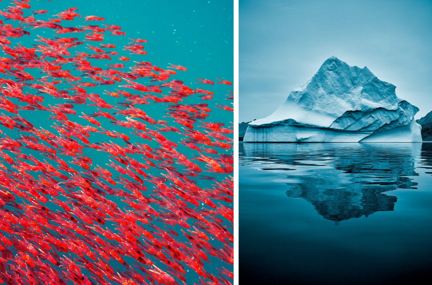
Prior to executing design concepts, we identified creative territories, taking inspiration from the Antarctica source, the krill and the brilliant red color of the pill. We aligned on a creative idea based on the magnificent power and strength of the krill when they’re in a ‘swarm’ – commonly known as a ‘bloom’.
Distilling brand into Design
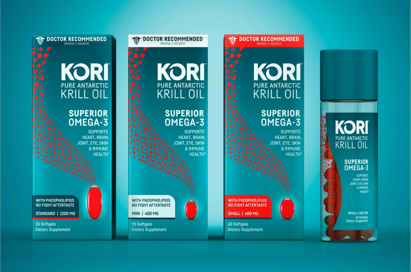
Inspired by the unique combination of the crisp, pristine, pure Antarctic Sea sand the powerful red Krill bloom, we explored various unexpected combinations to drive differentiation. When considering how to bring the krill and the krill bloom to life, we began to draw parallels between the power of one singular bloom with so many facets, to the singular pill with many health benefits. Our graphic bloom interpretation is a reflection of those parallels, manifesting the bloom through the natural health benefits of krill oil.

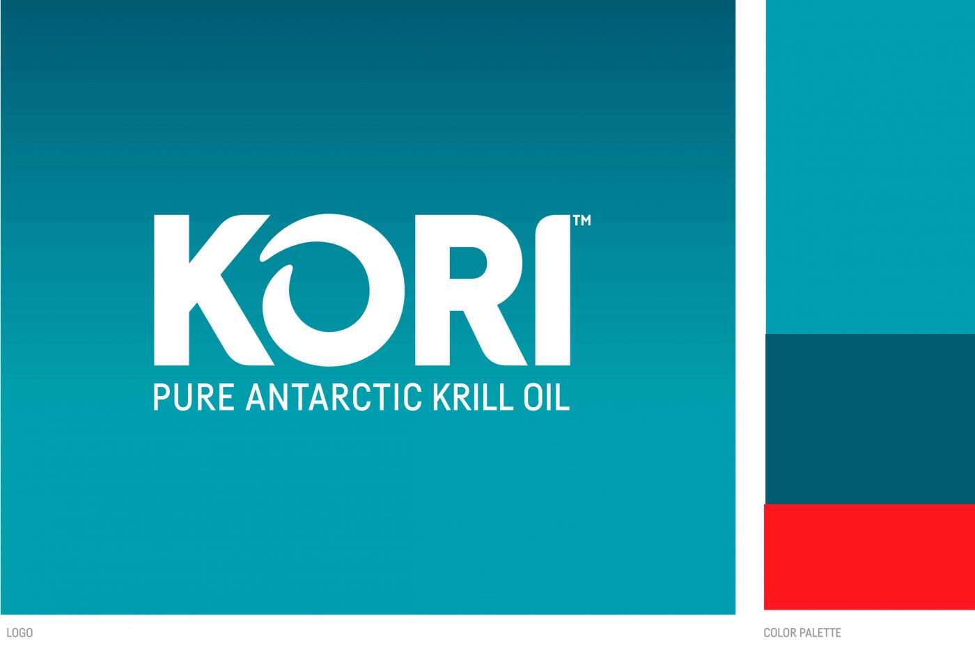
For the brand logo, we wanted the brand to show strength and movement. The tall letters in the logo represent our strength, while the curved edges project a more natural feel. The O in Kori is inspired by the top-down view of a krill bloom in motion. “It’s easy to be different just by being different, the challenge is to be different and add value. We studied the category and designed an identity that speaks to the natural origin of the product but found an approachable way to deliver the science. The teal background and the red bloom of our icons were directly inspired by the krill under the Antarctic waters,” says Helio Salema, lead Design Director on the project.

Taking a new approach to the category allows for the brand to become distinctive and different from the beginning. Excitement from both retailers and consumers is reinforced by consumer research. Achieving stand out in the supplements category is challenging, but the brand team is enthusiastic of
outstanding perceptions of quality, general health and no fishy aftertaste, which is a direct reflection of the unique packaging and allows us to stand out at shelf,
—- says Susmita Vellanki, Vice President of Marketing
Extending the Brand
Beyond the pack, the brand comes to life on various touchpoints, including point of sale, website (korikrilloil.com) and advertising media. To ensure a strong visual foundation, we developed a brand visual identity guideline that includes principles for the primary and secondary assets, photography and other touchpoint executions.
EpionBrands is an innovative new company focused on improving overall human health. Kori™ Pure Antarctic Krill Oil is the first consumer brand launched by Epion.

