France
Paris
Switch to your local agency
Retour au menu
Space is the final frontier according to Captain James Tiberius Kirk. It’s also where countless artists have boldly gone where no artist had dared go before.
Take Edward Hopper. The American’s paintings took spatial awareness to stark, new heights. Some evoke feelings of loneliness and longing that could break the hardest of hearts.
Musicians have long made use of pauses that hang in the air like soaring butterflies. These silent spaces are there to incite a sense of anticipation giving us a moment or two to gather our thoughts and emotions.
Listen to Barber’s Adagio for one of the most crushing, perfectly placed silences in the history of classical music. (Start at 5’30 to quickly take in its beauty).
Designers continue to seize this artistic technique that leaves time for consideration and emphasis. Read on to find out how less can indeed be more.

Imagine brimming with so many ideas that they won’t fit the space of a brief. The temptation is to cut out a few, make a tight fit and be good to go: the fewer grand plans ending up on the cutting room floor, the better for everyone.
That’s one way to see it, but spare a thought for the consumers looking at your creation for the first time. You spent hours crafting your design. They might only have a split second to digest it.
There’s a strong argument for being brave enough to abandon valuable communication real estate by knowing what and how much to leave out. It can be the tipping point that turns a good designer into a great one.

White space, also referred to as negative space, is essentially any area of design that is not taken up by content. This could be anything from vast expanses between different elements to the tiniest bits of space between some letters.
Despite the hint in its name, white space is not restricted to being white or any other color for that matter. It could be a textured surface or even a photo.
Used effectively you can establish a hierarchy in your composition, set a mood and improve readability. With care, you can achieve a harmonious balance that could take a consumer on a visual journey or draw their attention towards a specific element.
It might feel counterintuitive, but harnessing a whole lot of nothing is not wasting space. It can make or break your creation. It’s a fundamental design principle that will either keep the viewer on your page or leave them looking elsewhere, possibly with eye strain.
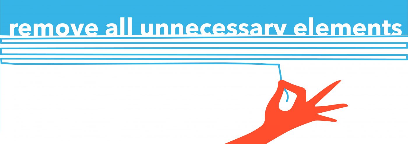
Negatives tend to be balanced with positives. Positive space refers to your subject matter, meaning all the elements that aren’t in the background.
For example, every letter in a block of text is a positive space. To avoid a messy jumble, we call on negative space to bring us much-needed breathing room and to restore balance. Get it right and you’ve achieved a bit of yin and yang.
Just to make things a tad confusing, white space can also be used in an active way to draw attention to a specific element. This could be something like a logo or headline. Taken to a new extreme when used in this way, it began an advertising revolution about 60 years ago.
So, fasten your seatbelts! Let’s take a trip back in time to revisit a piece of design work that put white space firmly on the map and changed the future of advertising and design forever.
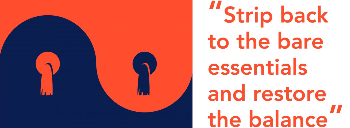
Set your flux capacitors to 1959 because that is when Bill Bernbach of DDB presented Volkswagen with his Think Small campaign idea. It’s regarded as one of the most effective and successful uses of space in design.
He bravely, some might have said foolishly, embraced space to such a degree that he used an ocean of it to surround a minuscule photo of a VW Beetle. This challenged the status quo at the time, ushering in a minimalist design revolution.
The ads caught the coolness of the product so well that people tore them from magazines and stuck them on their walls. It was the start of a new design movement that’s still going on today.
There have been countless negative space success stories ever since.
Take the FedEx logo with its clever arrow between the ‘E’ and ‘x.’ The negative space between these last two letters tricks the eye in a flash. The result is that we are drawn to a symbol conveying the company’s message that it’s super-speedy.
Over the years, IKEA’s ‘less is more’ approach to home furnishings has seen bright colors leap out from the page when set against sparse, Scandi-style wooden flooring. And, Apple’s use of clean, white space on its packaging reinforces a logo now synonymous with luxury, coveted tech.
Vive la révolution!
Staying with the revolutionary ‘50s theme, I was reminded of a controversial three-movement piece composed in 1952 by the American experimental musician, John Cage.
Written for any instrument or combination of instruments, the score, called 4’33”, instructs performers not to play during the entire piece. The work is then made up of the sounds from the environment that listeners hear while it’s performed.
A useful example of what parts of mindfulness are all about, it also reminds us that there will always be a smattering of sound to sprinkle on the aural equivalent of white space.
Apply the same concept to a minimally filled blank page and the light that shines on it. Deciphering its meaning can often lie in the eyes of the beholder. For a designer, the knack is to know what stays in and what stays out to provoke the desired reaction.

Why design trends come and go does, to an extent, depend on how we choose to make use of white space. White space will always be there and so will ever be a fundamental part of any design.
How far we choose to push its boundaries will play a part in keeping us looking fresh and shiny. So, what can we expect to see this year and beyond?
Minimalism continues to dominate, bridging the gap between art expression and lifestyle choices. It cuts through the noise and provides much-needed breathing space so that we don’t drown from an information overload.
Watch out for colorless and muted color designs, optical illusions and the use of geometric shapes trending everywhere. They all showcase the versatility and power of space that is called white.

This article was written by Arturas Janusas, Design Director, New York.
I’m excited to announce that the next Design Series article will be written and illustrated by CBA Senior Designer, Donny Marjalis, on the topic of shadows!
Privacy Overview
| Cookie | Duration | Description |
|---|---|---|
| aka_debug | This cookie is set by the provider Vimeo.This cookie is essential for the website to play video functionality. The cookie collects statistical information like how many times the video is displayed and what settings are used for playback. | |
| pll_language | 1 year | This cookie is set by Polylang plugin for WordPress powered websites. The cookie stores the language code of the last browsed page. |
| Cookie | Duration | Description |
|---|---|---|
| _gat | 1 minute | This cookies is installed by Google Universal Analytics to throttle the request rate to limit the colllection of data on high traffic sites. |
| YSC | session | This cookies is set by Youtube and is used to track the views of embedded videos. |
| Cookie | Duration | Description |
|---|---|---|
| _ga | 2 years | This cookie is installed by Google Analytics. The cookie is used to calculate visitor, session, campaign data and keep track of site usage for the site's analytics report. The cookies store information anonymously and assign a randomly generated number to identify unique visitors. |
| _gid | 1 day | This cookie is installed by Google Analytics. The cookie is used to store information of how visitors use a website and helps in creating an analytics report of how the website is doing. The data collected including the number visitors, the source where they have come from, and the pages visted in an anonymous form. |
| vuid | 2 years | This domain of this cookie is owned by Vimeo. This cookie is used by vimeo to collect tracking information. It sets a unique ID to embed videos to the website. |
| Cookie | Duration | Description |
|---|---|---|
| IDE | 1 year 24 days | Used by Google DoubleClick and stores information about how the user uses the website and any other advertisement before visiting the website. This is used to present users with ads that are relevant to them according to the user profile. |
| test_cookie | 15 minutes | This cookie is set by doubleclick.net. The purpose of the cookie is to determine if the user's browser supports cookies. |
| VISITOR_INFO1_LIVE | 5 months 27 days | This cookie is set by Youtube. Used to track the information of the embedded YouTube videos on a website. |
| Cookie | Duration | Description |
|---|---|---|
| CONSENT | 16 years 7 months 21 days 10 hours | No description |
| cookielawinfo-checkbox-functional | 1 year | The cookie is set by GDPR cookie consent to record the user consent for the cookies in the category "Functional". |
| cookielawinfo-checkbox-others | 1 year | No description |