France
Paris
Switch to your local agency
Retour au menu
CBA US visited Expo West in Anaheim last week. I think my feet have just about recovered from all the walking. The energy was amazing, and we left super inspired. I thought I’d jot down my main observations and share some of my amateur phone pics to illustrate them. Being a designer, I am mostly focused on food and drink innovation, as that is where change was most ‘out there.’
CBA US visited Expo West in Anaheim last week. I think my feet have just about recovered from all the walking. The energy was amazing, and we left super inspired. I thought I’d jot down my main observations and share some of my amateur phone pics to illustrate them. Being a designer, I am mostly focused on food and drink innovation, as that is where change was most ‘out there.’
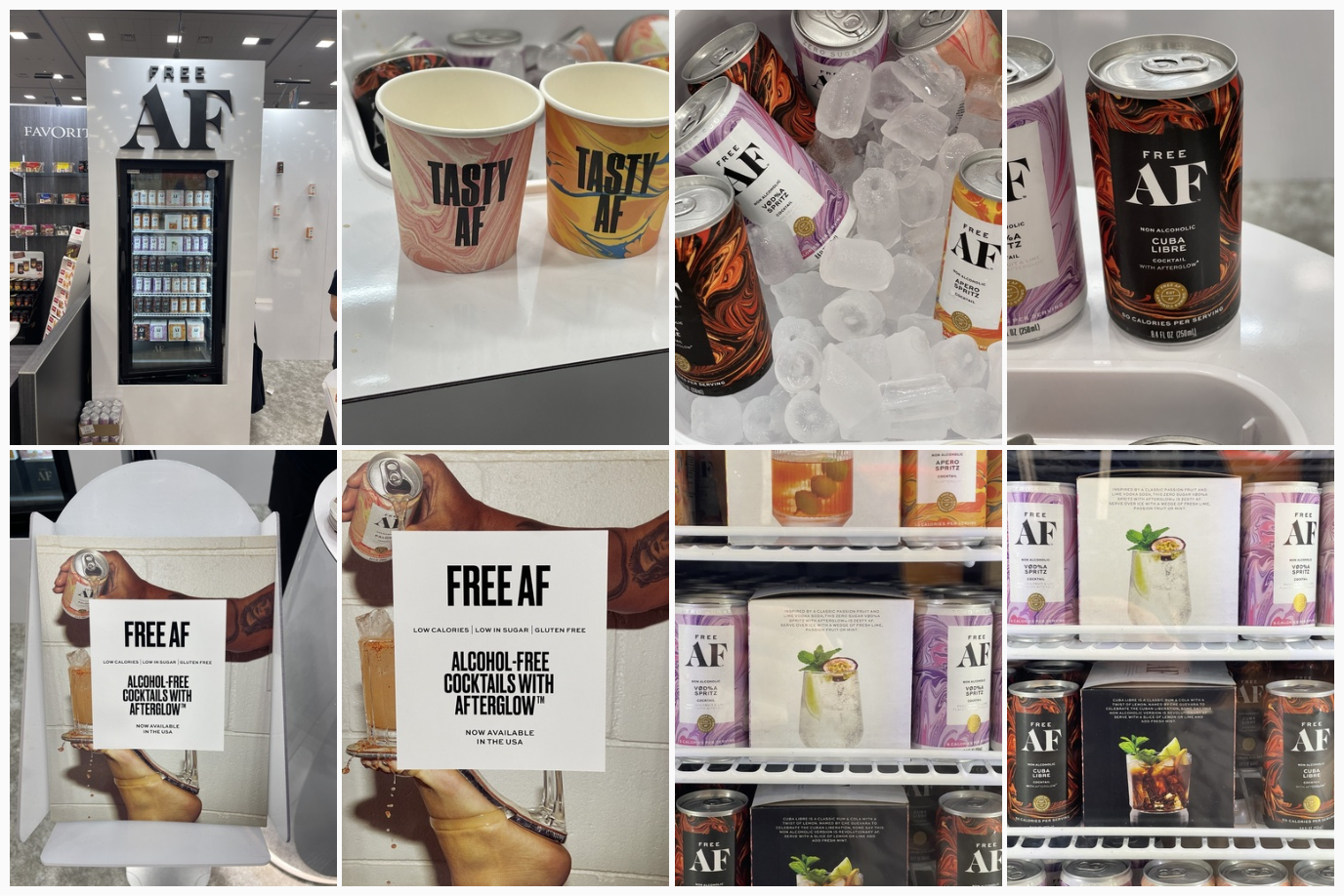
Full brand worlds were presented, not just the product and its packaging. The most successful booths attracted crowds that were seduced by appealing identity design, consistent blocks of color, strong branding extended to materials such as stickers, pos, leaflets and yes of course, packaging. FMCG corporate design is a real thing, and the best performers at the expo confirmed the importance of investing in this.
Full brand worlds were presented, not just the product and its packaging. The most successful booths attracted crowds that were seduced by appealing identity design, consistent blocks of color, strong branding extended to materials such as stickers, pos, leaflets and yes of course, packaging. FMCG corporate design is a real thing, and the best performers at the expo confirmed the importance of investing in this.

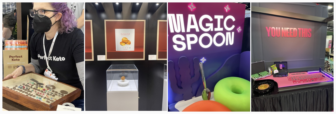
A memorable experience here was of course product tasting. This was set up, in some cases, as successful ‘theater,’ where the brand world was seamlessly translated to a ‘set’ where food was prepared. Then there were games, rock stages, and chill areas. There were many examples where the brand was effortlessly extended thanks to a strong visual and strategic foundation.
A memorable experience here was of course product tasting. This was set up, in some cases, as successful ‘theater,’ where the brand world was seamlessly translated to a ‘set’ where food was prepared. Then there were games, rock stages, and chill areas. There were many examples where the brand was effortlessly extended thanks to a strong visual and strategic foundation.


It came as no surprise, after multiple Gen Z reports about the preferences of our younger consumers, that brands are simple and bright. Packaging is designed to attract attention on shelf and on the small screen. Flat bright colors dominated the innovation section of the Expo. There was no holding back here, and every color of the rainbow was covered, including a notable presence of pink.
It came as no surprise, after multiple Gen Z reports about the preferences of our younger consumers, that brands are simple and bright. Packaging is designed to attract attention on shelf and on the small screen. Flat bright colors dominated the innovation section of the Expo. There was no holding back here, and every color of the rainbow was covered, including a notable presence of pink.

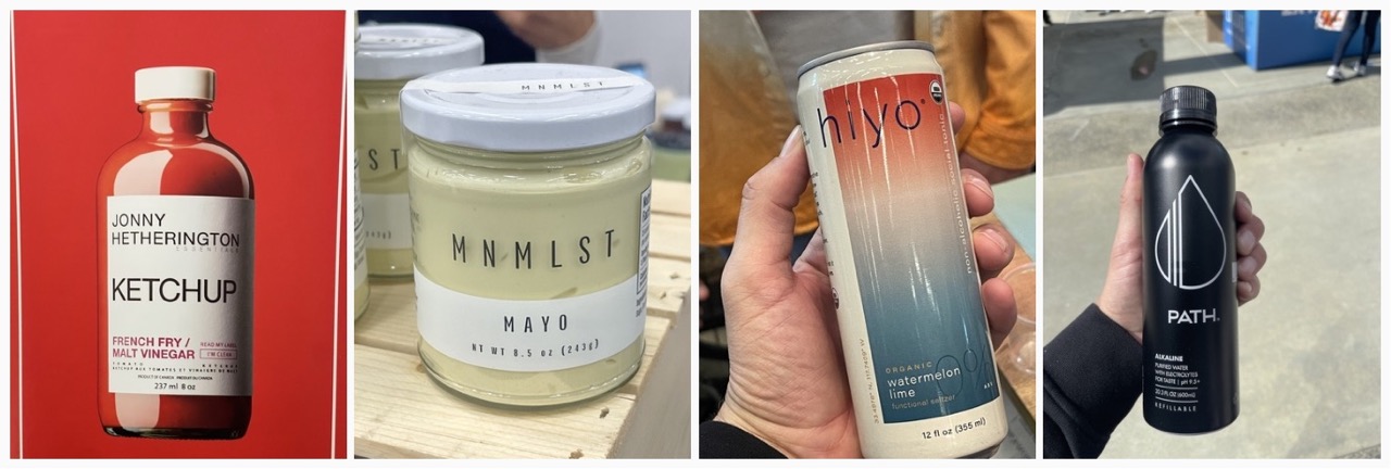
It was great to see that some brands choose to disrupt by being minimal. This is the design theory I was taught in school: just show what is necessary. A calm oasis amid the sensory overload that surrounds us in this chaotic world (and its supermarkets and digital space!)
It was great to see that some brands choose to disrupt by being minimal. This is the design theory I was taught in school: just show what is necessary. A calm oasis amid the sensory overload that surrounds us in this chaotic world (and its supermarkets and digital space!)

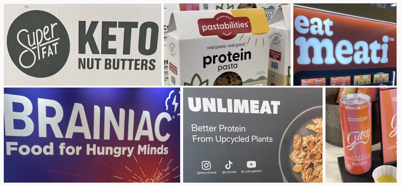
With simpler and cleaner packaging, what is on the pack now needs to work extra hard. Brand names often indicate what the product or positioning is. No more ambiguous names that need further investigating to understand what it actually means, but playful versions of real words creating an ownable brand name.
With simpler and cleaner packaging, what is on the pack now needs to work extra hard. Brand names often indicate what the product or positioning is. No more ambiguous names that need further investigating to understand what it actually means, but playful versions of real words creating an ownable brand name.

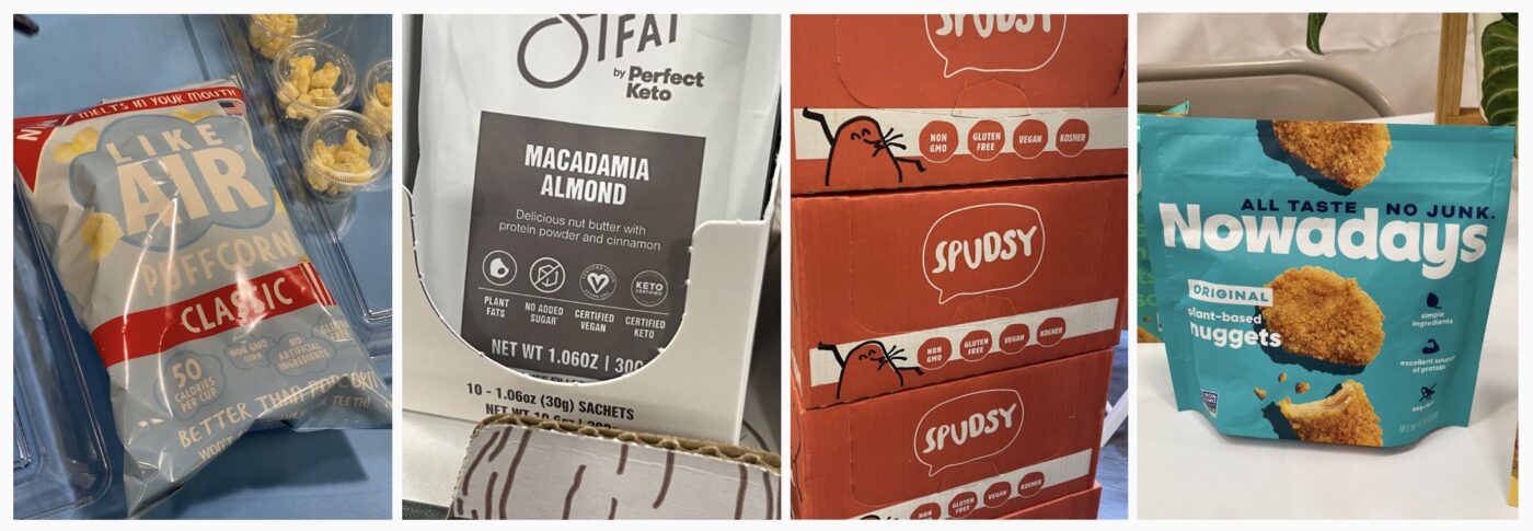
Many products now proudly present the important product info on the front of the packaging, such as ingredients (or lack thereof), how it’s made, where it’s from. All designed in an engaging way not just there to inform but also to make you feel good and in some cases, entertain. We also saw a ton of icons adorning all sides of the packaging and displays, further clarifying what each new innovation could mean for you.
Many products now proudly present the important product info on the front of the packaging, such as ingredients (or lack thereof), how it’s made, where it’s from. All designed in an engaging way not just there to inform but also to make you feel good and in some cases, entertain. We also saw a ton of icons adorning all sides of the packaging and displays, further clarifying what each new innovation could mean for you.


Designs were not there to just tell us a story but were designed to invite you in and engage. Messaging appeared human, crafted and/or unique. We all know the typography clichés and ‘go-to’ styles that often mark a specific category. Many designs are now inspired by a lifestyle and Instagram-ability (is this a word yet?)
Designs were not there to just tell us a story but were designed to invite you in and engage. Messaging appeared human, crafted and/or unique. We all know the typography clichés and ‘go-to’ styles that often mark a specific category. Many designs are now inspired by a lifestyle and Instagram-ability (is this a word yet?)

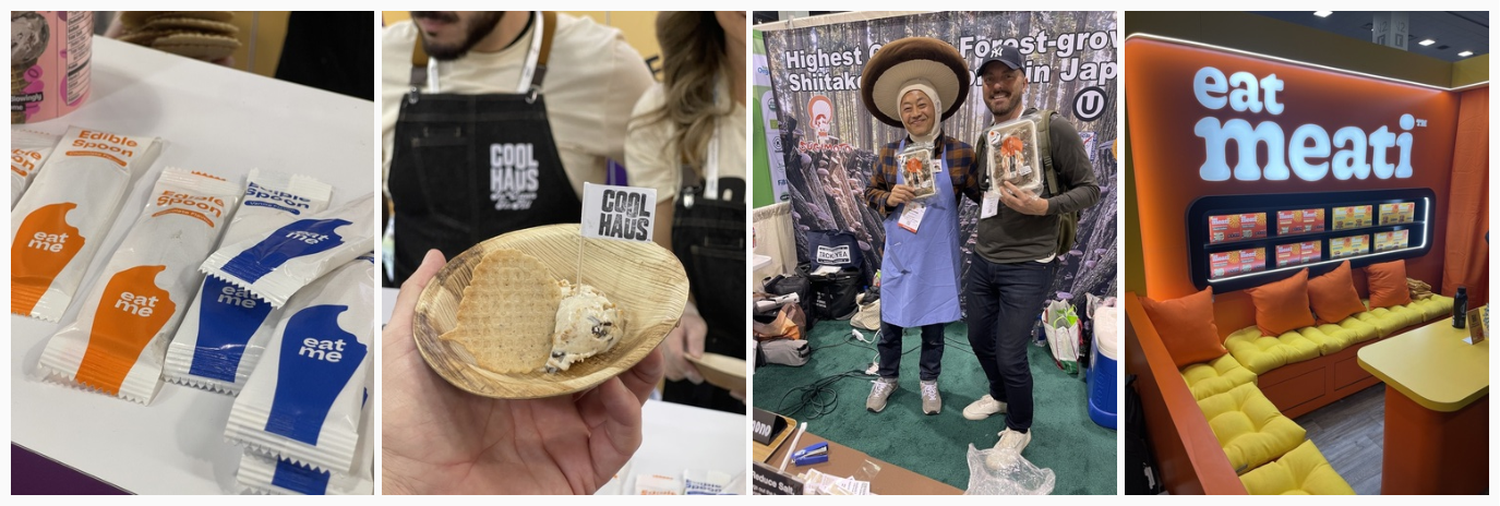
This should not be an ‘ah-ha’ anymore; however, we loved to see how sustainability is here to stay. Everything from plant-based serving platters to edible spoons (which I ate before my ice cream was finished, my bad). And then the biggest thing we saw this year: mushrooms! Mushrooms as protective packaging, mushrooms as chicken, truly incredible and delicious.
This should not be an ‘ah-ha’ anymore; however, we loved to see how sustainability is here to stay. Everything from plant-based serving platters to edible spoons (which I ate before my ice cream was finished, my bad). And then the biggest thing we saw this year: mushrooms! Mushrooms as protective packaging, mushrooms as chicken, truly incredible and delicious.

Now of course this is only a summary of three days of pure joy and inspiration. Impossible to pen it all down. As always, it’s good to share, and I hope this will pass on some of the energy I took away from the Expo. I love exchanging ideas and keeping the conversation going, so if you feel I left anything major out or if you want my opinion on something here and what this could mean for you as a designer or brand, let me know! Happy to talk.
By Rutger Thiellier, ECD.
Human design is a “tool that allows you to understand your energy mechanics, and the mechanics in interaction with your environment”. It allows a better understanding of oneself, of one’s strengths and weaknesses, and a better understanding of the other. It allows ultimately to understand it’s functioning and to work on oneself in order to act better, progress and accomplish oneself.
The human design describes 4 profiles:
The human design describes 4 profiles:
All of these typologies are complementary. They create an exceptional collective intelligence which allows new concepts to germinate, new markets to be reached, innovation to be fostered.
This collective intelligence is the winning key to value creation.

Let’s take the exemple of the brand Cora. In 2020, Cora wanted to mobilize all of its employees in the definition of the brand strategy and make them the first ambassadors of change. CBA accompanied the brand in this shift by building a tailor-made support « Cora demain » allowing for the first time more than 25,000 employees to work together. Debates and surveys were conducted among employees and workshops were organized to define the new fundamentals and identify the work to be done.

Let’s take the exemple of the brand Cora. In 2020, Cora wanted to mobilize all of its employees in the definition of the brand strategy and make them the first ambassadors of change. CBA accompanied the brand in this shift by building a tailor-made support « Cora demain » allowing for the first time more than 25,000 employees to work together. Debates and surveys were conducted among employees and workshops were organized to define the new fundamentals and identify the work to be done.
The results? A coherent corporate vision understood by all employees, a smoother internal communication as a result of engaged and happy employees. Cora is today the second favorite employer in food distribution.
The digital is an integral part of our daily lives et new digital levers are emerging, among them the metaverse or AI. Despite a certain reluctance from a part of the general public, we can point out the complementarity between these digital tools and the human intelligence, that allows you to go further, faster.
The artificial intelligence allows an optimisation of process, a precise analysis of data in order to reduce the working hours and an important reduction of human mistakes. In the framework of client experience, the IA allows a tailor-made personalization thanks to the data collected to make the experience more attractive, targeted and engaging.
Did you know that on average a European produces nearly 180 kgs of packaging waste per year? Did you also know that, according to the European Commission, more than 40% of plastic materials and 50% of paper used in Europe are intended for packaging?
However, more and more consumers no longer want to put up with packaging in their daily lives. According to Ipsos, almost 60% of French consumers plan to remove excessive packaging to fight climate change. Nearly half of American consumers are willing to pay more for their products for recyclable or reusable packaging.
The environmental cause affects us all. More than half of us adjust our behavior to become more responsible and contribute on our scale to the preservation of our planet.
That’s why this new awareness is pushing companies to innovate and come up with new eco-responsible packaging strategies.
Eco-responsible packaging, eco-friendly packaging or eco-packaging: all mean the same thing. It’s a packaging that limits its impact on the environment by considering its entire life cycle and without danger for its user.
Unlike what one might think, it’s not just limited to recycling! A multitude of concepts must be integrated. Here are few of them:
According to LSA Green, 90% of European consumers expect brands to commit themselves.
More and more brands are expected to invest in a new packaging design for their products in order to meet these new expectations and convictions required from their consumers. From luxury brands to cosmetics, or even agri-food, all types of industries are determined to eliminate plastic packaging.
Beyond attracting the consumer, packaging also allows a brand to communicate about its identity and values. An eco-friendlier packaging will allow brands to strengthen their image as committed companies. It will also help them to be in harmony with the desires of their customers and prospects.

And yes, more and more brands are launching innovative design and packaging solutions while being compostable and biodegradable.
Discover the Coffeeb capsules project from CAFE ROYAL. Forget all the aluminum ones… make room for small, compressed coffee balls, wrapped in a thin 100% biodegradable membrane!
Who hasn’t already been influenced by packaging when shopping? And yes, this is not new: packaging has a key role in consumer purchasing decisions, but is it as strong to transform impact our behavior for the very best?
Some brands have taken up the challenge and used the packaging of their products to raise consumers’ awareness about recycling and environmental cause.
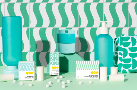
The 900 care brand is the perfect example of tackling the thorny problem of household pollution and the overconsumption of plastic. The company has designed a range of hygiene products as tablets that can be diluted in water to allow everyone to make their own products.
But what persuades us to change our habits? With their subscription system, you no longer need to worry! As soon as you run out of shampoo, you receive the refills directly at home.
Practical but also well-designed, the brand comes up with colorful refillable bottles that can also be used as decoration tools in our bathrooms.
CBA’s global team of designers, strategists and content experts have selected from out there what they considered top-notch in terms of design, branding and consumer trends, focusing on positive impact.
From this great curation we highlighted 15 trends that, in this year, will continue to encourage brands – large and small, from all categories – to innovate in order to become more useful to society.
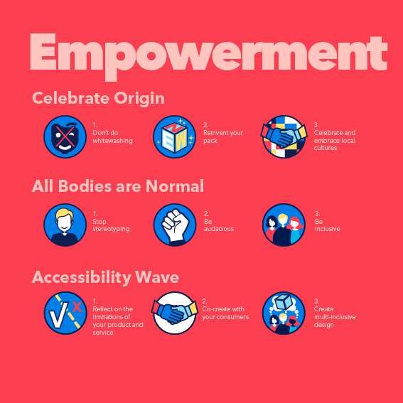
Trends are segmented into 5 pillars -pillars from the utility map of our Critical Imprint methodology:

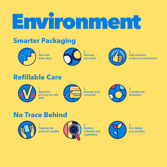
There is no Planet B, and we ought to take care of the one we live in.
Designing environmentally friendly packaging is a must: we need to consider the use of different packaging materials and formats.
Brands are increasingly celebrating
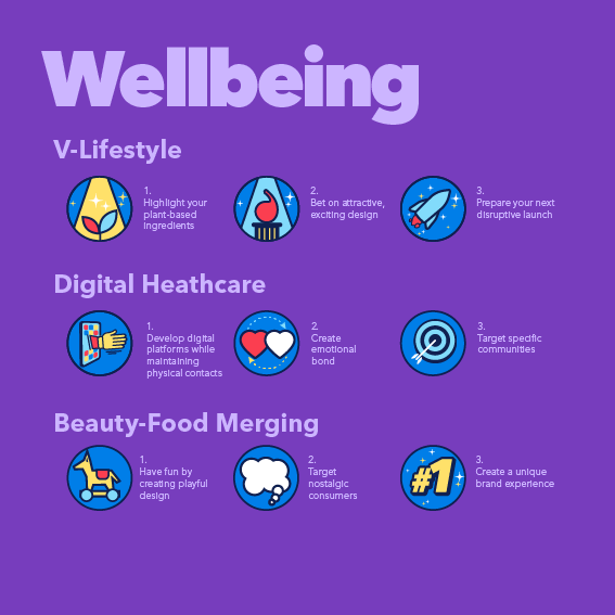
a boom of digital healthcare solutions catered to communities, and a playful integration between beauty and food brands.
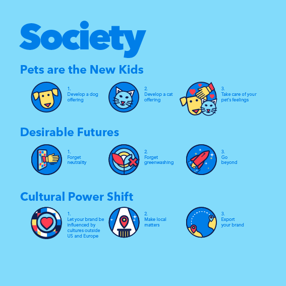
The pandemic and the ongoing process of globalization
have many of us questioning what is it that we want for
our future as a society
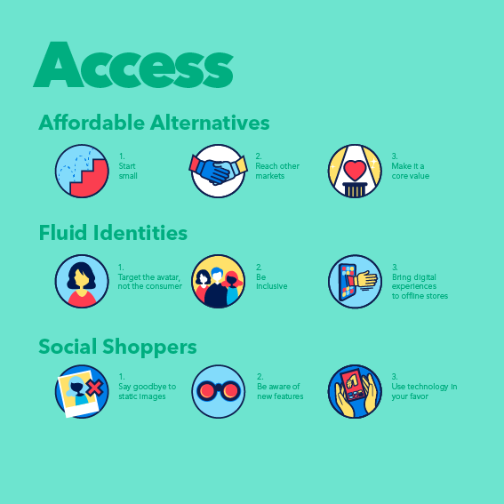
by making their offer more economically affordable, or expanding their presence in the metaverse and on social media.
In 2022, The Good Company and the study institute Kantar launched the Inclusion & Diversity in Advertising barometer.
The goal? « Confronting the perception and expectations of the French people with the reality of advertising content ».
72% of the French consumer think that « showing diversity in advertising is important, even very important ». It’s a high number that shows that the population wants to see more inclusive advertising that celebrates diversity. The consumer changes, evolves, and becomes more and more uncompromising towards brands. He is looking for brands that represent its values.
According to a study carried out by Environics Research and Amazon Ads, 72% of American consumers and 60% of Europeans consumers « aspire to more diversity and representation in advertising ». Thus, between the consumer and the emergence of cancel culture, brands must react.
According to a study carried out by Environics Research and Amazon Ads, 72% of American consumers and 60% of Europeans consumers « aspire to more diversity and representation in advertising ». Thus, between the consumer and the emergence of cancel culture, brands must react.
Brands’ authenticity is regularly questioned or pointed at. Are some brands legitimate? Authentic?
What brands are being criticized for is the lack of concrete proofs. A simple speech is not enough. It must be supported by actions.
————– Environics Research and Amazon Ads
Many brands are engaging in what is known as brand activism, i.e. the commitment of a brand, in a concrete way, to a social or environmental cause.
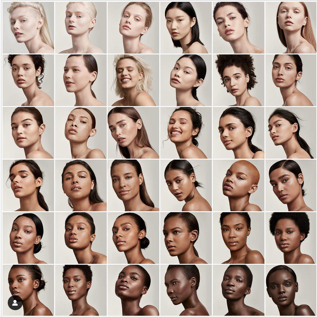
A concrete example is the brand Fenty Beauty, who launched more than 50 shades of foundation, in a market where it’s still difficult for black people to find a make-up product that matches their skin tone.
A concrete example is the brand Fenty Beauty, who launched more than 50 shades of foundation, in a market where it’s still difficult for black people to find a make-up product that matches their skin tone.

Gillette decided to question men stereotypes through its campaign called « The man your are » by highlighting a diversity of men when shaving. The goal? Break the codes. Gillette, in making that choice, wants to allow all men to feel represented when watching this ad.
The opulent expression of glamour & feminity has become dated and Lux has understood it well. The brand wanted to inspire women to rise above everyday sexist judgements & express their beauty & femininity unapologetically. Our teams redefined the brand’s purpose and accompanied Lux on the creation of its brand visual identity.
« Creative and developer, great artists, great feminists, big mouth, big heart (…) » … SNCF, the French public railway company, launched « Hexagonal », a video campaign, with the goal to federate its users by representing them through its advertising. A campaign rewarded by a Bronze Lion in the « Creative Strategy » category (Lion Cannes Creativity International Festival). A campaign to support the business plan launched in 2020 by the SNCF, which focuses on putting people at the heart of company, the development and vitality of territories, the ecological transition and digital mobility.
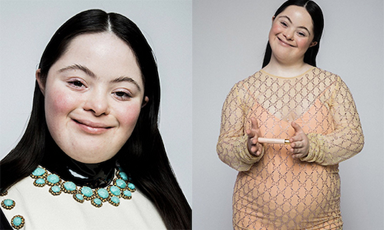
In 2020, the iconic luxury brand Gucci has chosen to appoint as the muse of its brand Ellie Goldstein, who has Down’s syndrome.
A bold choice since the market is still very stereotyped and standardized.
Gucci highlighted the effort to be made by the brands and denounced the lack of representation in of the market.

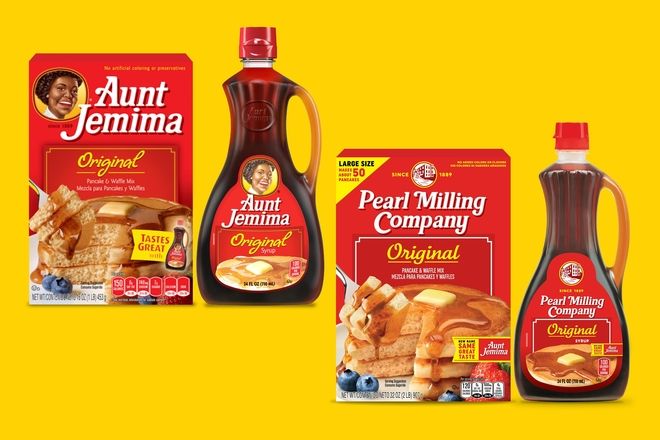
Other brands make the choice to rebuild completely their naming or visual identity. It’s the case of Aunt Jemina, which changes its name to Pearl Milling Company and erased the image of a black woman from its packaging ; caricature of the black nanny caring for the children of a white family.
Your typical zoomer has their eyes peeled across multiple formats for a broad spectrum of opportunities. Their phones open up a world that allows them to bounce around randomly. They’re in control, only stopping to look when something takes their fancy.

Brands that stand out from the crowd have the best chance of surviving the impact of short attention spans and infobesity. But, you can’t fool a zoomer easily. They’re fake news savvy, naturally skeptical, and dislike marketing hype.
Gen Z does not trust easily: their focus is on quality and authenticity.

Your typical zoomer has their eyes peeled across multiple formats for a broad spectrum of opportunities. Their phones open up a world that allows them to bounce around randomly. They’re in control, only stopping to look when something takes their fancy.
Brands that stand out from the crowd have the best chance of surviving the impact of short attention spans and infobesity. But, you can’t fool a zoomer easily. They’re fake news savvy, naturally skeptical, and dislike marketing hype.
Gen Z does not trust easily: their focus is on quality and authenticity.

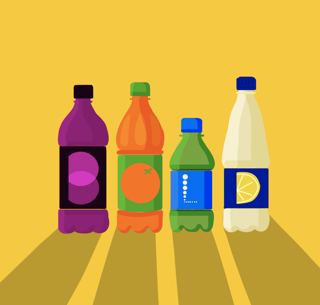
Big, bold, uncluttered designs that are recognizable across virtual and physical retail outlets alike need to flag up the inherent strength of a brand’s properties. The clarity of simplicity stands out to Gen Z consumers.
Nowhere is this more important than on anything digital, as this is where the next generations live. The strategy behind any redesign should incorporate the need to make a product highly “Instagram-able.”
Removing the superfluous to create simplicity has become a necessity, not just in the ecological sense but also as an aid to better engage with Gen Zers.
Gen Z-ers want to get to the point of the brand in nano-seconds.
Don’t confuse superficiality with darting around digital messaging platforms and making instantaneous u-turns between work colleagues, friends and family. Members of Gen Z seek deep emotional connections.
They enjoy easy accessibility to their heroines and heroes along with brands they value. They expect to be able to engage in meaningful ways that can have an impact on how they feel and how they interact with their peers.

60 percent of them say they want to communicate more with businesses via messaging.
Gen Z-ers want meaningful emotional connections and fast.

Don’t confuse superficiality with darting around digital messaging platforms and making instantaneous u-turns between work colleagues, friends and family. Members of Gen Z seek deep emotional connections.
They enjoy easy accessibility to their heroines and heroes along with brands they value. They expect to be able to engage in meaningful ways that can have an impact on how they feel and how they interact with their peers.
60 percent of them say they want to communicate more with businesses via messaging.
Gen Z-ers want meaningful emotional connections and fast.

Gen Zers know they can drill down into the mission and purpose of a company in seconds while on the move. Most say they’re more likely to buy a product from a brand that shares its broader commitments openly.
They’ll spend time checking out the values of a brand to ensure it fits with their own hopes and aspirations for the world’s future. Where a product is from and how it got made matter in a similar way to the price and quality.
Gen Z-ers are careful researchers who prefer products that share their values.

Gen Z states openly it’s willing to pay more for sustainable products and brands. It seems that with every generation, the pursuit of sustainability gets stronger. A significant majority of Gen Z is buying upcycled and preloved products, for example.
The point is that sustainability practices need to be relevant and match the expectations of their audience. Resale and consignment along with peer-to-peer marketplaces are part of the picture with some big brand names getting on board.
For Gen Z, brands must treat sustainability as more than a box-ticking exercise.
Almost three-quarters of Gen Z say they play a part in deciding what kinds of food and household products their families buy. They have a clear opinion about what’s best or cool. Their parents appear inclined to listen to them and act on their tastes and wishes.
More than 53 percent of Generation Z-ers bought something through a mobile device in the last six months.
Most Gen Z-ers are influencers, encouraging others to buy products they like.
In the US, Gen Z is at the cutting edge of the country’s changing racial and ethnic makeup. Only a slim majority of around 52 percent identify as non-Hispanic white.
Diversity matters to them all. They tend to see it as a positive.
They are also less likely to drop out of high school and more inclined to enroll in college. They expect governments to sort out the big problems, particularly those related to climate change.
Gen Z-ers embrace diversity & tend to be well-educated with a social conscience.
Whatever their hopes and despite being the least likely group to get sick from COVID-19, Gen Z has faced considerable disruption in education and in the job market.
They were the least likely group to get financial support for lost jobs.
They continue to experience the psychological scars of lockdown, a time many may have preferred to party. A degree of despondency may have crept in. Research suggests that almost two-thirds of young Europeans have been at risk of depression.
Gen Z-ers need some TLC and understanding of their anxieties.

There’s been a decline in young people aspiring to picture-perfect posts and content.
A significant proportion of Gen Z-ers is becoming fed up with a seemingly endless need for perfection that’s unrealistic, unreachable and unrelatable.
There’s been a shift in influencers with mega followings moving from self or product promotion to a desire to share important information such as getting vaccinated.
Gen Z-ers are ditching shallowness for meaningful dialogue.
We can check all our boxes and still be a bore. Meaning is critical but in the end our Gen-Z is spoiled with a plethora of entertainment options. Brands are here to entertain and are up against Tik Tok and Instagram. Work with all your might to create a brand experience by creating disruptive design, embracing video, and using technologies such as augmented reality (and and and,… never or)
Gen Z typically has an attention span of just 8 seconds, a few seconds shorter than millennials, who come in at approximately 12 seconds.
Now that we have framed the basics we look forward to sharing further insight into the vast world of branding and digital. Our next article is going to help us all better understand what the Metaverse is (besides a buzzword) and how we brand shapers can engage.
Now that we have framed the basics we look forward to sharing further insight into the vast world of branding and digital. Our next article is going to help us all better understand what the Metaverse is (besides a buzzword) and how we brand shapers can engage.
Now that we have framed the basics we look forward to sharing further insight into the vast world of branding and digital. Our next article is going to help us all better understand what the Metaverse is (besides a buzzword) and how we brand shapers can engage.
Now that we have framed the basics we look forward to sharing further insight into the vast world of branding and digital. Our next article is going to help us all better understand what the Metaverse is (besides a buzzword) and how we brand shapers can engage.
“You like potato and I like potahto. You like tomato and I like tomahto…” In my head, the song, “Let’s call the whole thing off,” made famous by Ella Fitzgerald was stuck on repeat as I jetted off to the US of A for a new chapter in my life.
I can’t have been the first Brit to fall foul of this earworm. I was mindful of the broad spectrum of differences between the UK and US, despite our sharing a common language, and I was keen to bridge the gap.
I’d done my homework and thought I was across our cultural, social and technical disparities, but one, in particular, came as a surprise. Read on to find out more.
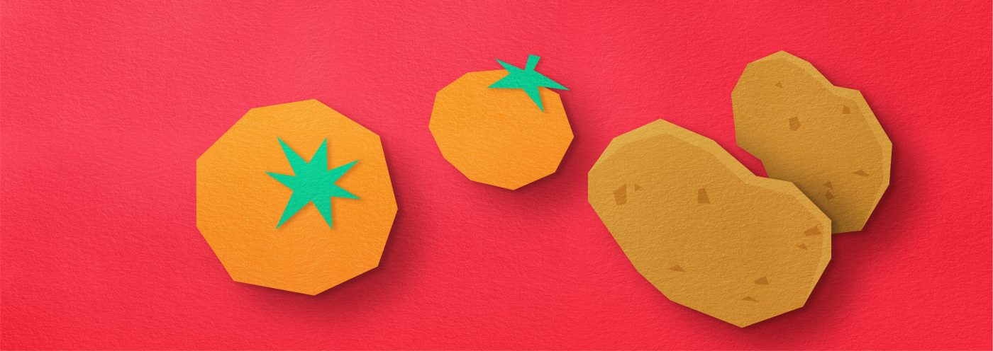
They may be reluctant to admit it, but there’ll be plenty of Americans out there who’ve blown up the occasional, home-grown, electrical appliance on a trip to Europe. For a nation that’s built a reputation on doing things bigger and brasher, the USA has lagged behind in some key respects.
It can, for example, only boast around half the standard voltage in its domestic electricity supply compared with its neighbors across the pond.
Having 100 fewer lines, the pictures on its TV screens have for years lacked the crispness and clarity of their European counterparts. Being across these and other divergences, I was cautiously optimistic of being already well on the way to fully-fledged American integration on my first day at CBA’s New York office.
Hold the front page.
“Where do we keep the A4, mate?” I asked as I gazed down at the empty office printer tray. I was met with a puzzled look from one of my new American colleagues. Here’s why.

It turns out that North America does not sing from the same hymn sheet as most of the world when it comes to paper sizes.
Mexico City, Ottawa and DC might buy their paper in “letter,” “legal,” “executive” and “ledger/tabloid” sizes. London, Paris and Rome most definitely do not. I embarked on a paper trail to find out why. Notepads at the ready.
ISO 3103 for a standardized method to make the perfect cup of tea!
ISO 3166 for country codes used in domain names and postal addresses
ISO 6 for camera film speeds
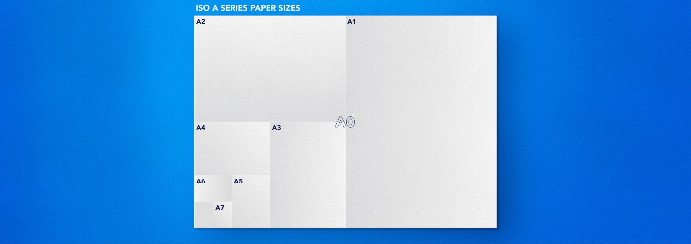
It could be that the reason America hasn’t taken on the A-series is in part due to the distance it kept from much of the rest of the world during WW2. It was reluctant to get involved and its economy was more or less self-sufficient.
With an infrastructure left unscathed by the war, unlike many other countries it didn’t feel the same need to adopt international standards.
Paper size conventions along with other measuring systems may not have been overtly political. As the Cold War set in, they may have been considered part of cultural identities that were worth holding on to.
Most of Europe had been using metric units since the 19th century. And yet, the USA still uses the British Imperial system, something even us Brits managed to shake off in the 1960s. Admittedly that was a step too far for some Euro-sceptic die-hards.

To an extent, the digital era has broken down the boundaries of the old world order. As a minor example, the virtual pages on our screens can now be as wide, round or narrow as we like. Woo hoo!
For some, paper sizes can feel like distant memories, strictures of a bygone era. Many of us have already crumpled them up and tossed them into the bin of history. And, the books we read still remain remarkably untouched by any desire to standardize their sizes. We continue to be as creative with their proportions as we are with their contents.
However, as I head back to the UK for a short break, I realize I still hold the ISO standardization and sheets of A4 close to my heart. They’re perhaps a small reminder of my roots and my heritage as a designer.
Although in the grand scheme of things determining generic paper sizes may seem trivial, it acts as a prompt to flag up bigger social and cultural identifiers: Swiss precision, German efficiency and American hubris, to name but a few.
I’m also reminded that, because of the language the USA shares with it, the UK holds a unique position that straddles North America and its European homeland. I’m enjoying being continually surprised by the differences between their rich but different cultures.

This article was written by Chris Martin, Design Director, New York.
The next Design Series article will be written and illustrated by CBA Associate Creative Director of Experience, Helio Salema!
Apart from distinctive stripes and a penchant for swimming, a tiger has many other strings to its bow. It can, for example, boast about belonging to the biggest species of cat in the world.
Given its striking stature, along with the noble connections of the Royal Bengal breed, a tiger might be forgiven for feeling a bit miffed about not being known as the “King of the jungle.”
That could, of course, be because some, like the Siberian variety, choose to hang out on snowy peaks. Fanatics might even dare to say that tigers make some of their distant African, plain-coated relatives look a little weak.
Size matters, and, when it comes to felines, the tiger steals the crown for being king of the world, not just of a few trifling tropics. So, read on to find out more about how and why these giant cats have become such irresistible subjects for storytellers, not to mention useful symbols for advertisers.
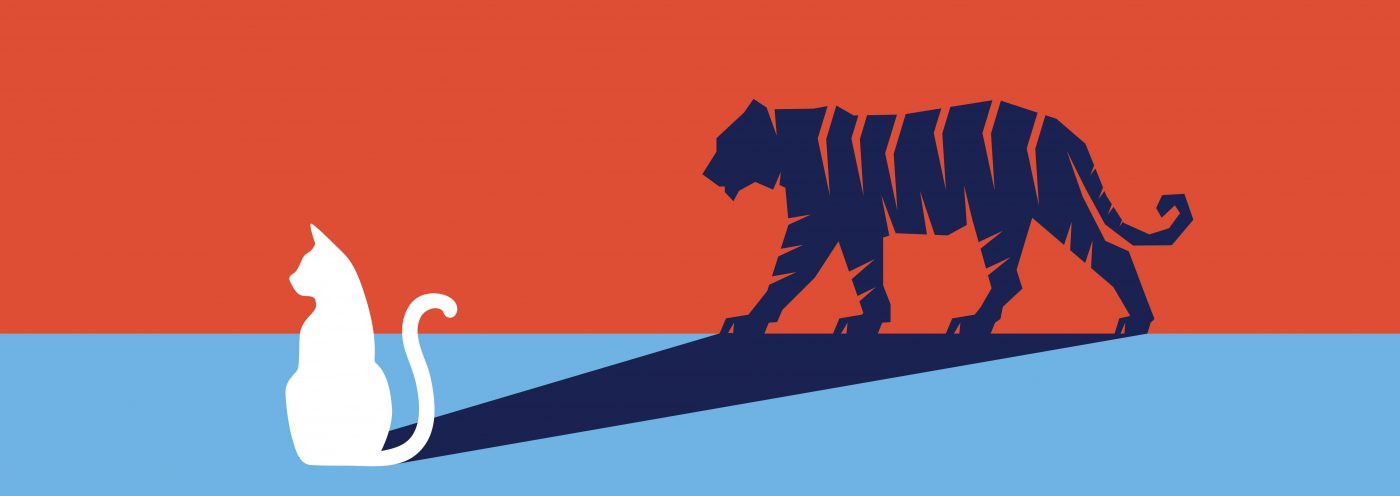
Tigers may be majestic, powerful and handsome, but they have a dark side too. Artists like Abba and Survivor have sold many millions of records about the danger of messing with these growling mega-moggies or people who display some of their characteristics.
It’s a familiar theme that goes way back in time. In 1794, William Blake’s contemplative poem, “The Tyger,” explored the duality between aesthetic beauty and primal ferocity.
The work was published as part of his “Songs of Experience,” but the original tunes for Blake’s poems have long been lost. Countless musicians from Benjamin Britten to Duran Duran have tried to create their own versions of the melodies ever since.
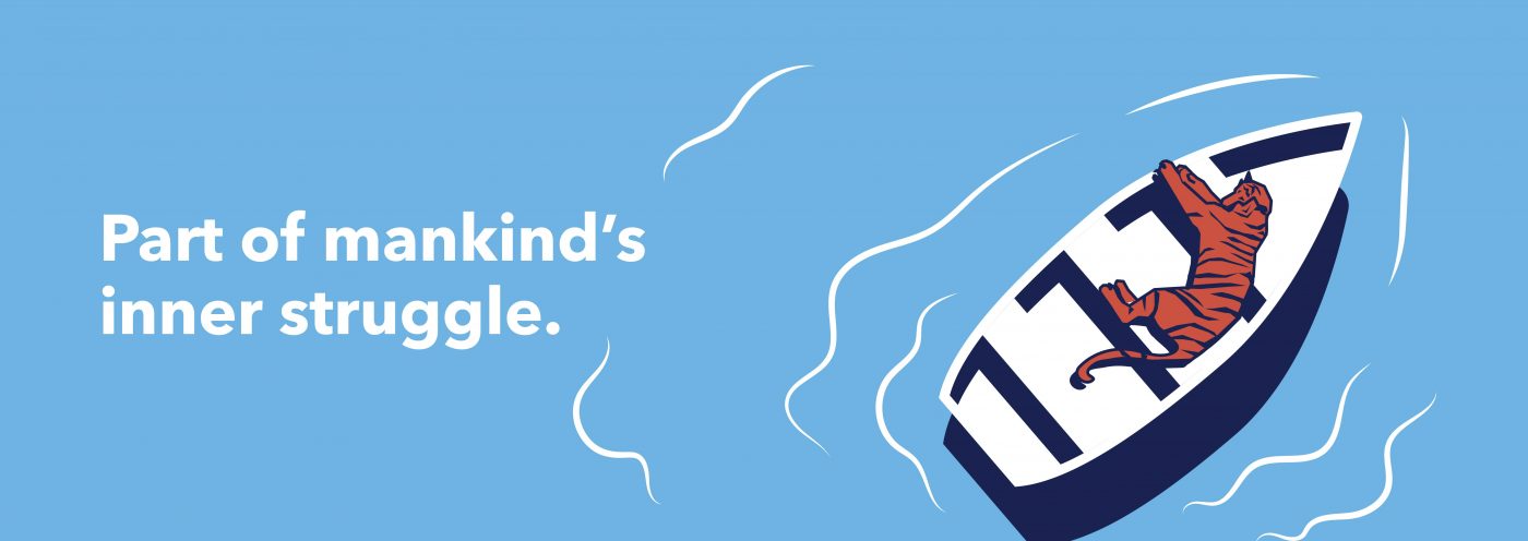
Part of mankind’s inner struggle is based on the concept of the contrary nature of things, Blake believed. Tigers were useful motifs to make the point. Employing a similar technique, Yann Martel features a tiger in “Life of Pi,” making the big cat a central character in the spiritual journey he maps out.
In a mix of humor and symbolism, Richard Parker, Martel’s tiger, is named after the man who’d captured him. It was all apparently due to a clerical mix-up at a zoo with the hunter assuming the tiger’s real name, Thirsty. For the sake of argument, Richard Parker represents what the reader chooses to believe.
When it comes to the most enduring commercial catchphrases ever, tigers have proved to be most definitely worth it. Take “Put a tiger in your tank” as a classic example.
True, it may no longer appear on billboards but it’s stood the test of time. Even if the brand that the slogan was promoting may now be hard to recall, the meaning is still clear as day: using Esso fuel would add some “va va voom” to your driving experience.
In the ‘60s, there was a rush on the fake tiger tails (now collectors’ items) available at participating Esso gas stations as millions of motorists hung them on their fuel caps as mementos. ‘They’re g-r-r-eat,” you might even imagine Tony the Tiger exclaim while munching through his morning bowl of energy-boosting Frosties.
(Incidentally, such was his resemblance to his Esso cousin that, in the ‘90s, Tony was at the center of a legal cat fight between Kellogg’s and the oil giant, by then Exxon Mobil).
Esso’s tiger was cute and cuddly. He served as an ambassador of post-war optimism after years of shortages. Easily identifiable, he gave a face to a product for which brand identity has always been something of a challenge.
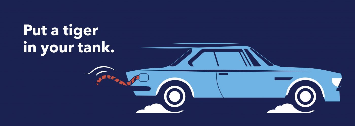
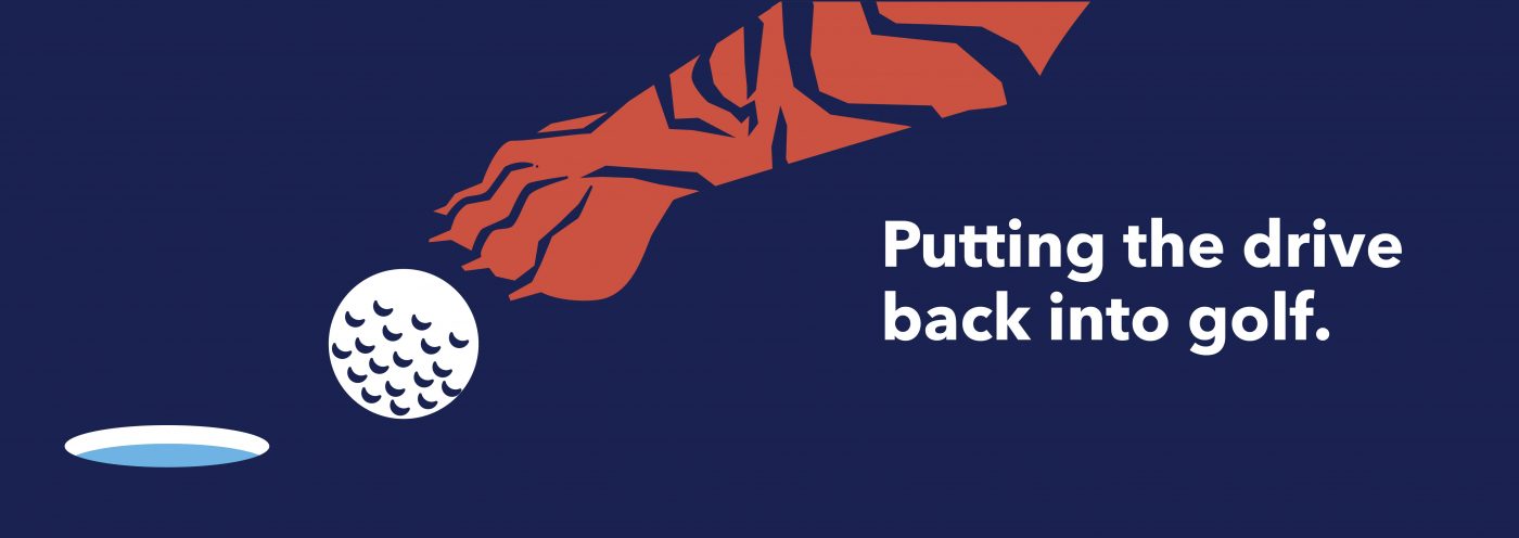
The Esso tiger is symbolic of what we could refer to as the Tiger Woods effect these days. Our sporting hero gave such a boost to golf that the game‘s now become synonymous with maximum athletic prowess.
Metaphorically speaking, he rubbed some much-needed tiger balm into a sport that had for far too long been dominated by white, middle-aged, pot-bellied men. The epic power ballad, “Eye of the tiger,” would now not feel out of place over the opening TV titles of the U.S. Open.
Despite one or two shortcomings off the course, our golfing superstar brought some refreshing beef, brawn and boldness to the fairway. And, the tiger effect has even swept through countries of SouthEast Asia that are experiencing a fiscal boom. The sheer muscle mass, speed and grace of these big cats are part of the reason we’ve coined the term “tiger economy.”
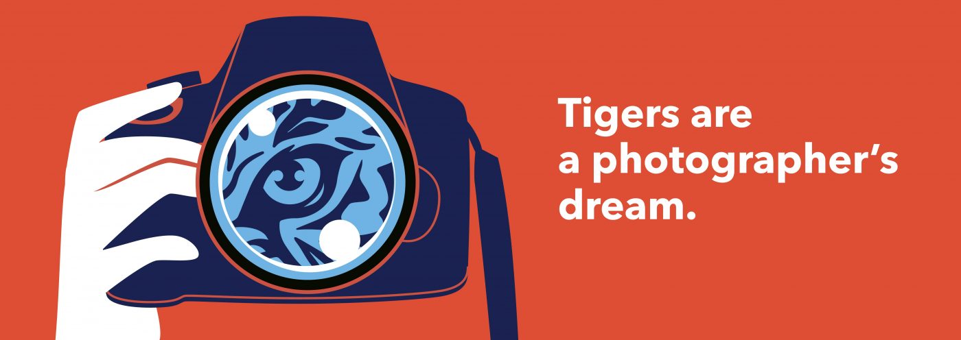
It’s also why tigers are a photographer’s dream. In more recent years, live-action tigers filmed by expert cameramen were used to illustrate the power and energy of Esso fuel.
A modern example therefore of the contrasting themes William Blake made about the big cats is that, back in the day, Esso’s tiger looked so different: like a character from Winnie-the-Pooh, in fact.
Let me introduce you.
“Glad to meet ya. Name’s Tigger. T-I-double guh-er! That spells Tigger,” said Tigger. “Climbing trees? Why, that’s what Tiggers do best! Only Tiggers don’t climb trees, they bounce ’em!”
Basing him on one of his son’s stuffed toys, A. A. Milne made Tigger a symbol of over-enthusiasm and bounciness. The fictional character is similar to one of those Jim Carrey-like friends a lot of us have that we both adore and sometimes wish had an “off” switch we could flip.
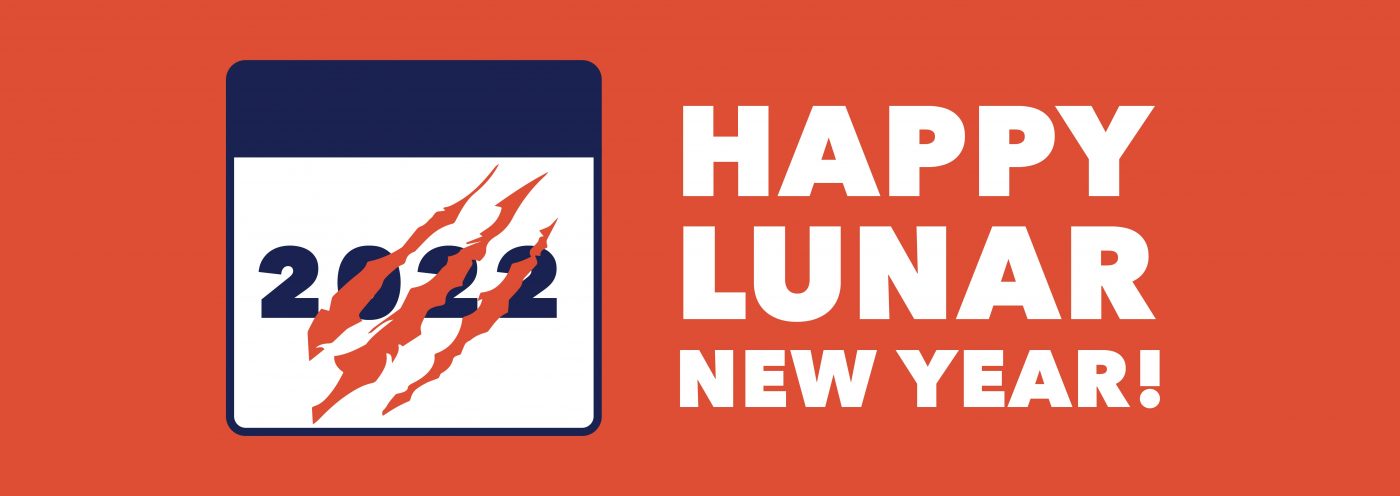
Nonetheless, many of us could probably do with a little optimism at the moment. It’s then perhaps highly appropriate that 2022 is the Chinese “Year of the Tiger.”
Here’s to a year filled with a bit of well-deserved tiger-like fearlessness and chutzpah to get us through the difficult times.
This article was written by Sara Jones, Creative Director, New York.
The next Design Series article will be written and illustrated by CBA Design Director, Chris Martin!

Born and raised in Indonesia, I’m from a culture where shadows have long been places in which mythical creatures and spirits lurk. You wouldn’t want to make these beasties your besties: on the whole, they don’t tend to be very pleasant.
I’ve gone global now and I can see my country’s fascination with creepy, ghoulish figures is not unique. The adoration of Michael Jackson’s “Thriller” video and the obsession with an alleged monster in Scotland’s Loch Ness have turned shadowy figures into star attractions.
So, what makes shadows such intriguing shapes and why are they such an integral part of design? Read on to find out.

TV’s “Got Talent France” introduced some of us to an extreme use of shadows as startling illusions. Contorted performers used their silhouettes to mimic anything from elephants to burnt-out trees.
Their act told a familiar tale of humans choking the life out of those they share the planet with. It also took me back to my roots.
Wayang kulit is a traditional form of puppet-shadow play. This time, shadow artists rear-project puppet figures on a taut linen screen using a coconut-oil light. The stories often have a similar theme of good against evil with the shadows accentuating the mood.

Film buffs will be familiar with this use of shapes and outlines to set the scene and create a little tension in a similar way to those puppeteers on my home turf.
Think of the titles of a 007 movie. Silhouetted gold-painted dancers moving through flames to the sound of a barn-storming belter would not look out of place.
Alfred Hitchcock was a movie genius partly for the way he used light to garner suspense and grip the viewer. Take his masterpiece (and personal favorite, according to his daughter), “Shadow of a Doubt.” Hitchcock uses a lighting scheme with very little fill light.
Gloomy, dim lighting creates the effect of contrasted light and darkness to reflect the duality of moral ambiguity. Powerful shadows blot out parts of the main characters. In one scene, Charlie (Teresa Wright) finds out that her uncle is trying to kill her. Hitchcock shows them in profile, facing each other.
They are lit from behind and with a high-key light source. They, therefore, appear in the depths of darkness. This lighting technique successfully captures her uncle’s wickedness and Charlie’s discovery of his evil.
The darkness of the scene is symbolic of Charlie becoming aware that the world is not always a happy place. It can be dark, cold and bleak. The movie “brought murder and violence back in the home, where it rightly belongs,” the director quipped.

Stage and film are two genres that by their very nature have the luxury of 3 dimensions. They can quickly make clever use of the mood and shapes that shadows can create. When you’re working with a plain sheet of A4 things are arguably trickier.
Trompe-l’oeil or trick of the eye is an extreme artistic technique that often calls on shadows to help out designers working on flat surfaces. It can take realistic imagery and create an optical illusion so that the depicted objects appear to exist in 3 dimensions.
Mind-bending geometric shapes complete with shadows can leap out from the page. They make you want to reach forward and touch their sides to check if they’re real or an illusion.
For less extreme purposes, drop shadows were a one-time favorite of graphic designers. They’re a visual effect consisting of an element drawn to look like something’s shadow. They give the impression that the object lies above what’s behind it.
They’ve developed a reputation for being somewhat overused. That’s partly because digital technology makes it almost too easy to create them. But, made use of wisely, they can add depth and not distraction.

What we refer to as cast shadows appear because an object blocks out the light source. That makes them different from their core cousins. Not for nothing is the shower sequence in Hitchcock’s “Psycho” awash with them.
On top of that, the killer is in silhouette. It all helps with the power of suggestion that this scene has become so famous for. We never, of course, see any actual stabbing, but through visual techniques, we could be mistaken for thinking that we had.
This duality of light and shadow lies at the core of some of the bigger questions of life. Dark sides best locked away, trick or treats, alter egos, good and evil, are all wrapped up in a world of brightness and obscurity.
With the notable exception of Father Christmas, the grim and ghastly tend to assemble at night. Vampires and ghosts simply can’t make a living at times when we’re better able to see them.
As if this wasn’t bad enough, researchers have found that we’re more scared of frightening noises and images at night than during the day, even in a well-lit room.
And that is all great news for Halloween aficionados (as well as for those mysterious things that go bump in the night and scare the living daylights out of us).

This article was written by Donny Marjalis, Senior Designer, New York.
I’m excited to announce that the next Design Series article will be written and illustrated by CBA Creative Director, Sara Jones!

Space is the final frontier according to Captain James Tiberius Kirk. It’s also where countless artists have boldly gone where no artist had dared go before.
Take Edward Hopper. The American’s paintings took spatial awareness to stark, new heights. Some evoke feelings of loneliness and longing that could break the hardest of hearts.
Musicians have long made use of pauses that hang in the air like soaring butterflies. These silent spaces are there to incite a sense of anticipation giving us a moment or two to gather our thoughts and emotions.
Listen to Barber’s Adagio for one of the most crushing, perfectly placed silences in the history of classical music. (Start at 5’30 to quickly take in its beauty).
Designers continue to seize this artistic technique that leaves time for consideration and emphasis. Read on to find out how less can indeed be more.

Imagine brimming with so many ideas that they won’t fit the space of a brief. The temptation is to cut out a few, make a tight fit and be good to go: the fewer grand plans ending up on the cutting room floor, the better for everyone.
That’s one way to see it, but spare a thought for the consumers looking at your creation for the first time. You spent hours crafting your design. They might only have a split second to digest it.
There’s a strong argument for being brave enough to abandon valuable communication real estate by knowing what and how much to leave out. It can be the tipping point that turns a good designer into a great one.

White space, also referred to as negative space, is essentially any area of design that is not taken up by content. This could be anything from vast expanses between different elements to the tiniest bits of space between some letters.
Despite the hint in its name, white space is not restricted to being white or any other color for that matter. It could be a textured surface or even a photo.
Used effectively you can establish a hierarchy in your composition, set a mood and improve readability. With care, you can achieve a harmonious balance that could take a consumer on a visual journey or draw their attention towards a specific element.
It might feel counterintuitive, but harnessing a whole lot of nothing is not wasting space. It can make or break your creation. It’s a fundamental design principle that will either keep the viewer on your page or leave them looking elsewhere, possibly with eye strain.
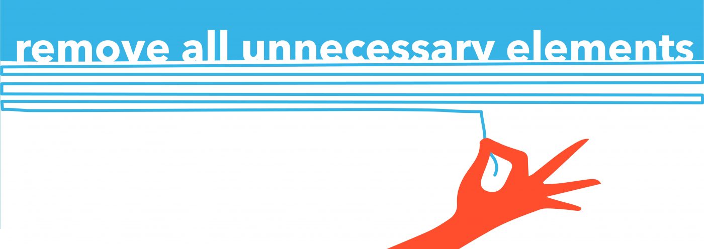
Negatives tend to be balanced with positives. Positive space refers to your subject matter, meaning all the elements that aren’t in the background.
For example, every letter in a block of text is a positive space. To avoid a messy jumble, we call on negative space to bring us much-needed breathing room and to restore balance. Get it right and you’ve achieved a bit of yin and yang.
Just to make things a tad confusing, white space can also be used in an active way to draw attention to a specific element. This could be something like a logo or headline. Taken to a new extreme when used in this way, it began an advertising revolution about 60 years ago.
So, fasten your seatbelts! Let’s take a trip back in time to revisit a piece of design work that put white space firmly on the map and changed the future of advertising and design forever.

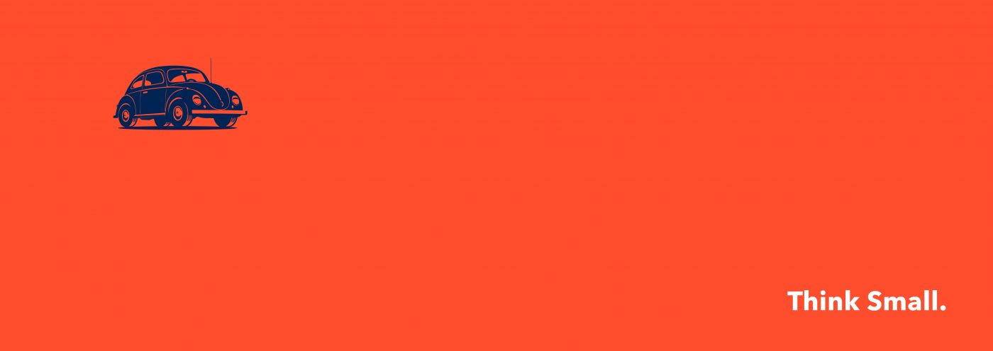
Set your flux capacitors to 1959 because that is when Bill Bernbach of DDB presented Volkswagen with his Think Small campaign idea. It’s regarded as one of the most effective and successful uses of space in design.
He bravely, some might have said foolishly, embraced space to such a degree that he used an ocean of it to surround a minuscule photo of a VW Beetle. This challenged the status quo at the time, ushering in a minimalist design revolution.
The ads caught the coolness of the product so well that people tore them from magazines and stuck them on their walls. It was the start of a new design movement that’s still going on today.
There have been countless negative space success stories ever since.
Take the FedEx logo with its clever arrow between the ‘E’ and ‘x.’ The negative space between these last two letters tricks the eye in a flash. The result is that we are drawn to a symbol conveying the company’s message that it’s super-speedy.
Over the years, IKEA’s ‘less is more’ approach to home furnishings has seen bright colors leap out from the page when set against sparse, Scandi-style wooden flooring. And, Apple’s use of clean, white space on its packaging reinforces a logo now synonymous with luxury, coveted tech.
Vive la révolution!
Staying with the revolutionary ‘50s theme, I was reminded of a controversial three-movement piece composed in 1952 by the American experimental musician, John Cage.
Written for any instrument or combination of instruments, the score, called 4’33”, instructs performers not to play during the entire piece. The work is then made up of the sounds from the environment that listeners hear while it’s performed.
A useful example of what parts of mindfulness are all about, it also reminds us that there will always be a smattering of sound to sprinkle on the aural equivalent of white space.
Apply the same concept to a minimally filled blank page and the light that shines on it. Deciphering its meaning can often lie in the eyes of the beholder. For a designer, the knack is to know what stays in and what stays out to provoke the desired reaction.

Why design trends come and go does, to an extent, depend on how we choose to make use of white space. White space will always be there and so will ever be a fundamental part of any design.
How far we choose to push its boundaries will play a part in keeping us looking fresh and shiny. So, what can we expect to see this year and beyond?
Minimalism continues to dominate, bridging the gap between art expression and lifestyle choices. It cuts through the noise and provides much-needed breathing space so that we don’t drown from an information overload.
Watch out for colorless and muted color designs, optical illusions and the use of geometric shapes trending everywhere. They all showcase the versatility and power of space that is called white.

This article was written by Arturas Janusas, Design Director, New York.
I’m excited to announce that the next Design Series article will be written and illustrated by CBA Senior Designer, Donny Marjalis, on the topic of shadows!
Privacy Overview
| Cookie | Duration | Description |
|---|---|---|
| aka_debug | This cookie is set by the provider Vimeo.This cookie is essential for the website to play video functionality. The cookie collects statistical information like how many times the video is displayed and what settings are used for playback. | |
| pll_language | 1 year | This cookie is set by Polylang plugin for WordPress powered websites. The cookie stores the language code of the last browsed page. |
| Cookie | Duration | Description |
|---|---|---|
| _gat | 1 minute | This cookies is installed by Google Universal Analytics to throttle the request rate to limit the colllection of data on high traffic sites. |
| YSC | session | This cookies is set by Youtube and is used to track the views of embedded videos. |
| Cookie | Duration | Description |
|---|---|---|
| _ga | 2 years | This cookie is installed by Google Analytics. The cookie is used to calculate visitor, session, campaign data and keep track of site usage for the site's analytics report. The cookies store information anonymously and assign a randomly generated number to identify unique visitors. |
| _gid | 1 day | This cookie is installed by Google Analytics. The cookie is used to store information of how visitors use a website and helps in creating an analytics report of how the website is doing. The data collected including the number visitors, the source where they have come from, and the pages visted in an anonymous form. |
| vuid | 2 years | This domain of this cookie is owned by Vimeo. This cookie is used by vimeo to collect tracking information. It sets a unique ID to embed videos to the website. |
| Cookie | Duration | Description |
|---|---|---|
| IDE | 1 year 24 days | Used by Google DoubleClick and stores information about how the user uses the website and any other advertisement before visiting the website. This is used to present users with ads that are relevant to them according to the user profile. |
| test_cookie | 15 minutes | This cookie is set by doubleclick.net. The purpose of the cookie is to determine if the user's browser supports cookies. |
| VISITOR_INFO1_LIVE | 5 months 27 days | This cookie is set by Youtube. Used to track the information of the embedded YouTube videos on a website. |
| Cookie | Duration | Description |
|---|---|---|
| CONSENT | 16 years 7 months 21 days 10 hours | No description |
| cookielawinfo-checkbox-functional | 1 year | The cookie is set by GDPR cookie consent to record the user consent for the cookies in the category "Functional". |
| cookielawinfo-checkbox-others | 1 year | No description |