France
Paris
Switch to your local agency
Retour au menu
Adjusting to life in the midst of a pandemic has me thinking about how much companies, business people, and the general public just take flying for granted and use it exponentially without being aware of its impact on the planet. After reading more about this, I wanted to write this article to put my thoughts into words.
In 2019, the United States generated more than one-third of the global travel expenditure. According to international travel statistics, 1.3 million people travel for business every day in the U.S. alone! We’re always looking for the quickest ways to work and get to places in this forever buzz-ticking world. What if we just paused for a second, and started looking at the bigger picture and started asking ourselves, “Do I really need to attend this meeting in person?” “Can it be done digitally?” “If not, then what alternative to a short flight can I choose?”

I love hopping around and discovering new places. Still, lately, I have realized that there are different (better and smarter) ways of doing this – for example, should I be required to attend a meeting, I could go there by train instead of by plane. I could also consider extending my trip. Let me explain. I am talking about creating more leisure – business and leisure – trips! Why wouldn’t we look at doing the unthinkable, mixing business with pleasure to do the best we can to help reduce carbon emission for our beloved planet? Instead of attending a meeting and flying straight back, why not just extend your stay for a week or two? Considering remote working is the new way of life, you can work from everywhere. Air travel is by far the most damaging way of traveling for our planet. As WWF mentions traveling by train results in a quarter of the greenhouse gas emissions versus traveling by plane.

Mother Nature was happy to see COVID settle in and take over our lives so that she could start breathing again. The virus has now been controlling our lives for over a year, forcing us to figure out new ways of working, which has led to a steep decline in business travel. To give you a few numbers, the spending around business tourism in the G20 area went from 357.9 billion dollars in 2019 to 109.4 billion in 2020. Our work here at CBA revolves around collaboration. Working together is at the core of our business – we work with our clients and not only for our clients. Even before the pandemic, here at CBA USA, we decided to innovate around ways of working by combining remote workflows with Sprint Mode®, our collaborative and agile service that infuses speed into design strategy, creating solutions with maximum efficiency. Sprint Mode™ enabled us to work collaboratively, even when we are not physically together. The lesson is, there are never problems, only solutions!
Sprint Mode® saves a lot of time on both our side and the client’s and enables us to work quicker! Sprint Mode® can be used anywhere in the world to help manage and create much more efficiently by optimizing lengthy processes and avoiding diary clashing! Working with Sprint Mode® helps reduce meetings, as everyone can interact on the platform directly. Therefore, it contributes to lowering carbon emissions, as it reduces the need for business travel. Our planet needs us. Let’s work and travel smarter!

This article was written by Jean-Marc Rinaldi, CEO of CBA USA.
“…a picture paints a thousand words, then why can’t I paint you?”
My Dad would often sing these classic lyrics to my Mom when I was a very young girl, prompting me to perfect my eye-rolling skills.

It’s doubtful that a set of emojis would have been of much use to the writer of these romantic words as he tried to capture the beauty of his true love. 😥
The song acts as a stark reminder that even pictures have their limits. A thousand words might be stretching it, but a simple heart can definitely replace eight little letters.
So, what do these playful pictograms tell us about the world we live in? Read on to find out.
Emojis are a byproduct of the new technological opportunities available on phones and keyboards. Because we can, we do. Their creation was almost inevitable.
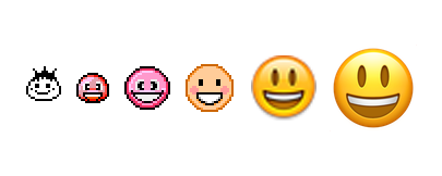
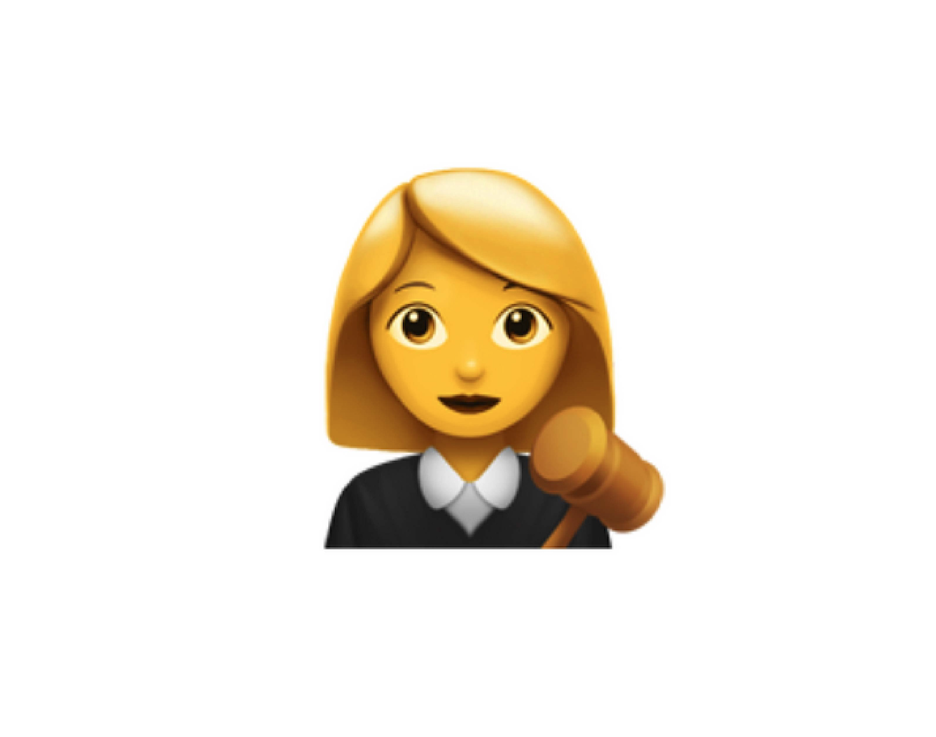
To give their age a little perspective, emojis are a year younger than the first episode of Judge Judy’s TV show.
When it was announced last year that her courtroom drama was to end, her millions of grief-stricken fans were limited to exchanging crying face emojis – there being no hysterical, ululating varieties (yet). The sad face emoji world had never been so busy since the death of Joan Rivers.
Judy Sheindlen may be queen of quickfire one-liners but modern technology is not her strong point. Her loyal sidekick, Officer Byrd, was often called upon to fill her in on the niceties of the digital age which cropped up in the cases she heard. Emojis. Sch-emojis! “Do I have stupid written on my forehead? Case dismissed!”

In Judyland, things are always clear-cut. The kinds of emoji-type images brand Judy could conjure up would be few but definitely extreme.
Emojis, not to be confused with their cousins, GIFs and Memes, may well give us emotional clues when we communicate, but in fact, they come from the Japanese word meaning picture character.
“Emojis increase the precision and nuance of our often super-brief and open-to-misunderstanding communications,” Alizah K. Lowell, Psychology Today.
Suzanne Moore, Columnist, the Guardian, “Winky smiley face. Excuse me if I don’t respond to the puppy, umbrella and fake flowers you send me … I am not six. Send help. Send words.” 🐶☂️💐
Suzanne Moore has a point, but the truth is that many of us don’t have the time or inclination to write exactly what we mean or feel. We’re so often glued to our phones that multitasking has become the norm and some jobs need to be quick.
Texting a pictogram of a thumbs-up, a bottle of bubbly or smiley face 👍🍾 😊 is irresistible while concentrating on the latest offering from Netflix, for example. It’s instant, fast and says what we mean. Job done.
So sophisticated have we become at using emojis that we can be caring, confrontational, passive-aggressive or sarcastic, all at the touch of a single button or emoji. (And, sometimes we don’t even mean to be any of those things.)
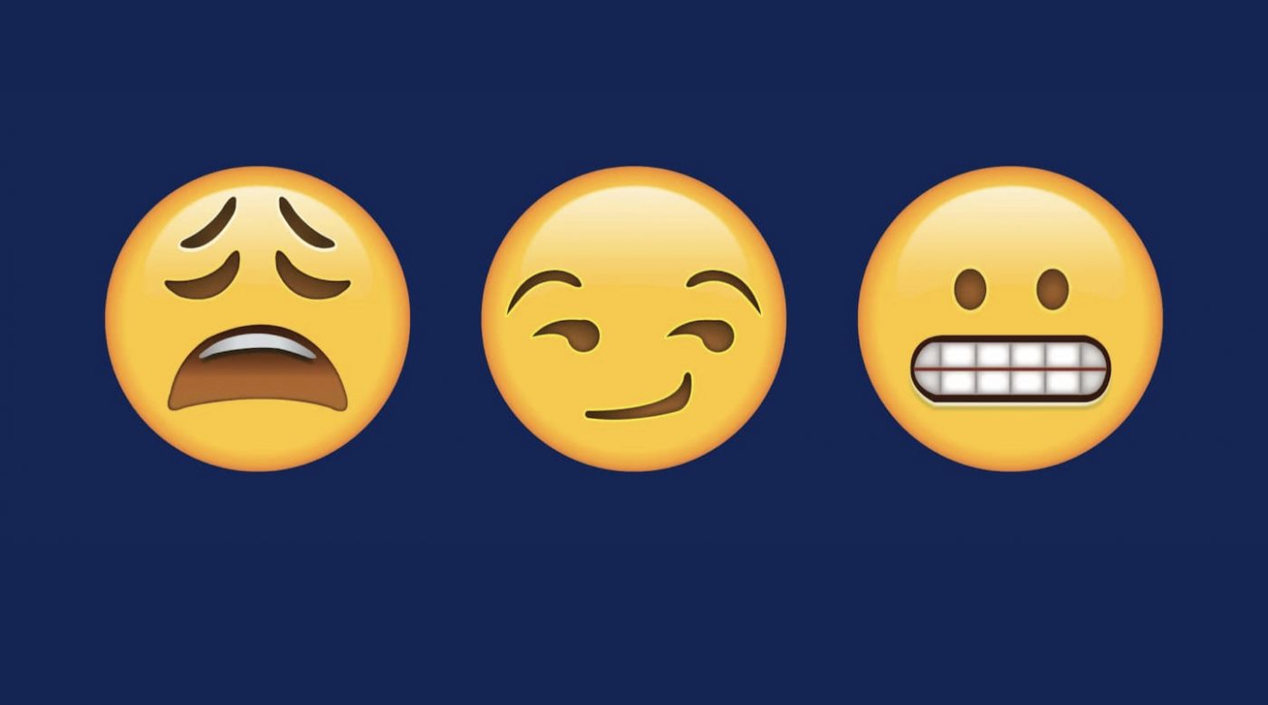
Given their simplicity, lazy artwork appears to be behind the controversy some emojis have caused during their relatively short lives.
“Clotted cream or jam on your scone first, madam?” It depends where you are, of course. Our very British Design Director, Chris Martin 💂 informed me of the war waged between Cornwall and Devon about the right way to make a proper cream tea. It’s as old as the ‘milk in first or last’ conundrum when making a cup of English Breakfast tea. 🫖
In a similar way, some food emojis have almost created international incidents. Users could be forgiven for not being truly grateful for the original cheeseburger emoji Google served up. The company got its emoji chef to recreate it with the cheese on top rather than underneath the patty.
Apple’s first attempt at a bagel emoji was enough to evoke a string of Gordon Ramsey-style expletives. Anemic and plastic-looking, it was replaced with something more realistic, tempting and filled with cream cheese. I’d have added a little smoked salmon myself.

Harmless water pistols have pushed real guns down the emoji pecking order. Even innocent-looking vegetables have found themselves caught up in the controversial world of sexual, emoji innuendo.
Emojis by their very nature are caught in the crossfire of diversity. It’d take a very brave person to try and come up with a range of emojis which fully represented humanity in all its different colors and shades.
The founding father and mother of all emojis is arguably the smiley face. It began with a simple 🙂 in texts and emails long before colorful, designer emojis became de rigeur.
Some researchers claim our brains even process and recognize facial expressions made up of characters in the same way as real ones. Who knows? We might one day start responding to an emoji as we would to a real bottle of red wine or beer. It’d certainly be cheaper. I’ll take two of each, please.
As I was researching for this article, I learned that Fatboy Slim, the international DJ aka Norman Cook, is a smiley face aficionado who’s gathered what’s possibly the biggest collection of smiley fashion items in the world.
The smiley he’s such a fan of was born in Worcester, Massachusetts in 1963 when artist Harvey Ball was asked by the State Mutual Life Assurance Company to make badges that would improve staff morale.
“The first ever 12-inch single I bought was Psycho Killer by the Talking Heads in 1977,” Fatboy Slim explains. “That had a picture of a smiley T-shirt. That was the first semi-ironic use of it – it was everything that punk rock wasn’t.”
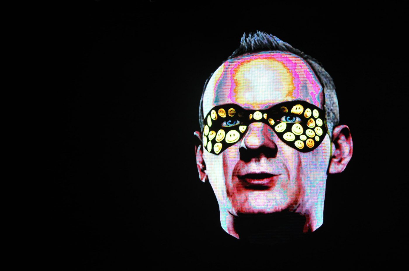
The smiley symbol has been rediscovered by generation after generation. Adopted as both a corporate logo and acid house icon, it’s inspired artists like Banksy and even featured in the noir superhero Watchmen movie.
It’s reassuring to know that during such challenging times modern versions of a happy face are still the most used and most popular emojis.
This article was written by Isabelle Narciso, Designer, New York.
I’m thrilled to announce that the next Design Series article will be written and illustrated by CBA Design Director Arturas Janusas on the topic of space!
They say things come in threes- definitely true in the case of triangles. In fact, that’s just about all we can say about them, isn’t it?
Don’t be too quick to write them off as a three-trick pony. Think about it. When you turn a square on its side, it’s still a square. No matter how many times you roll a circle around, it’s still a circle. Yawn.
Triangles are different. Triangles can spell danger. Barry Manilow loved them so much, he even had a hit with one. Decide your number one from our top fifteen favorite, fun factoids about triangles.

When Pink Floyd released ‘Dark Side of the Moon,’ they didn’t choose a circular or crescent moon shape for their iconic album jacket. Instead, they went for a design showing light refracting through a triangular prism. Why?
The concept was threefold- to flag up the band’s stage lighting and the album’s lyrics as well as to create a design which was simple and bold. Given it almost always features in lists of iconic album covers, the unorthodox design proved a huge success.
Triangles can be metal, musical instruments used for percussion. Often derided as overly simple, Mozart and Beethoven still chose to include them in their works.
Liszt even gave them a solo in one of his concertos. They’ve become an integral part of Cajun and Forró, a Brazilian music style.
British TV aficionados might well remember, or perhaps choose to forget, an ‘80s soap opera called ‘Triangle.’ The action happened on board a sea ferry which connected three European ports- hence the rather unimaginative title.
Anyway, the stilted scripts and corny relationships became the butt of many a joke. The BBC took it all on the chin and even chose to rebroadcast the first episode a decade later during an evening of programming entitled, ‘TV Hell.’
It wasn’t all bad though. Americans might also be familiar with the show’s star- the late, great Kate O’Mara.
‘Triangle’ didn’t harm her career too badly. She went on to play Caress Morell, the scheming sister of Alexis Colby in Dynasty and Jackie Stone, Joanna Lumley’s onscreen sister in Ab Fab.
This is the region in the western North Atlantic Ocean where a number of aircraft and ships are said to have disappeared under mysterious circumstances.
It’s also the title of one of Barry Manilow’s lesser-known hits. The lyric picks up the vanishing theme with the story of a guy who takes a girl to Bermuda only to find that she disappears with someone else. Clichéd? We still love you, Barry.
Let’s start with pizzas. If you want to eat them with your hands, then cutting them into triangles is the only way.
When it comes to iconic candy bars nothing beats the mighty Swiss Toblerone. Its distinctive series of joined, triangular prisms has been satisfying our chocolate cravings since 1908.
Ever wonder why tortilla chips are triangular?
An American couple who owned a Mexican deli in LA during the 1940s used up misshapen tortillas by cutting them up into triangles and frying them.
They became one of their shop’s best sellers. Little did they know that they’d just given birth to what’s become a 22 billion dollar global market.

This 1970s hit for Mary MacGregor was written by Peter Yarrow of Peter, Paul and Mary. It became a global sensation, so much so that the song was translated into a string of different languages.
Those in polyamorous relationships might rightly feel perplexed by this part of the lyric, ‘Lovin’ both of you is breaking all the rules.’ Nonetheless, the love triangle is a regular theme in popular music, particularly country and western: cue Dolly Parton’s ‘Jolene.’
In many parts of the world, triangular road signs warn drivers about potential dangers. These can range from wandering giraffes in Namibia to hippos in South Africa. ‘Humps ahead, Camels may be crossing!’ cries another sign in Egypt.
Triangles aren’t of course inherently dangerous to humans. They’re just the shape of choice to draw attention to danger by association. It could be that squares or circles are softer to the eye than their triangular counterparts.
Triangles feature heavily in Cubist art. The concept of reducing an image to a limited number of geometric shapes such as triangles grew out of the Cubists’ quest for simplification.
Check out ‘Still Life with Flowers’ by Juan Gris. This 1912 painting is famous for the stylistic use of triangles and overlapping planes that come together to form a scene of serene and humble beauty.
Now a symbol for lots of LGBTQ identities, it was once a badge of shame. The Nazis used it to identify gay people in their death camps. Activists reclaimed the symbol in the 1970s in their protest against homophobia.

Civilizations across the world have long built these structures which feature a series of triangles. The largest by volume is the Great Pyramid of Cholula in Mexico.
You’ll find the most famous pyramids in Egypt. Legend has it that the sun god Ra, father of all pharaohs, sat on a pyramid-shaped mass of earth which had appeared from the sea. The pyramid’s shape is thought to have symbolized the sun’s rays.
Modern architects love the triangle too. For many, it is the strongest symbol, capable of holding its shape, with a firm base and providing immense support.
This is the region where the borders of Laos, Thailand and Myanmar come together. It all happens at the confluence of the Ruak and Mekong rivers.
The Golden Triangle covers an area bigger than Texas and has become one of the world’s most famous tourist hotspots. There are plenty of golden Buddhas to see and luxury river trips to be taken.
The popular Old Opium Museum, located in the centre of Chiang Saen, is well worth stopping off at. It offers visitors an insight into the opium trade which was once rife in the region.
This is the symbol of modern Jewish identity. Its shape is that of a hexagram made up of two equilateral triangles which also appears on Israel’s flag.
It all goes back to the Biblical king and his legendary ‘shield,’ although there are more complex interpretations of the symbol based on the beliefs of Jewish mystics.
The symbol had many former lives as a motif for various organizations throughout history which were not exclusively religious. It was also used in Christian churches for many centuries long before its first known use in a Jewish synagogue.
To a triangle, all other shapes are pointless.
The obtuse triangle is never right.
What kind of triangle is a tortilla chip? An i-salsa-les triangle.
Why is a Toblerone shaped like a triangle? So that it’ll fit inside the box.
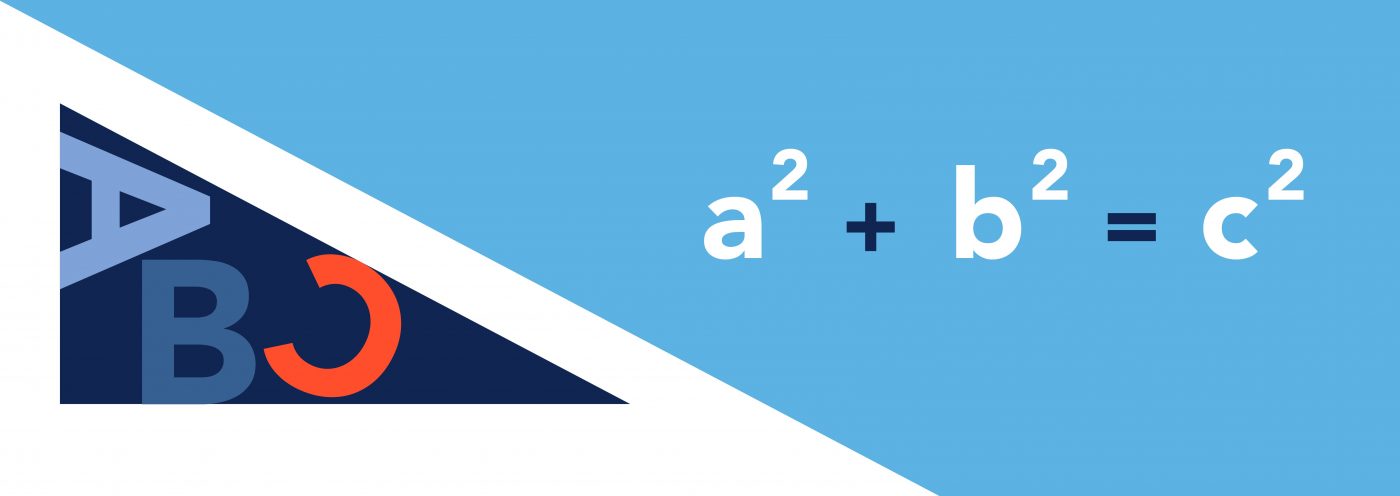
It’s right up there in the top ten most famous mathematical theorems. Pythagoras was an ancient Greek mathematician and philosopher born around 570 BC.
He’s probably best known for his theorem: in a right-angled triangle, the square of the hypotenuse is equal to the sum of squares of the other two sides.
Although he had a clear penchant for triangles, it didn’t color his better judgment that the world was in fact round.
In the Christian faith the triangular shape is associated with the Holy Trinity. That’s the unity of the Father, the Son and the Holy Spirit.
The triangle is used as a symbol for lots of other trinities too. These include heaven, hell and Earth as well as mind, body and spirit.
In sacred geometry, it can mean balance, harmony and completion. Rising upwards, it elevates us to higher consciousness.
So there you have it. One thing you can say about triangles with conviction is that they’re very useful.
They can take us to a higher place, alert us to danger, and we can even play them as a musical instrument. My personal preference is to eat them!
This article was written by Katie Dorrian, Senior Designer, New York.
I’m excited to announce that next month’s article will be written and illustrated by CBA designer Isabelle Narciso on the topic of emojis!
He’s Coming to Take You Away, Ha-Haaa!
There’s nothing like a semi-colon or comma in the wrong place to make some people’s blood boil. Never more true than in the case of a man in the English city of Bristol who became known as the Apostrophiser.
He’s the self-styled grammar vigilante who spent almost a decade tidying up the punctuation on store fronts and street signs.
His identity’s never been revealed, but he was known to creep around in the dead of night on the lookout for offending apostrophes. Armed with a long-handled homemade device and stepladder, he reached the highest signs to add in, or erase, any offending punctuation marks.
One of the signs which really rankled him was above a nail shop which bore the name, “Amys Nail’s.” In a secret interview, the Apostrophiser explained, “It was so loud and in your face. I just couldn’t abide it. It grates.”
He also managed to sort out “Cambridge Motor’s,” even receiving a ‘thank you’ from the owners for his efforts.
You might well be right in thinking that the actions of our Hyphen Hero were illegal. Perish the thought. His defense was unapologetic, “I’m sticking on a bit of sticky-back plastic. It’s more of a crime to have the apostrophes wrong.”

The antics in Bristol are extreme, but there may be more going on than we think in the brains of those who go round correcting other people’s grammar. Researchers are calling it Grammatical Pedantry Syndrome, or GPS.
We know there’s a FOXP2 gene which could be behind lots of grammatical issues people grapple with. These include difficulties making complex sentences or constantly deploying the passive voice.
Well, wait for it. There’s now evidence that a gene variant, the FOXP2.1, could cause us to become obsessed with correcting other people’s grammar. (Or, should that be correcting the grammar of other people?) And, btw, I’m right to put the question mark before the bracket in this instance, although I did have to check.
It’s not a far cry from the types of episodes caused by Obsessive Compulsive Disorder.
Those most affected can take some comfort from the researchers involved. They concluded the compulsion to fixate on grammatical complexities is “more socially acceptable than repetitive hand washing, the incessant touching of doorknobs or refusing to step on sidewalk cracks.”
Phew!

So let’s dig a little deeper into our punctuation pals. Officially there are fourteen of these little suckers in English, from commas to colons. Some have caused huge controversy with the humble hyphen almost sparking a war in Europe.
Czech and Slovak politicians had long been embroiled in what became known as the Hyphen War. In the final years of Czechoslovakia back in the early ‘90s, things came to a head.
To cut a long story short, the Slovaks wanted the same star billing in the country’s name. Nothing less than Czecho-Slovakia was going to do. In the end, the issue was resolved when the two equals peacefully went their separate ways and two republics were created.
There are few punctuation issues that ruffle more feathers than that surrounding the Oxford comma. To be or not to be, that really is the question.
It’s been a controversial, divisive, and painful saga. Or, should that be, “It’s been a controversial, divisive and painful saga?” You tell me, or, on second thoughts, please don’t.

There may be only fourteen official punctuation marks, but punctuation imposters are creeping in. Be alarmed, be very alarmed because one of them, the interrobang, looks to be here to stay.
For the purists out there, this exclamation/question mark hybrid is nothing short of sacrilege. Its very presence has cheapened punctuation stock value.
For others, the interrobang is a refreshing, clever combo. If you’re even at all dramatic, you’re likely to crave using it at least once a day. One student at Newcastle University in the UK agrees.
Along with others, she was recently asked to give her thoughts about her punctuation favorite. Here’s a sample of what she and a few of her peers had to say:
Isn’t the Interrobang the Ultimate Punctuation Mark‽
It’s bold. Observe as the supple curve of a ‘?’ juxtaposes the jutting confidence of a ‘!’. An elegant combination of two splendid punctuation marks, the interrobang helps you through written situations where you want to express excitement!! but also maybe hesitation??
Maud Webster

The Best Punctuation Mark Has to Be the Semi-colon.
I dare not think of any better way to separate my flamboyant shopping list. Not only does the semi-colon hold such a necessary purpose when writing, it is a beauty to hand-write itself. It’s like two-in-one; a full stop and a comma. The satisfaction I get after using a semi-colon is next to none!
Meg Howe
Ellipsis: the Sexiest of the Punctuation Marks
Flirtatious and alluring, the ellipsis leaves you wanting… These three dots say so much by saying nothing at all. A very […] omission. A charged silence. A pensive… pause. Leave it to the imagination, says the ellipsis. There’s nothing pretentious here, no finality or !!! drama — brevity or ??? interrogation. Just a little moment to sit and wonder what could have been. Or what will be…
Ella Williams
The humble comma is an unlikely candidate for the greatest punctuation mark, or so you may think.
Which other, however, can render the subtle rhythms of speech with such elegance, such grace? That little flick can make the clumsiest list flow smoothly, or break up overlong sentences with a mysterious pause, like so. Always charged with the promise of another clause, the comma brings hope where other, inferior punctuation marks (., !, ?, etc.) bring misery.
Peter Bath

What these students have done is bring to life a bunch of innocent dots and dashes. They’ve used humor to remind us that being pedantic can sometimes mean we overlook the artistic impact punctuation can have.
Go forth, I say, free yourselves up by scattering these marks far and wide. And, take a tip from the Spanish. ¡If a punctuation mark’s worth using once, it‘s worth using twice!
This article was written by Rutger Thiellier, Executive Creative Director, New York
I’m excited to announce that our Senior Designer, Katie Dorrian, is going to put together next month’s article. She’ll be revealing the secrets behind the magical shape of the triangle.
Picture it. An excited crowd awaits the diva. She puts down a glass of Champagne on her dressing room table and takes one last look at herself.
“Mirror, mirror on the wall, who’s the biggest attention seeker of them all?” She pouts her shiny red lips, smiles and then whispers, “Why you are, of course.” Her fans roar in eager anticipation.
A quick Google search and you’ll see that Taylor Swift’s apparently taken top prize in the international show-off category. It should come as no surprise then that her favorite color is red. It’s a smart choice.
Why? Sit back, and find out how this hot, fiery temptress of a color has become a number one attention grabber.

When we’re babies, red is the first color that any of us ever see. We’ll go on to recognize the full color spectrum aged 5 months.
It may not have always been this way. Scientists believe there was a time in early human history when we could only distinguish red in a world of black and white. This could have helped our ancestors do things like spot ripe, red fruit or potential dangers.
It might also partly explain why the color red has so many cultural associations and why it provokes the strongest of our emotions.
Chromology, or the psychology of color, is used when designing anything, from hotel bedrooms to cookie packages. So, can colors really affect a person’s mood?
‘Absolutely they can,’ psychologists have long argued. Understanding why this is the case is more complex.
Although color perception may be influenced by cultural conditioning, there are some broadly agreed connections between colors and emotions whatever their cause.

Early cave dwellers adorned their walls with scenes painted using red ochre. It was far cry from the luxurious, saturated shades of red such as Vermillion, Crimson and brilliant Cadmium used by renaissance painters.
Some of their most expensive red paints, made from the crushed scales of insects like the kermes beetle, were used to attract the attention of art admirers.
Over time, a myriad of reds have become symbols of power and influence for royals and church leaders alike. There’s even a correlation between more dominant male mandrill monkeys and the brightness of red colors which cover parts of their body.

“Bright reds, scarlet, pillar-box red, crimson or cherry, are very cheerful and youthful. There is certainly a red for everyone.” Christian Dior was right about that.
Wearing red is a head turner- think of Scarlett O’Hara’s red party gown in ‘Gone with the Wind or the glamorous red dress Julia Roberts wore in ‘Pretty Woman.’ Would Dorothy’s iconic slippers in ‘The Wizard of Oz’ be so memorable if they hadn’t been red?
Psychologists have found that women are perceived as more attractive and sexually desirable when wearing red, sentiments echoed by Chris de Burgh in his ‘The Lady in Red.’
Somehow red causes a voyeur to prefer one potential candidate over another in the love stakes.

Red increases our heart rate and can also raise our blood pressure. Drivers who get blocked in traffic by a red vehicle react more quickly and aggressively than those obstructed by cars of other colors, for example.
Red also heightens our metabolism and can make us feel more hungry. You’ll find that most global fast-food giants use red to market their products. But, there’s another reason why they do this which lies at the heart of why red is such an attention grabber.
Here’s the scientific lowdown. Objects don’t have color, they emit light which appears as color in our brains. That color is determined by the frequency of the light, red’s being lower than the others. This affects our perception of red and makes it stand out more.
It’s not hard to see then why red would be a good choice for a department store’s ‘Sale’ signs, a fire extinguisher, a London bus or indeed anything we want noticed.

Red might also give us a competitive edge. Scientists at Durham University found that men who wear red clothes send out a signal that they are angry and aggressive, in much the same way as if their face had reddened.
“We know that the colour red has an effect on the human brain,” one of the researchers explained. “This is embedded in our culture, for example the idea of wearing a red tie, known as a ‘power tie,’ for business, or issuing a red alert.
“The implications are that people may wish to think carefully about wearing red in social situations and important meetings, such as job interviews. Being perceived as aggressive or dominant may be an advantage in some circumstances but a disadvantage in others, for example where teamwork or trustworthiness is important.”
If you’re a risk taker, you’re likely to prefer using red poker chips, perhaps because the color’s become synonomous with dominance and winning.
The color red is an archetypal color; it is the first color humans mastered, fabricated, reproduced and broke down into different shades. The color red itself is a social phenomenon more than a physical material or a component of light alone.
Rich in its chromatic shades and cultural context, red will forever impact us as humans and alter the way we see things in the world around us – continually evolving our socio-cultural perceptions and the meaning of our lives.
Whether red’s properties have become embedded in our psyche because of our genes or experiences, they’re associated with survival, power and influence; all things that run as deep as the red in our veins.
We hope you enjoyed this insight into our love affair with the color red. Stand by for next month’s edition of CBA’s design series when we’ll be bringing some glamour to the ins and outs of punctuations.

The word “fail” or “failure” is perhaps too directly linked with a lack of success. By definition that’s exactly what it means, but must it lend itself to such finality? Some industry pioneers don’t necessarily think so. Leaders in creative, innovative, and inventive industries are embracing failure as an essential part of the process. However, there still remains a large contingent of fail-fearing people who stubbornly adhere to the antiquated adage, “Failure is not an option.”
The truth is that small failures have become not only an option, but often the impetus that unleashes extraordinary thinking, unconventional approaches, and more frequent success stories. The fear of failure is what boxes us in, causing us to second guess out-of-the-box ideas.
In the world of design, succumbing to this fear produces the predictable and grants us permission to recycle old ideas or “borrow” from others’ breakthroughs. This is what allows for, if not encourages rigidity and conservative approaches. To fear failure throughout the creative process is to shy away from being adventurous and creating something truly unique. And in today’s ultra-competitive, oversaturated environment that is the ultimate failure.

Speed as it relates to performance is valued now more than ever before. It’s more efficient (and effective) to keep thinking, keep moving, keep doing than to get hung up on getting it right the first (or second) go around. But it’s also important to pump the breaks and investigate the reason behind a minor failure. You may even end up realizing something you would’ve never even considered. Planning for and allowing for little failures along the way enables employees to work faster, liberating them from the time-consuming quest for perfection.
Agencies and companies alike must be conditioned to work in small iterations— assessing why an idea isn’t working and pivoting to see where the next one takes us. We must foster a safe-to-fail environment in order for a more fearless mentality to take root. We must shift the line of thinking to view little failures as opening doors, not closing them. After all, sometimes being wrong is what gets you to right.
Just think, if you were given a license to fail, wouldn’t you feel free to experiment with new methods, strategies and processes? Wouldn’t you feel empowered to explore uncharted directions? Wouldn’t the creative process be more productive, more collaborative, more explorative?
Of course failure is not a mission, a purpose or a value, but accepting it from time to time can build a culture of confidence, and achieve better results. Today, cooperation-oriented organizations aren’t looking for scapegoats or justice when something fails, but inquiring to learn from their “mistakes” and share the risk. These safe-thinking zones are the ones that implement novelty and ultimately succeed. Failing after investing tons of time and resources is what causes heads to roll.
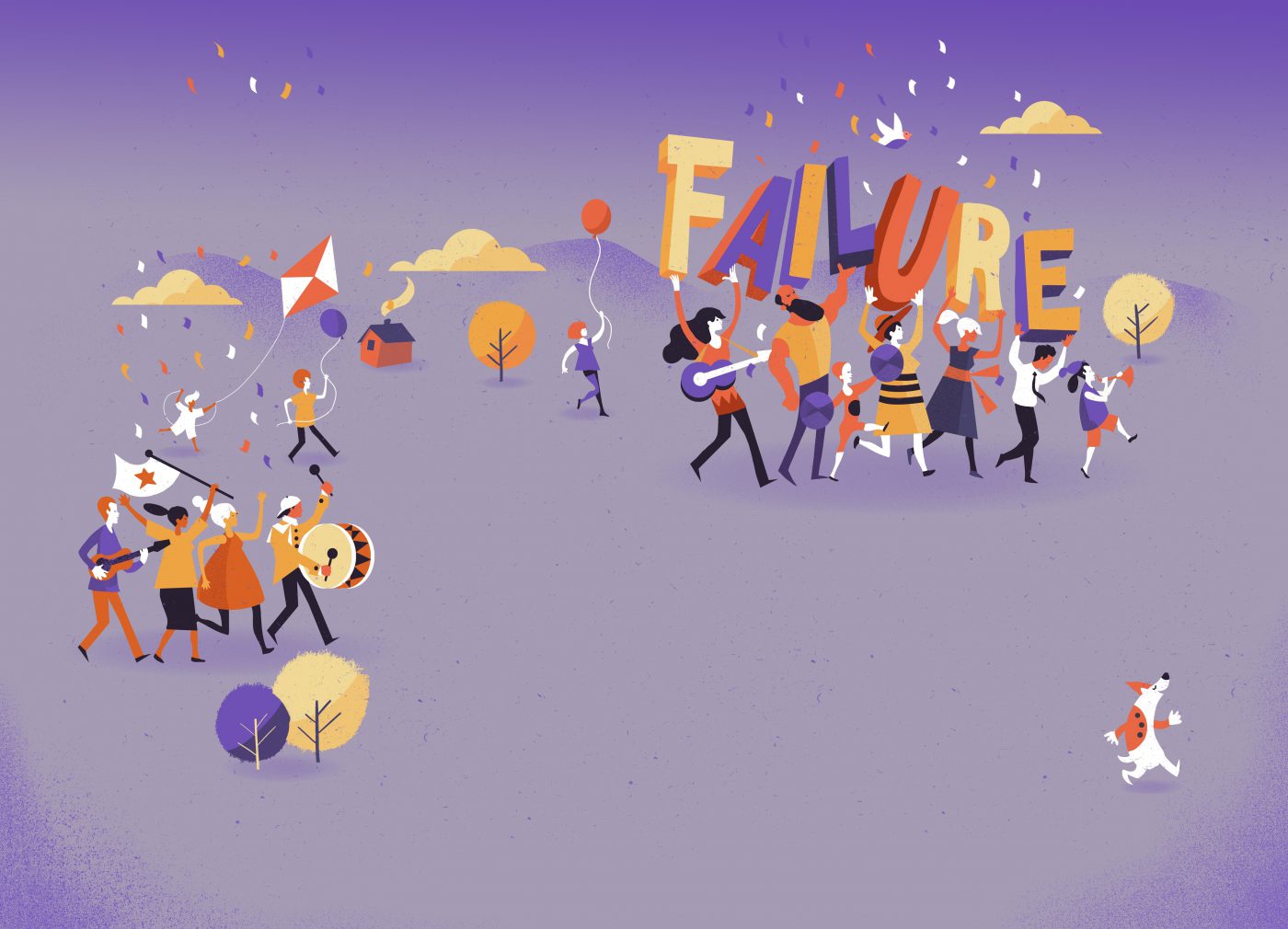
I like to practice what I preach, which is why I’ve always encouraged our team members to try bold, new approaches and different ways of working. At cba we like to test experimental practices out as Minimum Viable Products in partnership with willing clients. When applying one on a project, we exercise full transparency as to its prototypical nature. We’ve also fully embraced the Design Sprint Methodology developed by former Google Venture design partner, Jake Knapp. He captured this novel approach in the NY Times Bestseller SPRINT (here is a brief video synopsis of the book if you’d like to know more). I, along with key team members, have been fortunate enough to be trained by Jake in facilitating Design Sprints.
The great thing about SPRINT is that after a short period of time, you’re able to test your ideas in front of consumers. Even if they don’t take to an idea, it’s still useful learning. You can either tweak the idea and try again or abandon the idea and move on. Regardless, you haven’t spent five months striving for perfection only for it to be shot down in Quant testing.
If you want to know more about how we run Design Sprint and how we have adapted to more traditional branding project to act faster in SPRINT MODE you can find more information here.
Lastly, I’d like to leave you with a personal favorite quote by the renowned football coach, Paul Beard Bryant: “When you make a mistake there are only three things you should ever do about it : admit it, learn from it and don’t repeat it.”
Jean-Marc Rinaldi is CEO and Founder CBA USA.
TECHNOLOGY FOR BRANDED EXPERIENCES: FRIEND OR FOE?
In an ideal world, a brand has a story to tell. As strategists, we explore the means to tell those stories and seek to integrate exciting new ways to make them come to life. There has been an influx of tools and toys like VR, AR and even AI that brands can use. But, do those tools shape storytelling? Do they tell stories in a different way? What makes a tech-enhanced story… well, still a story? Beginning, middle and end? Protagonist versus antagonist? A heart-wrenching climax followed by a bittersweet resolution? Someone to root for? Where has storytelling been? And where will it go?
These are the questions we asked ourselves at the end of our visit to the Future of Storytelling’s pop-up, the Story Arcade.
A TRIP TO THE STORY ARCADE
For the month of April, Future of Storytelling hosted a pop-up experience, a Story Arcade featuring 8 exhibits with VR, AR, haptics, AI, and more. The premise promised cutting-edge technology combined with compelling storylines in order to transform audiences from passive spectators to active participants. Intrigued, we decided to pay the Story Arcade a visit.
Overall, the Story Arcade showed the far-flung boundaries of VR and tech-enhanced experiences. The impact of each experience was, however, a mixed bag. There were some exhibits that pushed our senses. “Cosmic Sleep” found us trapped under a blanket of haptic sensors that gave us a sense of the solar heat and space frost experienced by a comet.
“Jurassic Flight” gave us the ability to fly like a pteradon, pairing VR headsets with a full-body flight simulator, complete with fans to really drive home the sense of flying through a prehistoric landscape.
“Algorithmic Perfumery” demanded we fill out a lengthy quiz and in return an AI system concocted an original perfume catered to our personalities. The resulting scent was unique to us, with its own name and own recipe. Whether or not we liked the resulting scent was a different matter.
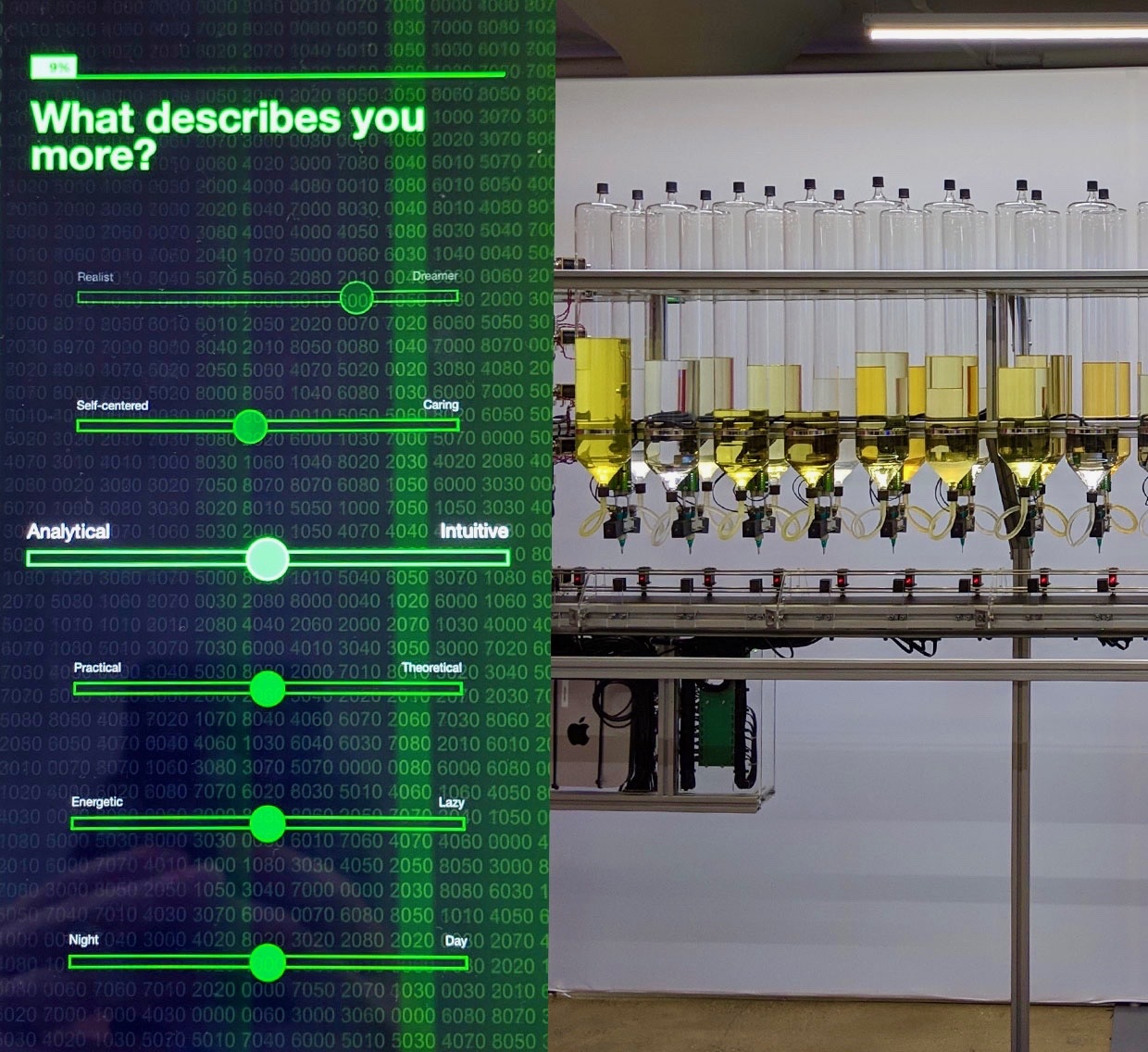
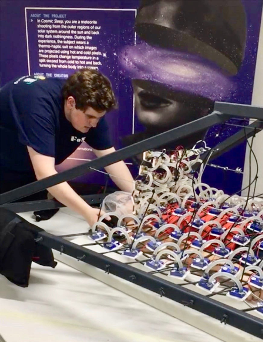
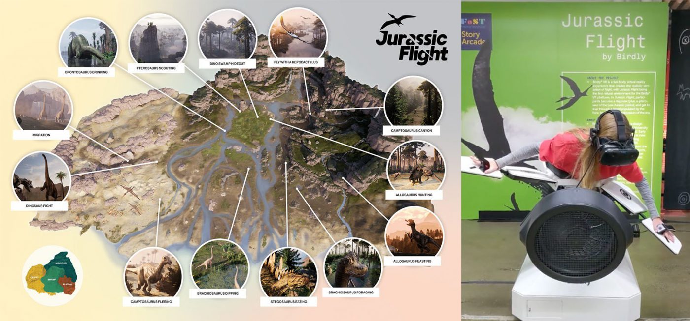
But those exhibits pushed only our senses. They delivered on little else. Take “Jurassic Flight” as an example. Did we feel the struggles or desires of a pterosaur? Would smelling the prehistoric fauna or feeling the Jurassic humidity have made us appreciate and connect with the life of these otherwise unknowable creatures? The answer is: probably not. We walked away from the exhibits feeling a bit dazzled, a bit disoriented, and a bit empty. Instead of leaving us with a vivid memory, we were left with a vague impression of VR technology.
This isn’t to say that all the exhibits left us feeling like we’d eaten empty carbs. There were some that genuinely moved us, even to the point of tears.
A standout was “Munduruku: the Fight to Defend the Heart of the Amazon.” Visitors were led into the world of an Amazonian tribe fighting against the ongoing deforestation of their home. The story became reality not because of the VR headset, nor even for the powerful scents of their ecosystem that were released in the pod.
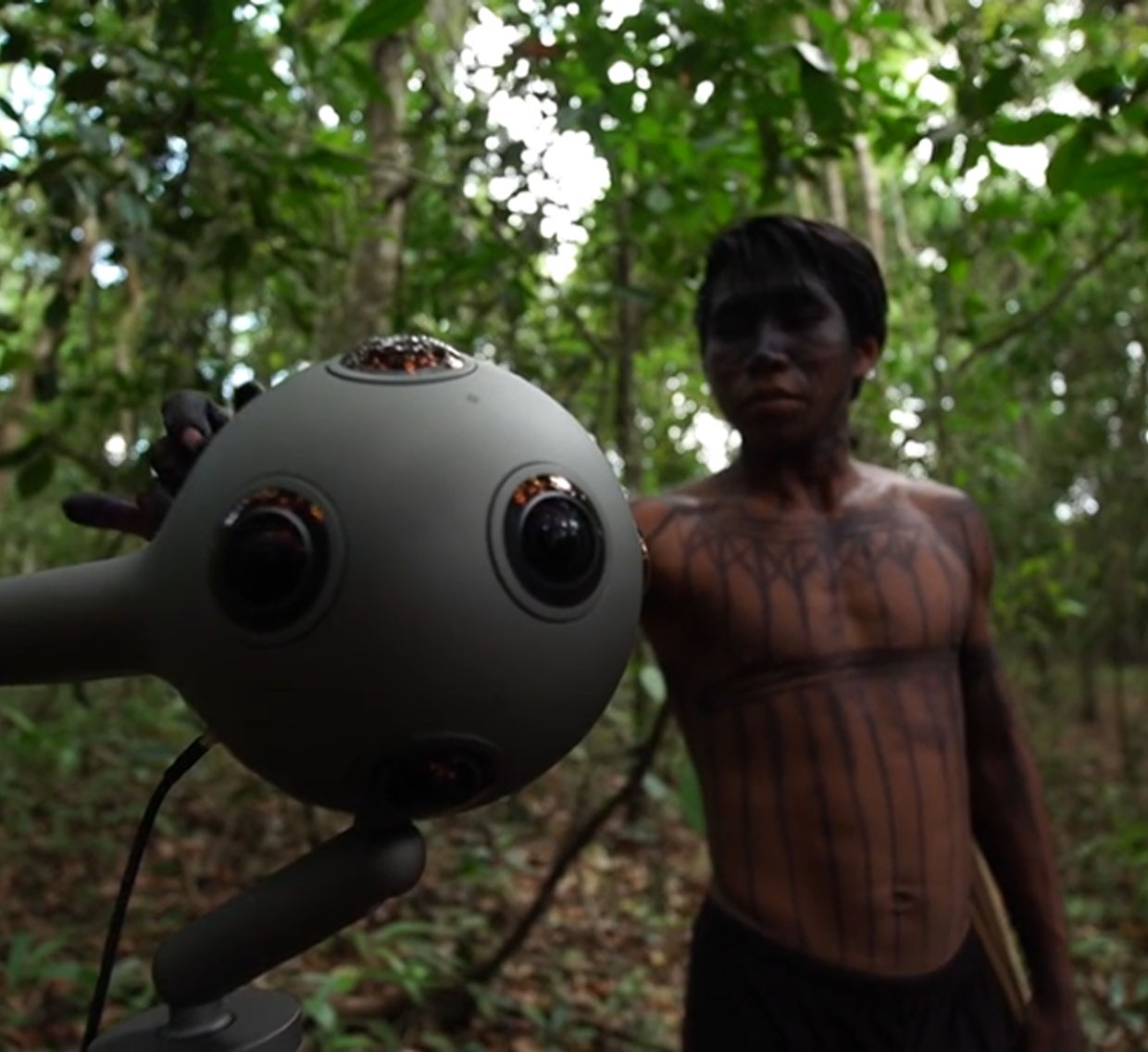
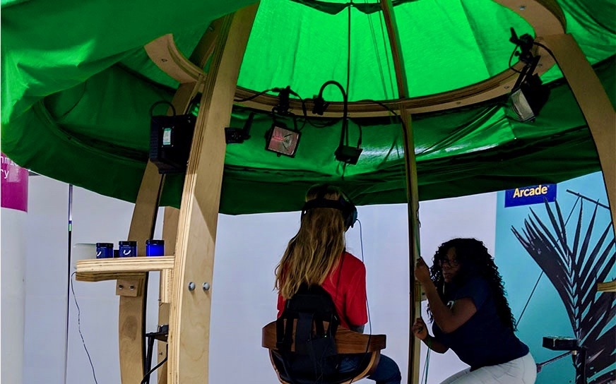
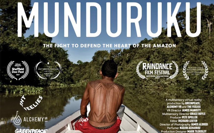
Narrated by the chieftain of the tribe, Caique Suarez Saw Munduruku, the film showed various aspects of the tribe’s daily life. We saw where they eat and were given a hot cup to simulate an active participation. We saw how they worked together to harvest root vegetables, understood the importance of their collective mindset, and then were treated to the aroma of the Amazonian rainforest during harvest season. We were shown the importance of the Munduruku’s ecosystem to their daily lives, but also were imprinted with the responsibility these people have to protect the Amazon.
The technology of this exhibit was impressive, there is no doubt about that. Although technology was very present in this multisensory, enhanced experience, it was only a fully-immersive and transformative success because it had other qualities. It had stakes. It had something that we as audience members could invest our emotions and hopes in. It showed struggle. It showed connections. In short, it had a story.
The Story Arcade was fascinating and well worth the visit. Successful storytelling has long engaged the senses. Tools like VR, AR, haptic sensors, and more only serve to enhance a story, to bring it to life in new ways. Without a story at the core, the tools are just entertaining gadgets that are quickly forgotten.
EXPERENTIAL MARKETING RULES EVERYTHING AROUND ME
This is exactly what we want to avoid in branded experiences. Experiential marketing has quickly become the norm when it comes to consumer engagement efforts. The goal is always the same: how can we get consumers to remember our brand?
At the Atelier Beauté Chanel, the story is lived, not told. When it comes to storytelling, Chanel has quite the mythical history to tap into, but it chose to anchor its experience in a very real present dimension: a showroom for consumers to try on all Chanel skincare and makeup products. Technology occupies a central role in this journey, although it assists rather than instructs. Upon entering the showroom, consumers sign in on their mobile browser, and as they stroll through the different stations (Cleansing, Primer, etc), they can find each product on their phone, “like/dislike” them, as well as seamlessly add them to a shopping cart. The web page also acts as a guide with detailed notes on every station. As a result, the technology does not overwhelm the brand’s unique vision. Rather, it facilitates storytelling by bridging the brand’s imagination with its real-life products.

When the brand can build a whole showroom and design an immersive experience with multiple touchpoints, the result is most likely going to be successful. But personal VR headsets provide brands with the opportunity to engage with consumers from the comfort of their own home while still providing a branded experience. Ikea’s VR Kitchen Experience, available on the Steam store, lets users fantasize about endless possibilities for a kitchen’s design and layout, allowing them to test all basic kitchen features. It’s a virtual playground for adults with dreams of the perfect kitchen. The story told here is one of convenience, accessibility, and putting the human back into home furnishing solutions. This is the core narrative for IKEA, but translated for the in-home experience using VR as a tool, not a gimmick.
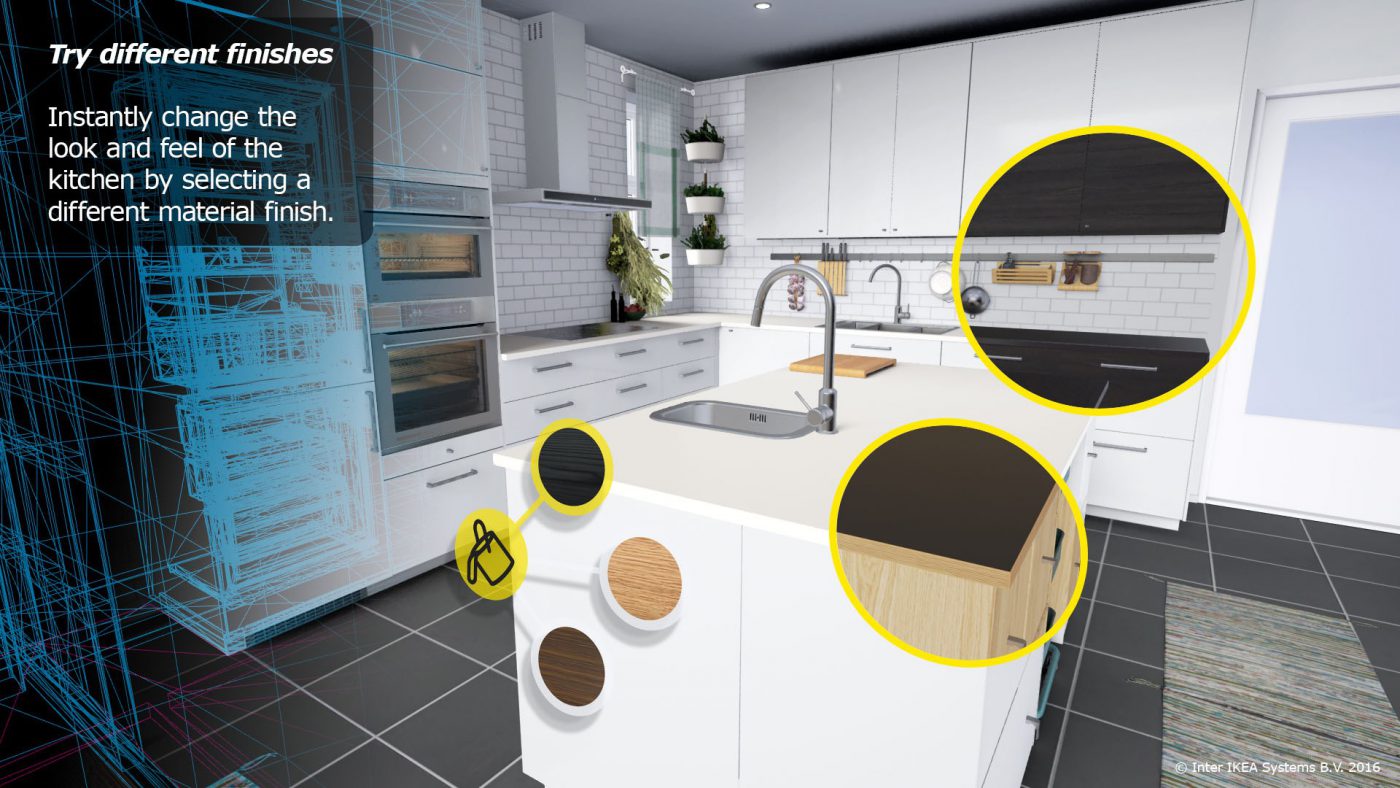
More than a glimpse into the brand universe itself, both the Chanel Atelier Beauté and the Ikea VR Kitchen let the consumer see their own personal world and daily routine, whether it’s beauty habits or kitchen renovation dreams, through the brand’s perspective. These brands encourage consumers to play, to explore, and to find new depths in the story of Chanel and IKEA. When exiting the Atelier or putting down the VR headset, what remains is an enticing, extraordinary reality that feels like it stepped out of the brand’s imagination. What makes all of these examples work is that they’re brand-centric, not tool-centric. In any best-in-show example, the decision to utilize new tools like VR is not made at the expense of the brand story and the experience does not become overshadowed by the flashiness of new tech. New experience for the sake of experience is not brand building, nor does it engender emotional equity.
THE TAKEAWAY
A consumer’s experience with a brand should reach them emotionally so as to leave a long lasting impression. The quickest and most impactful way to do that is through a strong brand story. As Brian Cornell, chief executive of Target, said, “At Target, we’re spending a lot of time exploring everything from AI to VR. But we’re also realizing there’s still no substitute for that human connection.” That human connection is what the best brand stories seek to form.
Even the simplest of enhancements generates immeasurable returns if the brand story is at the core. Technology can be great to magnify the senses, but it can’t fulfill the emotional task of storytelling. When brands properly leverage technology to take their brand to the next level, they are in fact no longer storytelling, but story building, creating a multilayered world that is sure to attract loyal consumers for a long time to come.
Today’s customers expect to be engaged directly. In the past, B2B companies have typically lacked the warmth and personality that connect FMCG brands to their consumers.
It’s customary for FMCG companies to put their brand first to create a personal relationship with consumers. This level of consumer engagement has made it increasingly necessary for B2B companies to tap into similar emotional purchase drivers. The result has been a blurring of the lines between B2B companies and FMCG brands.
For more on how FMCG brands continually elevate their consumer engagement, take a look at CBA New York’s Creative Director, Rutger Thiellier, explanation on how Packaging is Alive.
So, how do traditionally cold and functional B2B companies cut through all the clutter? Well, it all starts with YOU, the customers.
B2B marketers that take the time to know and listen to their customers are best equipped to engage directly with them. And the best of them do it in a way that humanizes their message.
Today’s purchasing drivers go beyond selection based on functional needs, even within the B2B environment. Identifying with a business on a more emotive, personal, and human level promotes an intangible connection that ultimately drives sales. Imagine selecting a contractor for your home – you’ll ultimately select the one that you can have a direct conversation with, who you feel has heard you, and can demystify complex problems in a way that you understand.
As most B2B marketing is digital and lacking in one-on-one interaction, it’s interesting to note that studies show a significant 19% increase in sales when businesses personalize their web experience. Simply put, customers are responding to the brands that sound, feel, and behave more human. People, after-all, hold board positions, approve budgets, and ultimately make the decisions. So, connecting with the decision makers on a personal level goes a long way.
Take a look at these three B2B marketing campaigns that contextualize their products and services, honing in on the intangible factors that drive purchase, and establish a clear and true emotional bond.
3M claims its products are never more than three meters away from its customers. The whimsical and lighthearted campaign humanizes the brand and puts a face to its customers. Through contextualizing 3M products within the everyday lives of customers, the brand achieves a new level of connection with its target market.
Freelance networking channel, Upwork, breaks the fourth wall of B2B marketing. The “Hey World” campaign directly engages B2B employees through traditionally FMCG channels. I saw the vibrant and playful campaigns on the subways from work and during a commercial break from my weekly Handmaid’s Tale viewing on Hulu. A colleague saw the ads in San Francisco on her commute in as well. We both were independently struck at the humor, timeliness, and personality of the campaign.
Collaboration hub, Slack, ran into some connectivity issues recently…did you notice, too?! The company’s Twitter account was on top of it; responding to its customers in real-time and still maintaining their personal touch. Slack not only sympathized with their customer’s complaints, but responded on a human-level.
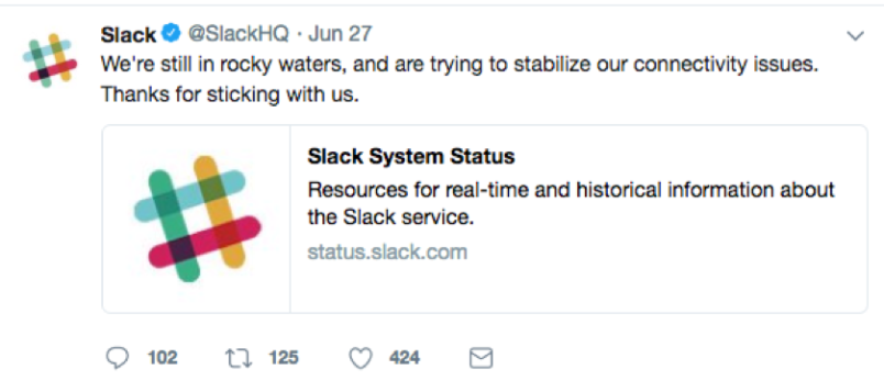
3M, Upwork, and Slack demonstrate how B2B companies are listening and behaving more like FMCG brands. Personalizing messages, engaging in unexpected mediums, and contextualizing services within a customer’s everyday lives have elevated B2B marketing expectations.
For emerging B2B companies to cut through the clutter and for existing B2B powerhouses to stay relevant, B2B companies will have to keep YOU, the customer, close to heart.
Authored by Senior Account Manager, Cliff Horowitz.
I remember the first time I saw one of my designs printed. It was a dubious looking London club flyer for legendary nightclub Heaven. It featured an alien scanned from some horror novel (and it did not look as awesome as it may sound). My first ‘big’ design was a Heineken pack for the European market. I was, of course, very proud (and so was mom). It was quite something to see my work plastered on billboards and on the shelf in the local store. As all designers know, it is a great feeling to see something you have worked on launched for all to see and admire. You get praise from (yes, mom) your friends, peers and of course the client (and if you are lucky, consumers). Once your pack design is out however, the rush quickly fades away, and then it’s on to the next design project. After years of experiencing the ebb of that initial excitement, I’ll share my hypothesized explanation.
Remembering the static designs from my early days, I felt pack design was just that, ‘a pack’, nothing more nothing less. Placed as a passive element in advertising communication, it was not ‘doing’ anything. This made me feel as if the role of packaging was massively undervalued. Countless times, myself and those around me wondered how we could evolve packaging to something that was not static, and active and alive. It made no sense for the point of contact with the consumer, to be one-dimensional and boring. Then, our world began to change…
Little did we know what the impact of the iPhone would be when we saw it for the first time. Now 10 years later and almost all of us are shaping the digital landscape with our mobile interaction. Things that were once fantasy are now reality. Mobile, has become a connecter and an activator. Static graphics can be brought to life, and a quick scan can connect you to any digital platform. Print production has also evolved significantly giving us even more to play with. Technology provides us with countless ways to activate packaging and bring it to life. Here are two inspiring cases that I would like to share with you that do this well.
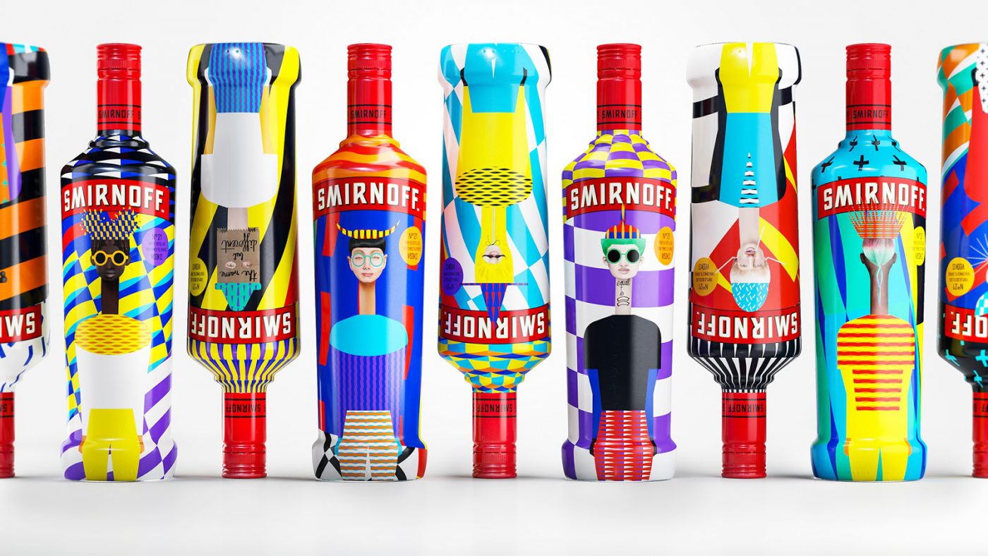
First let’s have a look at the the limited edition bottle design for Smirnoff by the Yarza twins. On this project, designers collaborated with Hewlett-Packard. Through a randomized printing plugin, they created an infinite series of designs, featuring interchangeable diverse portraits of people, hats, patterns and bodies. The bottle design itself is beautifully designed, however the important takeaway here is that the packaging came alive through the designers’ engagement with printing technology and the client’s sensibility to embrace this new approach.
Static design can be great, but living design will give you goosebumps. The range of exquisite visuals on this scale is almost magical. It creates an excitement around the Smirnoff packaging experience that we have rarely felt before. The credit for this work is shared between all the experts whose diversity of perspectives came together in a shared vision.
Mobile can be used to enhance features on pack and communicate information that you would not be able to visualise in 2-D. A great example is Lego’s use of augmented reality. In the past, a Lego pack’s purpose was to show a picture of the final model. A few years back Lego introduced augmented reality as a sales tool. You scan a pack in store with a mobile device for a 3-D model to pop up. This is effective due to the fact that you can see the size of the model and how it’s put together, functional and fun! Lego has continued to engage with users through augmented reality beyond the pack. Using Apple’s updated ARKit 2, you will soon be able to combine real-world Lego buildings with digital landscapes, a bit like a modern-day Sims. From a box filled with plastic bricks to a multi-dimensional experience. How can you not love Lego?
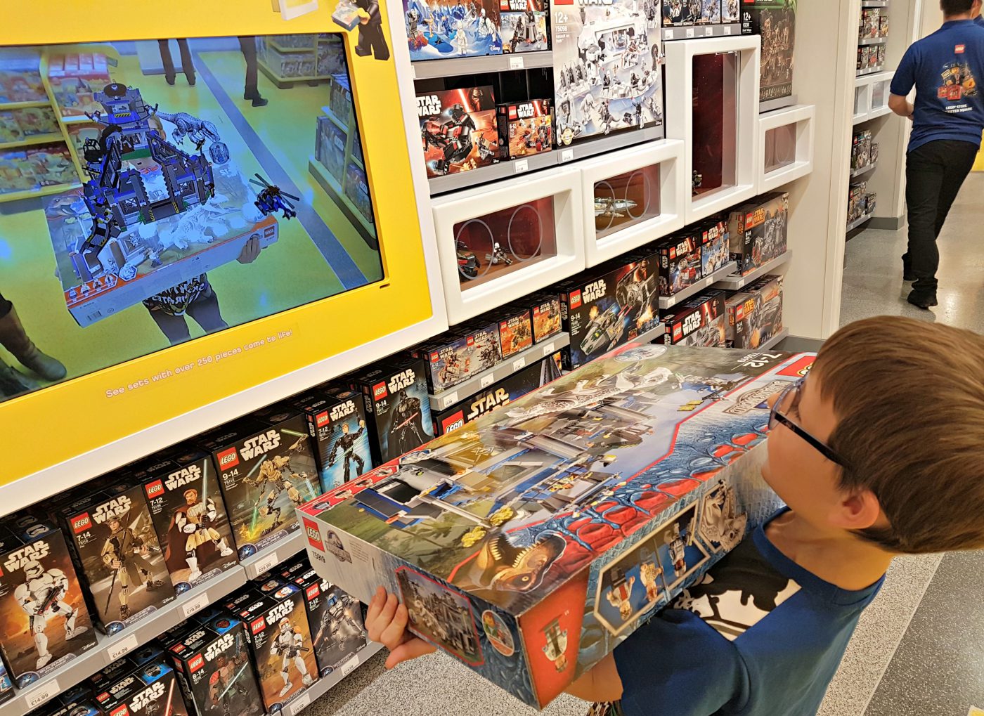
Brand packaging has entered an era of captivating new opportunities, with technological developments creating an opportunity for unlimited creativity when breathing life into the pack. Moving away from being the static design in the corner of an advertising poster, packaging inspires, arouses and interacts with an audience. It can finally be the star of the consumer’s journey: packaging is alive! Hooray!
Authored by Creative Director at CBA in New York, Rutger Thiellier.
Entrepreneurs. We praise them, and especially the way some food lovers have become true trailblazers in the food industry’s exciting developments. John Foraker is one of them, who I saw on stage at the last Expo West. He’s probably best known for his role as Chairman of the Board and then CEO at Annie’s, who sold to General Mills in 2014 for $820 million.
His latest food startup, Once Upon a Farm, develops fresh baby food products, introducing a whole new category to the market, while providing kids from low-income backgrounds with access to fresh organic food. While being interviewed at Expo West along with co-founder Jennifer Garner regarding the brand’s launch, the interviewer brought up a crucial question: “Are there any mistakes from your experience at Annie’s that came as lessons for Once Upon a Farm?” This was his answer:

We could say today that this ‘Brand First’ approach makes common sense. With John’s example, the development of the brand was a forced afterthought that thankfully gave the company clarity and license to grow. But very often, many entrepreneurs are operationally led and are not adopting this mindset as early as they should. What is certain today is the ‘Brand First’ approach is more important than ever. The rise of social media has accelerated the number of products entering the market, which means more competition, and more competition means that differentiation is the key.
I do believe that it’s the brand that drives the business and not the other way around, which is why John Foraker’s advice resonated so strongly with me. Last year I wrote about start-ups that were looking to design a logo before anything else and how that approach won’t get you far today. Rather than developing the shiny new visual identity first, time and energy should be dedicated to building a proper brand platform. A marathon runner starts with a first step and this should be yours.
Authored by CBA North America CEO, Jean-Marc Rinaldi.
Privacy Overview
| Cookie | Duration | Description |
|---|---|---|
| aka_debug | This cookie is set by the provider Vimeo.This cookie is essential for the website to play video functionality. The cookie collects statistical information like how many times the video is displayed and what settings are used for playback. | |
| pll_language | 1 year | This cookie is set by Polylang plugin for WordPress powered websites. The cookie stores the language code of the last browsed page. |
| Cookie | Duration | Description |
|---|---|---|
| _gat | 1 minute | This cookies is installed by Google Universal Analytics to throttle the request rate to limit the colllection of data on high traffic sites. |
| YSC | session | This cookies is set by Youtube and is used to track the views of embedded videos. |
| Cookie | Duration | Description |
|---|---|---|
| _ga | 2 years | This cookie is installed by Google Analytics. The cookie is used to calculate visitor, session, campaign data and keep track of site usage for the site's analytics report. The cookies store information anonymously and assign a randomly generated number to identify unique visitors. |
| _gid | 1 day | This cookie is installed by Google Analytics. The cookie is used to store information of how visitors use a website and helps in creating an analytics report of how the website is doing. The data collected including the number visitors, the source where they have come from, and the pages visted in an anonymous form. |
| vuid | 2 years | This domain of this cookie is owned by Vimeo. This cookie is used by vimeo to collect tracking information. It sets a unique ID to embed videos to the website. |
| Cookie | Duration | Description |
|---|---|---|
| IDE | 1 year 24 days | Used by Google DoubleClick and stores information about how the user uses the website and any other advertisement before visiting the website. This is used to present users with ads that are relevant to them according to the user profile. |
| test_cookie | 15 minutes | This cookie is set by doubleclick.net. The purpose of the cookie is to determine if the user's browser supports cookies. |
| VISITOR_INFO1_LIVE | 5 months 27 days | This cookie is set by Youtube. Used to track the information of the embedded YouTube videos on a website. |
| Cookie | Duration | Description |
|---|---|---|
| CONSENT | 16 years 7 months 21 days 10 hours | No description |
| cookielawinfo-checkbox-functional | 1 year | The cookie is set by GDPR cookie consent to record the user consent for the cookies in the category "Functional". |
| cookielawinfo-checkbox-others | 1 year | No description |