France
Paris
Switch to your local agency
Retour au menu
Our office, originally founded in San Francisco over 15 years ago, has continued to evolve and grow. With a history of working with some of the world’s most iconic consumer-loved brands and building upon strategic foundations that marry performance, visual language, and storytelling, CBA USA has decided to offer a more specific service to start-ups in the US market, that need strategic direction.
With solid experience and established credibility in the startup’s ecosystem, we’ve observed one key insight: Startups tend to focus on perfecting their product and its technical aspects, but in doing so, they can miss a crucial element: their brand. Realizing this significant oversight, we have accompanied startups for quite some time, crafting their brand strategies hand in hand.
Below the Brand is dedicated to developing foundational brand and product strategies for start-ups with ambitious goals. It focus solely on achieving growth objectives by:
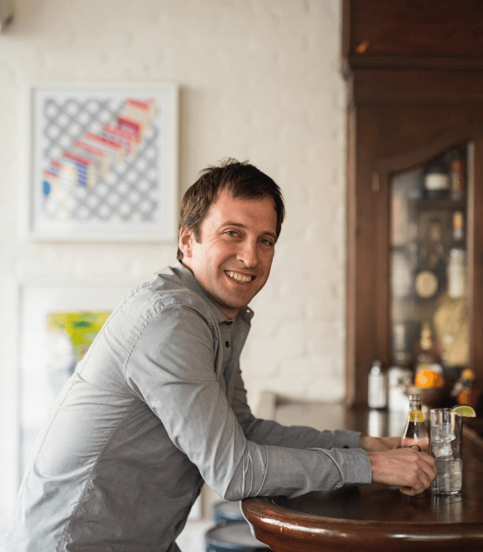
Below the Brand was just what we needed! They’re talented, strategic and move fast – exactly what a start up needs. We did a “Sprint Mode” with them and it turned out great.
The whole process was super collaborative, and by starting with really well thought-out ideas and then working through a number of rapid iterations, they added a ton of strategic and creative value fast and effectively.And best of all – they’re fun to work with!
— Jordan Silbert, founder of Agro
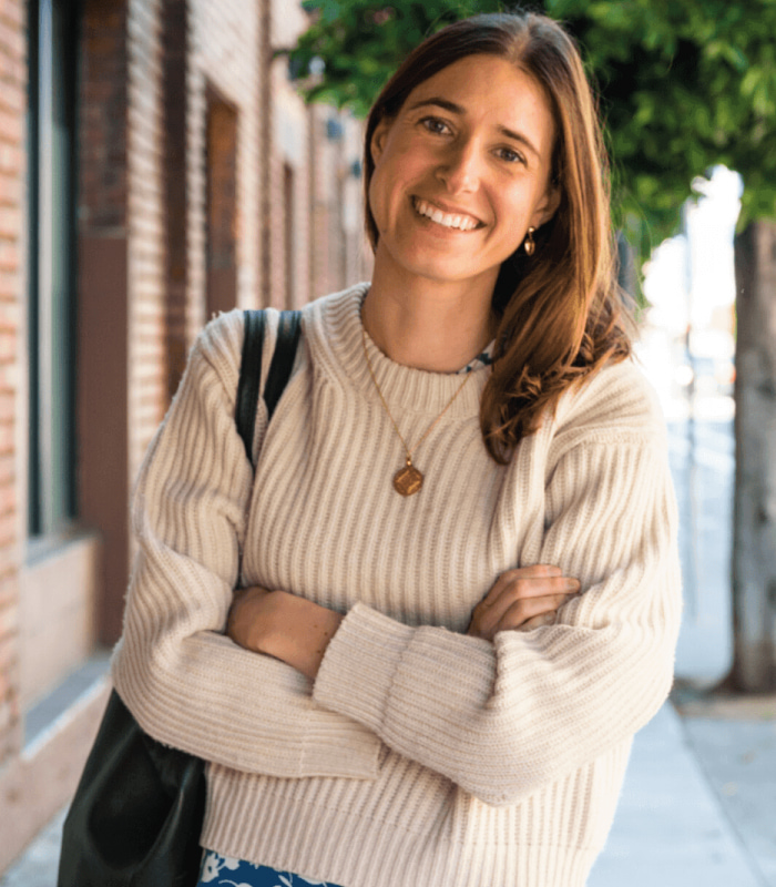
Working with the Below the Brand team was my secret weapon while building a marketing function from scratch.
From value proposition design to brand strategy to architecture and naming, they helped our team create foundational assets that set Brightseed up for success. Without collaborating remotely in Sprint Mode® I would not have been able to scale marketing in such an efficient and inspiring way
— Emma Cooper Mullin, Senior Director of Marketing, Brightseed
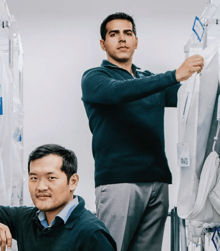
We felt they were a very good fit.
More importantly, their team gave us confidence that they would care for our brand with the same level of commitment as we would ourselves.
— Ajay Prakash, founder & CEO, Rinse
Outstanding perceptions of quality, general health and no fishy aftertaste, which is a direct reflection of the unique packaging and allows us to stand out at shelf.
— Susmita Vellanki, Vice President of Marketing, Epion Brands


Outstanding perceptions of quality, general health and no fishy aftertaste, which is a direct reflection of the unique packaging and allows us to stand out at shelf.
— Susmita Vellanki, Vice President of Marketing, Epion Brands
The Designalytics Effectiveness Award was created to help elevate the role of package design by spotlighting the immense financial impact that it can have on consumer brands. As always, winner selection was entirely data-driven, based on sales performance in the marketplace, as well as rigorous quantitative consumer testing.
This year’s winning redesign was awarded for our work on the CVS Beauty brand and carried the additional honor of being the first private-label winner in the history of the award.
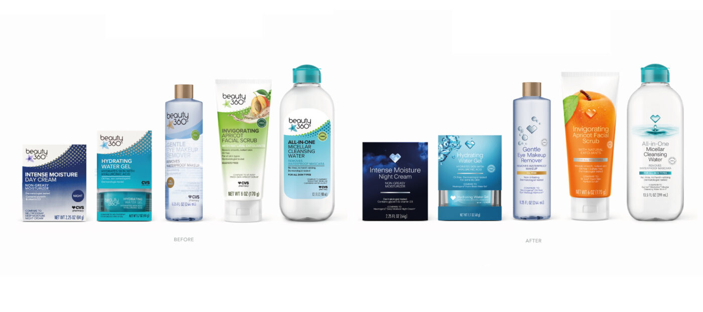
The Beauty 360 brand from CVS had been competing with national brands by offering high-quality beauty and personal care products for years. With this redesign, CVS Beauty made a revolutionary shift — eliminating the Beauty 360 branding altogether and replacing it with the familiar CVS heart, while also communicating product efficacy, premiumness, and gender inclusivity.

Consumers “hearted” the new look, with 74% preferring this version over the previous design, and the sales results bore this out.
During the six months following the redesign, sales of CVS Beauty products increased by 20% compared to the same period during the prior year.
Every year we give this award, we see more and more compelling—and often jaw-dropping–evidence that great design drives brand growth, and CVS Beauty presents a uniquely straightforward case study.
Given the minimal advertising and promotion afforded private-label brands, this result is especially staggering; a bold, strategic design change was—clearly and unequivocally—the engine behind this brand’s growth
—- Steve Lamoureux, CEO and founder of Designalytics
Right, now that I have your attention, here’s the real reason for what’s soon to be a monthly message from me to you.
Ta-Dah! I’m calling it our ‘Design Series’ and I’m going to be sharing some of the stories behind the tools that we as designers use every day.
Many of us live life at lightning speed. Sometimes it feels as though our working day changes into tomorrow with the blink of an eye.
I’d like us to stop for a moment and consider some of the elements of our craft.
How did that particular typeface we all love or hate come into being, for example? What factors draw us to our favorite color? How on earth did designers manage before the birth of digital technology?
So, sorry about the booze, although do feel free to read on with a glass in hand.

Browsing through a secondhand bookstore one rainy weekend, I stumbled across a paperback called, ‘Type: the secret history of letters,’ by Simon Loxley. A quick scan of the intro and suddenly I felt I was being drawn into a plot from ‘Dynasty.’
Here’s some of what Simon has to say, ‘The phenomenon of the trained designer as typographer is a relatively recent one; in the past the type designer often began by following an entirely different calling. Theirs was no creative ivory tower. They brought to their designs all the inescapable human baggage of ambition, jealousy, desire, treachery and love. And it is this baggage which makes their stories as fascinating as the letter shapes they brought into being.’
This all set the ball rolling for me to begin a journey of discovery. I wanted to find out more about the kinds of stories that Simon Loxley was alluding to.
Most of us will have watched TV shows like, ‘Who do you think you are?’ They’re proof that discovering the truth about our descendants is more than just fascinating. It’s emotional too because it touches on parts of our identity. It’s as if our genetic makeup can suddenly be brought to life by hearing the stories of where we came from.
So, what if we were able to tap into the tales that lie behind the tools of our trade? We’d learn something about their past of course, but we’d be humanising them and bringing them to life as well.
Fonts and colors are no different to anything else. They have a past and personality. Appreciating them and understanding where they came from adds insight and a richness to what we all love to do. All this got me thinking about the colors we as designers use.
Take yellow, for example. There’s more to it than something that’s bright, shiny and warm. Like many of the fonts we’re familiar with, it has individuality as well as a history with differing significance in different places.

Chris Martin had his own take on the color yellow but he’s not the only one to give it meaning.
In Japan, yellow is the color of courage and yet in American slang cowards are referred to as yellow. And, in Egypt, yellow is the color of mourning.
Ever wondered why Manhattan’s taxis are yellow? Part of the story stems from 1915 when the entrepreneur John D. Hertz painted all his taxis yellow in the windy city.
He did this after reading a University of Chicago study alleging that yellow was the color most easily seen from a distance. Yellow also became synonymous with the car rental company that took his name after a takeover in the 1920s.
We all love these kinds of factoids and there are a ton of them lurking behind most of what we do every day at CBA.
Such pieces of trivia are really trivial, right? Wrong! They’re part of our profession’s illustrious history. These nuggets are the building bricks and foundations of what we all love to do. Perhaps without even realising it, they’ve led us to the successes at CBA that we are right to be proud of.
Sprint Mode ™ came about because we have such a strategic understanding of design. We know that the solutions we offer our customers need to be backed up with supporting evidence. We also need them to be fun.
Innovation which we developed in house allows us to get portfolios sorted. Our Mural tool means collaboration will always happen. Our archetype game makes complex assessments entertaining, accurate and more cost-effective for our clients.
By enriching our hearts and minds with the stories behind what we do, we can add a new dimension of creativity to draw from. All this freshens up the palate, gets the blood flowing and can inspire us.
And so, this month I’d like to share with you the first article in my ‘Design Series.’ Click on this link and check out what our Italian colleagues discovered about how a particular sans serif typeface took its inspiration from a comic book!
I’ll be back next month with more thought-provoking stories to tickle your tastebuds.
Rutger, Executive Creative Director
CBA’s been the creative force behind some big names in the drinks industry. We built the BVI systems for SKYY vodka as well as Wild Turkey, Long Branch and Russell’s Reserve bourbons. You now have the chance to win one of these top tipples. The first person to email me the correct acts who had hits with the 5 songs quoted in the subtitles of my message can choose a bottle from one of the four brands. ([email protected])
New York has a string of iconic references to its name. It’s known as ‘the city that never sleeps and for being ‘so good they named it twice,’ for a start.
It’s a city that’s inspired the imaginations of many, never more so than as the fictional metropolis where Batman’s adventures were set. Gotham City is a ‘fantasy transposition’ of Manhattan, despite nobody ever saying so explicitly, often taking on the identity of the city’s noirish side.

Bill Finger, a co-creator of Batman, wrote many of the superhero’s adventures. He’d been drawn to an entry in the phone book for Gotham Jewelers. The name Gotham, he felt, was a fit for his fantasy city. Little did we know that it actually dates back to medieval England when it meant ‘goat’s town.’
Typeface designer Tobias Frere-Jones, a partner with Hoefler & Co at the time, chose Gotham as the name for the sans serif font he created in 2000.
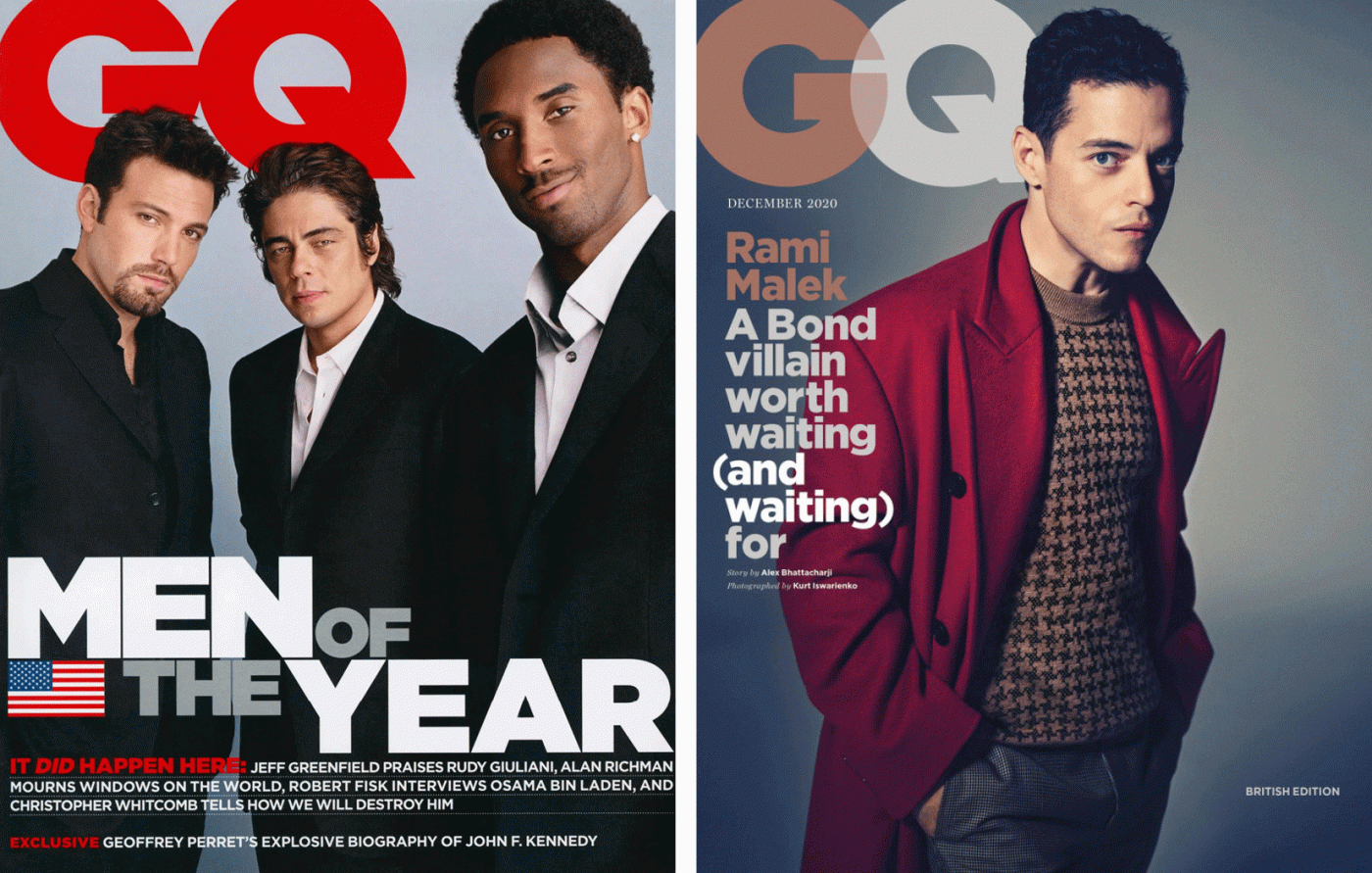
It was GQ who had actually commissioned this new font. The magazine was looking for a linear typeface with a geometric structure. Something ’masculine, new and fresh’ was the order of the day. This, it believed, would bring authority and credibility to its published articles.
To capture the essence of Manhattan, Tobias had spent hours taking thousands of photos around the city. He focused on signs from the mid-20th century. He wanted to capture the freethinking spirit found in architecture and urban planning during those years.
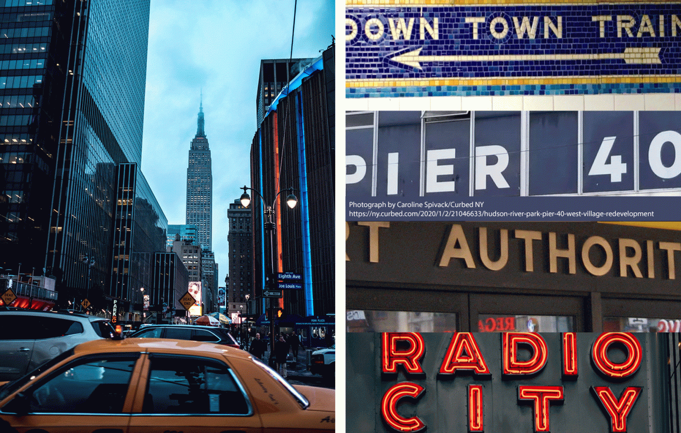
It was signage on the Eighth Avenue façade of the Port Authority Bus Terminal that caught his eye and captured his imagination. He summed up its simplicity when he said, ‘They are letters that only an engineer could have come up with. The fact that they were born outside a typography environment gives them a very distinctive flavor.’
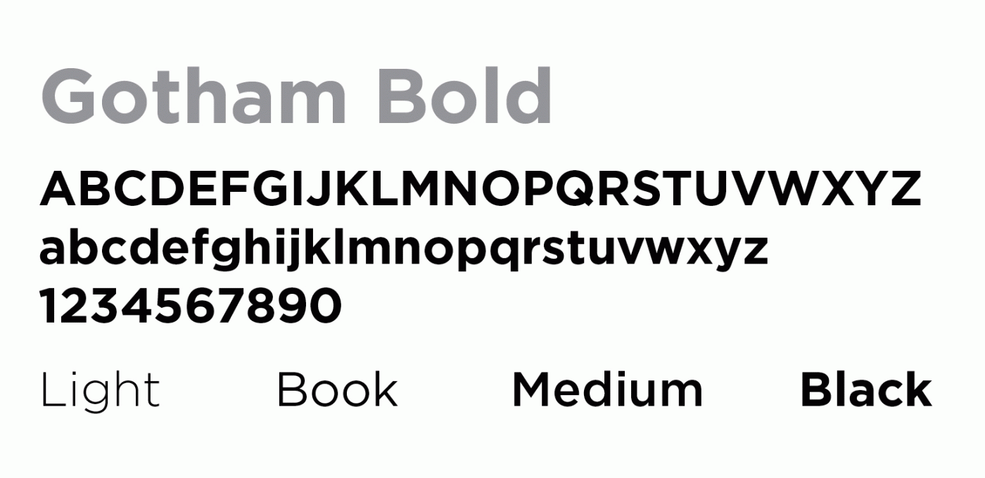
The Gotham characters encapsulate the minimalist philosophy which inspired them. Initially there were 44 weight variants. Now there are 66. No room here for anything silly or nonsensical, Gotham is solid, concrete and functional. At the same time it’s an accessible typeface.
The description on the Hoefler & Co website is quite clear about all this. ‘From the letters that inspired it,’ it says, ‘Gotham has inherited an honest tone that is assertive but never imposing, friendly but never crazy, confident but never aloof.’
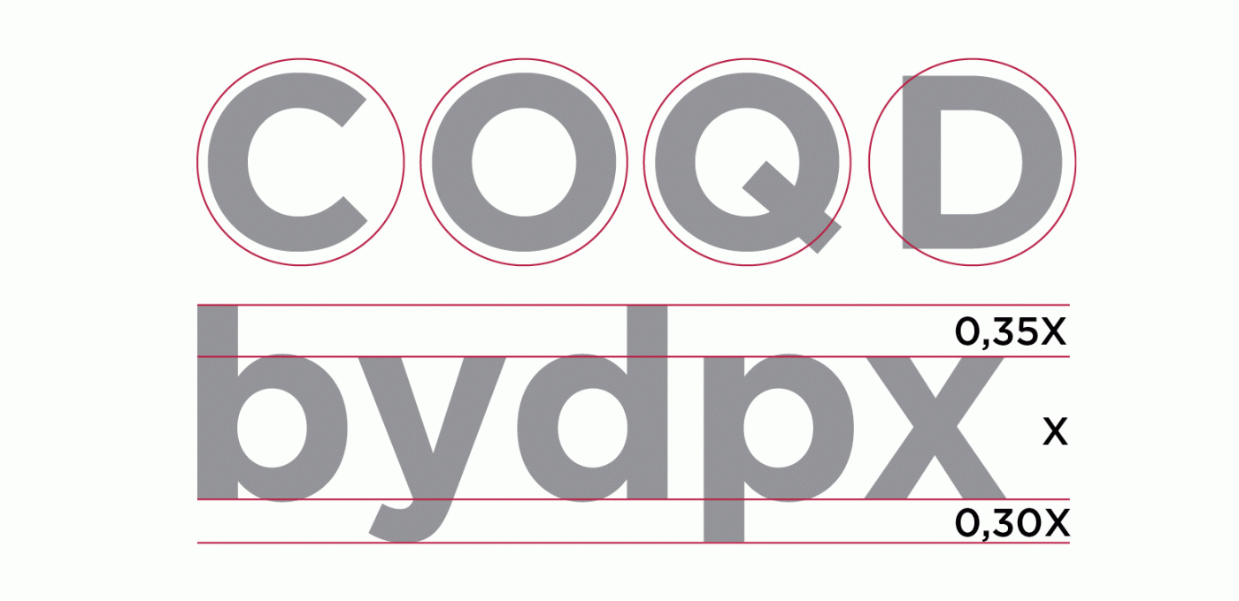
Among its most striking features are the circular shape of many of the letters and the very limited ascender and descender heights.
A few years after its birth and once the exclusive rights reserved by GQ had expired, more and more people began using Gotham. The Freedom Tower, the World Trade Center, and the National September 11 Memorial & Museum all chose it as their main character.

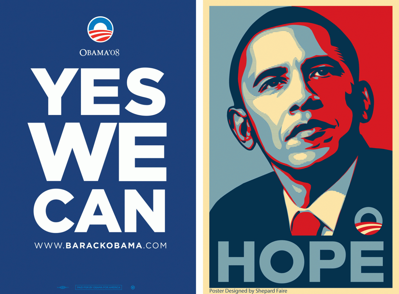
However, it was in 2008 that Gotham found true fame. The then American presidential candidate, Barack Obama, selected it as the official character for his candidacy.
Gotham, with its simple and incisive look, was a natural match for the clear and direct messages he wanted to get across. These included, ’YES WE CAN’, ‘CHANGE’ and ‘HOPE.’ Graphic designer Brian Collins described Gotham as the ‘linchpin’ to the former President’s entire campaign imagery.
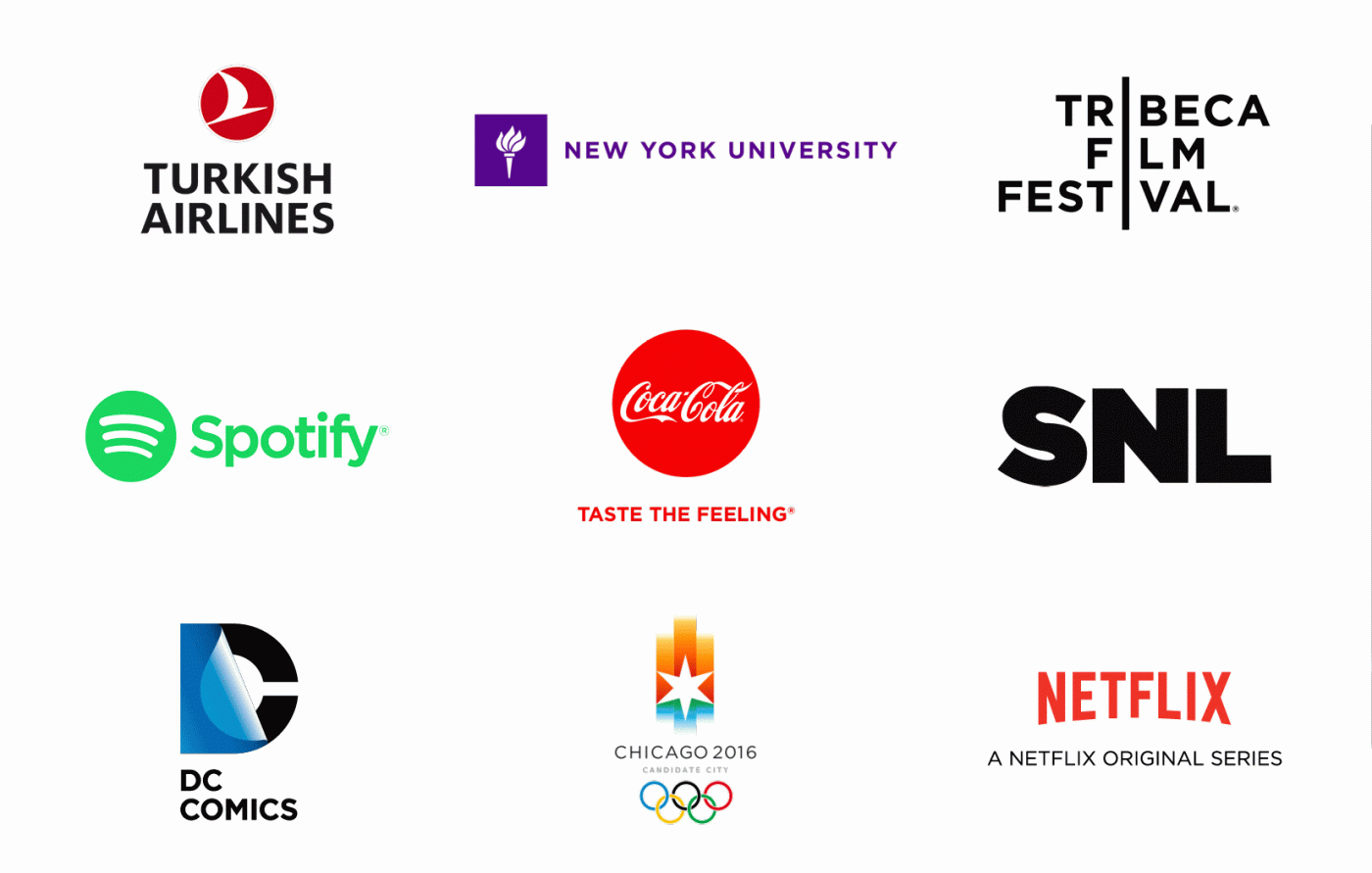
The ’Obama character’ has become popular not only in the United States but throughout the world. It’s used by Coca Cola, Netflix, Saturday Live Night, Turkish Airlines, DC Comics and the Tribeca Film Festival, to name but a few.
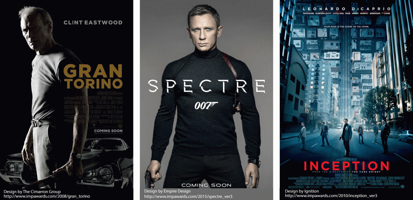
It’s even popular in the world of cinema, proudly standing out on the posters of countless blockbusters.
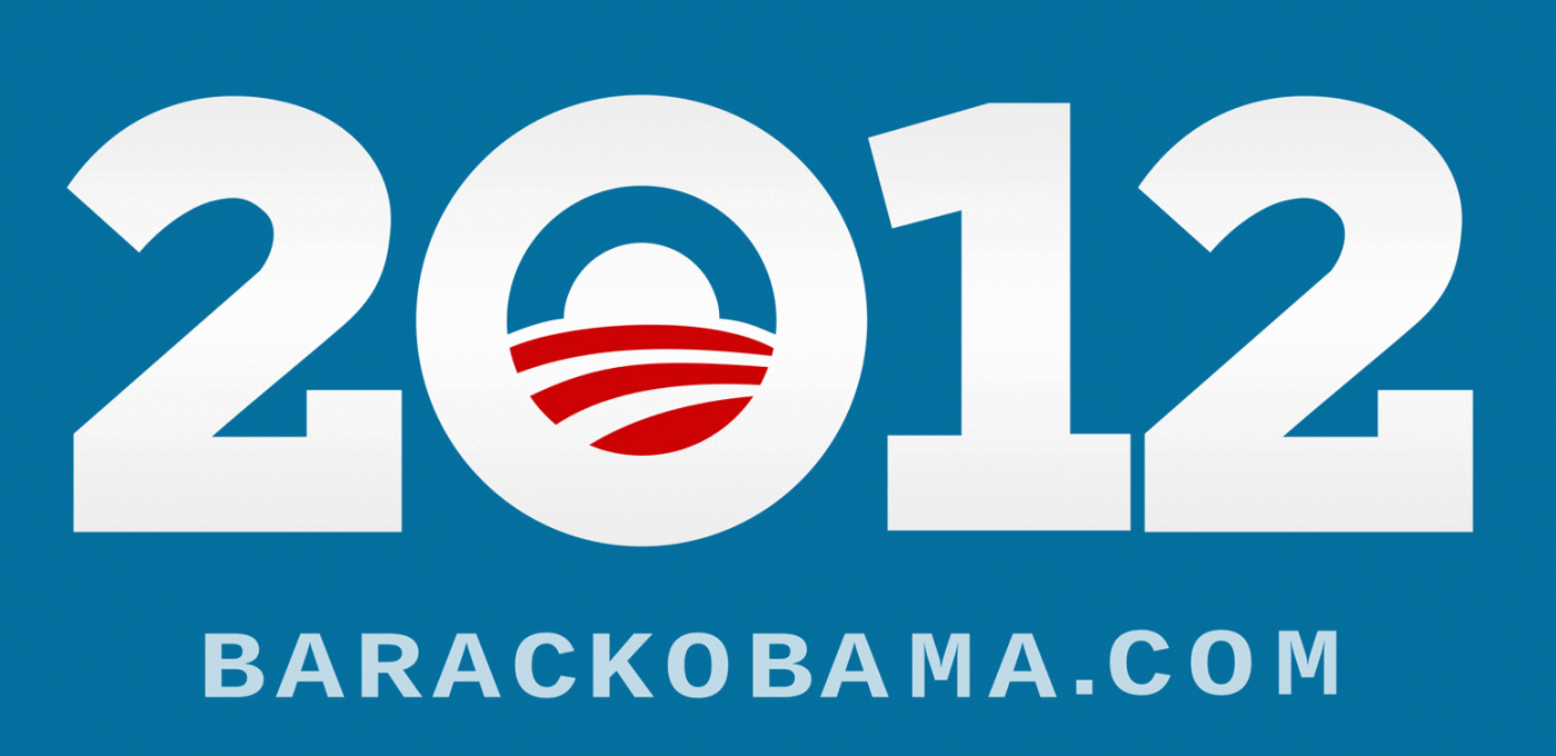
Four years after the first campaign, Barack Obama decided to use Gotham again for the 2012 midterm elections. This time serifs were added to ‘improve’ the typeface. When asked about how all this came about, Frere-Jones and Hoefler delighted by responding in words used in the Obama campaign,
I want to thank Giuseppe Mascia who’s based in Milan with CBA, Italy for writing this article. I hope you enjoyed discovering more about the Gotham typeface. Thank you for reading and I look forward to sharing a new and inspiring topic with you all next month!
Rutger, Executive Creative Director
Each year, the head of CBA agencies throughout the network gather for three days of work, discussion and idea-sharing. The 2019 edition was hosted and organized by CBA Italy in their Milan office.
They named the event u0022ONE, Open Network Experienceu0022, a title that encapsulates what makes our network unique as well as the spirit in which we approached these three days of work.
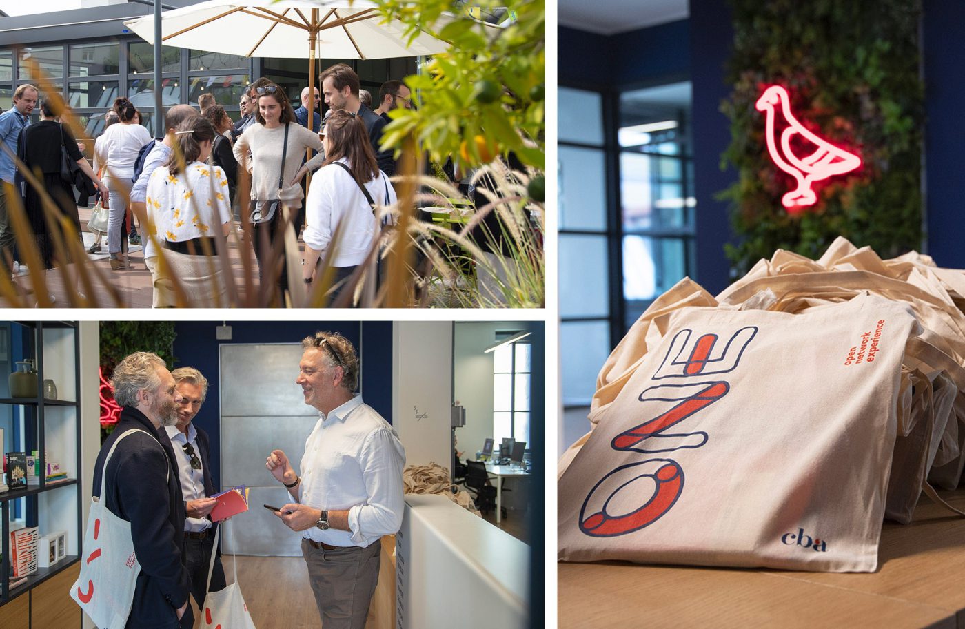
Indeed, the various CBA agencies all have different backgrounds, they work and different markets with different clients, and over time have developed different skills and merits. Being able to open up to the rest of the network in order to share innovative ideas, experiments and strategies is an effective way of making the whole of CBA more open, curious and flexible. Setting aside just a few, intensive days for this moment of exchange has given rise to a wonderful, stimulating experience for colleagues who came from all over the world to Milan.
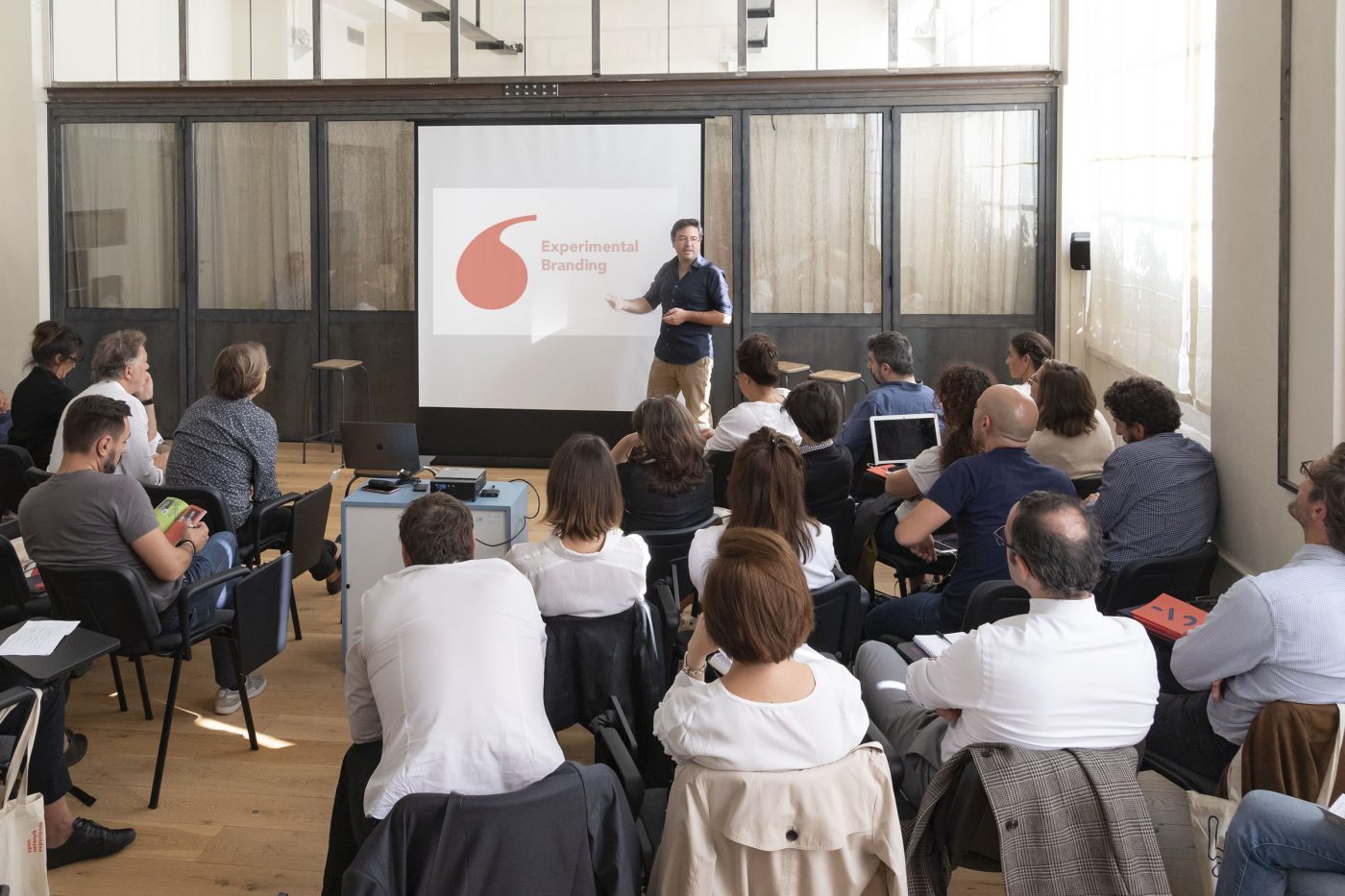
The Brazilian team told us about their observation of the correlation between companies adopting “experimental” practices and their greater economic growth. This means that branding, which has always been a force for change and exploration, must also seek out tools to support the companies in carrying out such experiments, to challenge the status quo and find a new way to do business and innovate.
CBA Brazil does this by combining strategy and execution in one integrated, fast and repeated process: trial, test, modify, test again and launch. By analyzing how the companies work, CBA has identified 5 drivers that can guide the client in developing a more experimental, and therefore more successful, approach: being more open and willing to exchange information; empowering people to take risks and accept failures; the practice of creating solution prototypes to enhance the learning process; guiding resources towards a more practical execution (of their tasks) and a more personal experience of their mission.
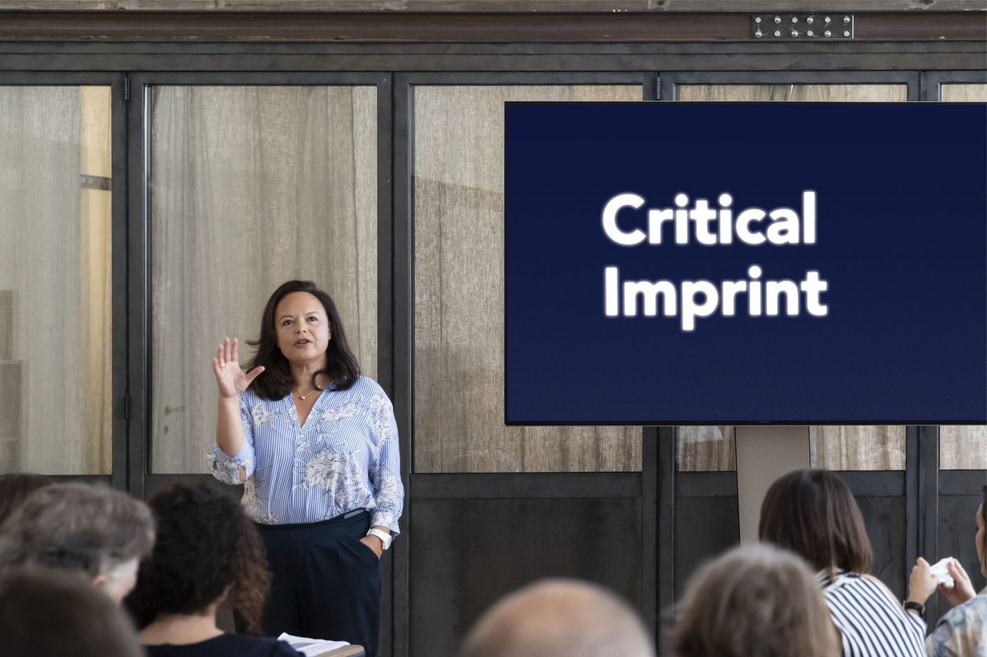
The French team has suggested a new focalisation from the specific point of view of CBA. It will allow us to better understand, from the inside, how to improve our ability to make an impact for our clients through design and branding.
This is how Critical Imprint began, a CBA framework that makes us even more relevant for our clients, as it presents a new outlook which always manages to align the brand with an honest, positive and inclusive mission.
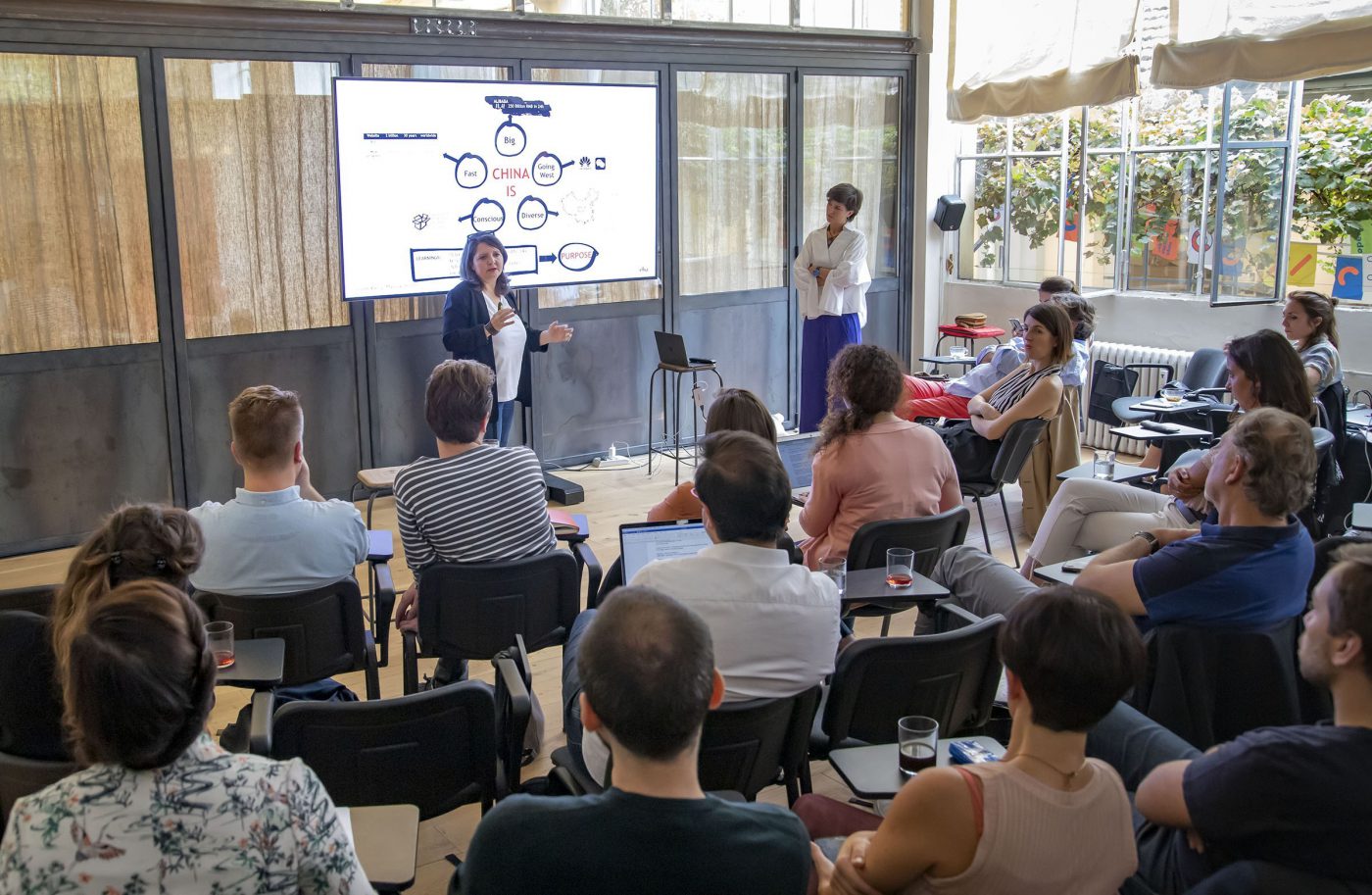
China is a huge nation that is developing at an incredible speed. However, according to Isabelle Pascal (CBA Shanghai) and Margaux Lhermitte (CBA Paris), who have been working and living in the country for years, China first of all represents an extraordinary network of human relationships (关系guanxì) that connect Chinese people, cities and communities scattered around the world. This is why CBA in China represents a platform, a place and a way of working together to create business innovation and a positive impact. It is a network that connects those abroad who want to do business in China and, on the other end of the spectrum, those from China who want to open up to the world. This has proved to be a winning formula, as we know that the concepts of collaboration and co-creation are embedded in the minds (or rather the hearts, 心xin, the organ responsible for thought according to traditional Chinese culture) of the Chinese people, who are now increasingly more aware of and sensitive to topics related to environmental sustainability.
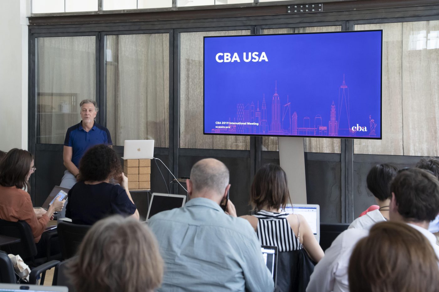
Our US team presented the network our journey with adopting new methods of working, cheaper without giving up on the crucial benefits of co-designing, and with a lessened environmental impact.
From Design Sprints to Sprint mode, we’ve adapted the process to make our clients’ lives simpler. Remote co-design generates decisive insights that are necessary for decision-making to come to light more quickly, with no one feeling like they can’t express themselves. What’s more, calling on the client’s team right group of experts leads to even faster decisions. This is also made possible by replacing the classic brief with an initial session with our clients where we align on key information and creative guardrails to lead projects. We’ve also made our lives easier thanks to internally developed tools such as the Archetype Game, an actual board game that, using a series of leading questions, allows clients to go through their unique positioning in detail.
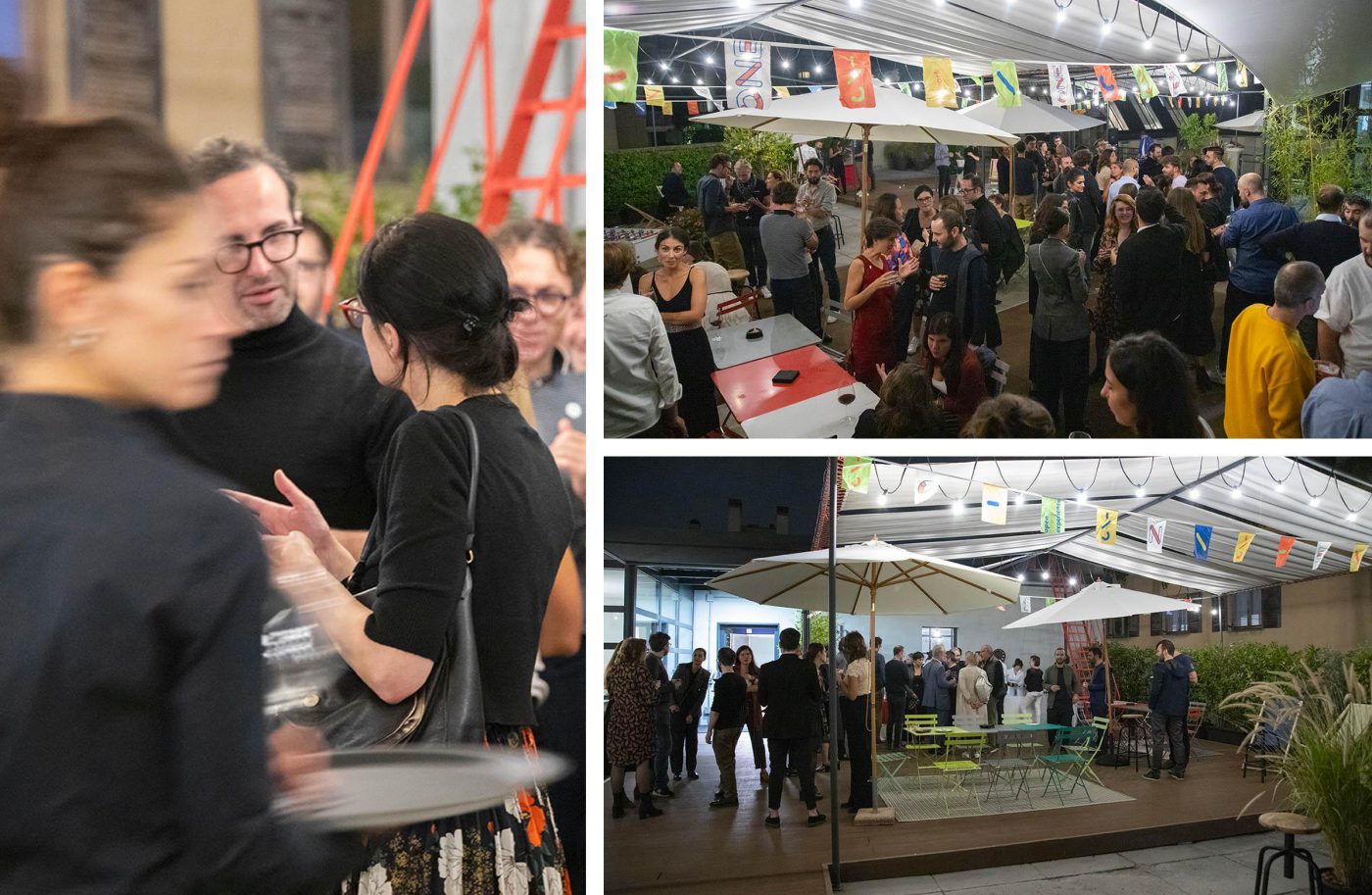
Finally, we celebrated the end of the event with a party organized in the beautiful Milan studio.
For the past three days, our team has been scouting the Summer Fancy Food Show in quest of the hottest new foods. It was held at the Javits Center, in the booming Hudson Yards neighborhood, which has become a focal point for all things trending, from architecture to retail to.. well, food. Here’s what went down.
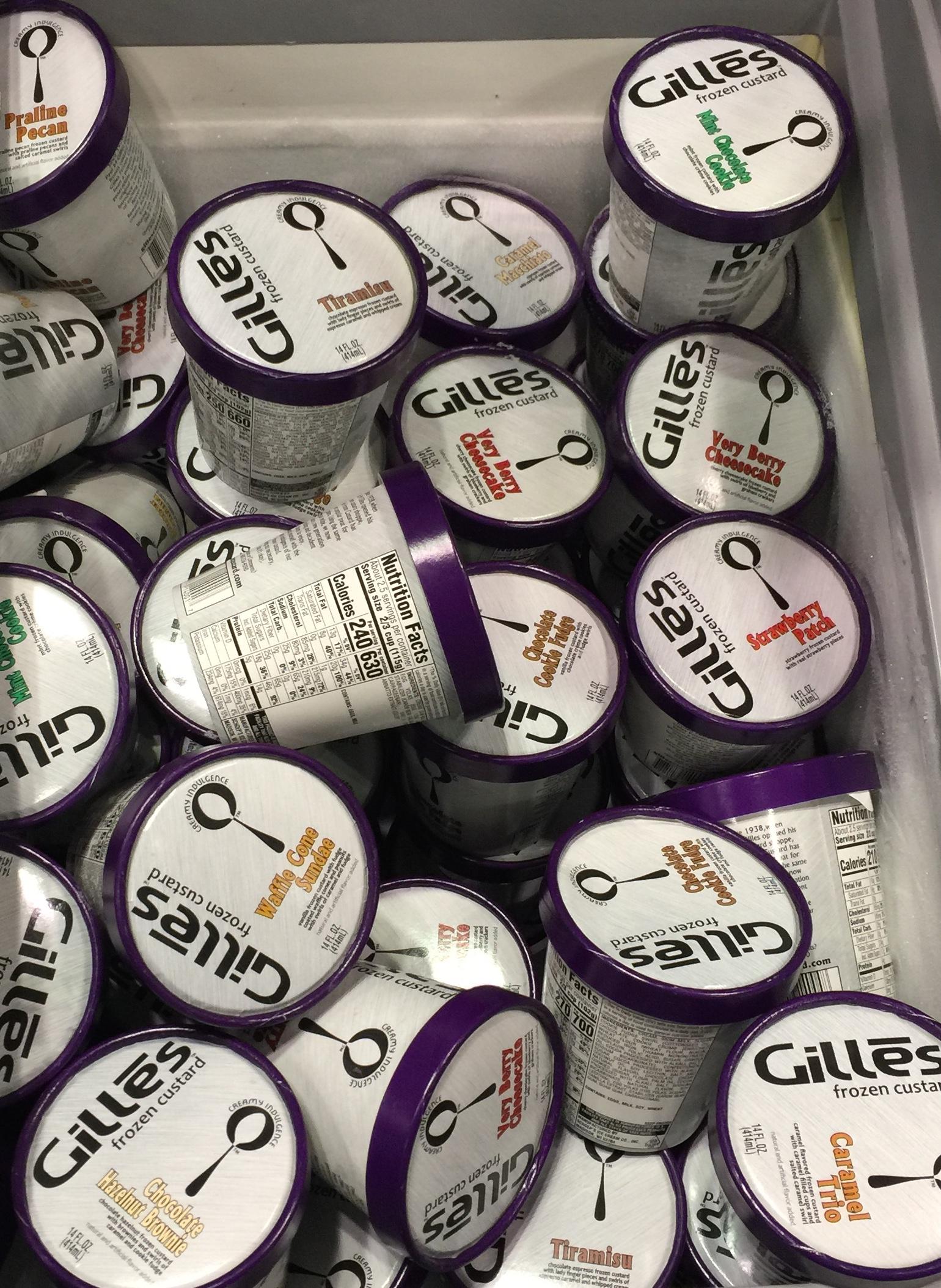
Taste came back from a guilt trip, after having been eclipsed by competing claims of clean-eating. The dessert category has made room for unapologetic propositions, made with the richest ingredients for a genuinely indulgent brand promise. Frozen custard was at the center stage, as seen with classic Milwaukee dessert shop Gilles, vowing to build layers of intense and bold flavors by adding egg yolk to the ice cream mix.
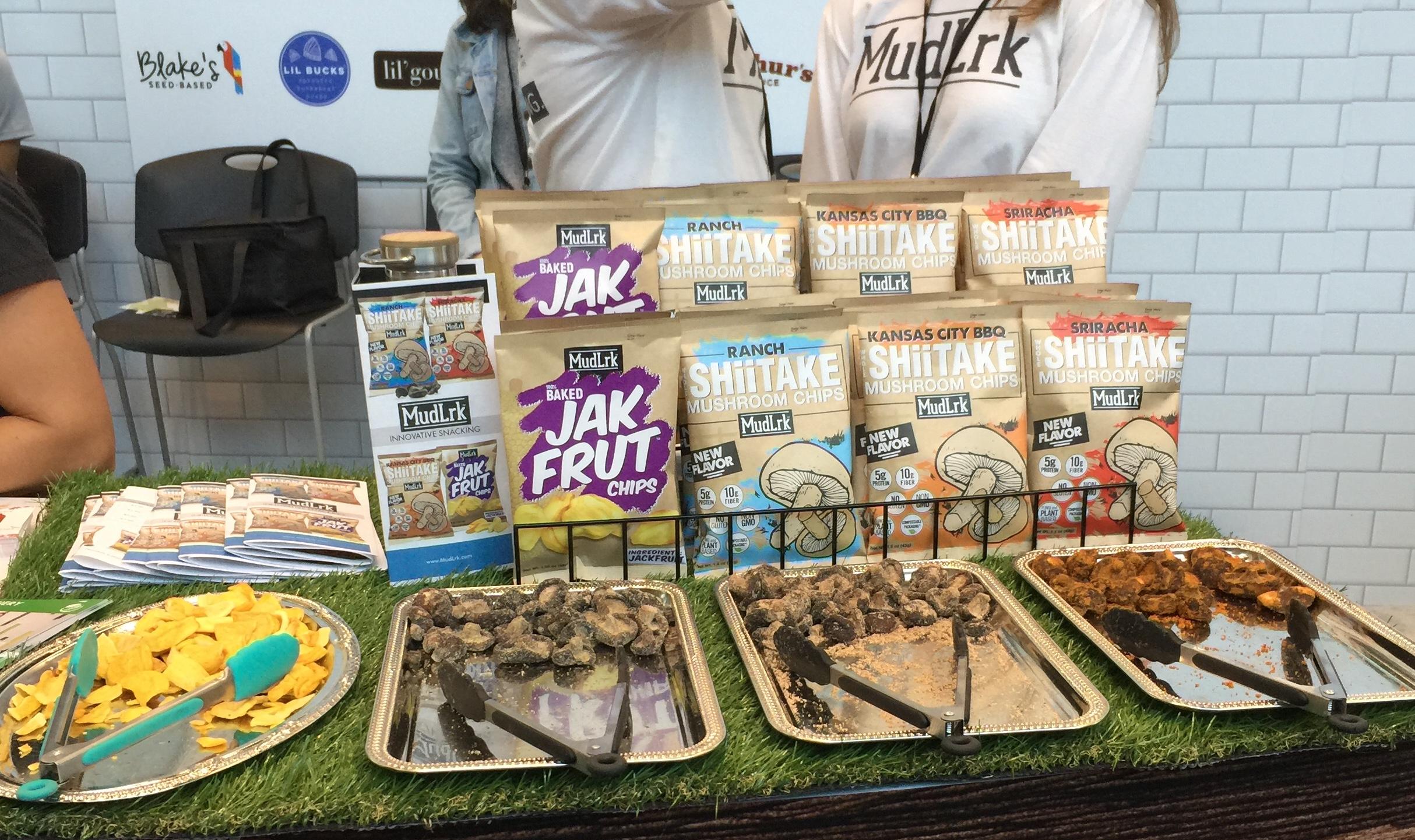
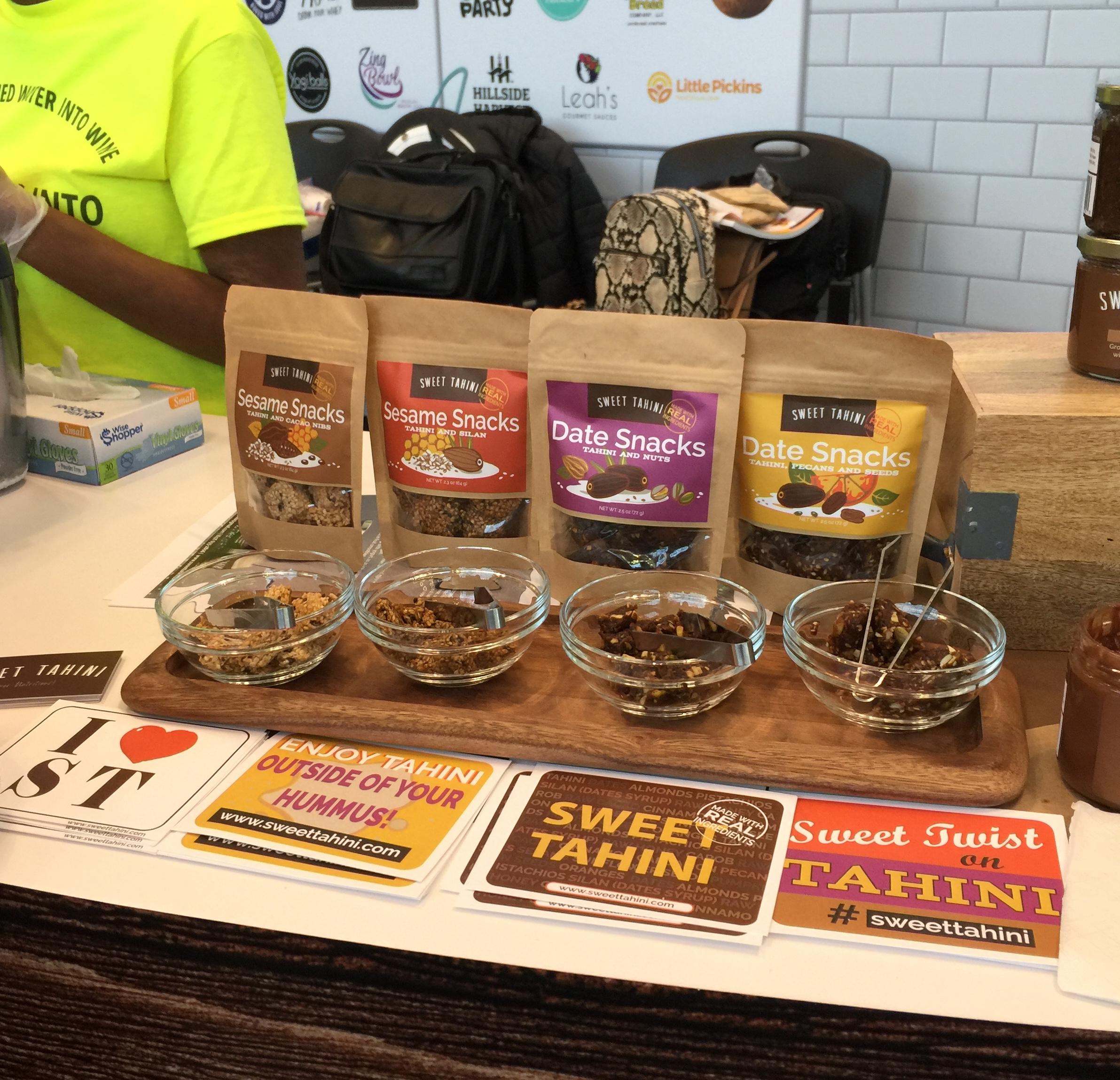
The superfood trend has also penetrated the indulgence proposition, moving away from the all-too expected “light” category. Sweet Tahini integrates the infamous chickpea oil into bold treats, and MudLrk takes their shiitake proposition to the next level: an explosion of flavors, a proudly bold snack. These ingredients are not simply made for savvy nutrition gurus, they are the proof that natural foods are game for everyone’s taste buds, and can live outside of the health claims universe. Clean nutrition is still very much part of this narrative, but it is now taken for granted.
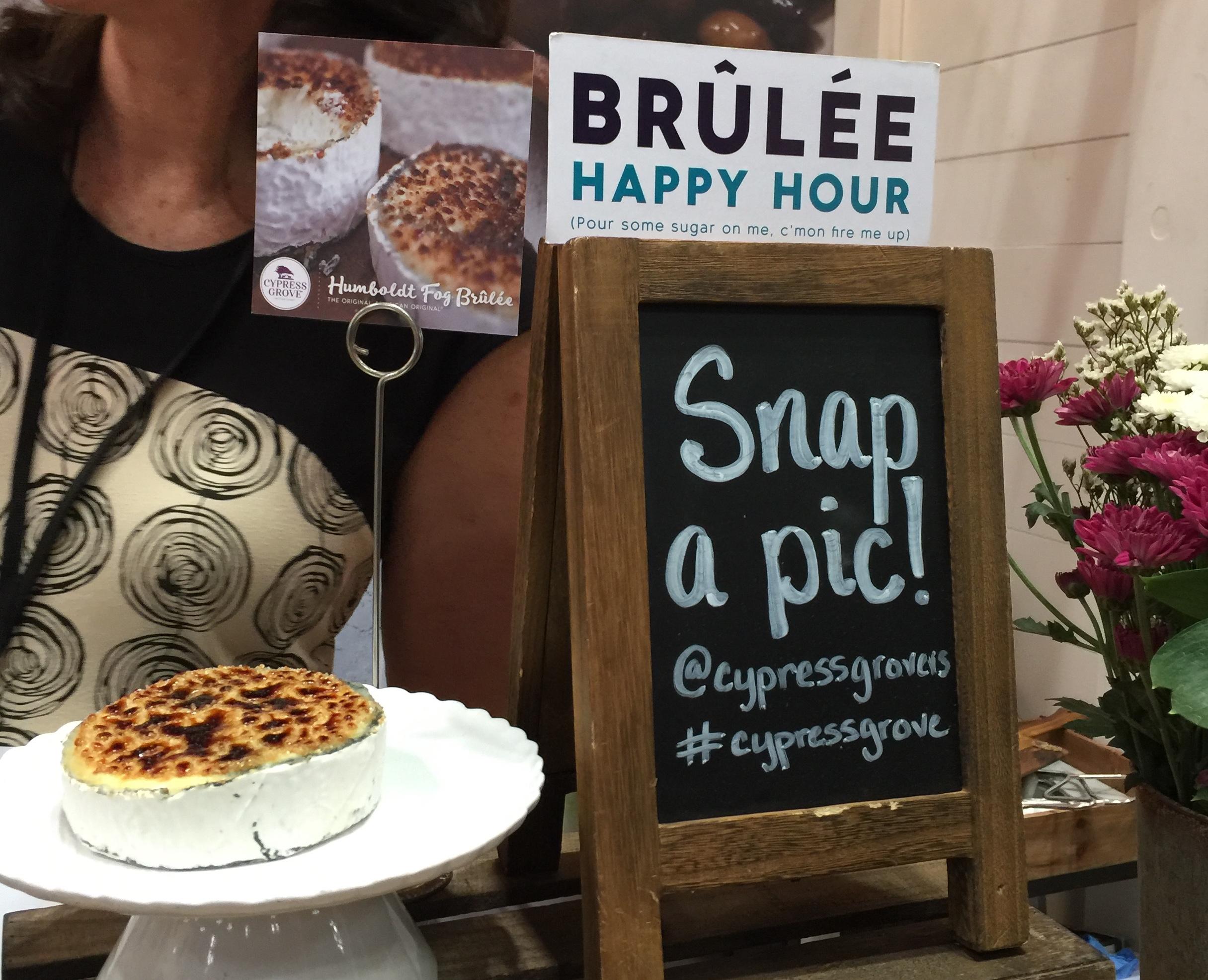
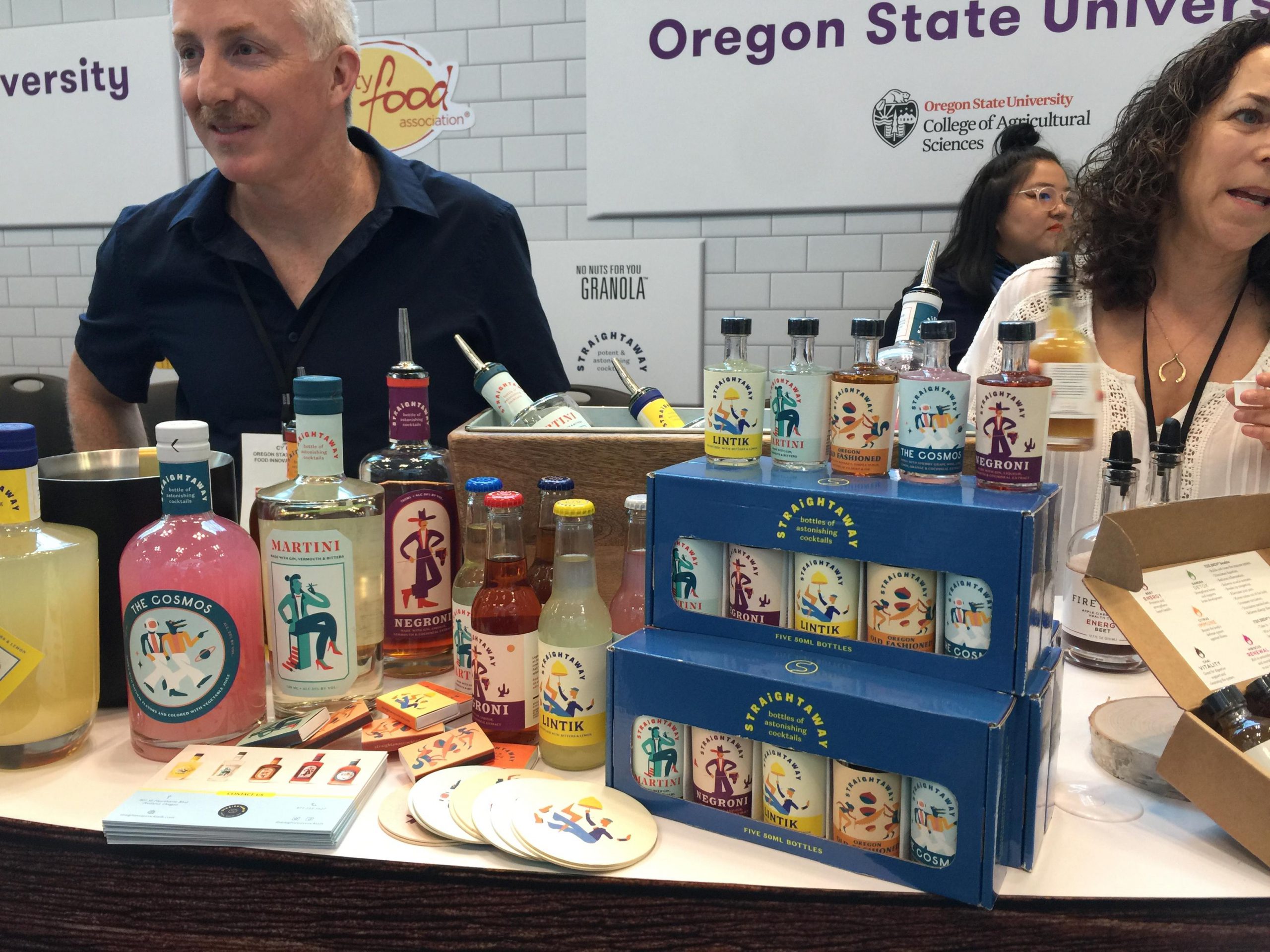
On the other hand, the experience around food rituals is also given increasing attention. For some, it’s encouraging the audience to experiment, play with how food can be served to create a genuine moment of creativity (see Cypress Grove’s recommendations and “brulée” cheese). Making more out of the product than it already is creates experiences worthy of sharing online, a major concern common to millennials, Gen X and Z alike. For bottled craft cocktail manufacturer Straightaway, it means extending the bar look and feel to your in-home cocktail game, with an identity inspired by classic mixology cues. Experience makes the exceptional reachable and elevates the product itself.
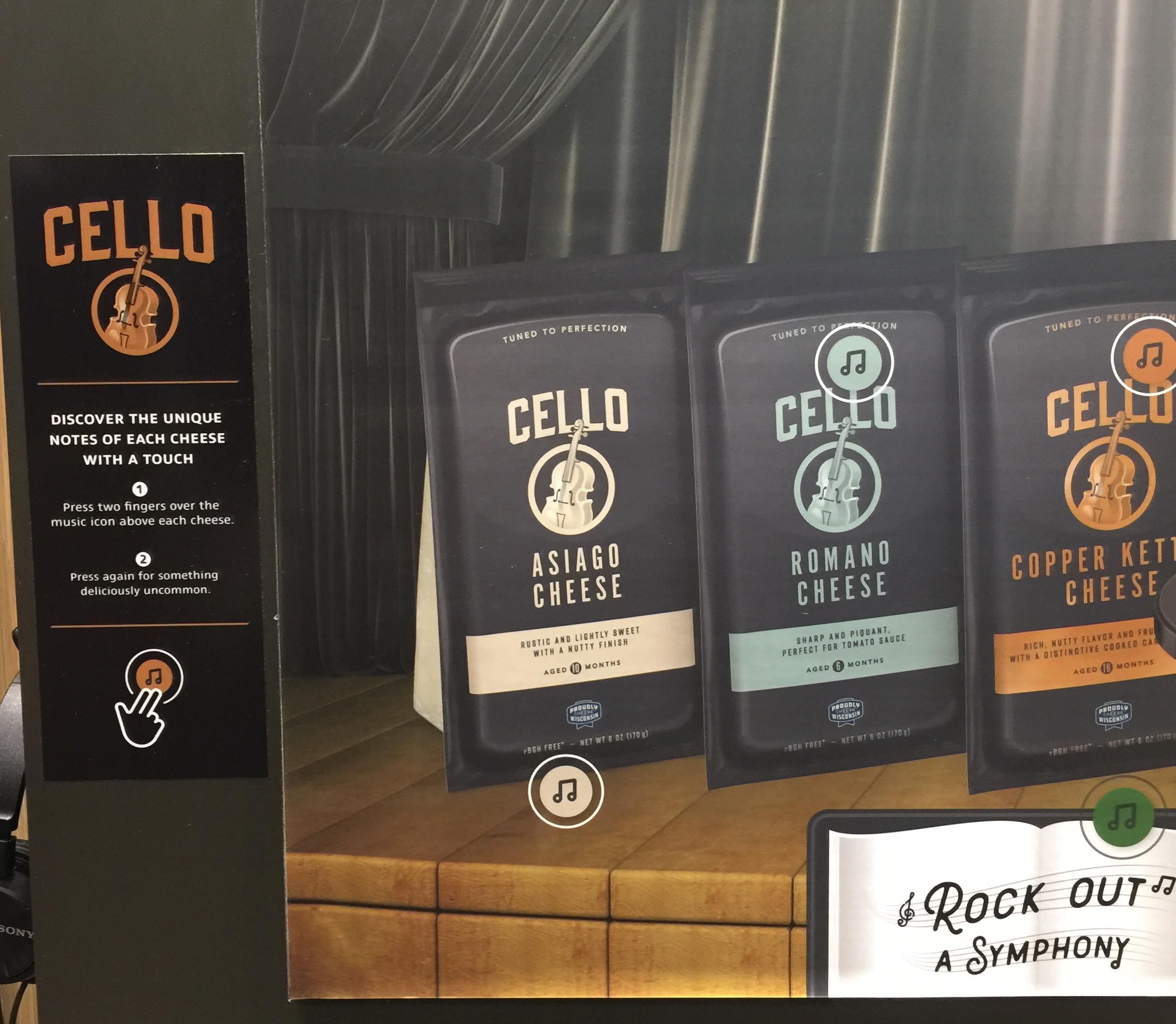
Grated cheese brand Cello brings premium to another level by turning its products into a noble art form, a symphony. A melody is associated to each type of cheese to create a multi-sensorial experience, creating an exceptional tasting ritual.
A tradition of the Fancy Food Show, the Incubator Village hosted a panel of inspiring, innovative unique brands. These are housed under the mentorship of powerful mainstream brands such as Chobani along with local ones fighting a social fight like Hot Bread Kitchen. For brands to take on such disruptive products under their wing shows their commitment to creativity and experimentation outside of their food specialty.
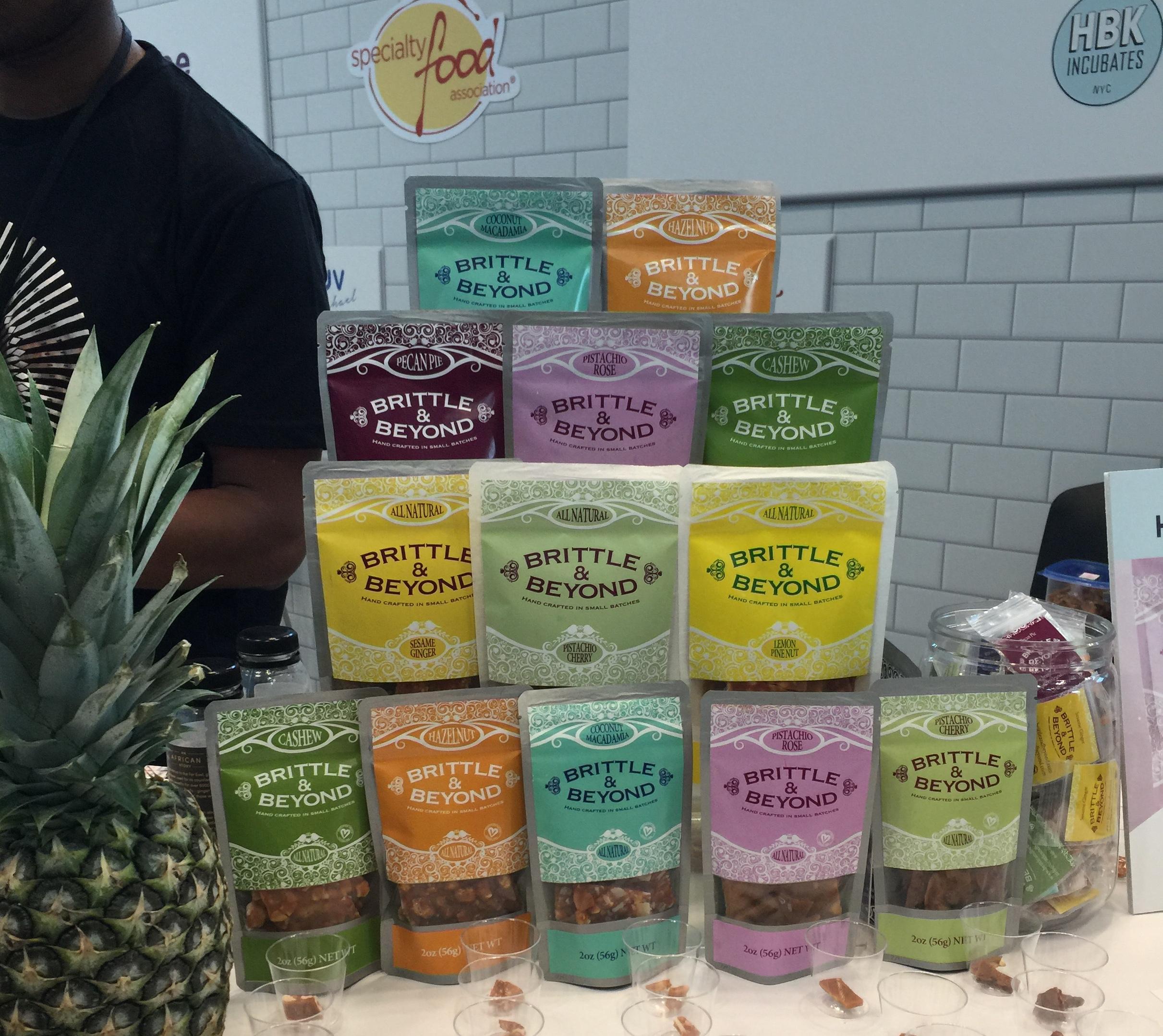
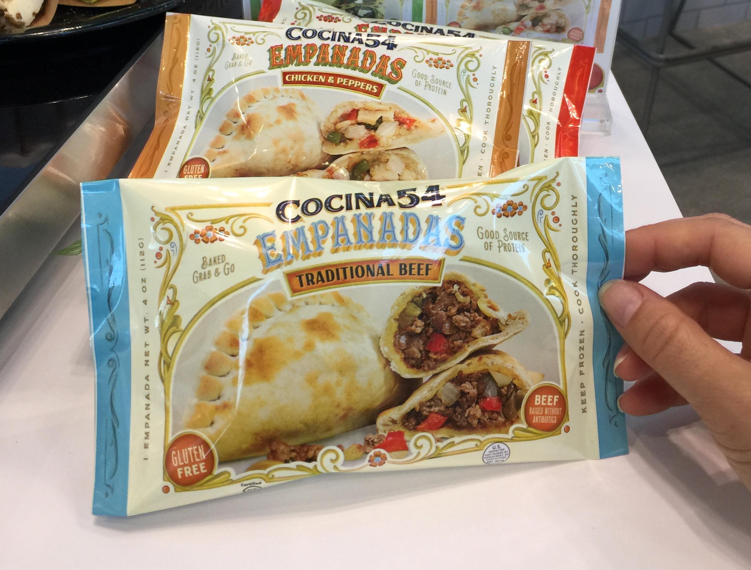
Overall, the “incubees” were brands blending traditional storytelling with modern claims from contemporary insights. For example, Cocina54 has developed an authentic Latin identity with their empanadas that also constitute a high source of protein and are made from scratch. Brittle and Beyond has taken on the “small-batch” trend in an old-school apothecary way with their with their coconut oil-based snacks. From a packaging design standpoint, this extravagant visual trend is gaining ground on more minimalistic and blunt approaches to transparency in ingredients.
This year’s show demonstrated that with small brands breaking down barriers of traditional challenges such as clean diets, indulgence and convenience, mainstream ones very much have an opportunity to lead change and assert themselves as icons.
Authored by Strategist Chloe Rinaldi
For its second year of participation, CBA USA will reward the winning startup of the Americas competition of the French Founders’ Startup Tour with the u0022People Prizeu0022. The Prize offers a Design Sprint: 4 days of intense work sessions in NYC to identify a business challenge, work together to find solutions, and create a prototype that will go on to be tested by 5 customers.
Regional chapters have been taking turns electing their best in class to move on to the final competition, set to take place in New York City in September. Last week, the Los Angeles chapter chose startup Yobs Technologies, whose mission is to help companies scale their hiring with soft skills reports and video . They are the sixth nominee of a series set to compete in the final:
In Toronto, Sampler, as the leading platform supporting brands like L’Oréal and Nestlé in delivering samples online and gathering the insights they need.
As for the San Francisco chapter, winner came out to be Crossing Minds, that democratized access to recent gains in Artificial Intelligence (AI) research by building the world’s best content recommendation platform.
Mexico City saw Decidata move on, a marketing software based on AI that predicts and guarantees results to advertisers and operators.
New York chapter chose UBEES, a startup committed to saving bees by combining traditional beekeeping expertise with innovative science and technology.
Finally, in Boston, online coaching platform Ace Up will go on. They deliver personalized executive coaching to connect employees from all levels with their full potential using a tech-enabled network.
Stay tuned for the final in September, in the meantime visit the Startup Tour website for more details.
The spark of innovation is what drives progress, and the 2018 edition of the Startup Tour showed us the flame was alive and well. The event covered today’s most critical business challenges, cybersecurity and climate change, with a visionary willpower to lead change. FrenchFounders have been providing a framework to support entrepreneurship, a value that CBA holds close to its heart, making us proud attendees of the program. We’ll be working very soon with the winner of the American competition, Droice Labs, whose compelling purpose empowers medical decision-making through Artificial Intelligence. The perspective of collaborating with them for a Design Sprint bears an important meaning, that to accompany actors of innovation in tackling business challenges.
For over 20 years Rutger has helped shape the face of some of the world’s largest brands. He has created award-winning designs for companies such as ABInBev, Philip Morris, Asics, Philips, Grolsch and The Macallan, Nestlé and Unilever to name but a few.
Starting in his homeland, the Netherlands, he has continued his career in both Europe and the U.S., managing creative teams in Amsterdam, Chicago, Brussels and London. His unique cross-cultural perspective, combined with a deep understanding of brand strategy enables him to bridge the gap between business problems and creative solutions.
Rutger will help build and lead the creative team for CBA New York, supporting existing and new clients and continuing to uphold and advance CBA’s standards of creative excellence.
Each year, the GDUSA Package Design Awards Package honor the best design firms for their work in outstanding package design. We are pleased to announce that our work with Häagen-Dazs and Choux were both awarded 2017 GDUSA Package Design Awards.
Privacy Overview
| Cookie | Duration | Description |
|---|---|---|
| aka_debug | This cookie is set by the provider Vimeo.This cookie is essential for the website to play video functionality. The cookie collects statistical information like how many times the video is displayed and what settings are used for playback. | |
| pll_language | 1 year | This cookie is set by Polylang plugin for WordPress powered websites. The cookie stores the language code of the last browsed page. |
| Cookie | Duration | Description |
|---|---|---|
| _gat | 1 minute | This cookies is installed by Google Universal Analytics to throttle the request rate to limit the colllection of data on high traffic sites. |
| YSC | session | This cookies is set by Youtube and is used to track the views of embedded videos. |
| Cookie | Duration | Description |
|---|---|---|
| _ga | 2 years | This cookie is installed by Google Analytics. The cookie is used to calculate visitor, session, campaign data and keep track of site usage for the site's analytics report. The cookies store information anonymously and assign a randomly generated number to identify unique visitors. |
| _gid | 1 day | This cookie is installed by Google Analytics. The cookie is used to store information of how visitors use a website and helps in creating an analytics report of how the website is doing. The data collected including the number visitors, the source where they have come from, and the pages visted in an anonymous form. |
| vuid | 2 years | This domain of this cookie is owned by Vimeo. This cookie is used by vimeo to collect tracking information. It sets a unique ID to embed videos to the website. |
| Cookie | Duration | Description |
|---|---|---|
| IDE | 1 year 24 days | Used by Google DoubleClick and stores information about how the user uses the website and any other advertisement before visiting the website. This is used to present users with ads that are relevant to them according to the user profile. |
| test_cookie | 15 minutes | This cookie is set by doubleclick.net. The purpose of the cookie is to determine if the user's browser supports cookies. |
| VISITOR_INFO1_LIVE | 5 months 27 days | This cookie is set by Youtube. Used to track the information of the embedded YouTube videos on a website. |
| Cookie | Duration | Description |
|---|---|---|
| CONSENT | 16 years 7 months 21 days 10 hours | No description |
| cookielawinfo-checkbox-functional | 1 year | The cookie is set by GDPR cookie consent to record the user consent for the cookies in the category "Functional". |
| cookielawinfo-checkbox-others | 1 year | No description |