As a traditionally French pastry, choux is a delightful product, but when a pastry chef decided to open a storefront with the same name in San Francisco, she struggled with how to make the offering desirable to an American audience.
CBA helped Choux redesign its brand strategy, visual identity and packaging to convey a more premium product, without losing the french identity at its core. The result is one part old world France and one part San Francisco, full of new world creativity.
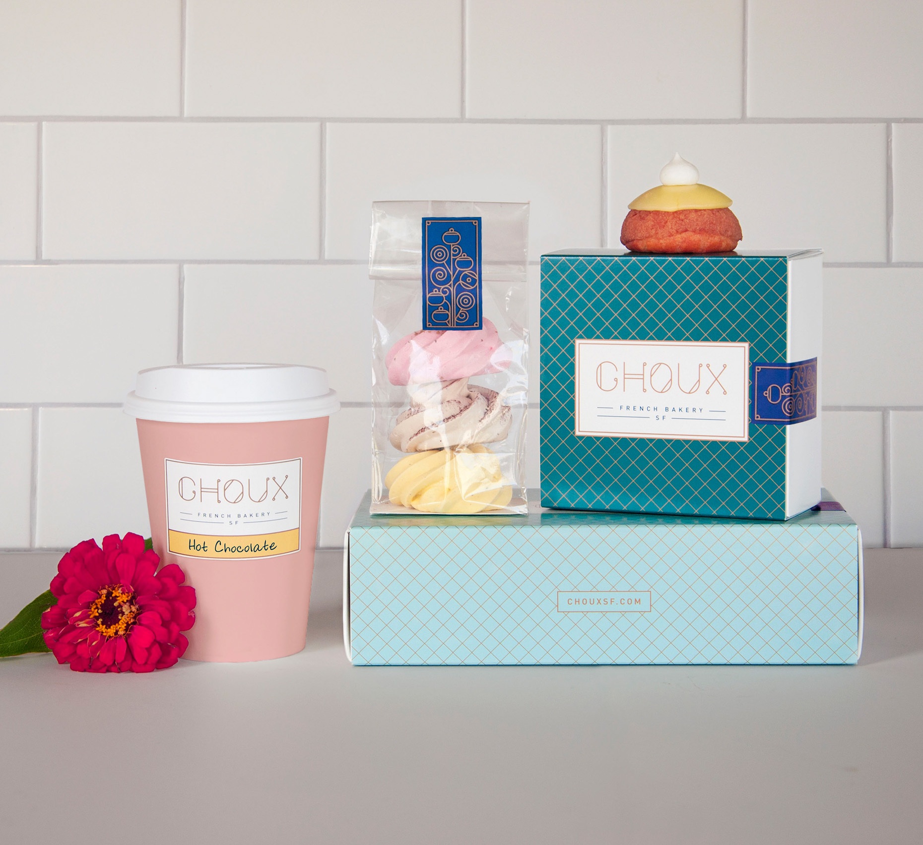
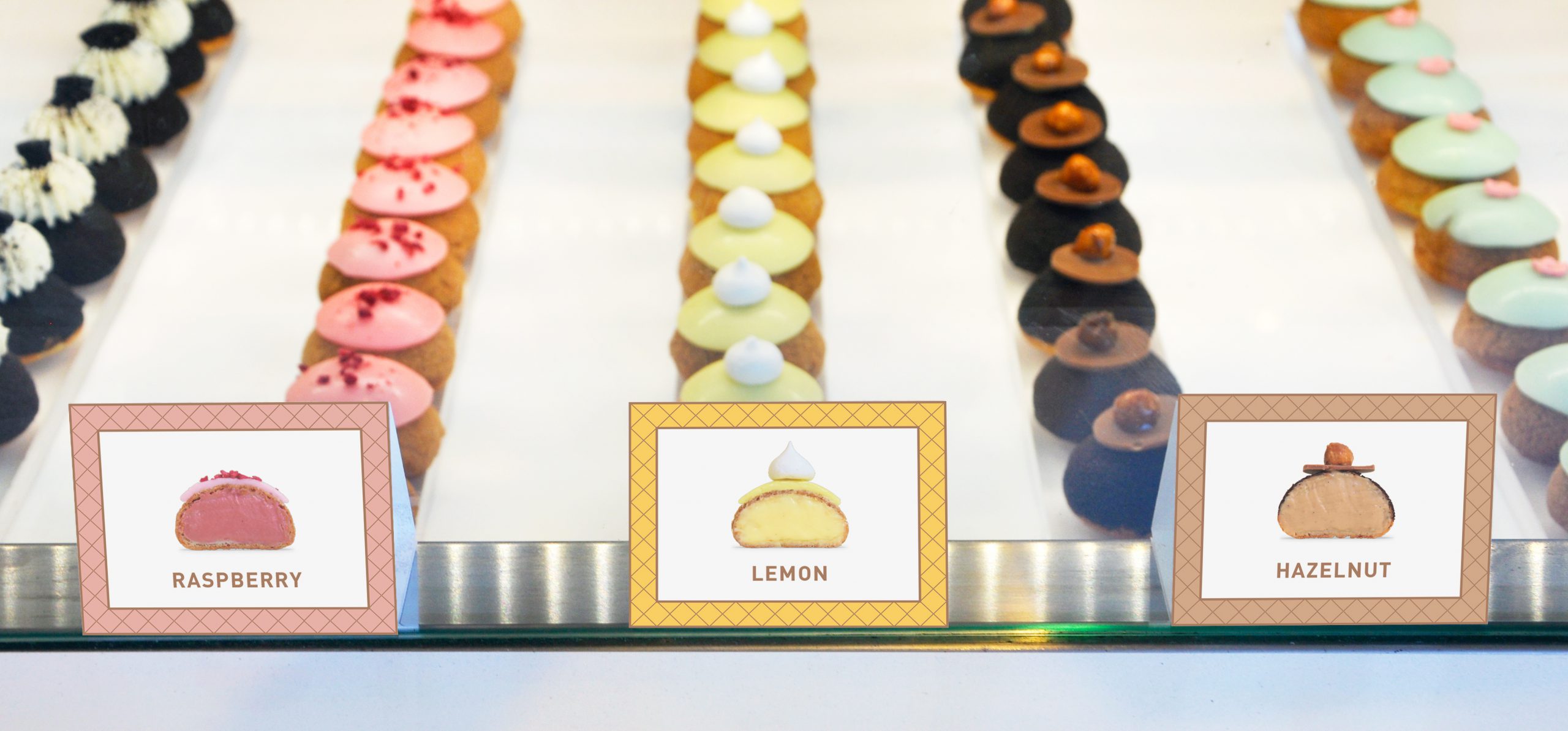
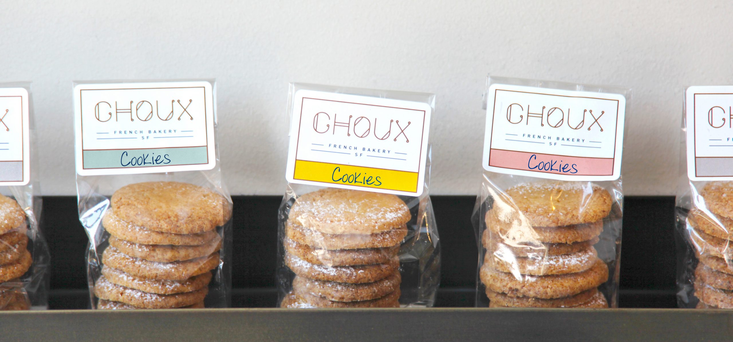
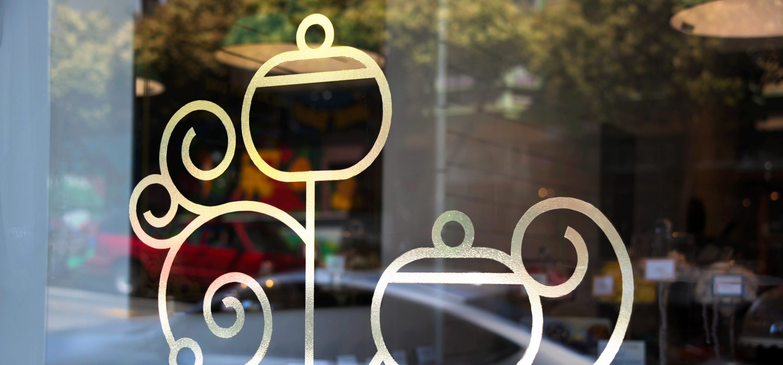
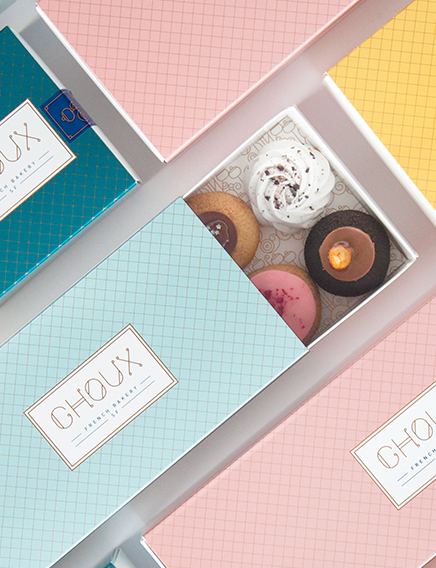
A refined pastel color palette speaks to the colors of traditional french pastry while golden filigree connects the brand elements together, creating a bouquet pattern that nods both to the gift-able nature of the brand, and to the art nouveau architecture that surrounds the Choux storefront in San Francisco. Adding to the brand’s delight, each box contains a line within that reads, u0022Roses are red, violets are blue, sugar is sweet and so is Choux.u0022
By creating a design language that is both premium and covetable, CBA was able to help position Choux as the perfect gift to share with others. And the unexpected nods to the city make Choux a brand that was truly inspired by France, but brought to life in San Francisco.
