Business Need/Challenge
SKYY sought to reinvigorate this globally iconic brand by creating a more product-centric brand visual identity (BVI) system to highlight their unique product story.
Background
With its launch in San Francisco in 1992, SKYY® redefined vodka as the world knew it. Inspired by the progressive spirit of San Francisco and a history of innovation, SKYY recognized an opportunity to evolve its liquid for a new generation of vodka drinkers, initiating a complete global relaunch in 2021. Fueled by the forward thinking of its hometown, and a respect for the natural character of the Pacific coast, the brand introduced a twist to the liquid. Now made from water enhanced with minerals, including Pacific Minerals sourced from the San Francisco Bay Area, and filtered through California Limestone, SKYY also took the opportunity to introduce refreshed packaging – inspired by the natural elements of San Francisco.
Brand Strategy
Recognizing that SKYY was uniquely positioned to promote a differentiated product story and connect with consumers in a purposeful and relevant way, we leveraged our core brand truths to develop an own able and scalable brand visual identity system.
Building a BVI
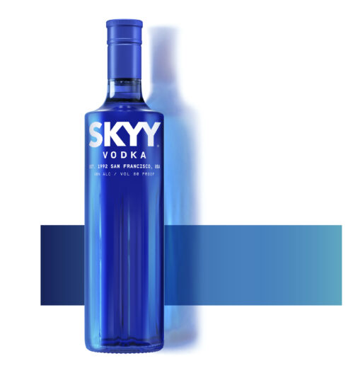
Starting with SKYY’s iconic blue color, we created the SKYY GRADIENT. A unifying element that can be used simply across all communications including physical branded touchpoints. Inspired by the blues of the Pacific Ocean speaking to transparency, the gradient also expresses the idea of motion and seamless transitions. An integral part of the SKYY BVI, the photography style depicts two key messages – the ‘Brand Story’ and lively ‘Activated Moments’ to allow for greater flexibility with global consistency.
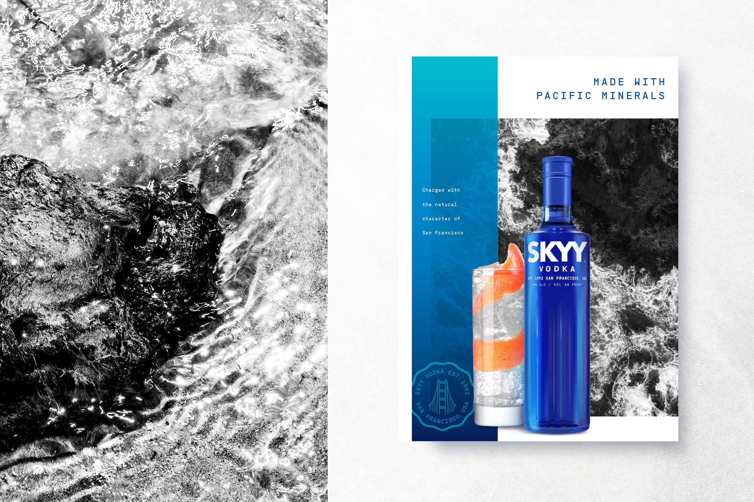
The Brand Story communications highlight SKYY’s San Francisco provenance and product attributes by utilizing black & white imagery to accentuate the timeless, iconic feel of the bay area, along with the minerals and limestone found in the surrounding coastal waters that provide a unique flavor profile. The ownable flood of blue and white contrasted against dramatic B&W coastal photography delivers a premium, yet arresting, brand block at retail.
Starting with SKYY’s iconic blue color, we created the SKYY GRADIENT. A unifying element that can be used simply across all communications including physical branded touchpoints. Inspired by the blues of the Pacific Ocean speaking to transparency, the gradient also expresses the idea of motion and seamless transitions. An integral part of the SKYY BVI, the photography style depicts two key messages – the ‘Brand Story’ and lively ‘Activated Moments’ to allow for greater flexibility with global consistency.

The Brand Story communications highlight SKYY’s San Francisco provenance and product attributes by utilizing black & white imagery to accentuate the timeless, iconic feel of the bay area, along with the minerals and limestone found in the surrounding coastal waters that provide a unique flavor profile. The ownable flood of blue and white contrasted against dramatic B&W coastal photography delivers a premium, yet arresting, brand block at retail.

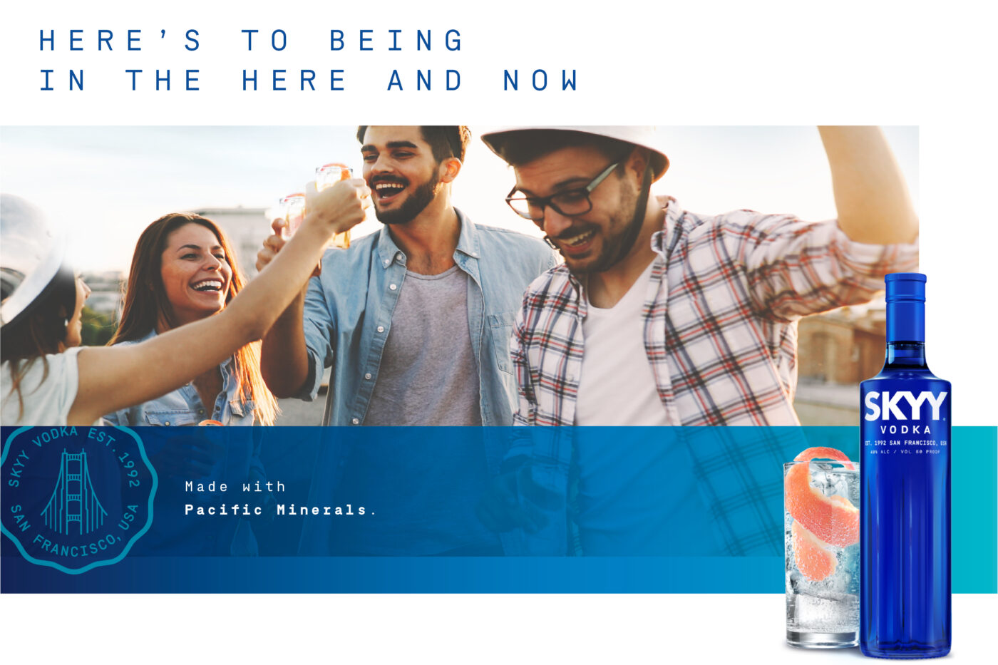
Activated Moments are in color. Often reflective of usage occasions, or driven by trends, they depict the SKYY brand experience. Used primarily in social media, online and for limited editions, we evoke easy energy using natural light, textures and ingredients to share unstaged moments of joy.
The SKYY SEAL is a mark of heritage and quality, with the iconic Golden Gate bridge at its heart, an emblem of pride. The rippled edge of the outer shape reflects the newly launched bottle footprint, inspired by the waves of the Pacific coast. The visual identity system also extends to SKYY Infusions, celebrating the portfolio’s natural flavors by introducing a saturated photography style that speaks to freshness and taste. Infusions connects visually to the core range by featuring the same lifestyle photography, injected with subtle flavor color cues and by leveraging the iconic SKYY gradient consistently across touchpoints.
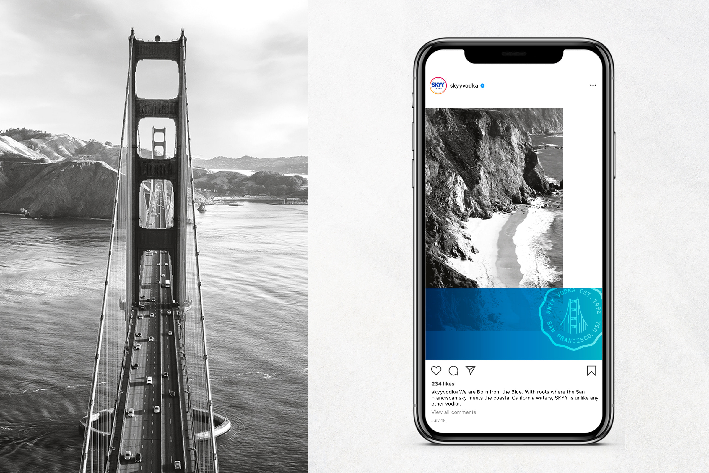
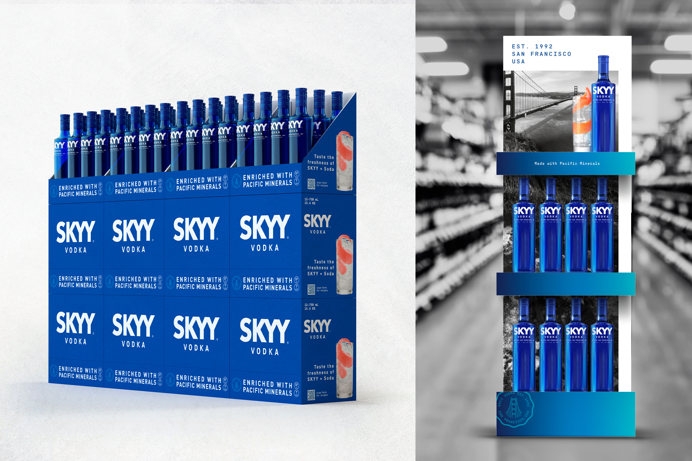
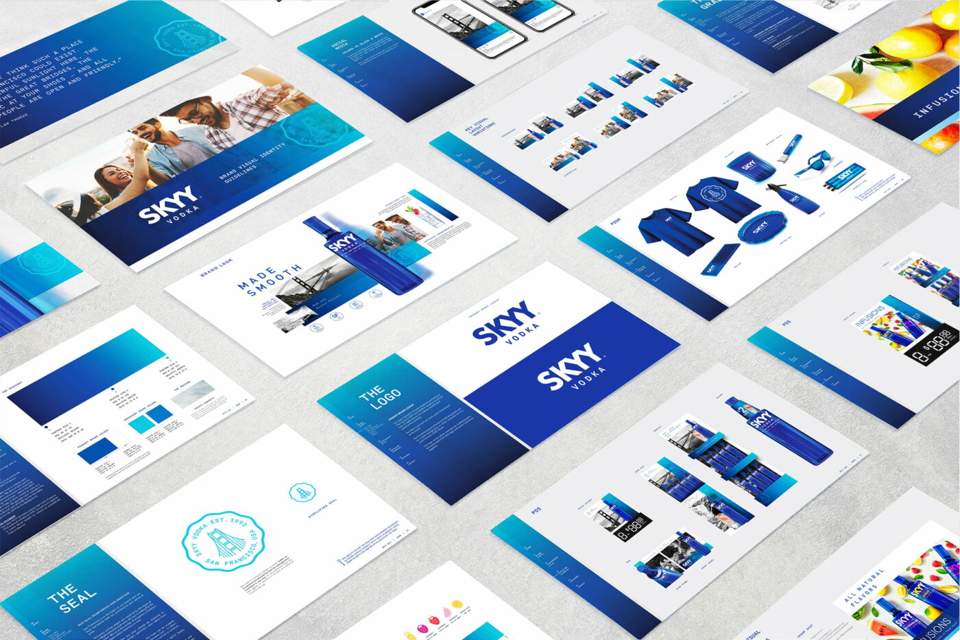
These core elements are applied to a range of touchpoints – including communications and point of sale materials (POSM), branded items, trade show environments and social media templates, represented in the form of a branded manual. The wide range of visual executions act as a consistent foundation for both global and local market creative partners.
Campari America is a leading spirits company in the US, boasting a rich, comprehensive portfolio of more than 22 brands, including award-winning vodkas, whiskies, rums, gins, cordials, and liqueurs. Campari America is a wholly owned subsidiary of Davide Campari-Milano S.p.A. (Reuters CPRI.MI – Bloomberg CPR IM). More information on the company can be found at www.campariamerica.com.

