France
Paris
Switch to your local agency
Retour au menu
Working closely with our studios around the world – 15 studios in 13 countries – we create unique brand expressions and experiences.
We shape brands.
We create experiences.
We generate value.
We are designers.
We shape brands.
We create experiences.
We generate value.
We are designers.
With our extensive expertise in the Soft Drinks industry, our teams are dedicated to helping you make your brand purposeful and sustainable now and in the future. We are committed to pushing the boundaries of creativity and innovation to enhance your business performance.
RESEARCH . STRATEGY . BRANDING . PACKAGING . RETAIL & ARCHITECTURE . DIGITAL . ACTIVATION . COMMUNICATION
Makers and Designers.
Makers and Designers.
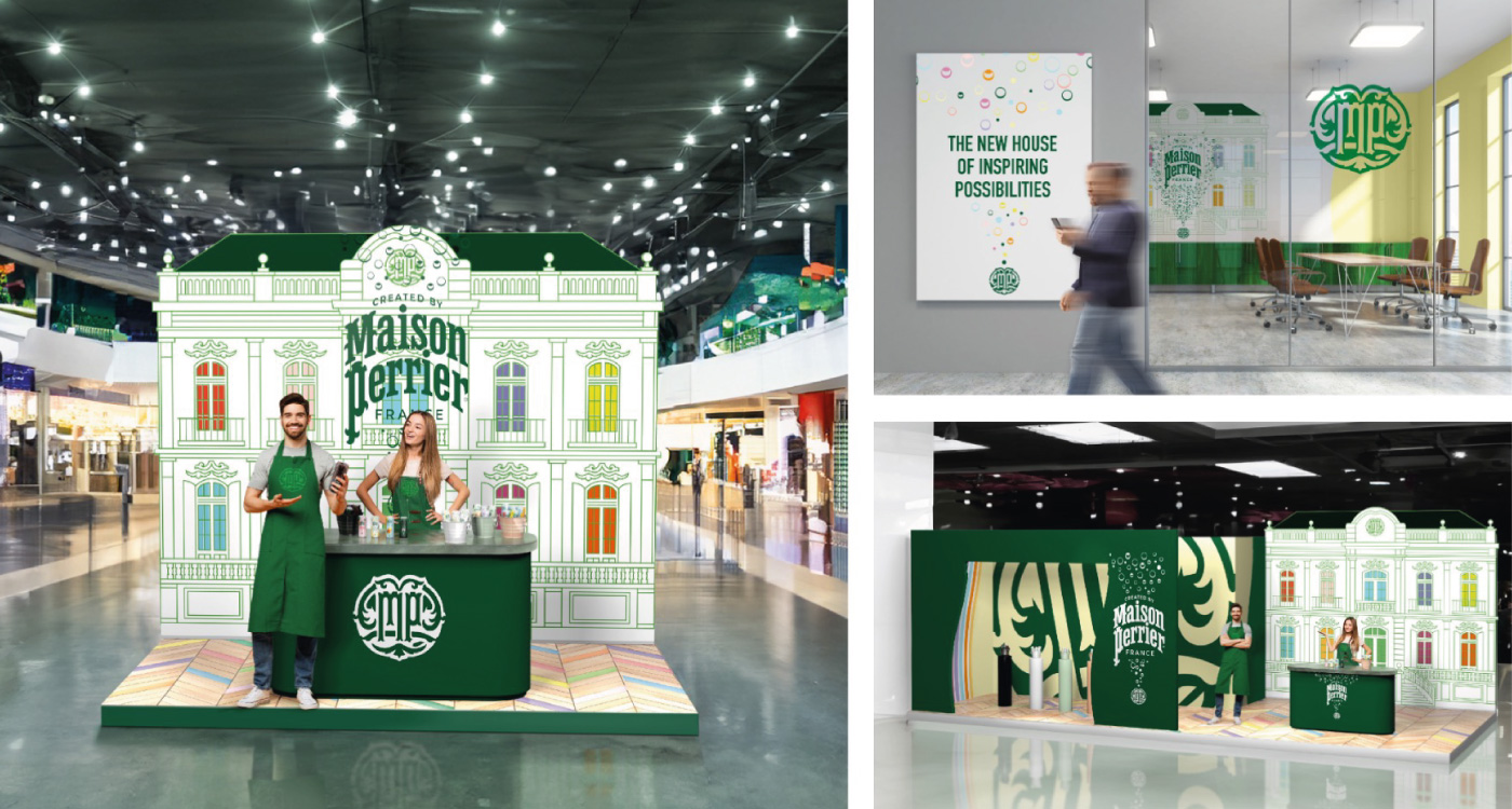
Maison Perrier
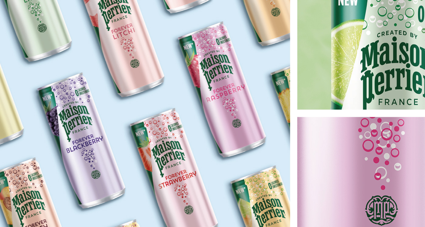
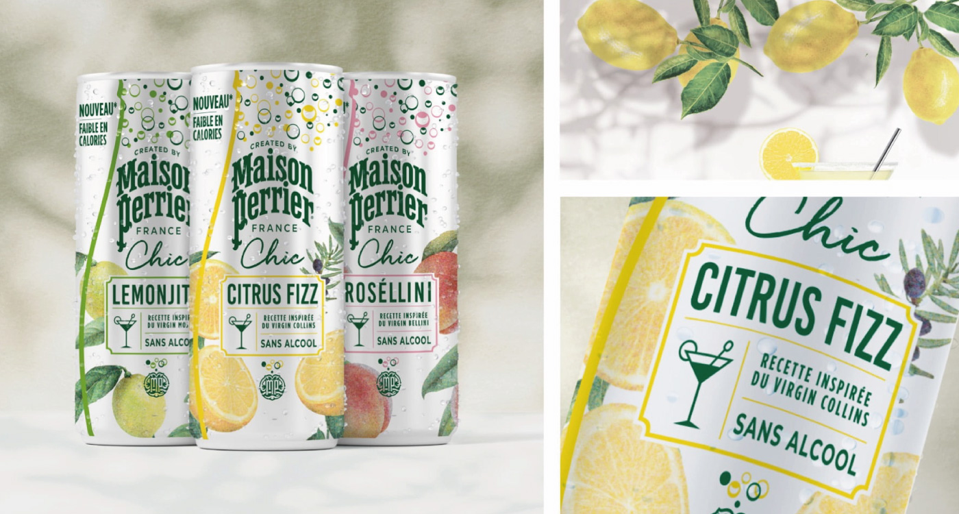
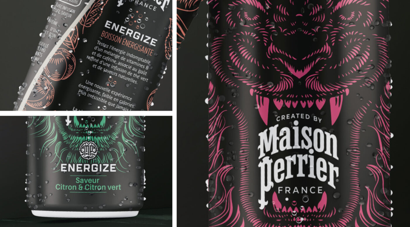
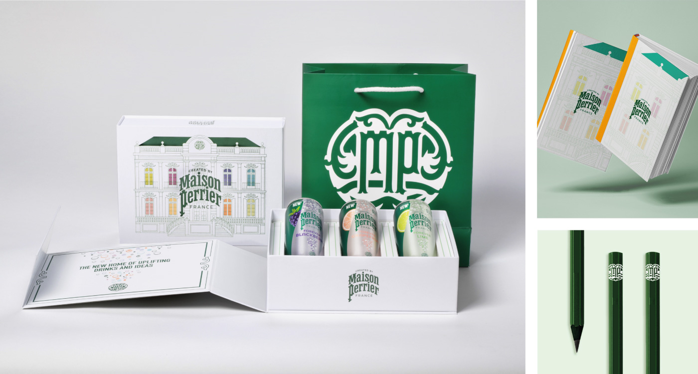
Challenge: In a constantly evolving beverage market, Perrier, with 160 years of history, seeks to modernize its image while preserving its heritage and premium positioning.
Solution: Creation of Maison Perrier with CBA Design — from logo to name, distinct packaging for each product line, communication materials, and customer experience, all enhancing the “French touch” and Perrier’s expertise.
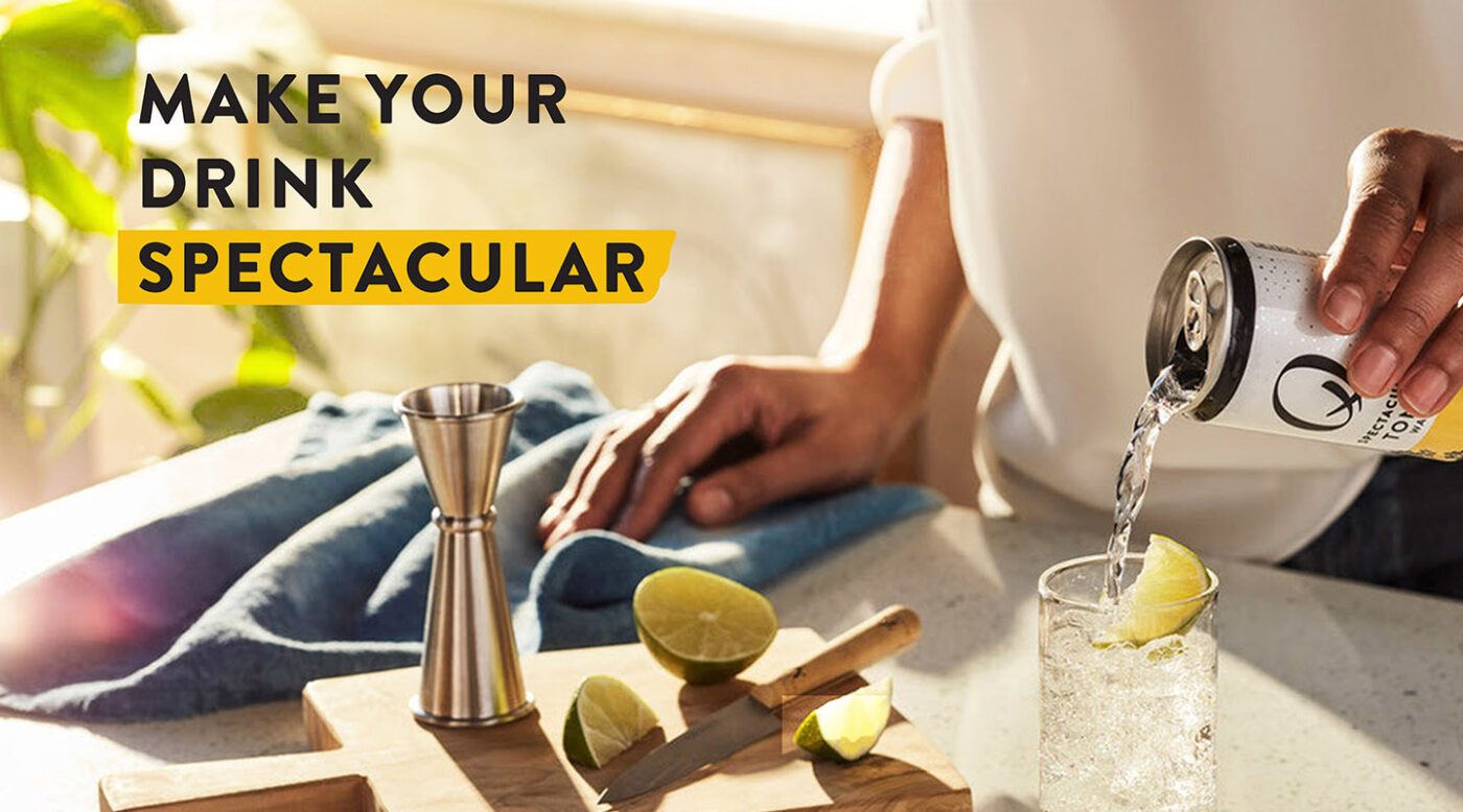
Q Mixers
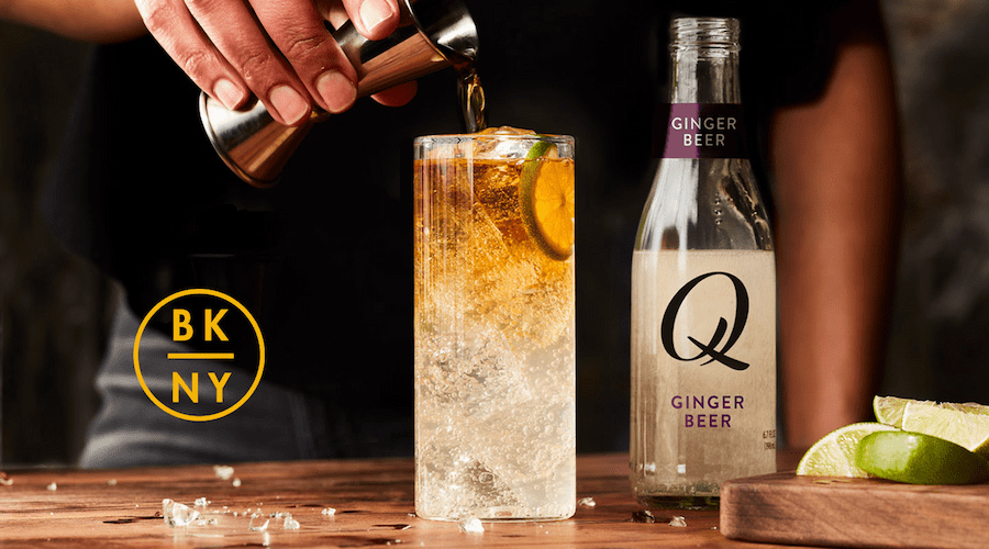
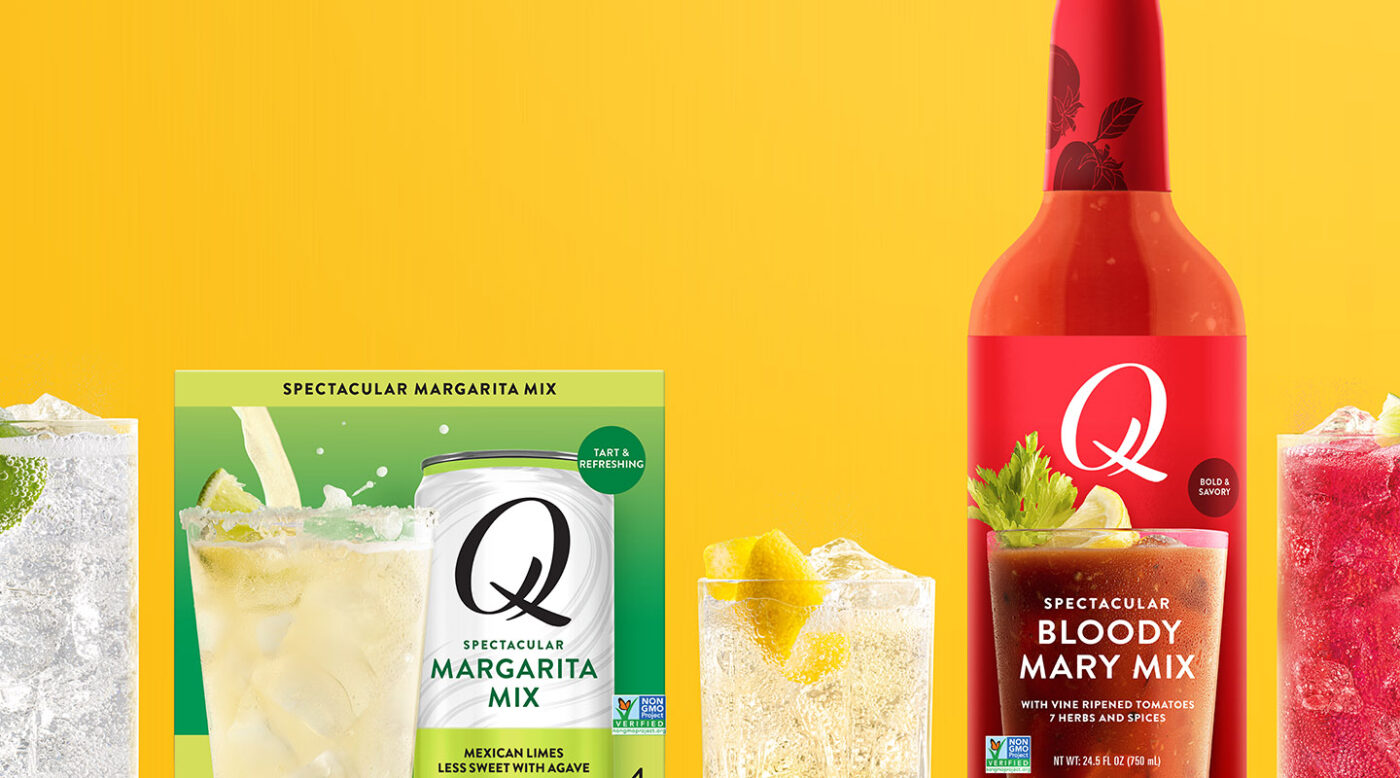
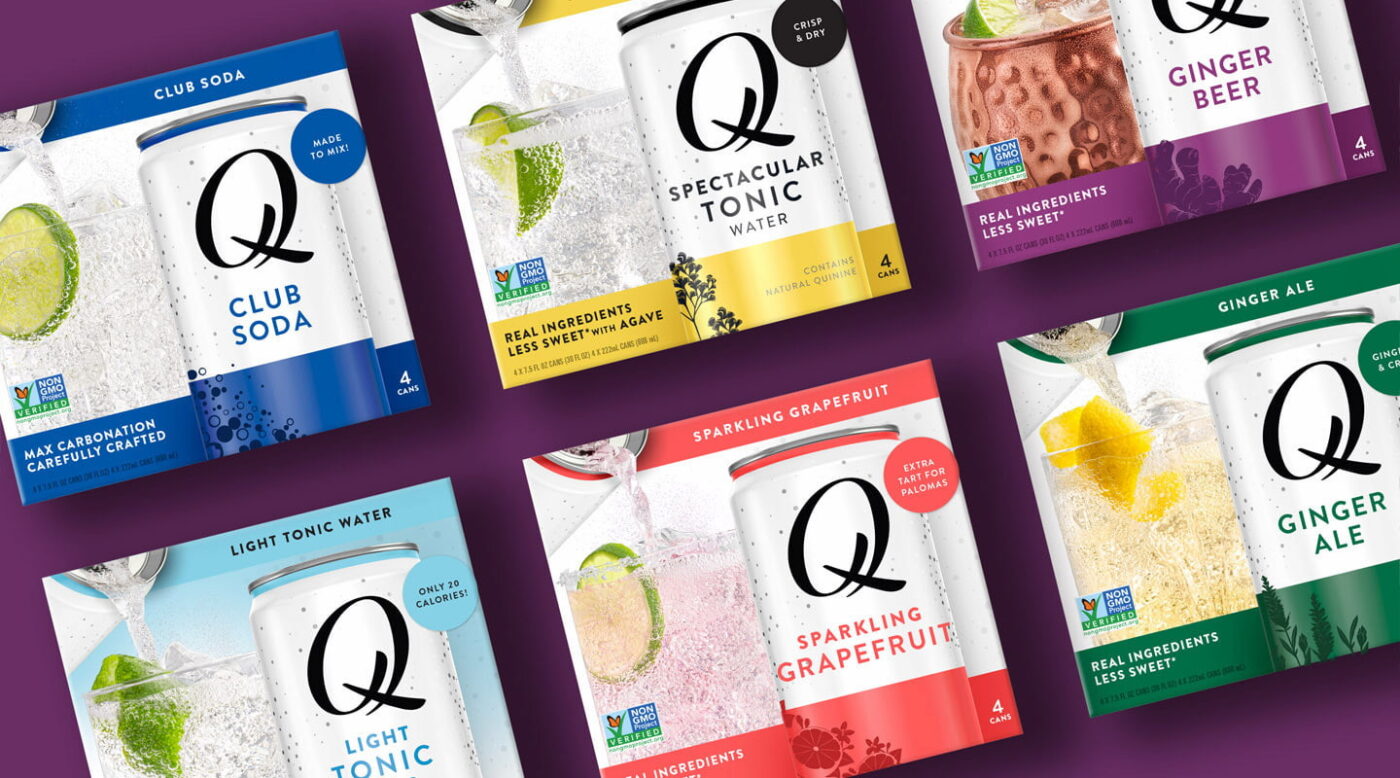
Q Mixers, a New York-based brand, crafts premium mixers with natural ingredients and perfect carbonation, designed for exceptional cocktails.
Challenge: Differentiate and position itself as a leader in a saturated and competitive market.
Solution: Creation of a dynamic logo and attractive packaging leveraging cocktail inspiration and the quality of ingredients. A “golden hour” color palette and clear communication reinforce consistency and elevate the mixology experience.
Nescafé
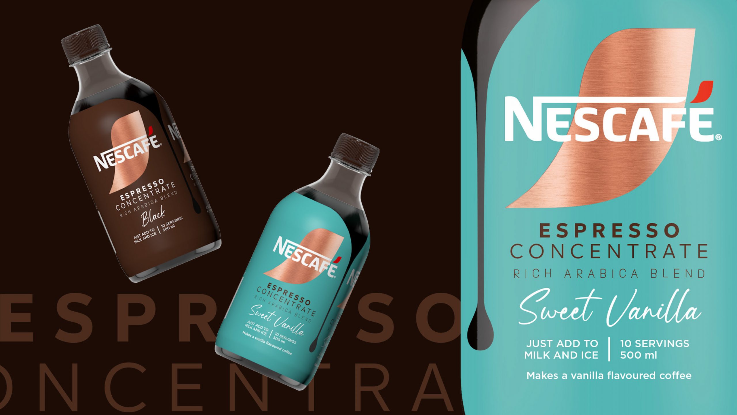
Nestlé wanted to modernize the visual identity of its NESCAFÉ brand globally, emphasizing authenticity and simplicity.
Challenge: Deploy this new visual identity consistently and effectively across 180 markets, taking into account local specificities.
Solution: CBA orchestrated the collaboration of its international agencies to create a modernized logo, a clean and natural design, and rolled out this branding across all NESCAFÉ packaging.

Numen, Spain’s first premium water, aims to revolutionize the market with elegance and finesse.
Challenge: Create a memorable visual identity reflecting luxury and inspiration, while distinctively positioning the brand in the market.
Solution: An iconic bottle, a unique color palette, contemporary typography, and an exclusive baroque frame, creating an elegant and consistent identity across all media.
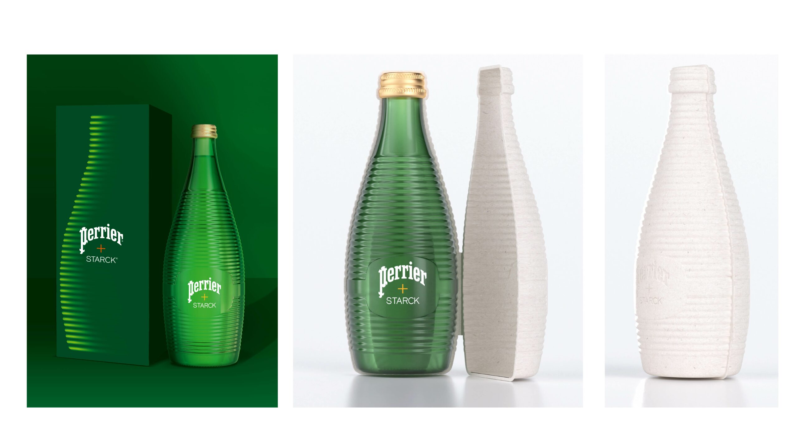
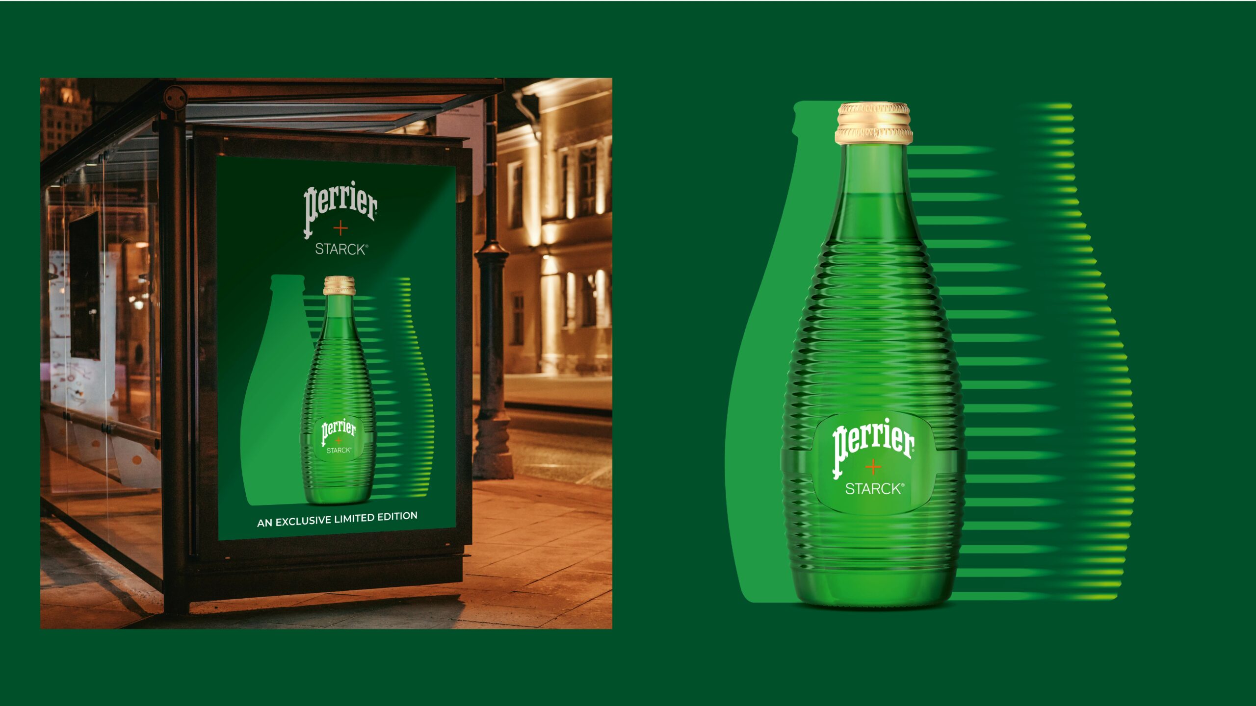
Perrier x Starck
Perrier celebrates its 160th anniversary with a global limited edition: PERRIER + STARCK. Philippe Starck reimagines the iconic glass bottle.
Challenge: Extend the PERRIER + STARCK bottle design across various communication materials, while maintaining Perrier’s brand consistency.
Solution: Inspired by Fresnel lenses, the Starck bottle features striations that capture light. CBA Design extends this luminosity to the packaging, press kit, key visual, and promotional items, creating an immersive and premium brand experience.
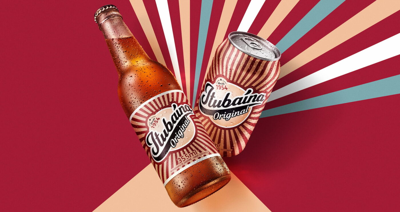
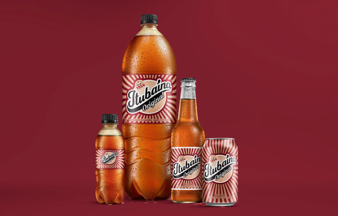
Challenge: Modernize Itubaína’s visual identity to embody “spontaneous fun” and attract a new customer base, while retaining the established brand’s recognizable codes and maintaining loyalty among existing customers.
Solution: Creation of a dynamic and colorful visual identity with modern typography, applied to packaging and supported by a comprehensive Brand Book for unified and consistent communication.
Nestlé Aquarel aims to connect with consumer concerns by refocusing its strategy on nature and its benefits.
Challenge: How to visually translate this new direction and highlight the unique origin of Aquarel water, sourced from biosphere reserves?
Solution: A new brand territory focused on nature, illustrated by ivy and fern, symbols of the Montseny and La Siberia reserves. A realistic, multi-layered style showcases the richness of these ecosystems and invites reconnection.
Privacy Overview
| Cookie | Duration | Description |
|---|---|---|
| aka_debug | This cookie is set by the provider Vimeo.This cookie is essential for the website to play video functionality. The cookie collects statistical information like how many times the video is displayed and what settings are used for playback. | |
| pll_language | 1 year | This cookie is set by Polylang plugin for WordPress powered websites. The cookie stores the language code of the last browsed page. |
| Cookie | Duration | Description |
|---|---|---|
| _gat | 1 minute | This cookies is installed by Google Universal Analytics to throttle the request rate to limit the colllection of data on high traffic sites. |
| YSC | session | This cookies is set by Youtube and is used to track the views of embedded videos. |
| Cookie | Duration | Description |
|---|---|---|
| _ga | 2 years | This cookie is installed by Google Analytics. The cookie is used to calculate visitor, session, campaign data and keep track of site usage for the site's analytics report. The cookies store information anonymously and assign a randomly generated number to identify unique visitors. |
| _gid | 1 day | This cookie is installed by Google Analytics. The cookie is used to store information of how visitors use a website and helps in creating an analytics report of how the website is doing. The data collected including the number visitors, the source where they have come from, and the pages visted in an anonymous form. |
| vuid | 2 years | This domain of this cookie is owned by Vimeo. This cookie is used by vimeo to collect tracking information. It sets a unique ID to embed videos to the website. |
| Cookie | Duration | Description |
|---|---|---|
| IDE | 1 year 24 days | Used by Google DoubleClick and stores information about how the user uses the website and any other advertisement before visiting the website. This is used to present users with ads that are relevant to them according to the user profile. |
| test_cookie | 15 minutes | This cookie is set by doubleclick.net. The purpose of the cookie is to determine if the user's browser supports cookies. |
| VISITOR_INFO1_LIVE | 5 months 27 days | This cookie is set by Youtube. Used to track the information of the embedded YouTube videos on a website. |
| Cookie | Duration | Description |
|---|---|---|
| CONSENT | 16 years 7 months 21 days 10 hours | No description |
| cookielawinfo-checkbox-functional | 1 year | The cookie is set by GDPR cookie consent to record the user consent for the cookies in the category "Functional". |
| cookielawinfo-checkbox-others | 1 year | No description |