
Braskem is a global petrochemical company with innovative DNA and strategic business vision, whose purpose is to improve people’s lives by creating sustainable solutions in chemistry and plastics.
CBA B+G, Braskem’s partner in several projects, was responsible for the company’s brand evolution and its strategic repositioning; for the development of Brand Center Braskem and its branded environment; for the expansion of the product portfolio encouraging circular economy based on the already recognized brand I’m green™ and, more recently, for the creation of the Cazoolo brand.
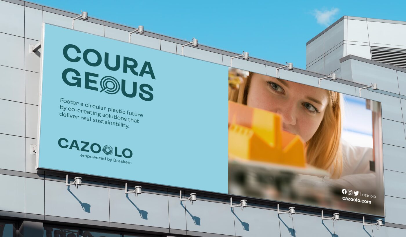
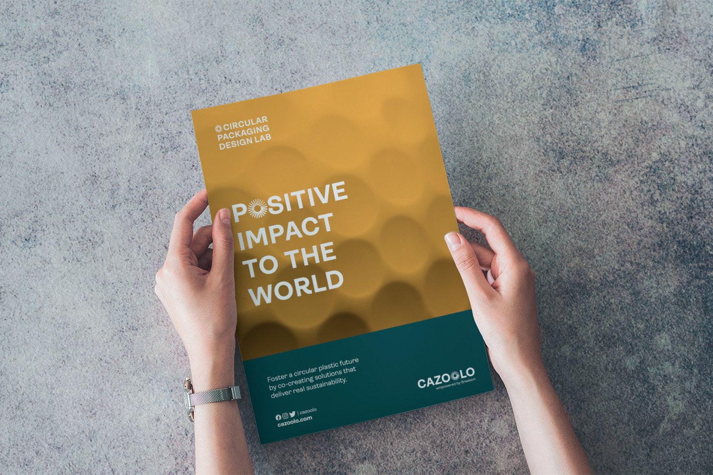
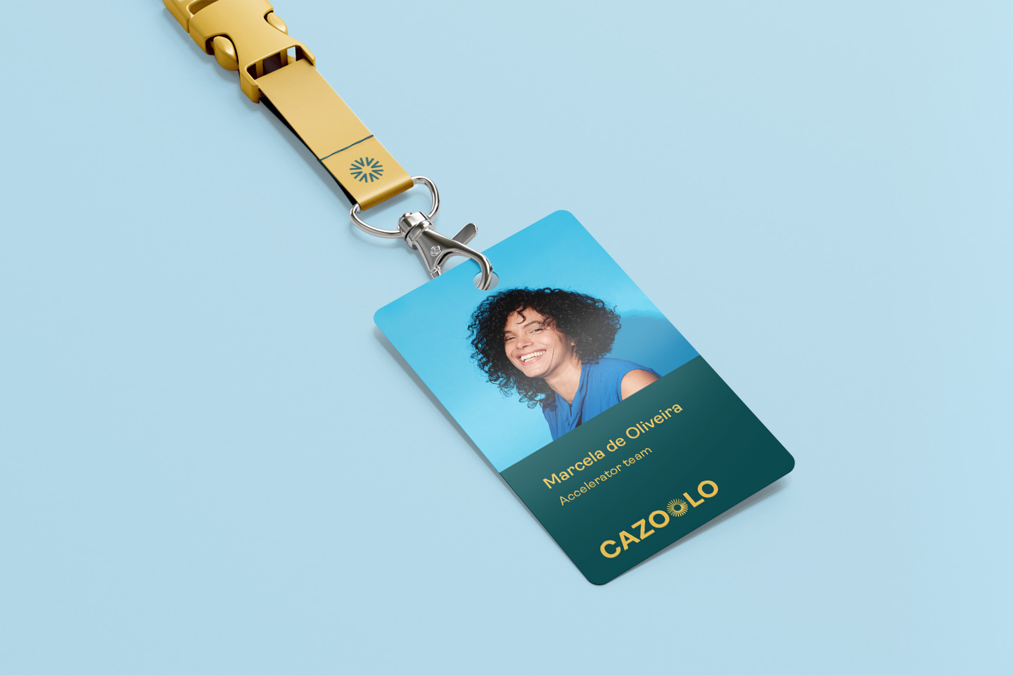
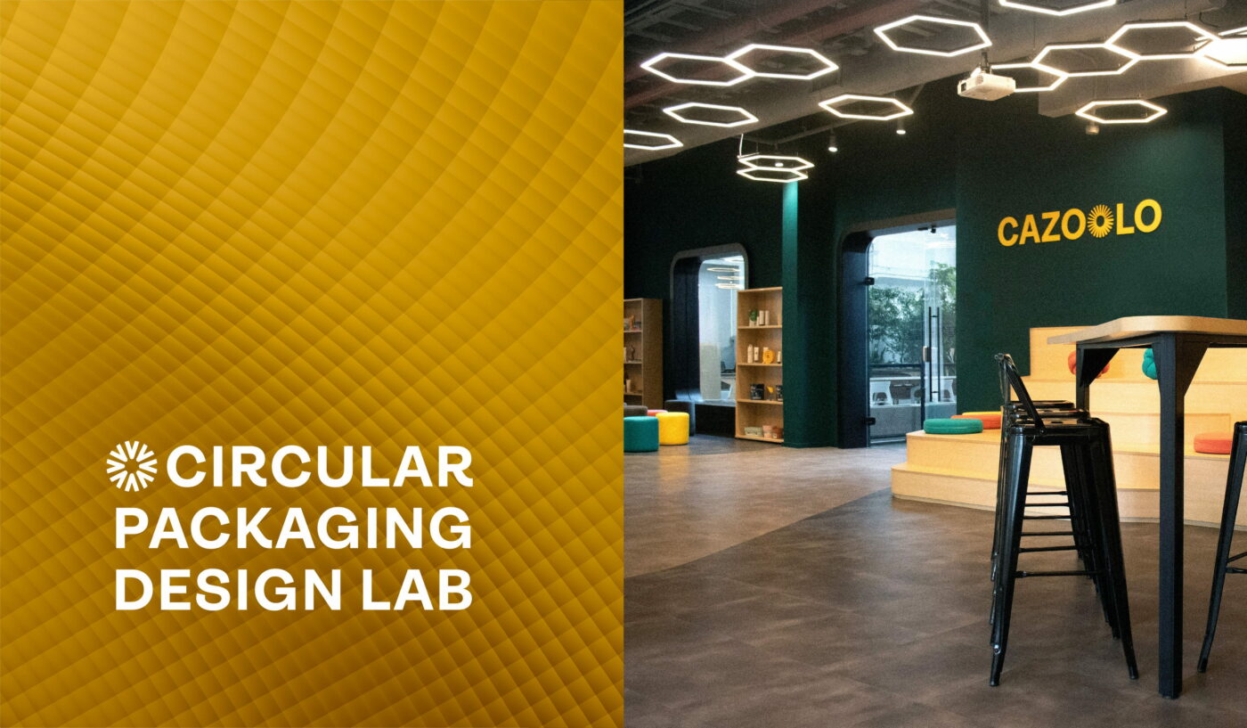
Cazoolo is the Packaging Design Lab for Braskem’s Circular Economy, located in the capital city of São Paulo. It is an innovation hub designed to house a creative community, where customers, brand owners, designers and startups can meet to rethink packaging from a sustainable design approach, crafting the whole process – from concept to post-consumption – aiming at circularity and lower environmental impact.
Circular packaging design lab
From day one, we at CBA were well aware of the huge challenge we were facing, and we developed an extensive, thorough, and rewarding branding project. From strategy to visual identity, from naming to phygital experience, the process involved a lot of co-creation.

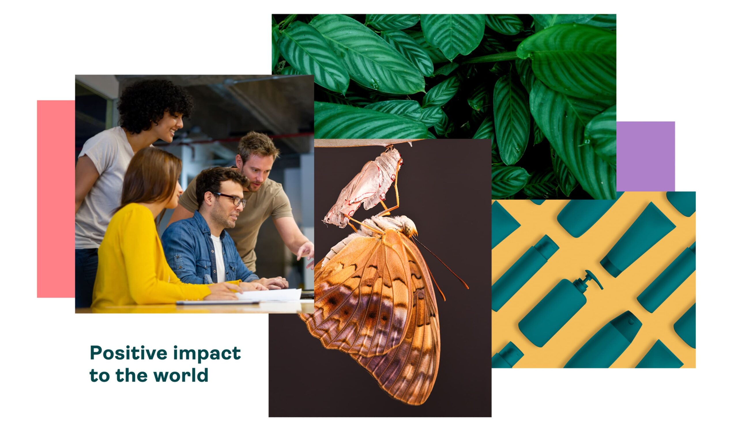
To create the new brand strategy, the first step was to develop its platform, establishing the brand personality, purpose, and values, to define the brand positioning. Key values such as being a facilitator of tangible solutions, believing in creative and accessible collaboration and understanding the positive value of plastics, have guided the development of brand elements.
For the naming, the inspiration was to look for something that stems from within, a great transformation that happens from the inside out. We believe that the energy required to evolve, to create something new, is to be found within each individual. The name (which sounds like “casulo” – the Brazilian word for “cocoon”) is also a direct reference to the concept of packaging, since a cocoon is in itself a package. All the more, a perfect package, shaped by nature’s ingenuity. A place where big changes happen and where everything can be transformed into its best version.
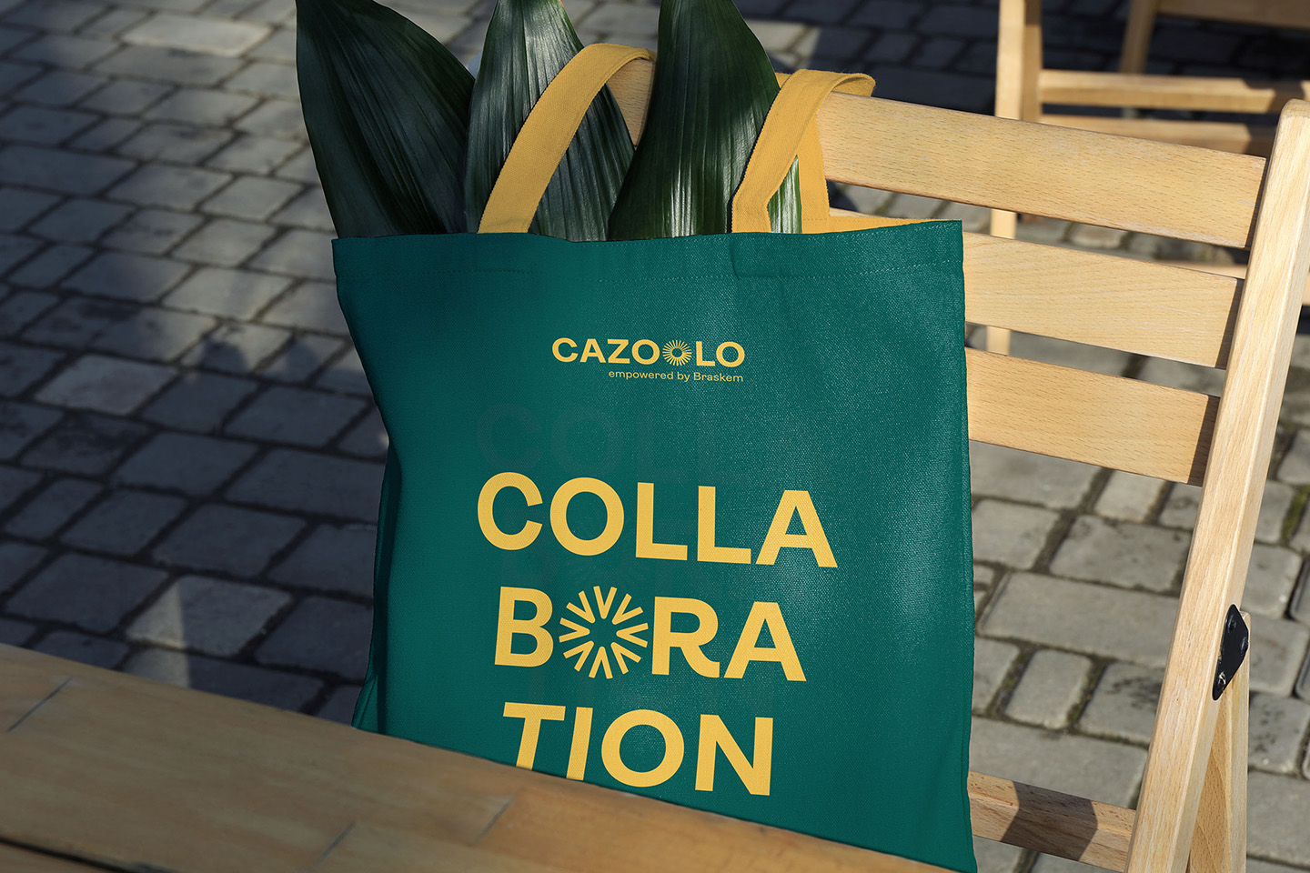
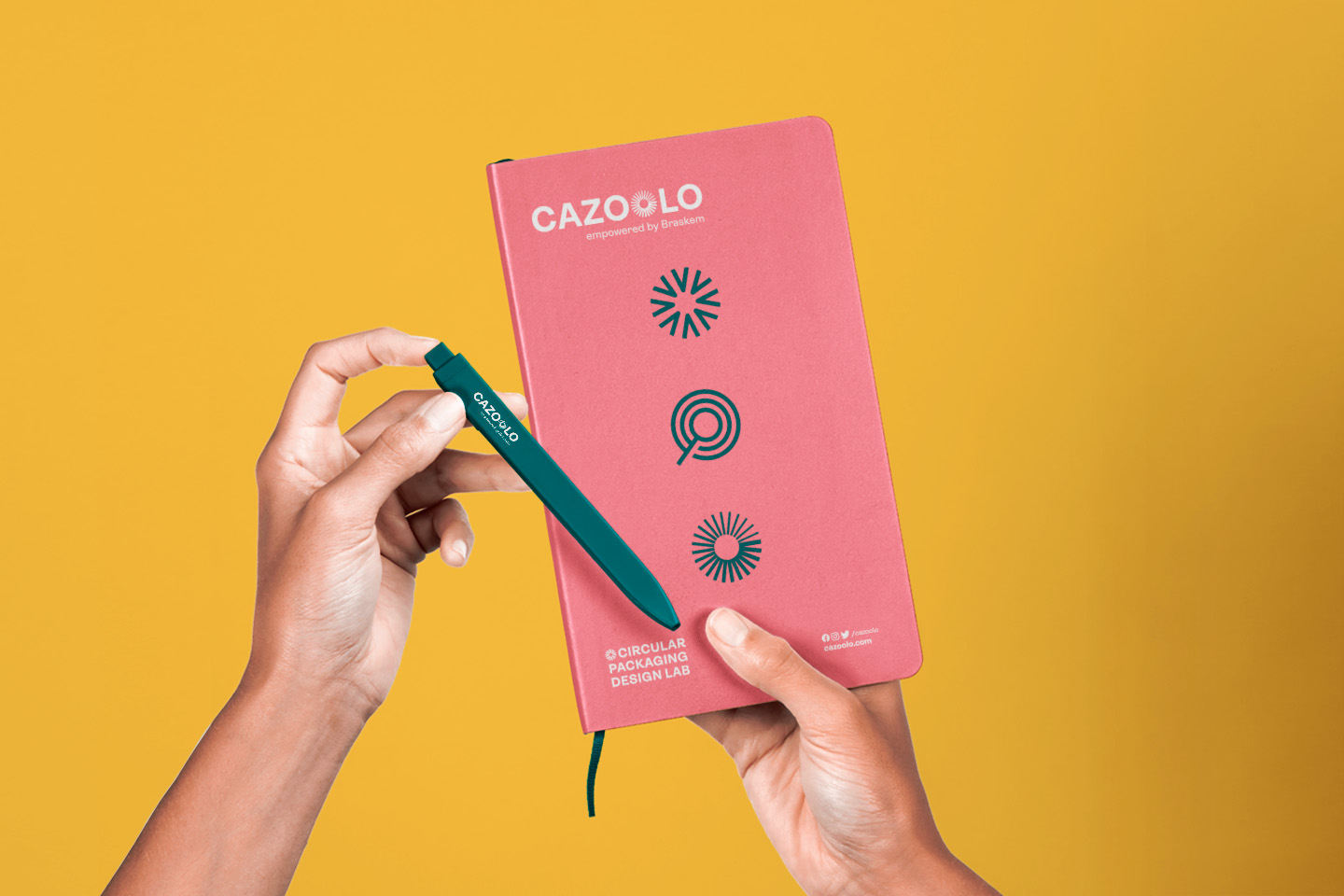
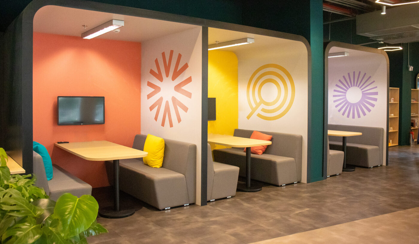
The letter “O” is replaced by the main icon of the brand, alluding to transformation and movement; the transformative power that everyone possesses.
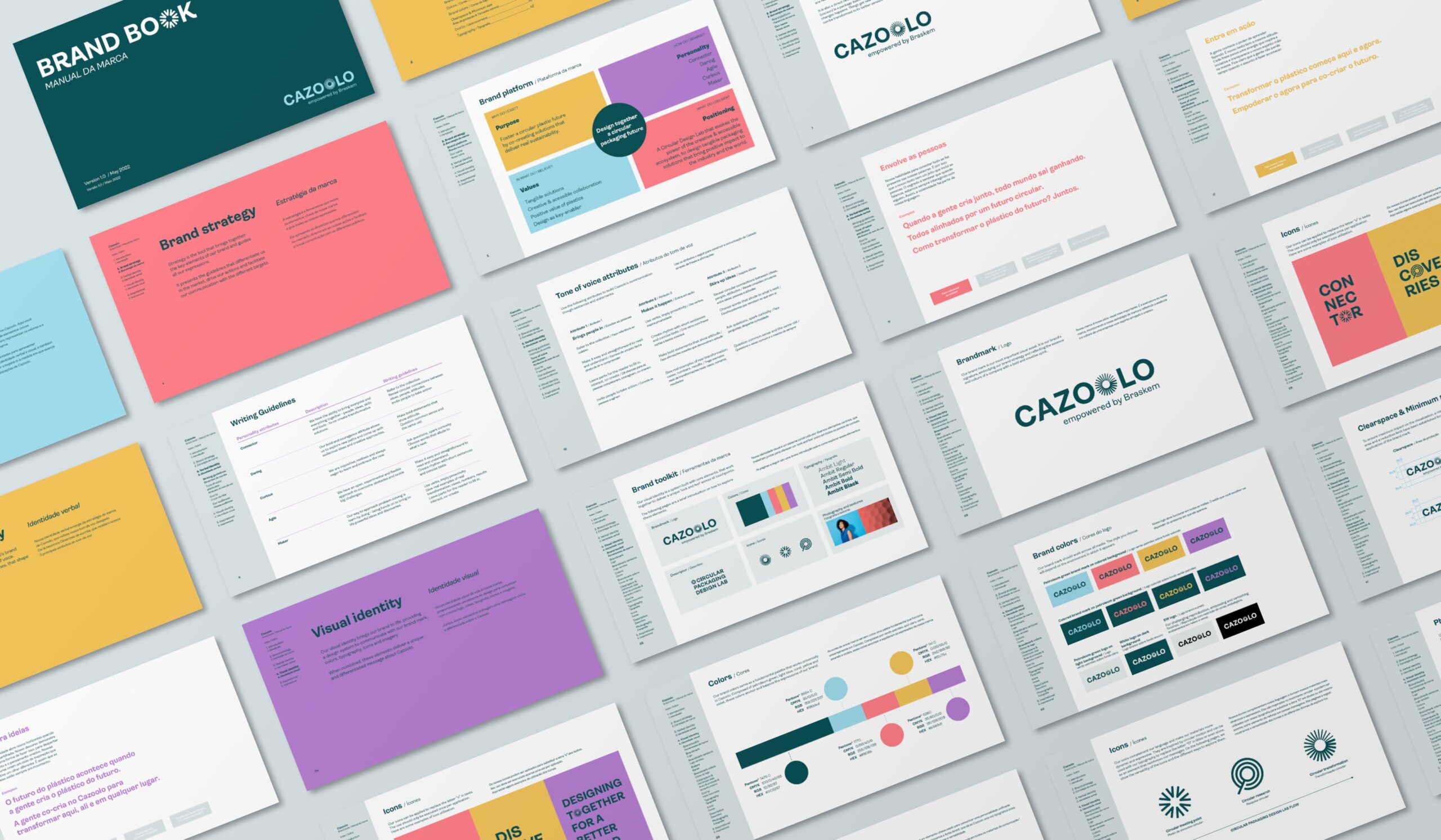
For its visual identity, we adopted a clean graphic concept, supported by a contemporary color palette, with simple and uncomplicated typography and icons, creating a purposefully more down-to-earth brand, connected with the maker culture and the positive attitude of the lab.
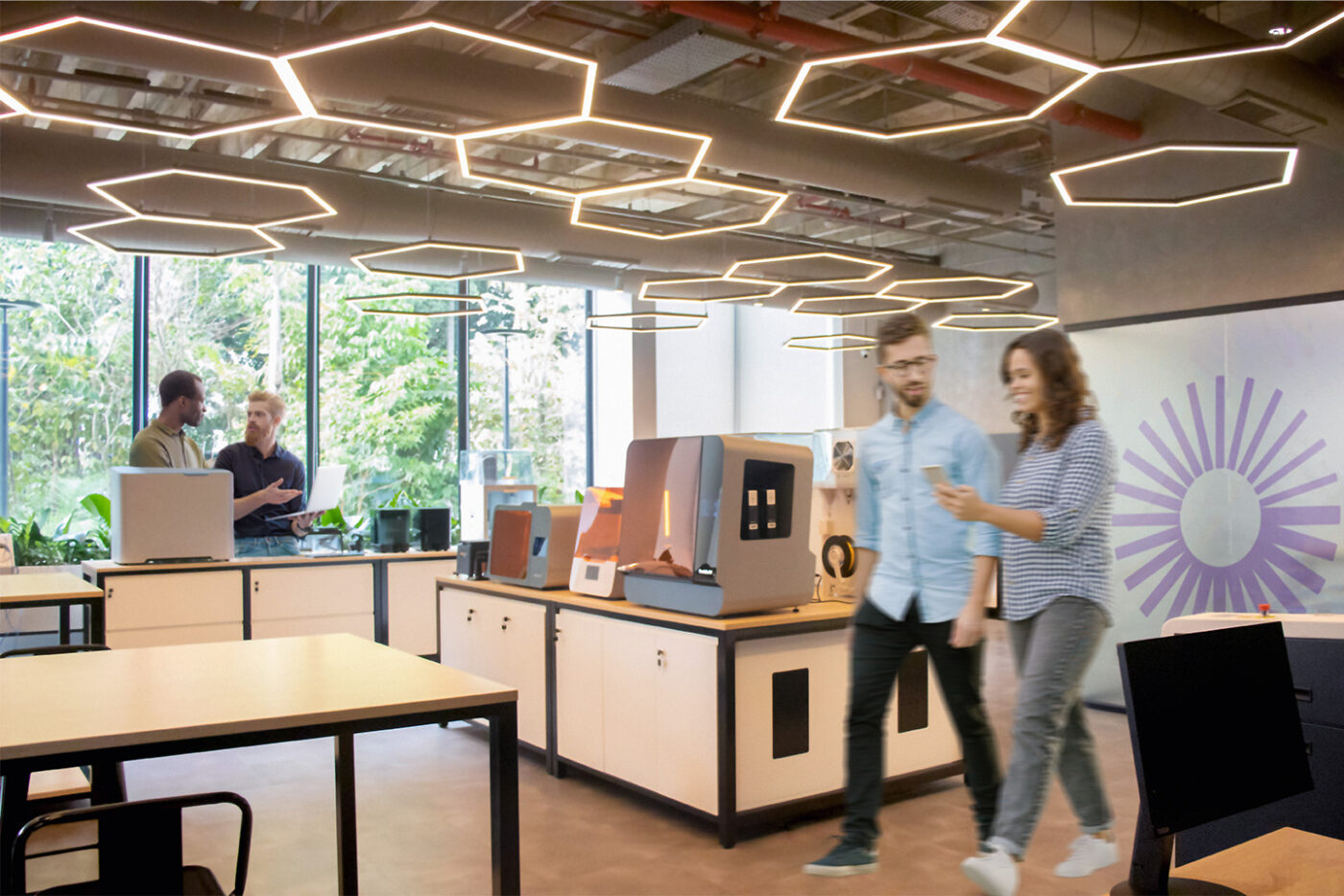
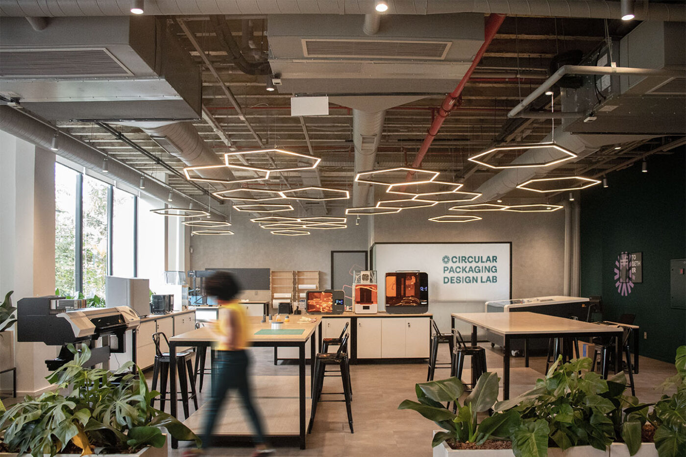
The projects developed in the hub will be based on Design for Environment (DfE) and Life Cycle Analysis (LCA) concepts, giving birth to innovative and sustainable packaging.
Leveraging the advance of packaging circularity is a mission that relates to our vision, and we love being part of this story.
