
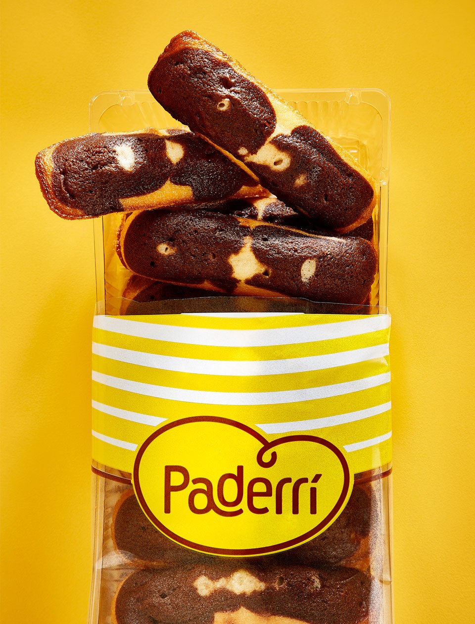
Something is cooking
A French brand holding a tradition in bakery decides to make bread for a target made of bread lovers and consumers. That was how we faced the challenge Norac brought over to us. Norac Foods Group, born 30 years ago in France is now in Brazil since 2011, with the brand Ateliê.
Ateliê produces and distributes fresh and ready-to-eat products in the sandwich and salad segments. The group decided, in the peak of its expertise in bakery and confectionery, that it should expand the business and produce larger amounts, just like the way it’s already done in its native country.
For jumping in this new opportunity, they needed a platform that was able to embrace the new business direction: a different brand in terms of range and production scale – but keeping the French baker, boulangère and bread expert essence.
Strategy and creativity applied
The actual challenge was twofold: developing a unique value proposition for the brand, with such a motivation that it would hook people’s interest, making them consider and consume it; besides that, we would create this new brand from scratch. Actually not from scratch, considering the French core was always there to enhance it.
However, it would be necessary to shape the platform and create the brand’s strategy, identity, proprietary elements, and finally the packs.
As we use to say, ‘Art & Science’, a kind of work we love doing: combining strategic and analytic thinking with the creative and intuitive force of design.
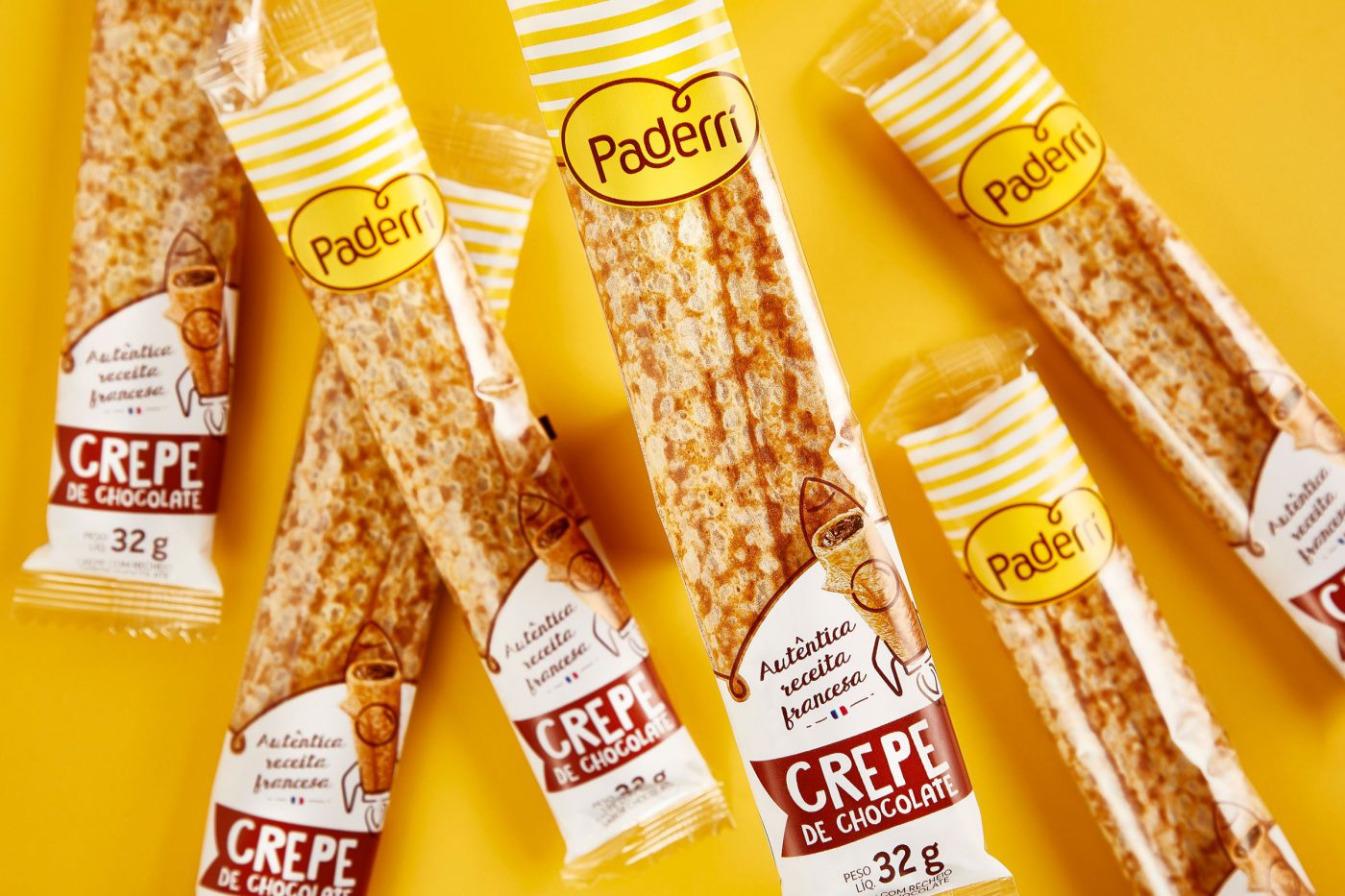
Naming
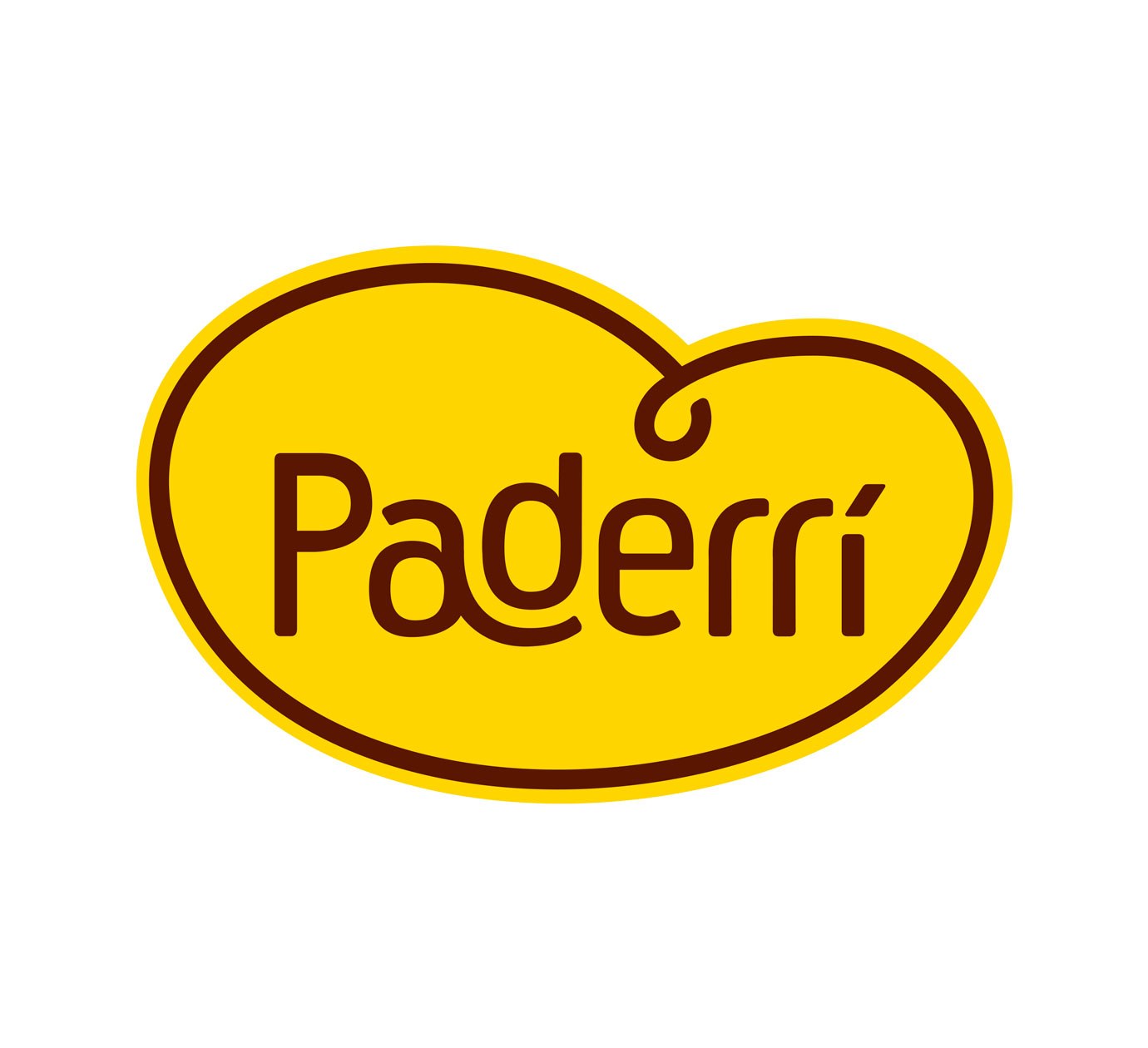
Pushed by the brand’s pillars and its “brand pulse”, we jointly got to the conclusion that the name should be suggestive to evoke the brand’s territory, as well as sonorous, easy-to-get, reinforcing its French roots.
From that on, we set off to the defiant task of generating ideas for the name itself. It was a cheered-up, light and relaxed process, which in the end resulted in a name with the needed differentiation aspired by the brand.
Visual identity
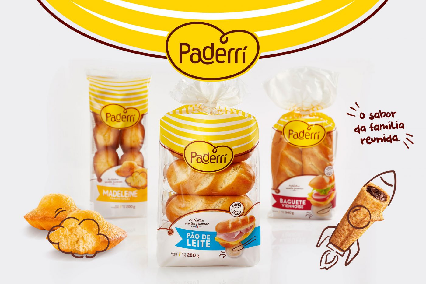
With the name set up, we set off to its identity. As of the brand’s pillars – care, handcrafted, joy & practicality – as well as a look into the category, we went in search for identifying the visual codes. If on the one hand we wanted to convey the French expertise and tradition, we were also aware about the need of balancing modernity and tradition, also bringing up the matter of family in a different and singular way – after all, the sharing of bread is a strong symbol of care and affection. So we got to the point of grasping the consumption habits of customers, so that we could build up the brand’s strategic lines.
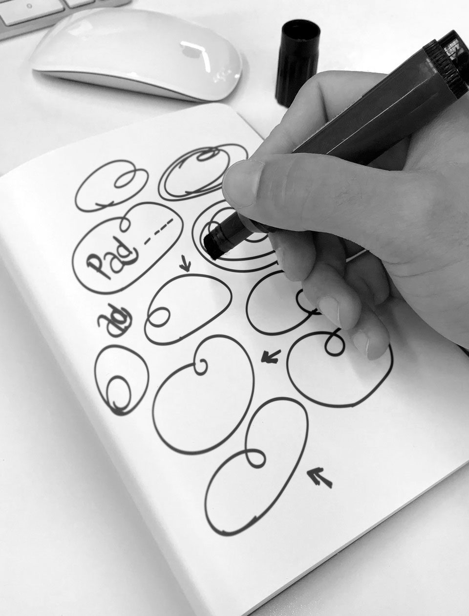
We carried out qualitative and quantitative researches with the brand’s potential consumers in order to get genuine insights, and then started developing a “look and feel” to the new identity, with a handcraft touch, fun iconography, colors, a joyful and positive graphic and photographic style.
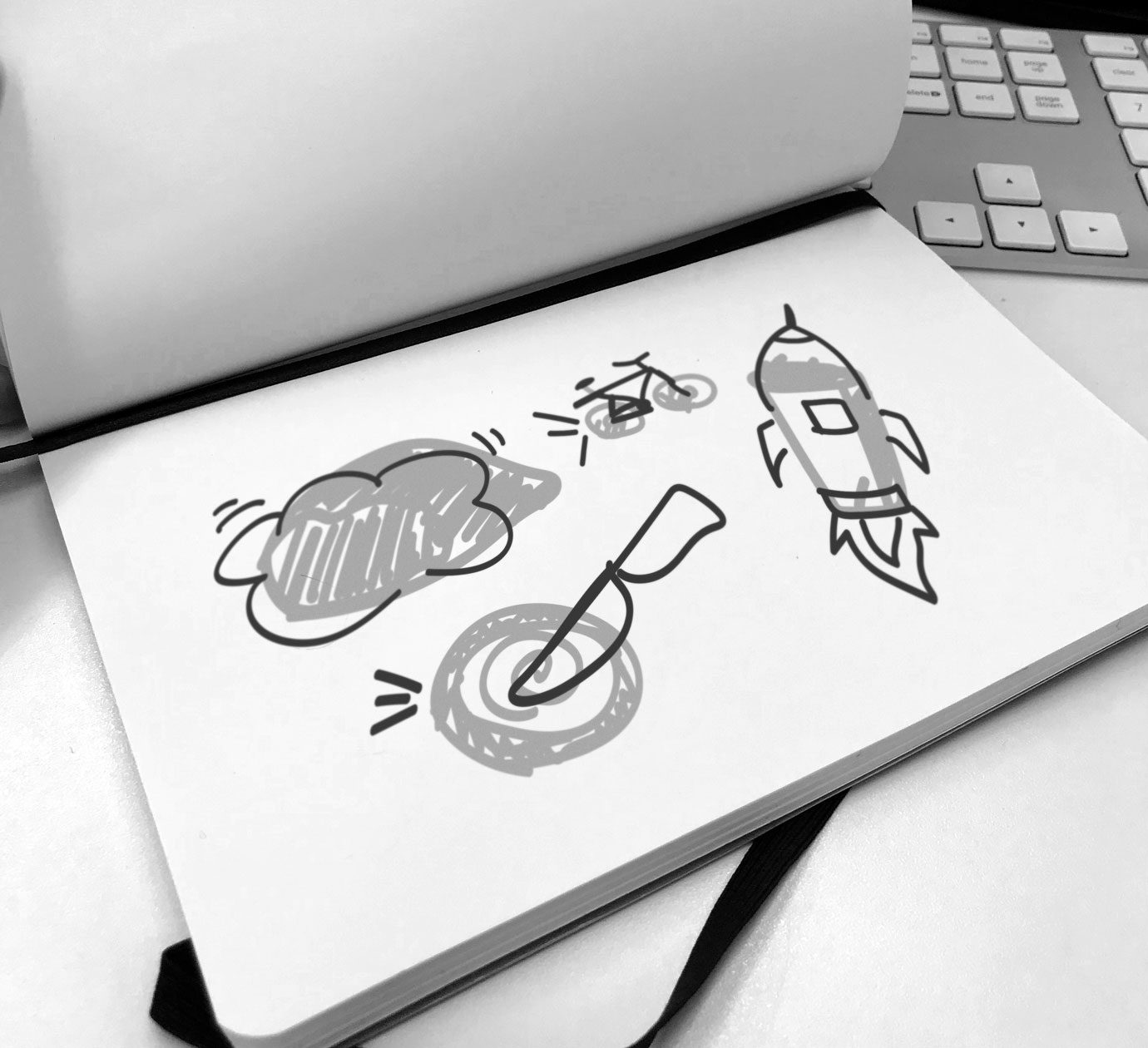
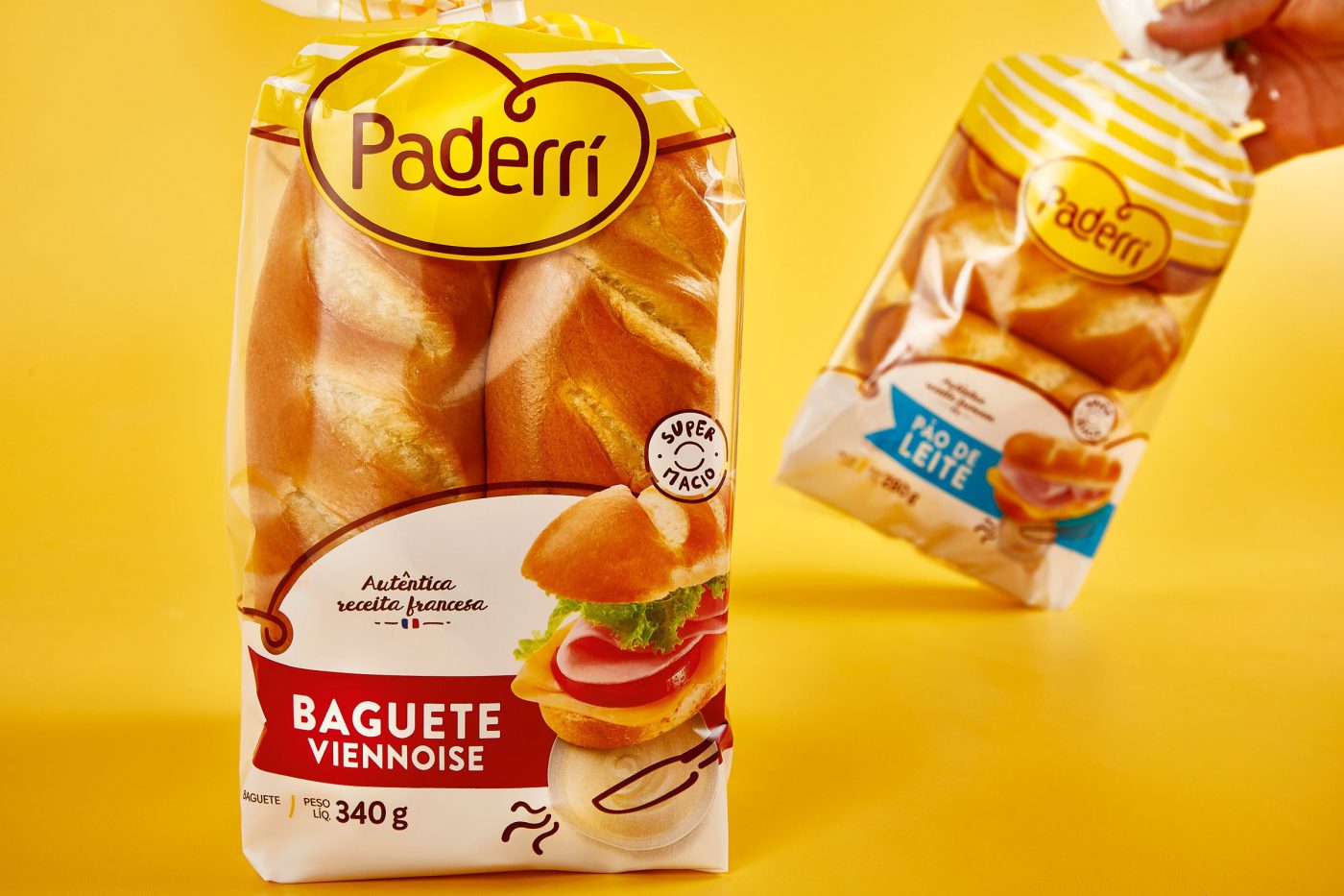
On the packages, relaxation!
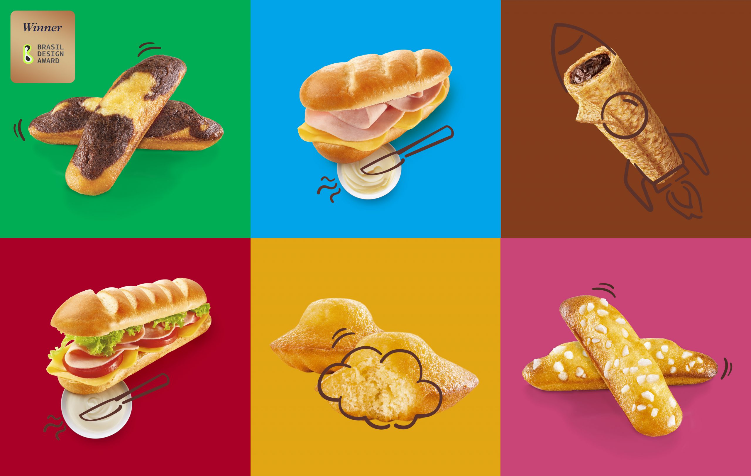
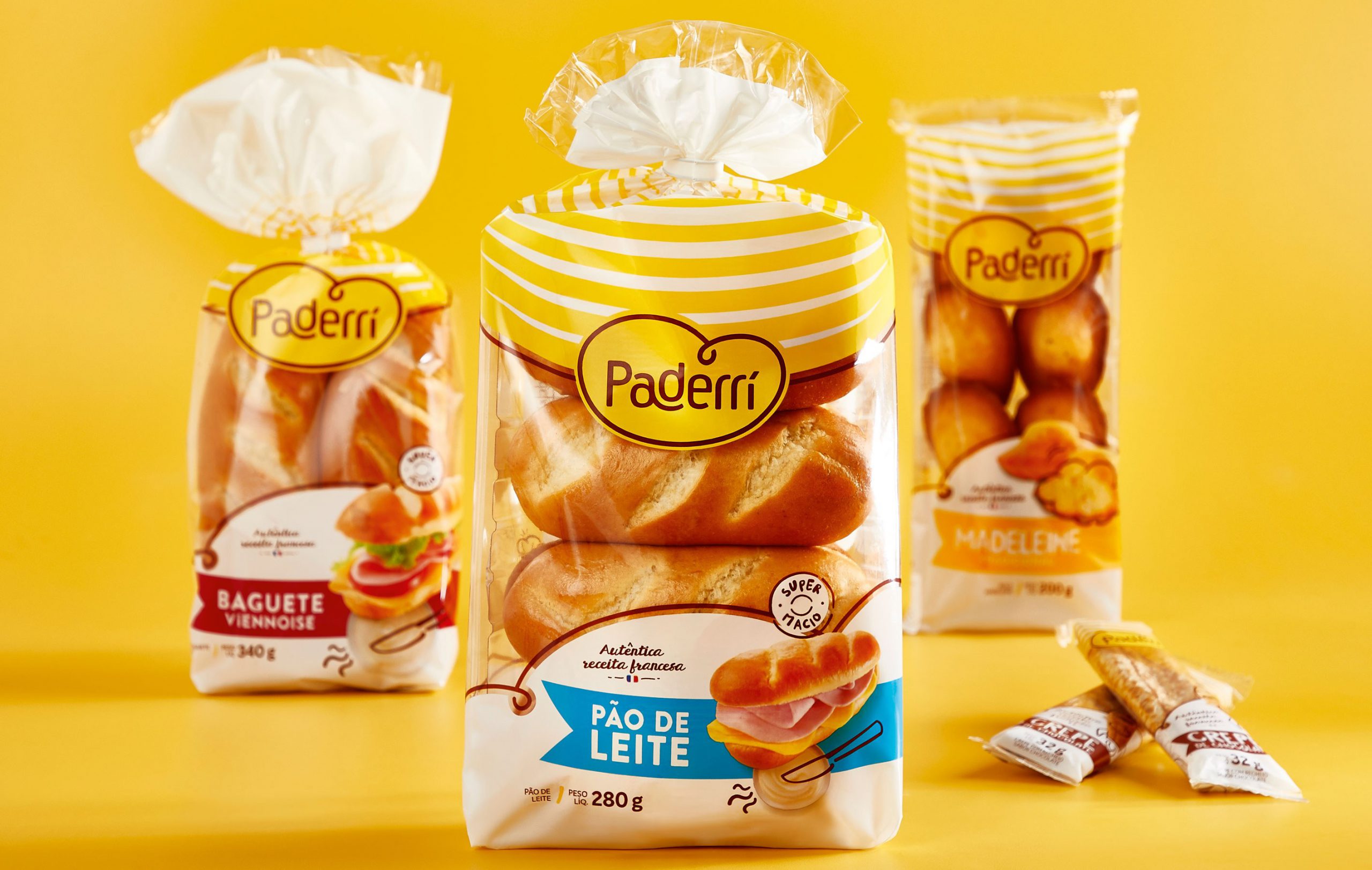
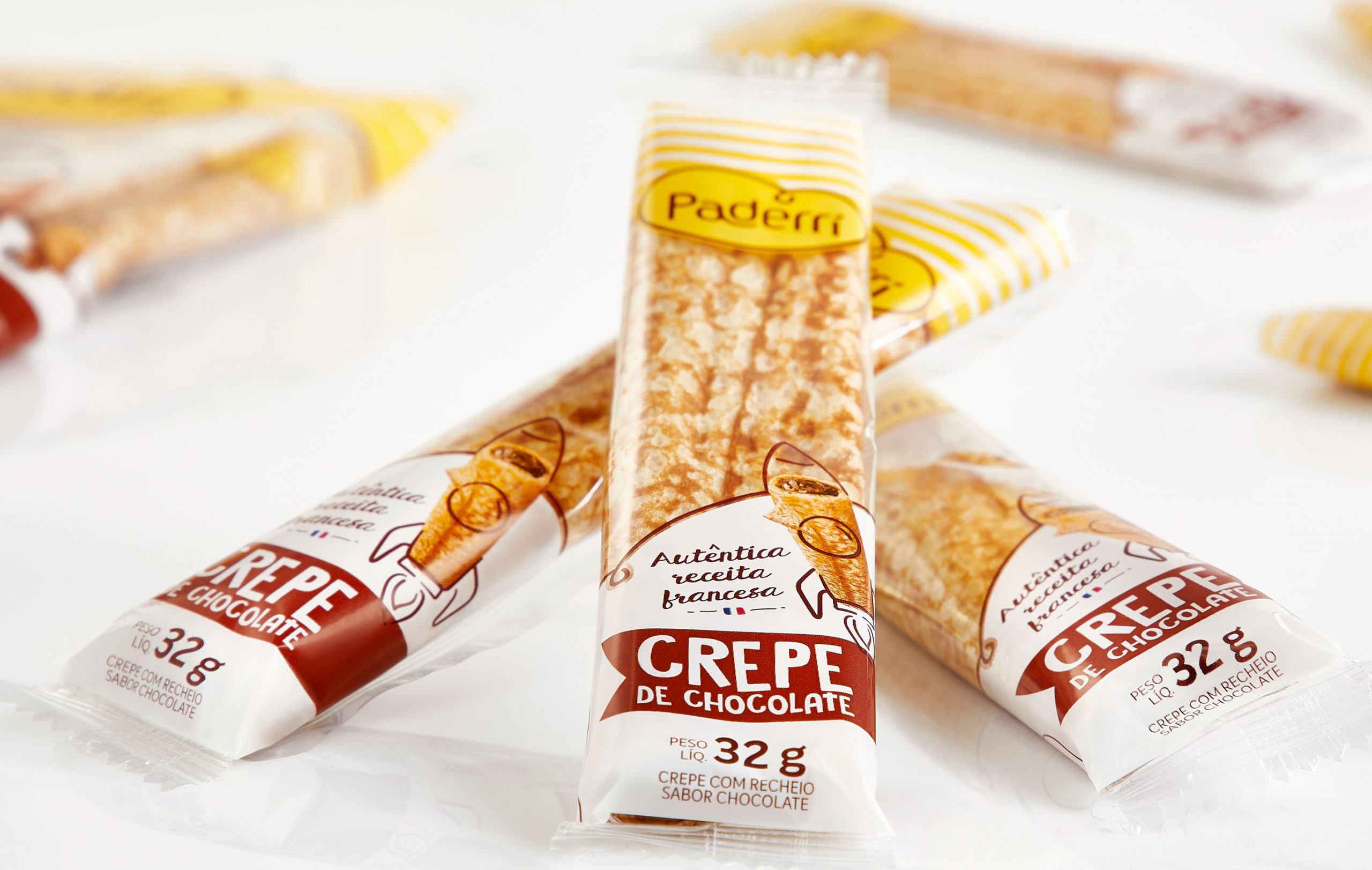
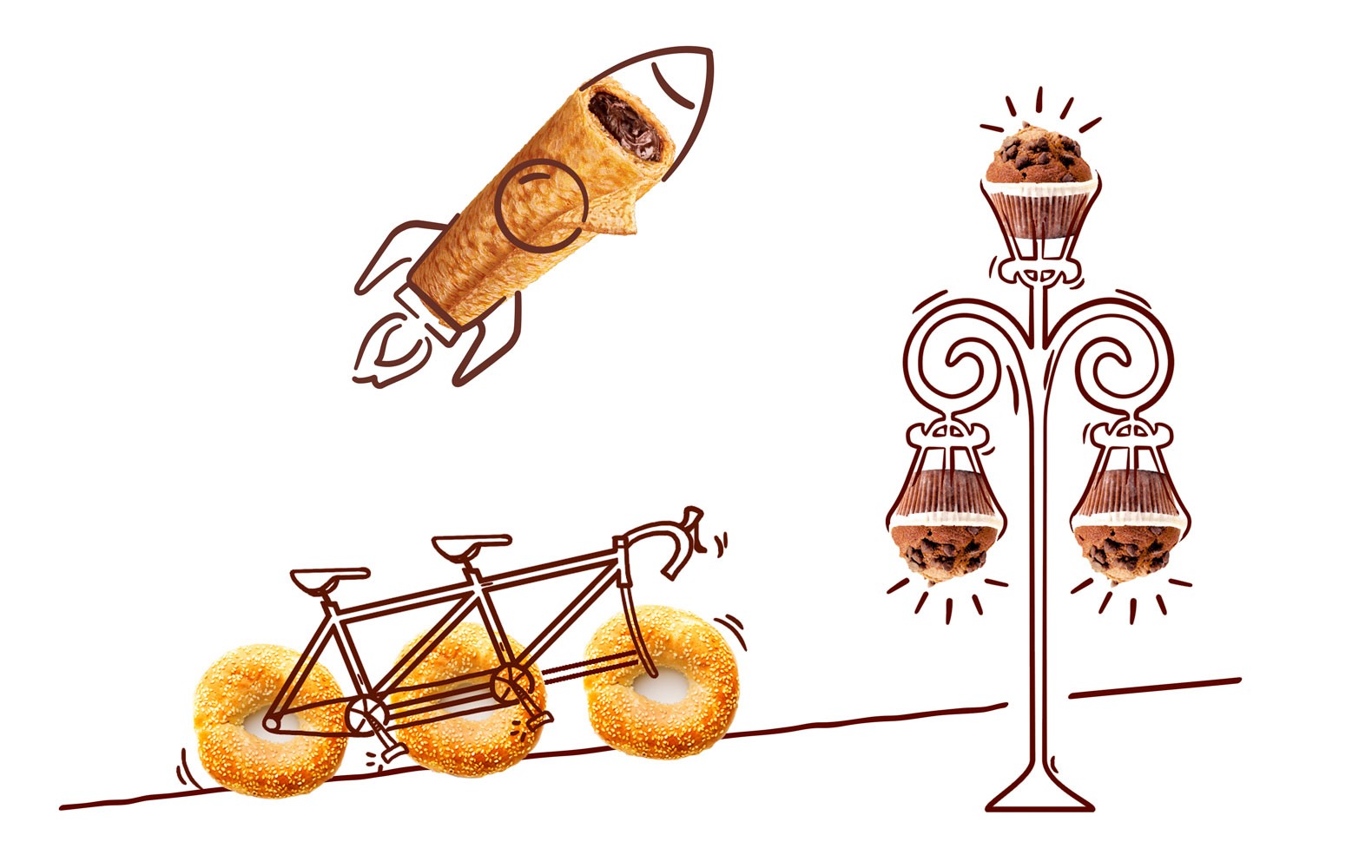
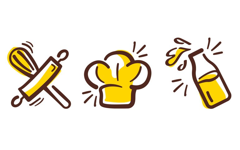
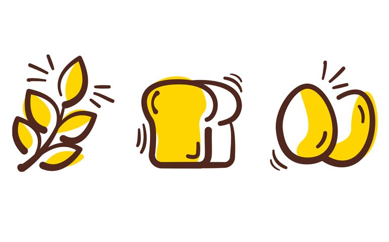
The brand’s typical relaxation enables the interaction between the illustrations and the products, creating unwonted and fun situations. The icons give the sensation of being handmade. Just like Paderrí’s baguettes, madeleines and crepes.
Fresh products, prepared out from homemade recipes with an unmistakable handcraft touch.
