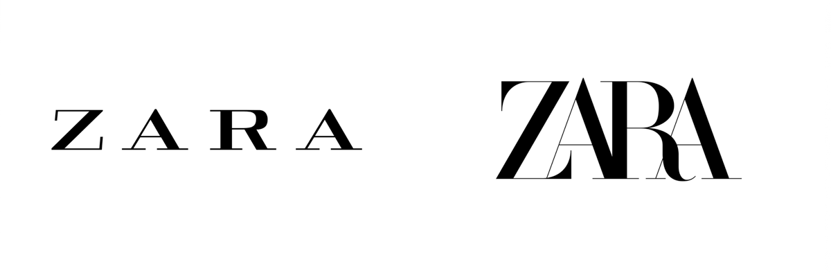
This is the reaction to the redesign of ZARA, one of the most famous Spanish brands on the international scene. Since the company launched its new identity last Monday, two consecutive questions have been generated in any talk between brand experts. Have you seen it? Do you like it?
I intuit that the same thing has happened among your most loyal followers, and it turns out that the general reaction revolves around the same, strange faces. Why?
This is the luck (or bad luck) of branding, of a typography, of a form, of a color, or of any composition. How a series of elements, apparently subtle, are determinant to reflect the personality of a brand and what we perceive of it.
Some people say we think in words, others say we think in images. In any case, as Matt Mullican (one of the most influential artists in contemporary art in recent years) says, we think in emotions.
And these are the only ones that always give us a clear verdict of what we feel before what we see. That’s why people’s spontaneous reaction to a brand change is so valuable, because it connects or disconnects them from it.
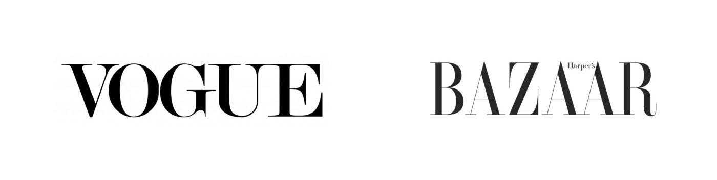
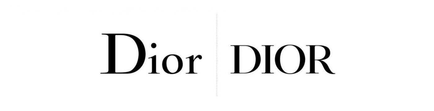
In the case of ZARA, the discomfort generated by the new logo may have its origin both on form and substance. The first lies in a complicated interpretation of the aesthetics of the publishing world in fashion, in addition to its indisputable similarity to the logos of VOGUE or HARPER’S BAZAR (the latter designed by the same agency).
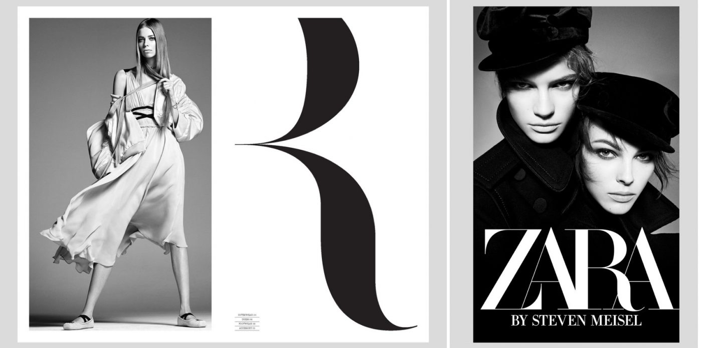
According to the agency responsible for the project, ZARA’s new identity seeks to ”elevate its image and bring it closer to the standards of contemporary luxury”. An exercise that bets on getting rid of the negative connotations associated with the low-cost concept to speak now in terms of ”democratization of art and fashion”. A nuance that changes the course of ZARA’s positioning, or at least that’s what we interpret. The debate could be on whether it is coherent with the brand and product or even whether it is credible and legitimate to share an aesthetic language with Dior, for example.
In any case, Fashion brands are not the only ones facing this kind of challenge, apparently easy to judge. Google, for example, created more than 2,000 doodles over the years and has changed its official logo no less than seven times. And yet it has achieved a brilliant branding exercise based on the iconicity, still preserving its identity, recognition and connection with its public.
Article published on MarketingNews and El Publicista.