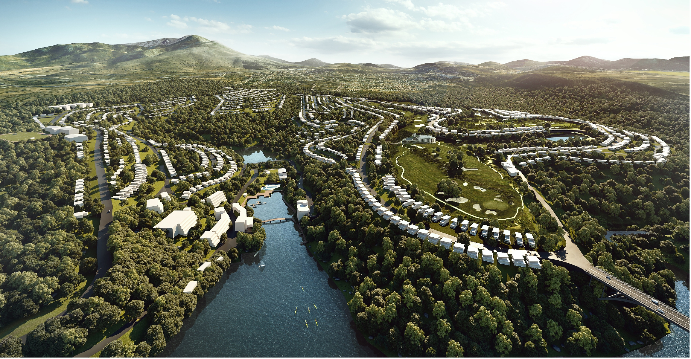
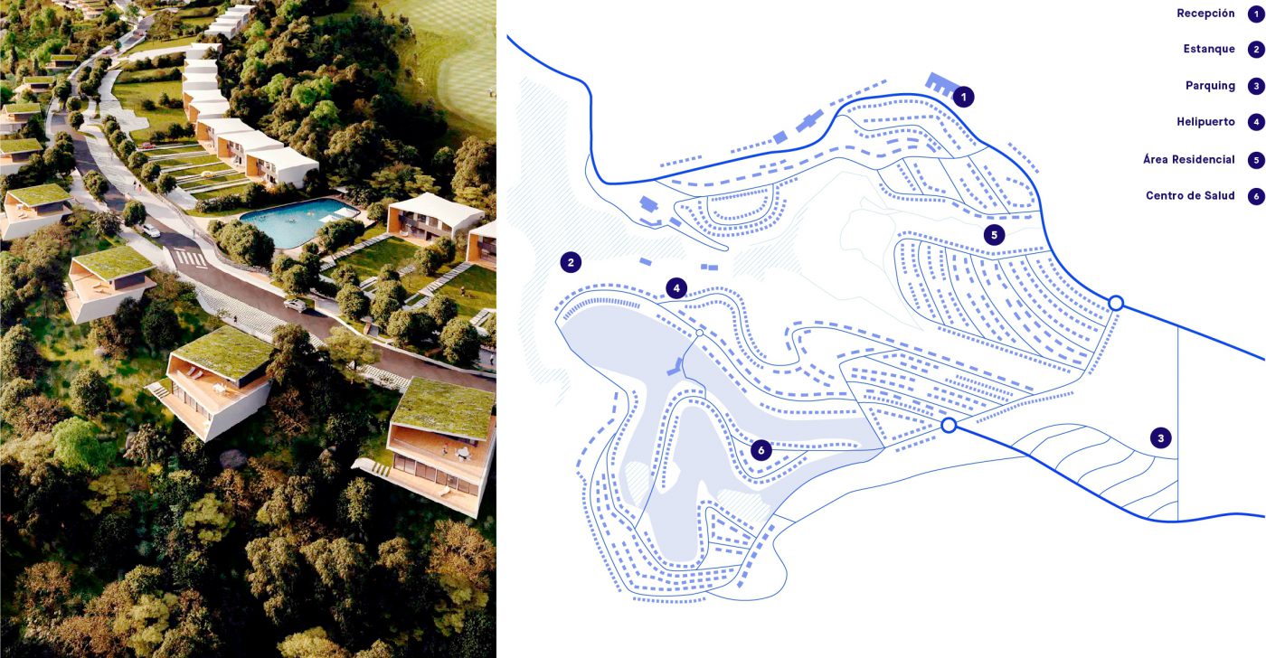
A new space that seeks to become a European reference for sustainability, mobility, technology and design. An urban district that, beyond a functional occupation, will become a territory of experience focused on people, their desires and their behaviour. An intuitive, sensory, flexible and collaborative place that will activate the osmosis between people and nature, giving rise to a truly significant relationship. The opportunity to design a differentiating discourse that capitalizes on what really matters, connecting it with the attributes and benefits of the project.
Therefore, we stopped building on the idea of Smart City to define the concept of Sensitive City, which places the human being at the center of our reflection, empowering plural families to live a more conscious and connected lifestyle.
A place where technology is replaced by tech-care devices, mobility is substituted by the slow-motion transport network and sustainable living is mimicked with the Living-Bloom environment and leisure offerings drive activities to breathe.
/ brand
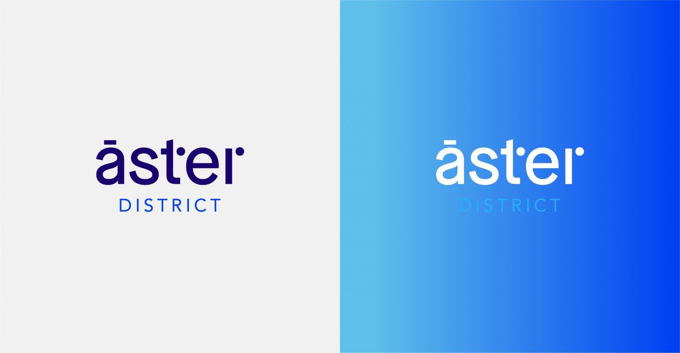
This is how Áster District was born.
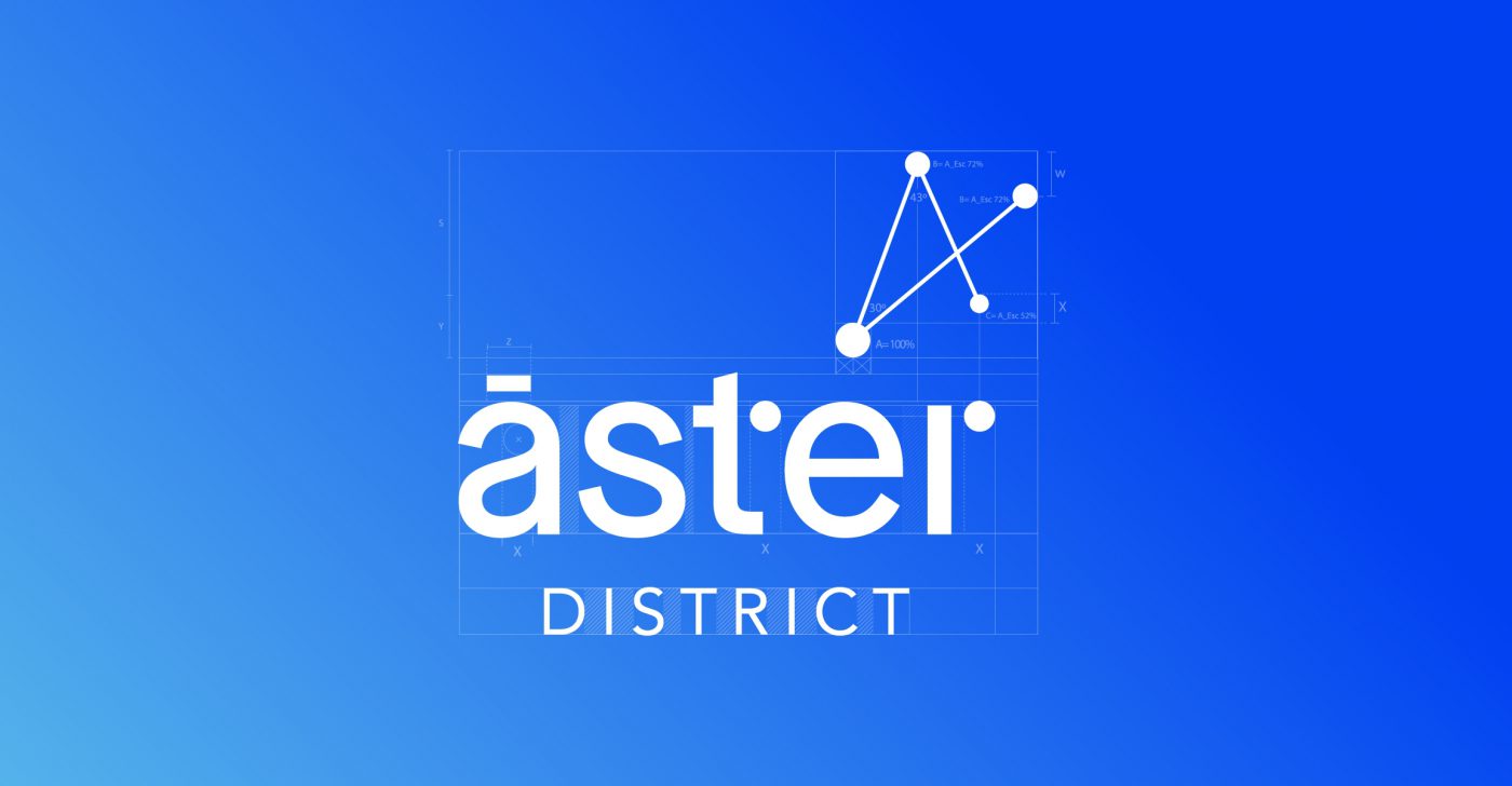
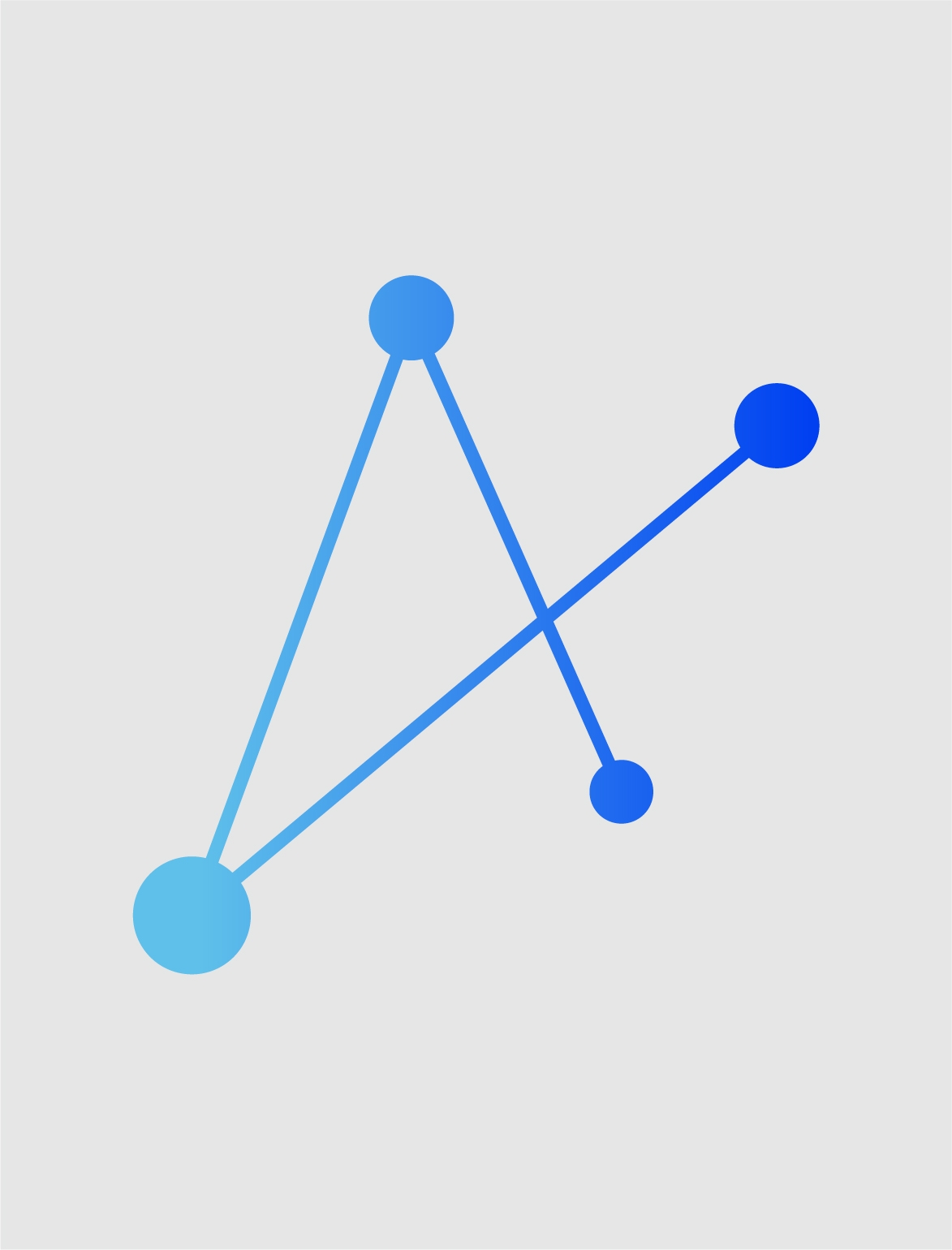
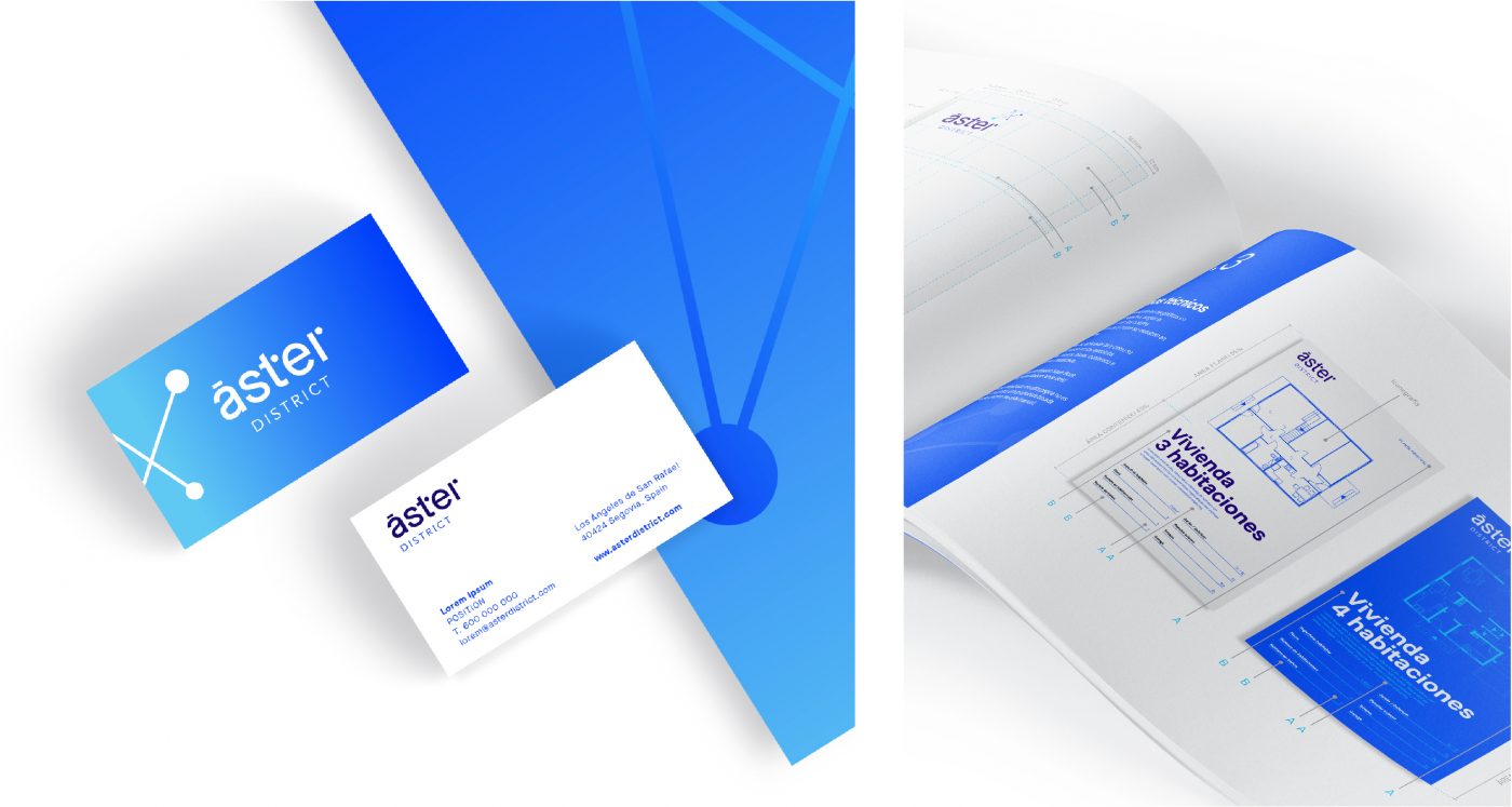
A brand that connects people with their environment and with themselves. A friendly and close graphic construction, a reflection of a sustainable and dynamic community. A simple aesthetic language, designed from the confluence of lines and points, which conveys the concept of innovation and interaction through three-dimensionality.
/ iconography
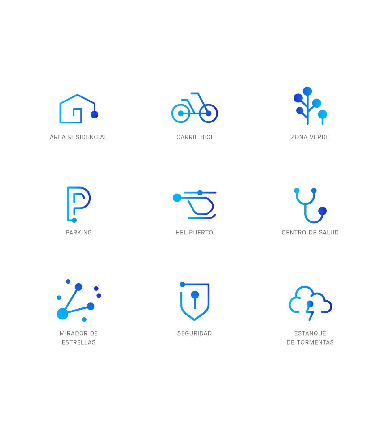
The simplicity of this new visual identity allows the development of a flexible image, thanks to the strength of its iconography.
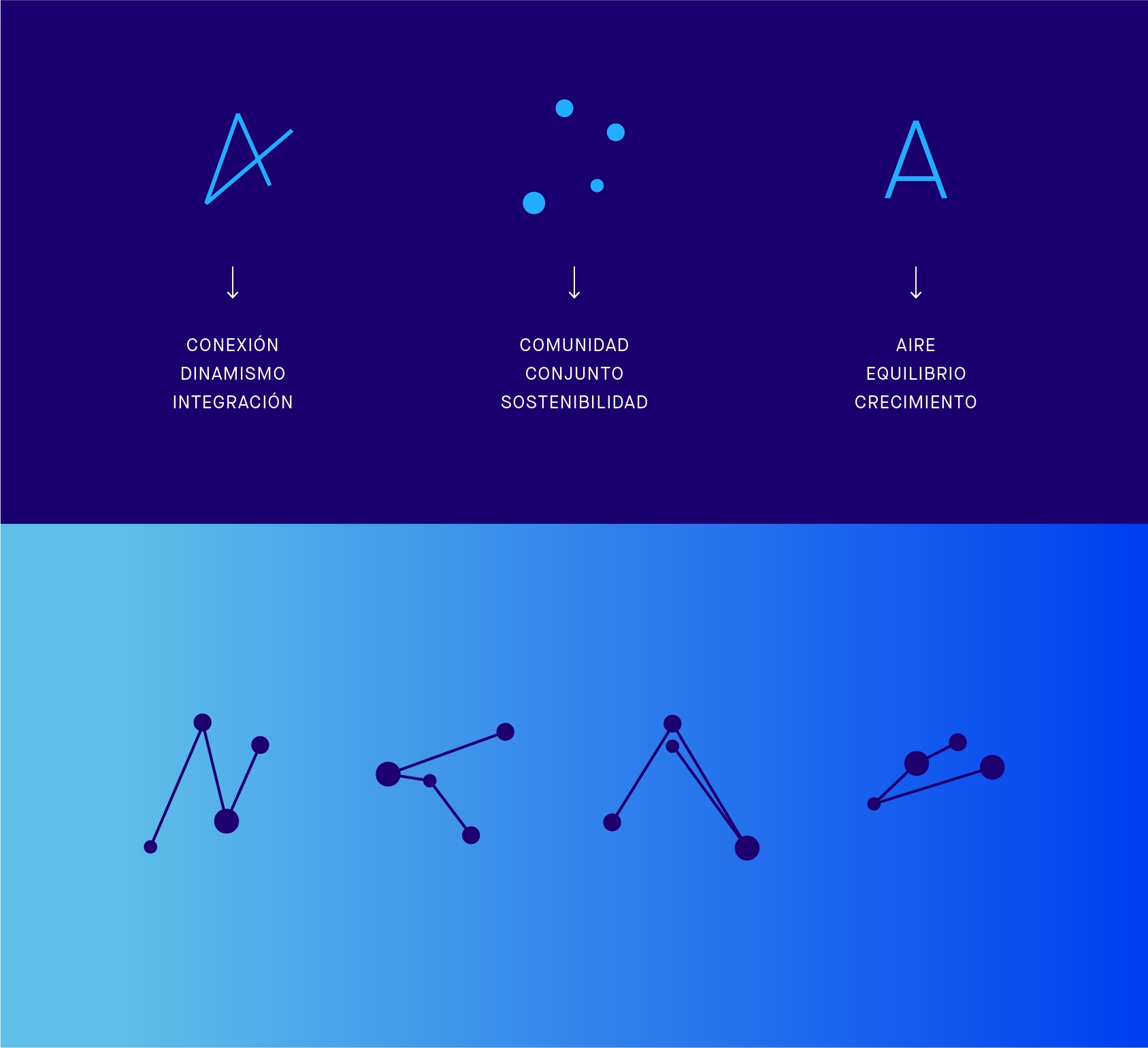
This strength is born from the typographic construction itself, and expands to the rest of the key elements of its imagery. The icon, for example, which can work with the logo or without it, reminds us of the “A” in the name, but at the same time it is interpreted as a free, volatile element that always looks upwards, in constant evolution and growth.
/ Color Palette
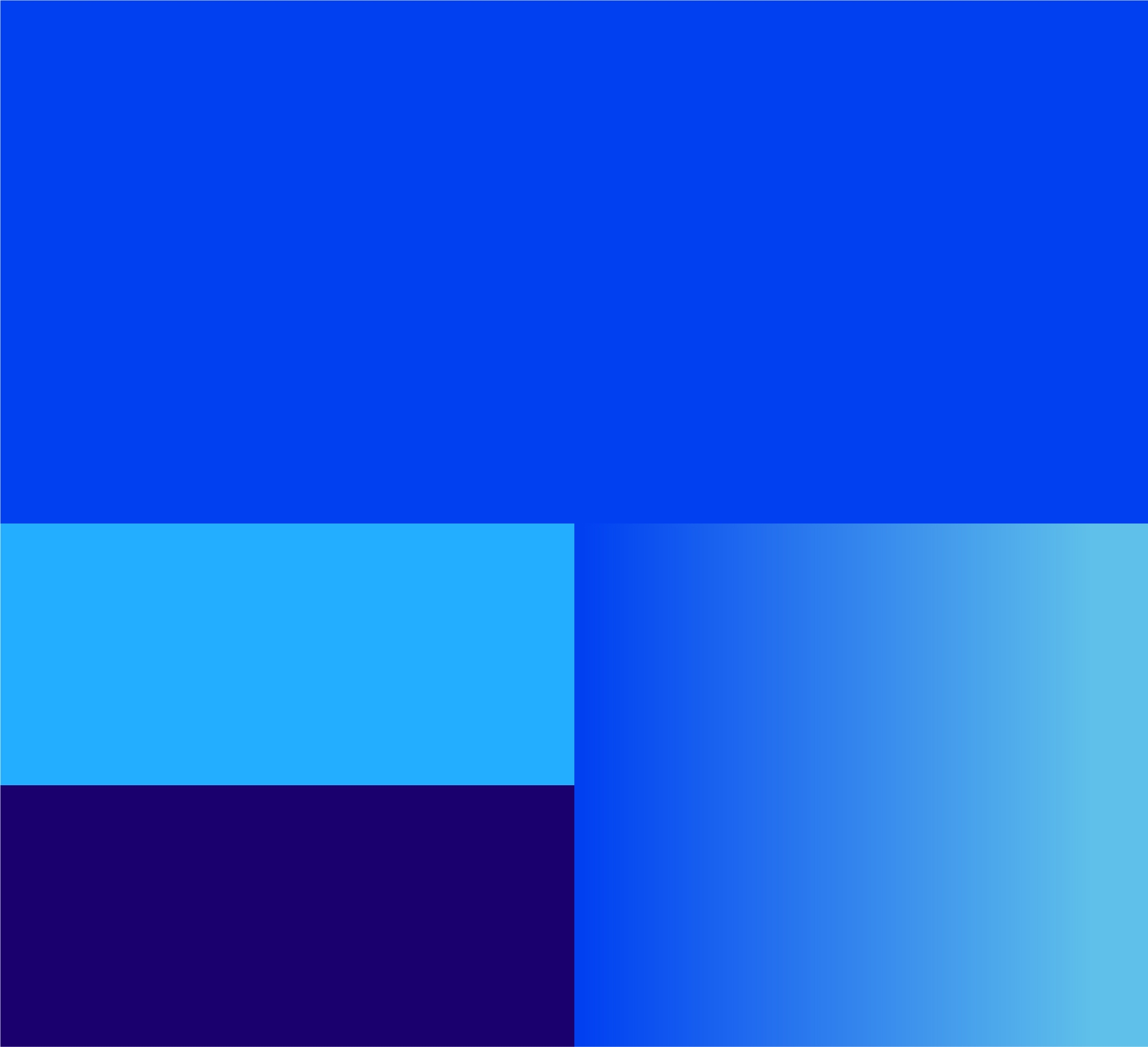
From a chromatic point of view, a clear relationship has been established with the quality of the air in the area. The use of white and blue, which extends in the form of a gradient, projects the light of a day’s cycle. The image of a clean and transparent sky. Pure.
A color palette used as a recognizable element of the brand language in all its forms of expression.
/ RESULT
In short, a brand that seeks to establish an intimate link with the way of life of tomorrow. More aware, more respectful and at peace with ourselves and our environment.
We use cookies on our website to give you the most relevant experience by remembering your preferences and repeat visits. By clicking “Accept”, you consent to the use of ALL the cookies.
This website uses cookies to improve your experience while you navigate through the website. Out of these, the cookies that are categorized as necessary are stored on your browser as they are essential for the working of basic functionalities of the website. We also use third-party cookies that help us analyze and understand how you use this website. These cookies will be stored in your browser only with your consent. You also have the option to opt-out of these cookies. But opting out of some of these cookies may affect your browsing experience.