/ context
A carefree life.
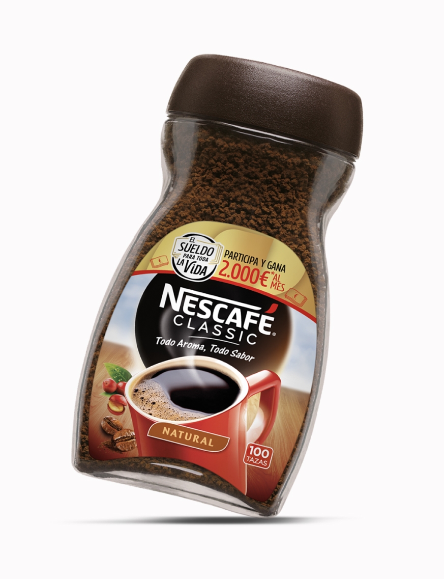
Over 35 years have passed since Nescafé launched its renowned campaign “El Sueldo Para Toda La Vida”, which already holds the heart of thousands of people in Spain and allows lucky winners to spend a trouble-free life thanks to a lifetime salary. A unique promotion that needed a distinctive and recognisable visual identity, capable of reflecting Nescafé’s popular graphic codes through simplicity.
/ VISUAL IDENTITY
Inspired by the emotional bond that the brand progressively built with its customers, the visual identity was created based on three fundamental values: tranquility, iconicity and emotion.
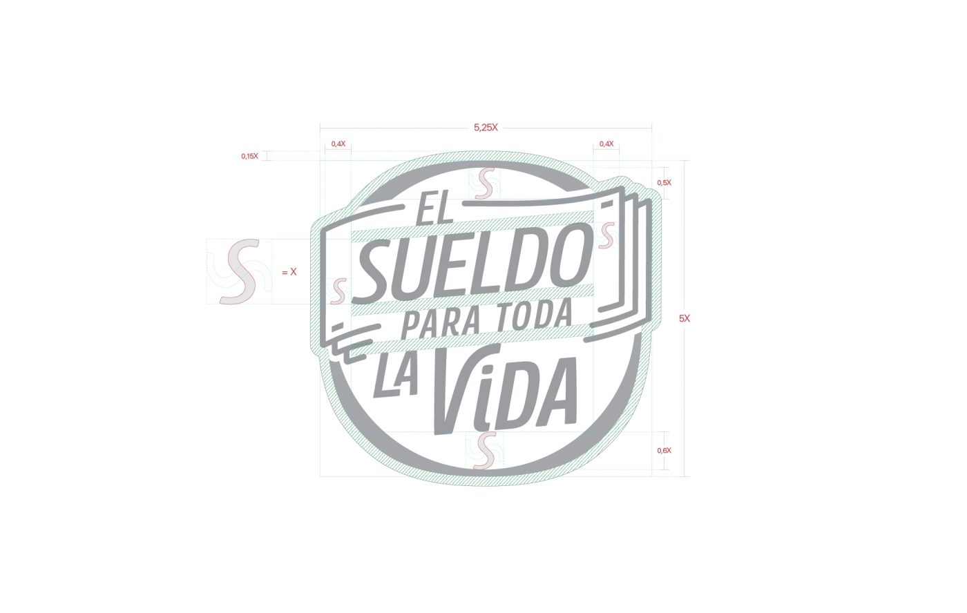
These three pillars are the mirror of a genuine campaign that today benefits from unprecedented popularity. Therefore, it needed a timeless logo that expressed closeness and simplicity. The new design was born from the Nescafé Hub to create a connection between them and, from there, characteristics of the promotion were incorporated in order to convey its essence while being able to identify the Nescafé brand.
/ tipography
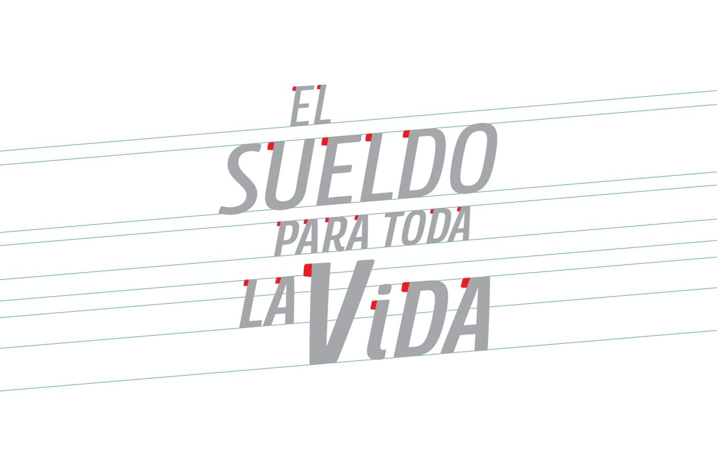
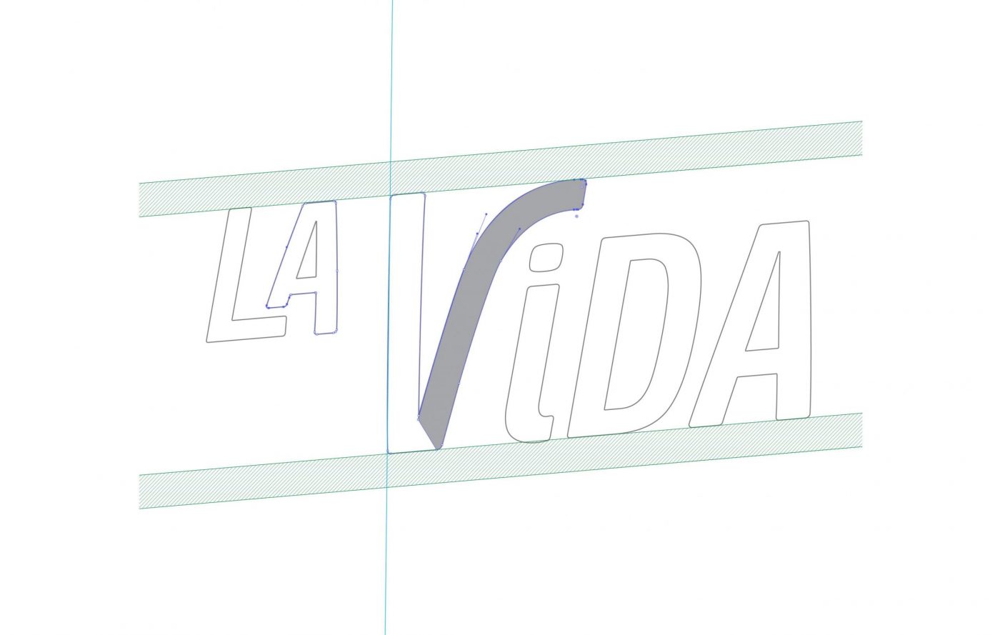
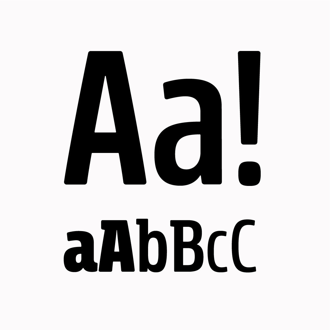
Through a simple but recognizable typography, it manages to coexist with the Nescafé brand without losing the clear identification of the promotion. In the typography of the logo, features such as the global direction of structure were incorporated, which manages to dynamize it and represent part of the imaginary of the promotion: the vision of future and stability that “El Sueldo Para Toda La Vida” provides to the lucky winners.


/ result
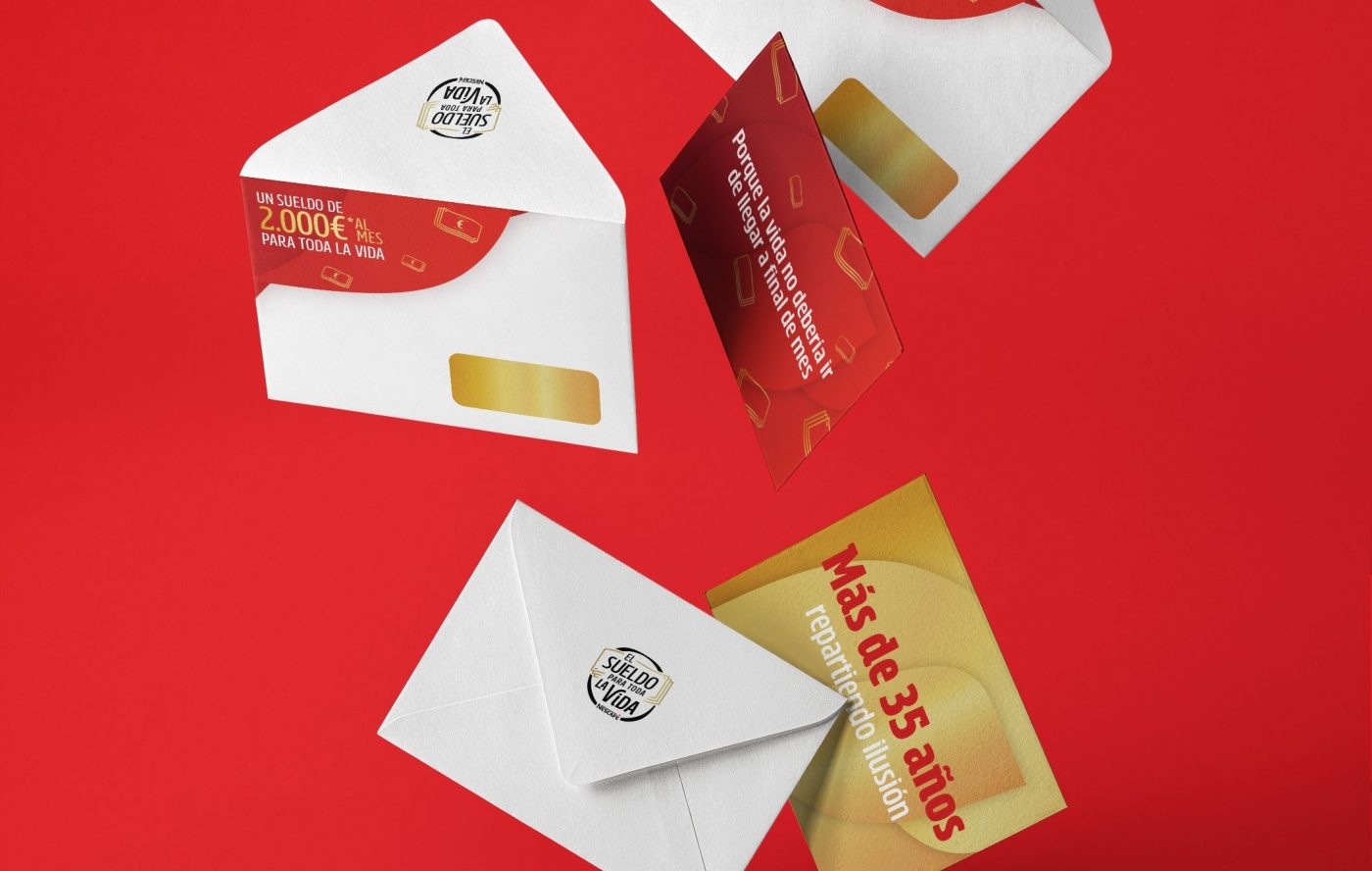
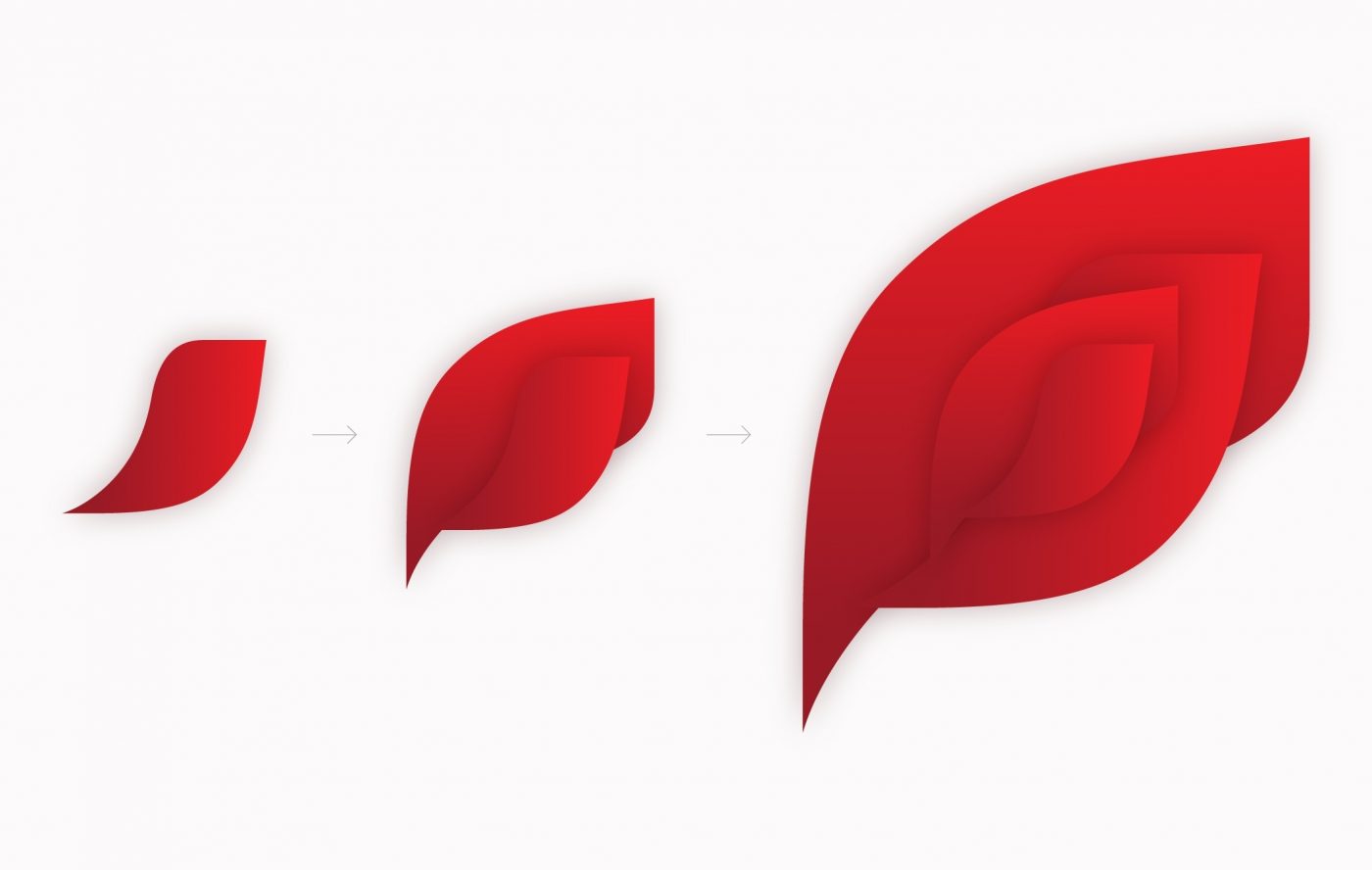
The graphic codes were created from the elements and colors of the logo, giving prominence to the gold banknotes that stand out on red and gold backgrounds to give light to this incredible opportunity. Complemented with an ownable brand language, an icon is developed that can be applied on different supports, creating a solid and genuine brand identity.
A promotion that will stand the test of time and will continue to bring joy to consumers.


