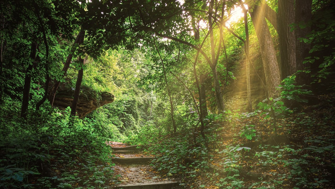
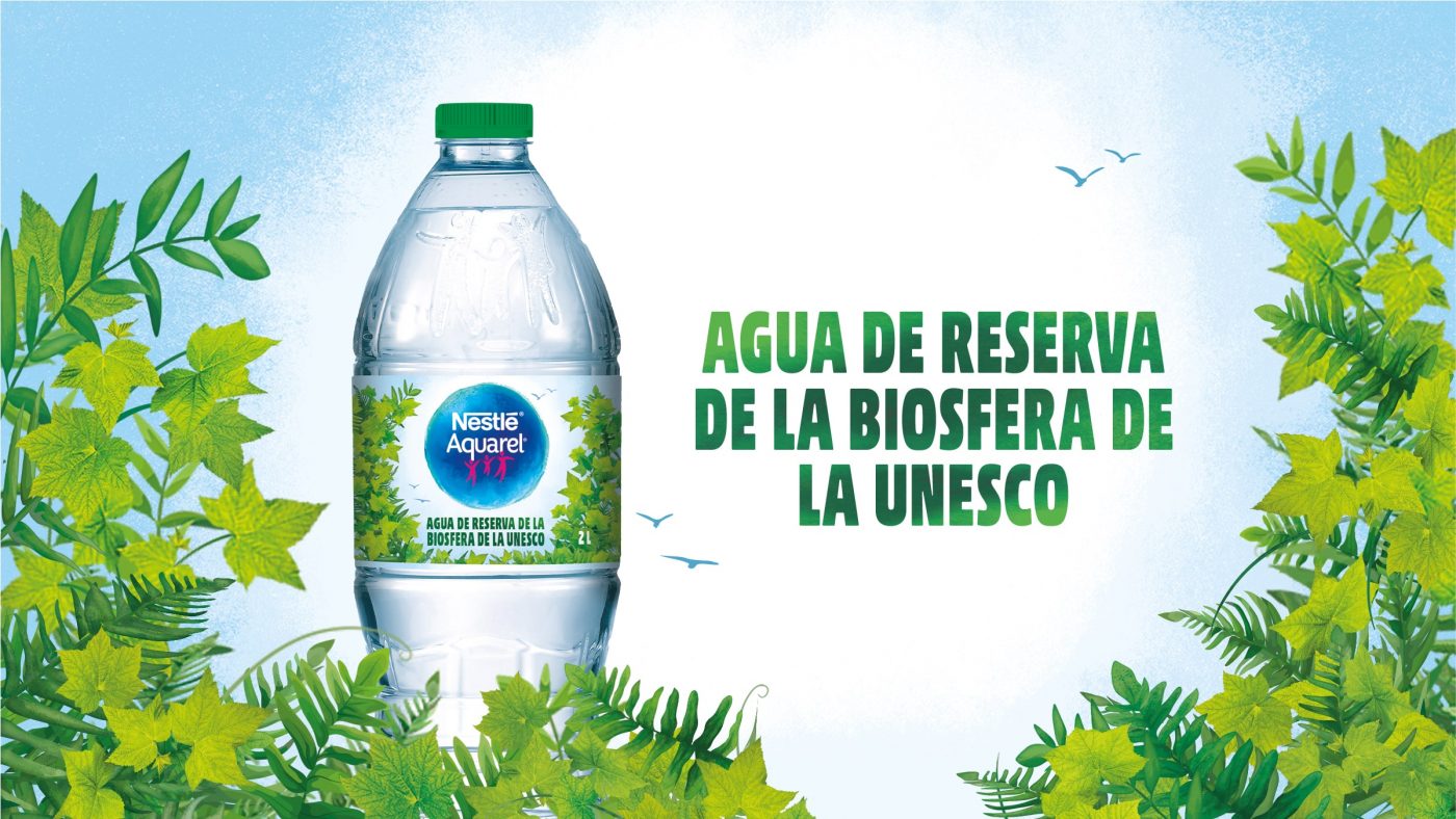
Nestlé Aquarel has redesigned its strategic platform and positioning, inviting us to recover our natural rhythms, to slow down and reconnect with the environment that surrounds us. A new vision that turns nature into the main character of its speech and reinforces the unique origin of its water as a differentiating factor: Montseny Natural Park (Parque Natural del Montseny) and la Siberia Extremeña, both designated biosphere reserves by UNESCO.
This new approach, with which Nestlé Aquarel reminds us of the importance of recovering our balance and well-being, is the starting point for the creation of its new image.
The challenge has been redefining its expression codes, creating a unique a distinctive imaginary within the mineral water category, without losing the identity that the brand has built up internationally throughout its history.
To define its new territory of expression, we decided to treat nature as a member of the family, being the two nature reserves and their unique combination of flora and fauna a unique environment in which we can immerse to reconnect with ourselves, and with our surroundings.
/ Visual language
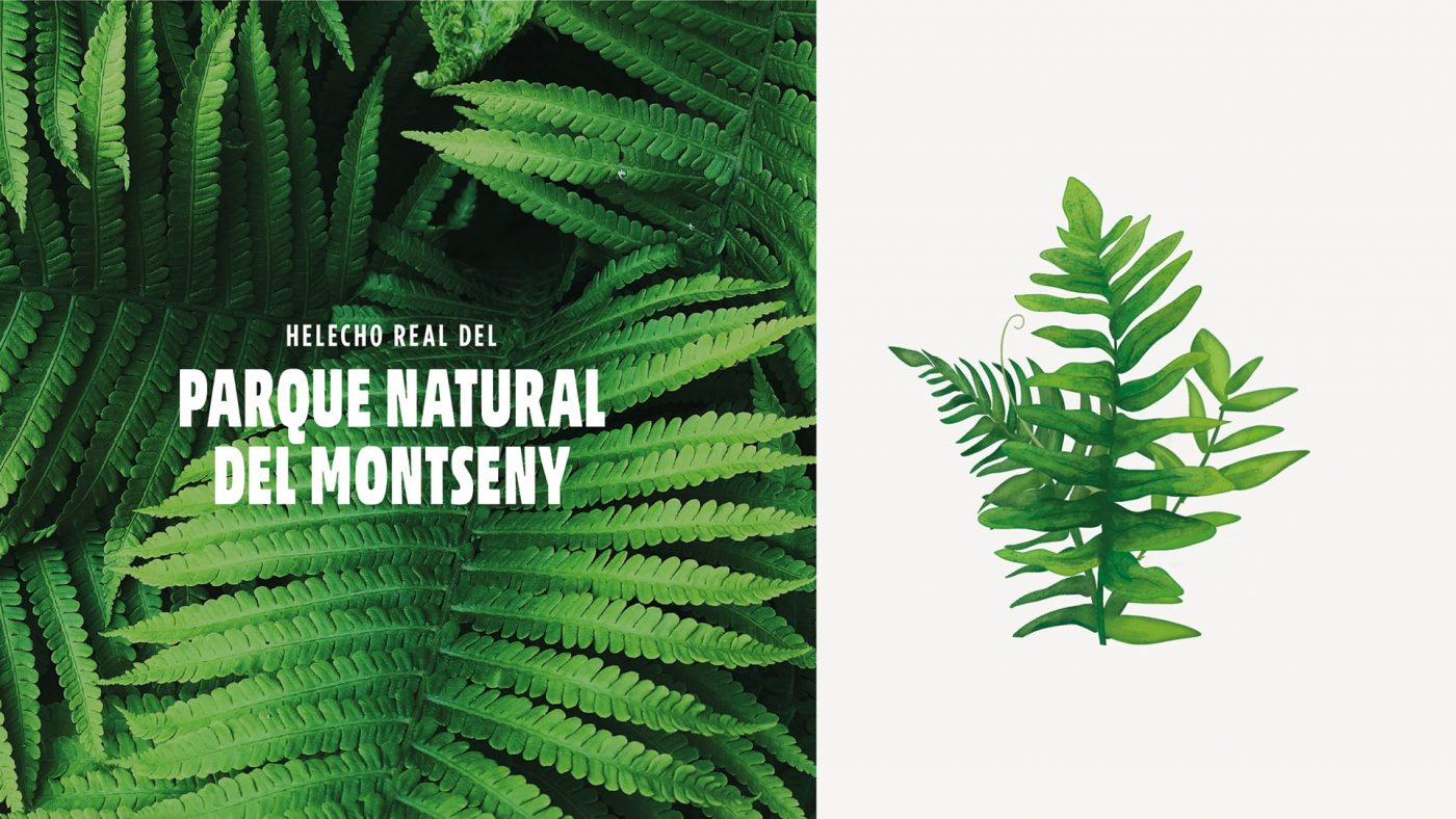
From a visual perspective, we bring to life our own relevant imaginary that captures the essence of the two nature reserves.
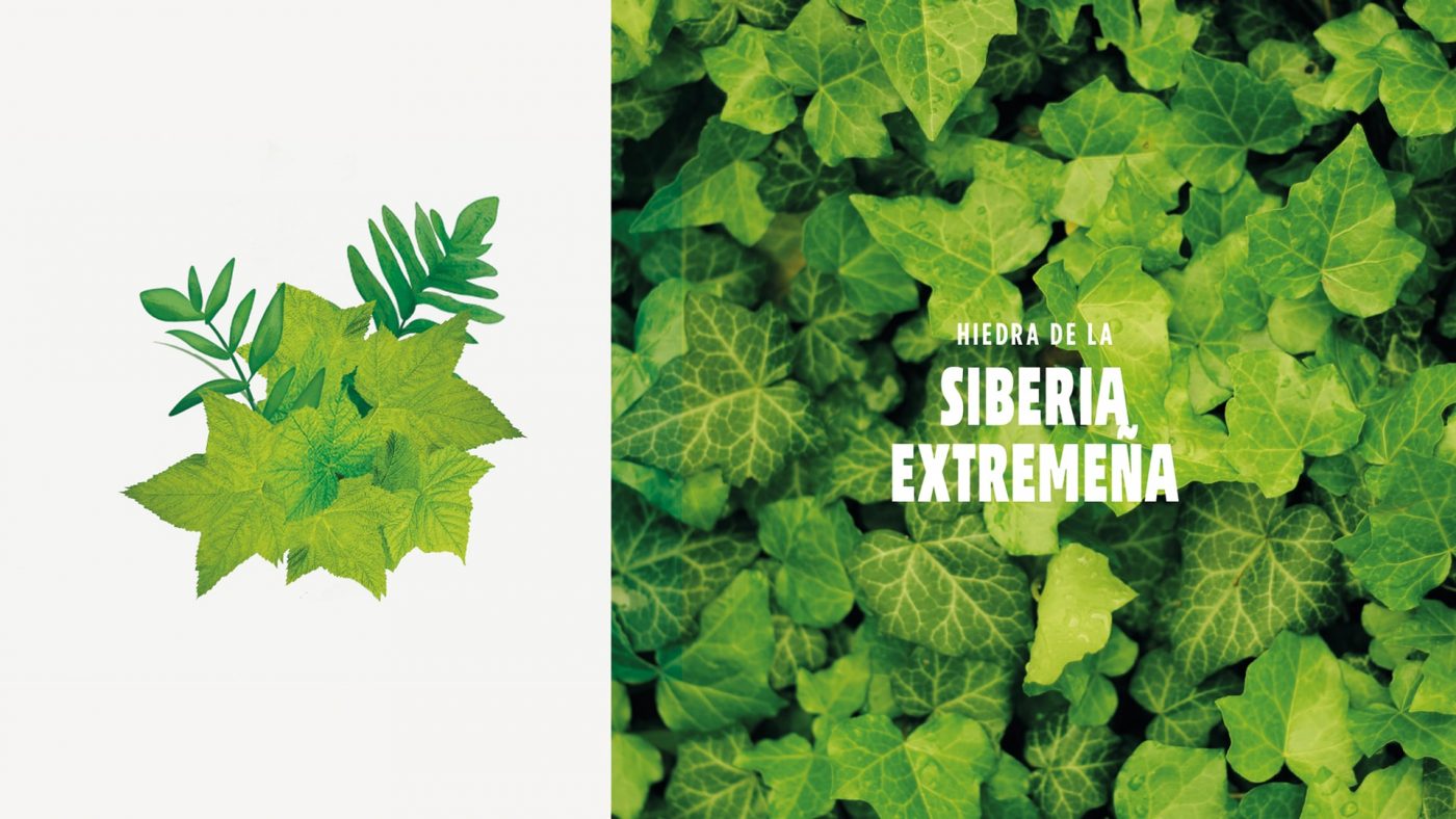
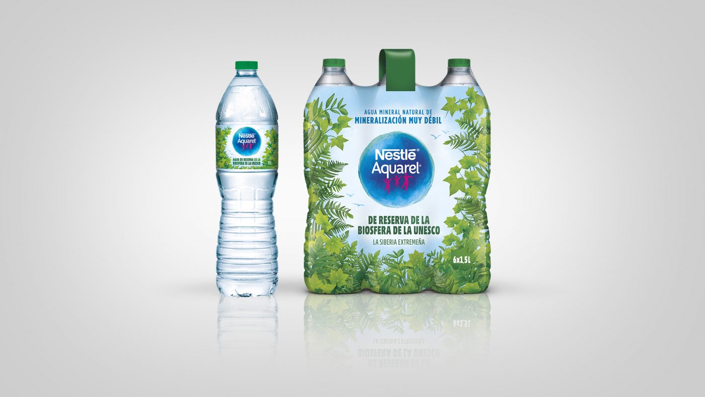
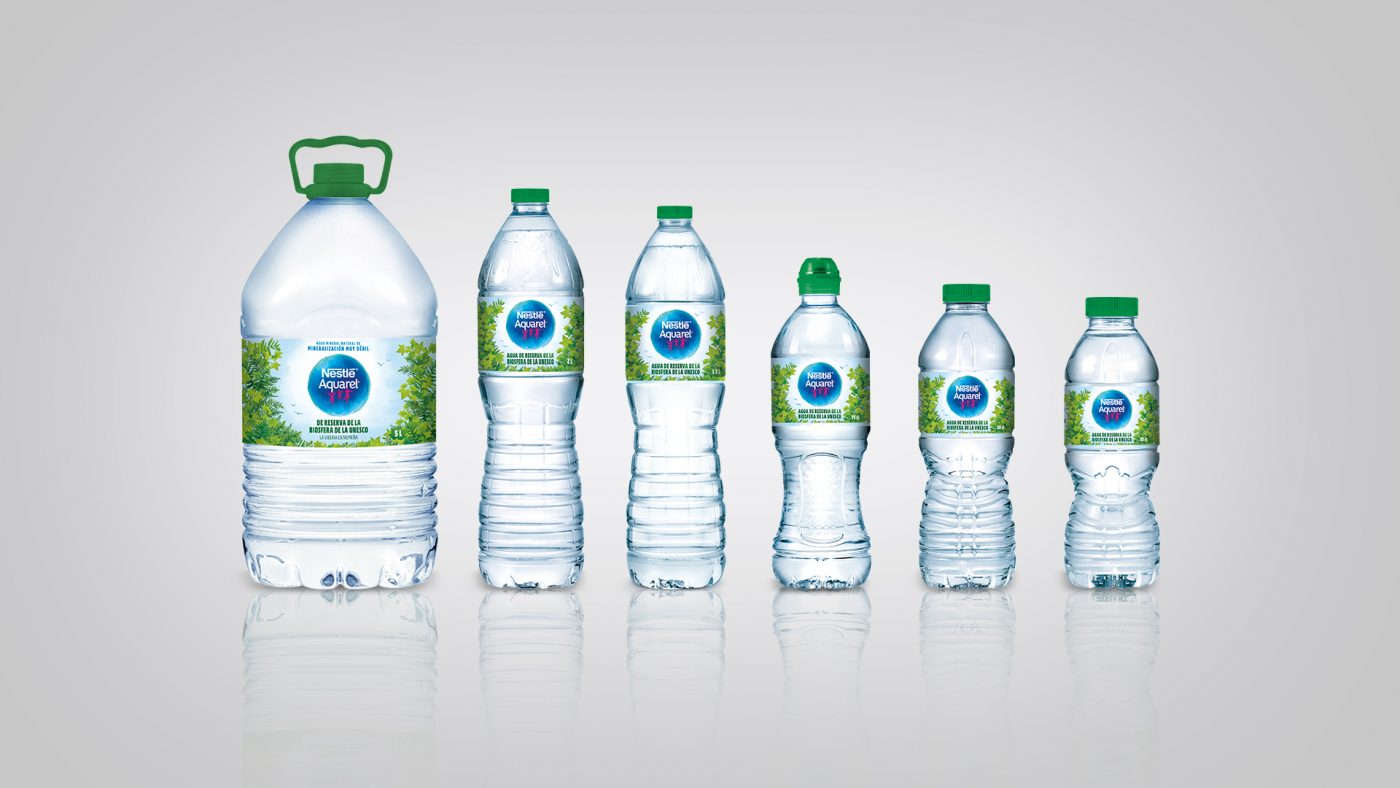
Although both have very different locations, they share similar climates because of the presence of water and the morphology of their landscapes. That is why we have selected two types of vegetation that characterize them and that can be found in their most humid environments: ivy and fern.
We represent these two types of vegetation creating our own realistic illustrative style, with multiple layers that give life to nature and its infinite interpretations. The richness of the composition of the leaves, the technical, precise and delicate complexity in the textures, as well as in the lights and shadows, give rise to a unique and characteristic illustration, generating the feeling of being in a fresh and natural environment.
/ result
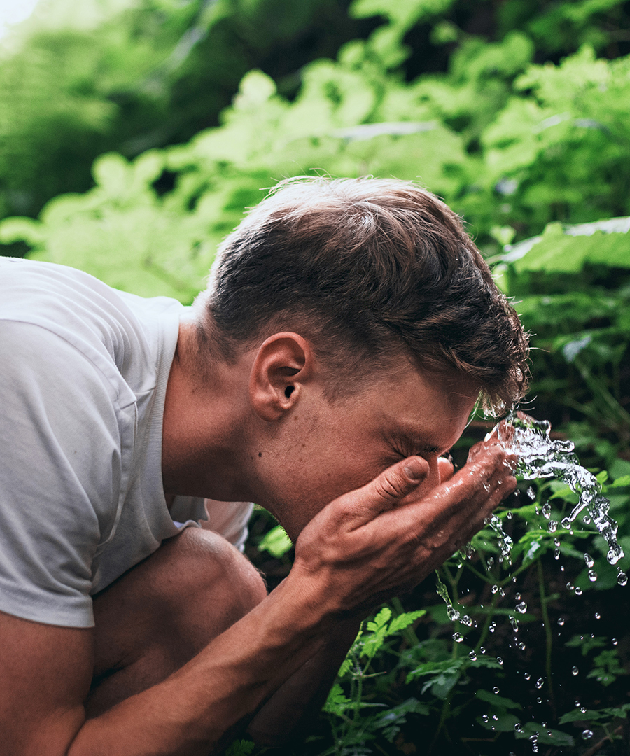
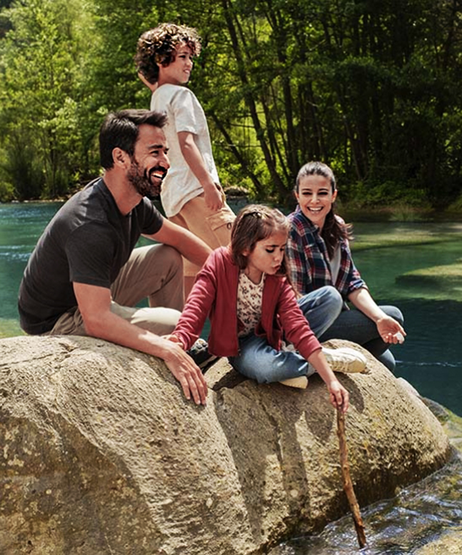
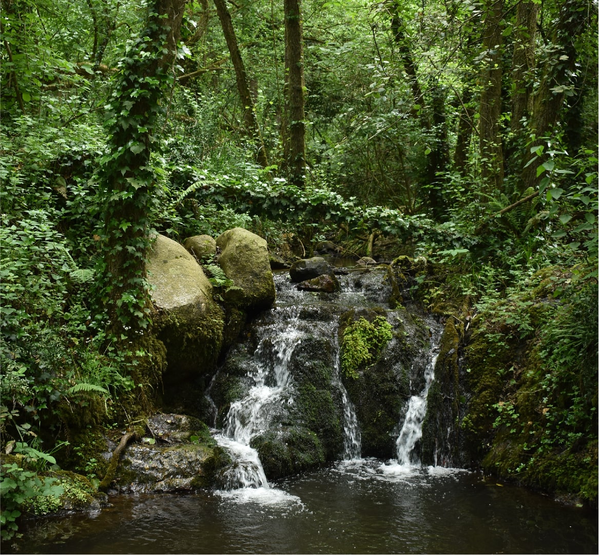
The new graphic language is complemented with textures, typographies and photographs that refer us to the depth of nature, its tonalities and irregularities. All this emphasizing the relationship and interaction established between its landscapes and the people who enjoy them.
In short, a renewed identity with which nestlé aquarel incorporates new codes in the sector and highlights the power of nature to improve our well-being and that of our families, through optimism and proximity.
We use cookies on our website to give you the most relevant experience by remembering your preferences and repeat visits. By clicking “Accept”, you consent to the use of ALL the cookies.
This website uses cookies to improve your experience while you navigate through the website. Out of these, the cookies that are categorized as necessary are stored on your browser as they are essential for the working of basic functionalities of the website. We also use third-party cookies that help us analyze and understand how you use this website. These cookies will be stored in your browser only with your consent. You also have the option to opt-out of these cookies. But opting out of some of these cookies may affect your browsing experience.