“It’s Close to Midnight, Something Evil’s Lurking in the Dark”
Born and raised in Indonesia, I’m from a culture where shadows have long been places in which mythical creatures and spirits lurk. You wouldn’t want to make these beasties your besties: on the whole, they don’t tend to be very pleasant.
I’ve gone global now and I can see my country’s fascination with creepy, ghoulish figures is not unique. The adoration of Michael Jackson’s “Thriller” video and the obsession with an alleged monster in Scotland’s Loch Ness have turned shadowy figures into star attractions.
So, what makes shadows such intriguing shapes and why are they such an integral part of design? Read on to find out.

Is It a Person? Is It an Animal? Is It a Tree?
TV’s “Got Talent France” introduced some of us to an extreme use of shadows as startling illusions. Contorted performers used their silhouettes to mimic anything from elephants to burnt-out trees.
Their act told a familiar tale of humans choking the life out of those they share the planet with. It also took me back to my roots.
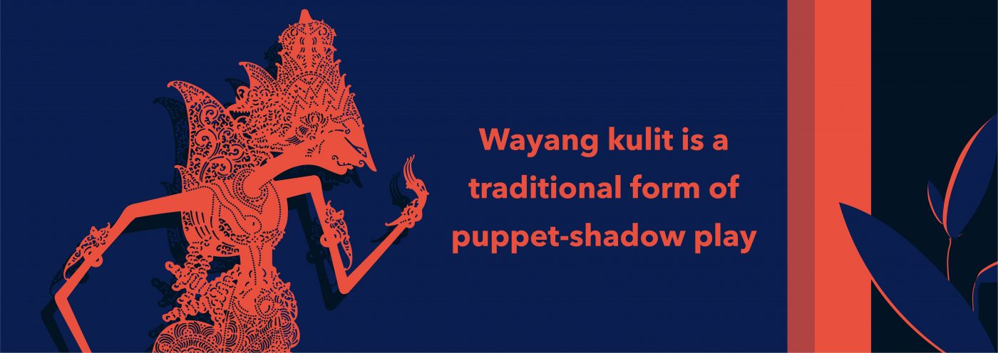
Wayang kulit is a traditional form of puppet-shadow play. This time, shadow artists rear-project puppet figures on a taut linen screen using a coconut-oil light. The stories often have a similar theme of good against evil with the shadows accentuating the mood.

Bond Is Back!
Film buffs will be familiar with this use of shapes and outlines to set the scene and create a little tension in a similar way to those puppeteers on my home turf.
Think of the titles of a 007 movie. Silhouetted gold-painted dancers moving through flames to the sound of a barn-storming belter would not look out of place.
Alfred Hitchcock was a movie genius partly for the way he used light to garner suspense and grip the viewer. Take his masterpiece (and personal favorite, according to his daughter), “Shadow of a Doubt.” Hitchcock uses a lighting scheme with very little fill light.
Gloomy, dim lighting creates the effect of contrasted light and darkness to reflect the duality of moral ambiguity. Powerful shadows blot out parts of the main characters. In one scene, Charlie (Teresa Wright) finds out that her uncle is trying to kill her. Hitchcock shows them in profile, facing each other.
They are lit from behind and with a high-key light source. They, therefore, appear in the depths of darkness. This lighting technique successfully captures her uncle’s wickedness and Charlie’s discovery of his evil.
The darkness of the scene is symbolic of Charlie becoming aware that the world is not always a happy place. It can be dark, cold and bleak. The movie “brought murder and violence back in the home, where it rightly belongs,” the director quipped.

How to Give a 2D Medium an Extra Dimension
Stage and film are two genres that by their very nature have the luxury of 3 dimensions. They can quickly make clever use of the mood and shapes that shadows can create. When you’re working with a plain sheet of A4 things are arguably trickier.
Trompe-l’oeil or trick of the eye is an extreme artistic technique that often calls on shadows to help out designers working on flat surfaces. It can take realistic imagery and create an optical illusion so that the depicted objects appear to exist in 3 dimensions.
Mind-bending geometric shapes complete with shadows can leap out from the page. They make you want to reach forward and touch their sides to check if they’re real or an illusion.
For less extreme purposes, drop shadows were a one-time favorite of graphic designers. They’re a visual effect consisting of an element drawn to look like something’s shadow. They give the impression that the object lies above what’s behind it.
They’ve developed a reputation for being somewhat overused. That’s partly because digital technology makes it almost too easy to create them. But, made use of wisely, they can add depth and not distraction.

Be Afraid, Be Very Afraid at Nighttime
What we refer to as cast shadows appear because an object blocks out the light source. That makes them different from their core cousins. Not for nothing is the shower sequence in Hitchcock’s “Psycho” awash with them.
On top of that, the killer is in silhouette. It all helps with the power of suggestion that this scene has become so famous for. We never, of course, see any actual stabbing, but through visual techniques, we could be mistaken for thinking that we had.
This duality of light and shadow lies at the core of some of the bigger questions of life. Dark sides best locked away, trick or treats, alter egos, good and evil, are all wrapped up in a world of brightness and obscurity.
With the notable exception of Father Christmas, the grim and ghastly tend to assemble at night. Vampires and ghosts simply can’t make a living at times when we’re better able to see them.
As if this wasn’t bad enough, researchers have found that we’re more scared of frightening noises and images at night than during the day, even in a well-lit room.
And that is all great news for Halloween aficionados (as well as for those mysterious things that go bump in the night and scare the living daylights out of us).

This article was written by Donny Marjalis, Senior Designer, New York.
I’m excited to announce that the next Design Series article will be written and illustrated by CBA Creative Director, Sara Jones!

