France
Paris
Switch to your local agency
Retour au menu
Remember the last time you scrolled through TikTok and saw a brand collaboration so bizarre it made you laugh out loud? Maybe it was pickle-flavored soda, or a luxury fashion house selling Crocs encrusted with… something. Welcome to the era of the Playful Extravaganza, where brands are ditching the predictable and embracing the absurd to capture our fleeting attention.
In today’s attention economy, brands are battling for relevance. CBA’s Pulse 2025 report reveals a powerful truth: consumers crave brands that inject joy, humor, and a touch of the unexpected into their experiences.
So, what exactly is Playful Extravaganza? Forget fleeting trends. It’s a deliberate, strategic approach to brand building that prioritizes:
Unconventional creativity: Daring to defy industry norms and think outside the box.
Emotional resonance: Tapping into positive emotions like joy and humor, while also evoking a sense of nostalgia.
Authentic expression: Unveiling your brand’s unique personality and distinctive voice.
Experiential engagement: Crafting memorable and shareable moments that resonate with your audience.
Disruption of the everyday: Offering a refreshing escape from the ordinary and predictable.
A “playful extravaganza” directly connects to this context: it’s not about instant gratification but about surprising with lightness. The concept of delight—unexpectedly enchanting—emerges as a response. Even brands committed to serious causes like environmental care and inclusivity are now challenged to communicate more authentically, accessibly, and humorously.
This movement isn’t confined to design; it reflects a broader cultural shift shaped by digital entertainment dynamics and the constant expectation of novelty. Generation Z—multicultural, fluid, and curious—naturally navigates between aesthetics, flavors, and categories. Open to the world, they seek the new with enthusiasm but have less patience for overly serious messages or predictable formats.
But here’s the tension: this desire for playfulness is intertwined with the allure of instant gratification, fueled by the dopamine rush of social media likes and the constant stream of new experiences.
Gen Z, the digital natives who have grown up in this dopamine-driven world, are particularly susceptible to this influence. They are constantly bombarded with new trends, flavors, and experiences, leading to a heightened expectation for surprise and difference. This explains the boom in unlikely flavor combinations, bizarre brand collaborations, and the meme-ification of everything. The rapid-fire humor and absurd content that dominate platforms like TikTok are shaping a new generation’s expectations for entertainment and engagement.
This tension requires careful consideration.
Here’s how it translates to ROI, with examples in action:
Beyond these core examples, we see playful strategies driving success across diverse industries. Consider Target’s Fantastical Forest, where immersive in-store and digital experiences turn holiday shopping into a whimsical adventure, complete with peppermint swirl paths, curated gift chalets, and playful product zones, capturing consumer imagination and driving engagement. Nutter Butter’s TikTok account amplifies their playful side and drives brand relevance, while Duolingo, with its quirky owl mascot and playful gamification, demonstrates how to keep users engaged and motivated, driving app usage and promoting language learning in a fun and accessible way.
Even collaborations, like the McDonald’s x Cactus Plant Flea Market Happy Meal for adults or the Nike x Ben & Jerry’s “Chunky Dunky” sneaker, showcase the power of surprise and nostalgia to drive sales and spark conversation.
The challenge for brands is clear: how to embrace fun without falling into the trap of superficiality? How to engage with different facets of the same audience—who, at times, seek purpose and depth, and at others, lightness and escapism?
The answer may lie in moving beyond binary thinking and designing portfolios and experiences that accompany this natural alternation of moods. Between mindfulness and rave, there’s a vast territory to explore. And it’s in this vibrant and unpredictable space that playfulness proves more necessary than ever.
Consider these critical questions:
At CBA, we understand the transformative power of play. We empower brands to unlock their playful potential through:
This article is the second in a series inspired by the insights introduced in our Pulse 2025 report.
Our report offers 9 fundamental insights, illustrated by more than 60 global case studies, to help you create positive impact and identify strategic opportunities for your brand.
This article is the first in a series inspired by the insights introduced in our Pulse 2025 report.
Our report offers 9 fundamental insights, illustrated by more than 60 global case studies, to help you create positive impact and identify strategic opportunities for your brand.
Coffee, one of the world’s favorite beverages and a daily staple for many, is constantly reinventing itself! The coffee market is dynamic, but currently facing a significant challenge: Robusta prices have increased by 200% in the last two years. This is due to climate change, including a lack of rain and significant temperature variations.
This situation invites us to look at new market trends, influenced by consumers who are budget-conscious, environmentally aware, and seeking new experiences.
With the rising cost of coffee, at-home coffee consumption continues to grow. The global at-home coffee market, which includes whole bean coffee, ground coffee, pods, and instant coffee, is expected to reach $108.4 billion by 2029 (Stylus).
Making coffee at home is significantly cheaper than purchasing it to go or enjoying it at a café. In Canada, 94% of coffee drinkers think that brewing coffee at home is an effective way to save money (Mintel, The Future of Coffee: 2024).
Similarly, in the United States, 83% of consumers believe that good coffee can be affordable.
Beyond cost, time is a factor influencing at-home coffee consumption. Preparing coffee, whether using capsules or ground beans, remains a quick and easy process. However, this convenience isn’t the only driver. While speed is a key consideration for many, the desire to replicate the coffee shop experience at home and play barista holds significant weight. The ability to customize drinks to suit dietary needs and preferences is both appealing and reassuring.
This ‘Barista Experience’ trend is driving coffee brands to develop innovative product lines. Nescafé is a good example with its Expresso Concentrate range. A liquid coffee concentrate that allows consumers to prepare iced coffees and replicate the barista experience at home.
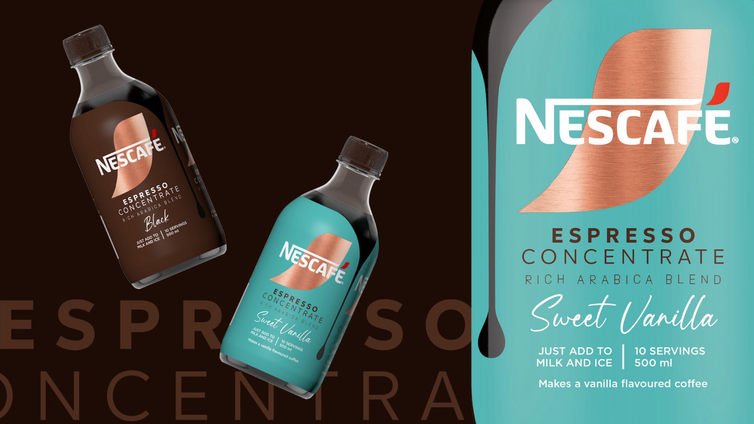
A rising trend in the coffee industry is its transformation into a functional beverage. Coffee is increasingly seen as a functional beverage, particularly among Gen Z and Millennials who are integrating it into their health lifestyles.
In the UK, 38% of Millennial coffee drinkers express interest in coffee with added health benefits, while 26% of US consumers are drawn to functional innovation in this category (Mintel). This growing trend has sparked a wave of innovation, especially in what goes into the coffee itself.
Creamers, originally added for flavor, are now being enriched with nutrients and supplements that promote wellness, many containing probiotics or ingredients like collagen, which have a range of health benefits.
are drawn to functional innovation in this category
Among the leading brands, Vital Proteins stands out with its Collagen Peptides and recently its Collagen Creamer. These products are designed to support healthy hair, skin, nails, and joints, and one of their biggest advantages is how easily they dissolve without changing the taste or texture of your drink.
A key figure behind the brand is Jennifer Aniston, who serves not only as an ambassador but also as a genuine advocate for the products.
Interestingly, Jennifer anniston was a supporter of Vital Proteins even before becoming an official ambassadorship.
Across the Atlantic, Aime, a French brand specializing in dietary supplements, has introduced a collagen powder designed to be mixed into beverages, including coffee. This collagen-enhanced creamer helps firm skin and strengthens nails and hair, making it a perfect addition to a wellness routine.

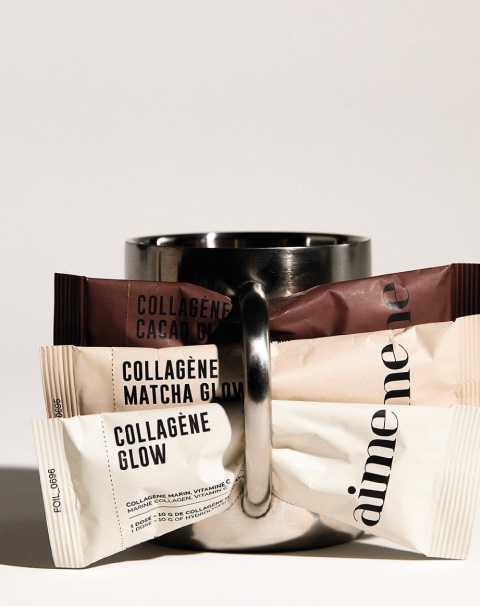
Credits: Aime
While at-home coffee consumption is growing strongly, the number of coffee shops continues to rise, confirming the popularity of takeaway coffee.
Coffee shops have become unique places for meeting and socializing, but also workspaces (digital nomads, ring a bell?).
Many people are looking for taste experiences, translating into a demand for quality coffee, exploring different aromatic profiles, and discovering various coffee origins. Coffee shops are attracting a younger target audience, those under 30, who consume less alcohol, frequent traditional cafes and brasseries less often, and are looking for a welcoming environment offering a wide range of beverages (lattes, cappuccinos, matcha, flat whites, etc.).
Credits: @gardenclubcafe
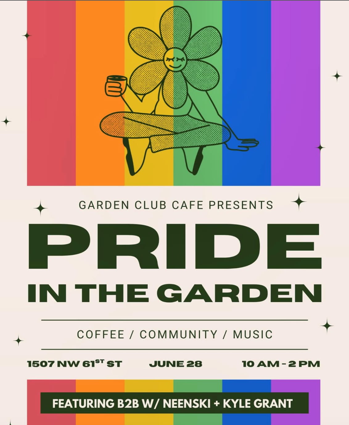
This welcoming environment goes beyond just serving coffee. These places are becoming meeting places and true experiential spaces.
Garden Club Cafe, a community pop-up located in Seattle, organizes unique experiences mixing speciality coffee with house music. Recent event have included a DJ set to celebrate Pride Month and another event to raise donations, showcasing a mix of culture and purpose over a cup of coffee.
This coffee shop trend extends to many other forms of gathering from running clubs to creative workshops, turning the café into a true community space.
This trend is also reflecting into bigger brands. Many players, especially luxury brands, have recognized this strong demand as a significant opportunity. By creating new retail spaces, brands aim to immerse customers in their unique worlds, enhance their brand image, and attract a wider audience. These spaces are designed to generate buzz on social media, with the intention of making them go viral through user-generated content.
To celebrate the launch of its new fragrance, Nina Ricci has opened an immersive pop-up café inspired by the iconic apple-shaped bottle. A fully staged space in shades of pink where visitors can enjoy pastries in the colors of the perfume and receive complimentary accessories and miniature fragrances. The atmosphere immerses visitors in the world of the perfume, with areas designed to encourage photo opportunities, including a room filled with multiple mirrors creating a play of infinite reflections.
Credits: WBA & Paris Secret
Kate Spade embraced the coffee shop trend with a cheerful cafe at Bloomingdale’s Dubai (April-June 2024). The space featured the brand’s signature green, pink, and red palette, along with iconic stripes and polka dots. Guests enjoyed specially branded treats and drinks, including spade-etched coffee. Kate Spade extended its brand codes through this new retail space.
To celebrate the launch of its new fragrance, Nina Ricci has opened an immersive pop-up café inspired by the iconic apple-shaped bottle. A fully staged space in shades of pink where visitors can enjoy pastries in the colors of the perfume and receive complimentary accessories and miniature fragrances. The atmosphere immerses visitors in the world of the perfume, with areas designed to encourage photo opportunities, including a room filled with multiple mirrors creating a play of infinite reflections.
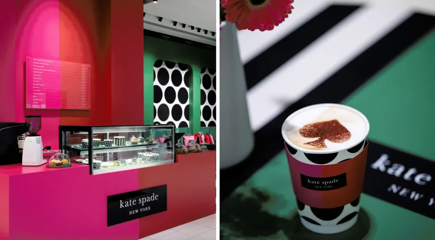
Credit: TheStyleList.in
From barista style at home routines to immersive cafe experiences and luxury brand innovation, the coffee market is exciting and full of opportunities
While coffee brands are striving to reconcile affordable prices with consumer values, luxury brands are focusing on innovation with new concepts to extend the customer experience and reinvent themselves.
Imagine scrolling endlessly through Instagram, yet simultaneously craving a moment of complete digital disconnection. This tension defines the On-Off Generation, and it’s reshaping consumer behavior.
“Brainrot“, Oxford’s 2024 word of the year, perfectly captures the mental fatigue of our hyper-connected world.
But what if brands could tap into this desire for balance, offering moments of respite and authentic connection?
At CBA, we believe they can. We help brands understand and connect with this dynamic consumer mindset, crafting resonant messaging and experiences that capture the attention of this influential demographic.
The “digital detox” and “sober curious” movements might seem like separate trends, but they reveal a deeper cultural shift: the On-Off Generation’s pursuit of balance. This generation fluidly transitions between periods of intense engagement and mindful disconnection, presenting both a challenge and a significant opportunity for brands.
Much has been said about the harmful impact of screens in our lives. Today’s consumers are overwhelmed by digital stimuli, spurring the “digital detox” movement. From screen-free challenges to the conscious embrace of analog experiences, people are seeking ways to disconnect.
This isn’t about rejecting technology; it’s about integrating intentional and conscious offline moments. This new balance manifests in different spheres in areas such as technology, travel, analog practices, and social life, all embracing more mindful, screen-free experiences.
Curiously, technology itself tries to offer solutions for its excessive use. Platforms like Instagram incorporate features like “Take a Break,” while other applications propose to block social networks on demand. However, there’s an evident paradox: isn’t it contradictory to resort to technology to solve problems that it created itself?
This presents a unique opportunity for brands to tap into the desire for tangible, authentic experiences.
How can your brand offer a respite from the digital deluge?
This pursuit of balance extends beyond the digital realm. The “sober curious” movement, particularly prominent among Gen Z, reflects a search for more conscious socialization and questions the societal norms around alcohol consumption. Why is sobriety often stigmatized? This generation is challenging the pressure to drink to socialize, recognizing the potential harm of this ubiquitous drug. According to Euromonitor International, non-alcoholic beverage sales exceeded 6.5 billion liters globally in 2022.
The phenomenon reflects not full abstinence but intentional sobriety periods (like “Dry January”) or interest in alternatives, from non-alcoholic drinks to psychedelics. Brands like Botivo, Tourtel Twist (pioneering festive non-alcoholic options in France), and Kiro’s Switchel meet the demand for pleasure without alcohol, emphasizing artisanal production and promoting conscious consumption.
Credit: Botivo, Kiro, Tourtel twist
This presents a lucrative market for brands willing to innovate and cater to the growing demand for sophisticated, alcohol-free options.
Another illustration of responsible consumption and a compelling alternative to alcoholic beverages is the Maison Perrier brand. To cater to a growing market segment, Maison Perrier has introduced its chic new range, featuring non-alcoholic cocktails and sparkling water-based drinks. This collection, with packaging designed by CBA, combines sophistication with a refreshing twist.

Credit: Hinge
The phrase “After the effort, comes the comfort,” popularized on urban brand products, encapsulates this generational duality. It reflects a complex persona comfortable with apparent contradictions: the festival-goer who is also a marathon runner (example: when you are 30 and can’t decide on a lifestyle).
Similar to the resurgence of analog: print magazines, fanzines, and diaries offer tactile experiences impossible to replicate digitally. Examples include the Hinge’s couples’ stories magazine, and Miu Miu’s Summer Reads campaign.
But also other examples of how this duality manifests:
How to engage with these multifaceted individuals? How to create messaging, products and services that resonates with both moments of intensity and conscious disconnection?
It’s interesting to think that within the same portfolio, a beverage brand can offer options with and without alcohol, sponsoring events focused on mindfulness and others more festive. Or promote the importance of offline moments using physical events and analog resources, while maintaining a consistent digital presence strategy.
Understanding this alternation mindset – which allows individuals to transition between periods of “total connectivity” and moments of focus or detoxification – has become essential for contemporary brands.
This article is the first in a series inspired by the insights introduced in our Pulse 2025 report.
Our report offers 9 fundamental insights, illustrated by more than 60 global case studies, to help you create positive impact and identify strategic opportunities for your brand.
This article is the first in a series inspired by the insights introduced in our Pulse 2025 report.
Our report offers 9 fundamental insights, illustrated by more than 60 global case studies, to help you create positive impact and identify strategic opportunities for your brand.
Consumer expectations constantly evolve, and new culinary trends are emerging on the gastronomic scene. Today, the quest for protein-rich foods is no longer confined to athletes but has become an important purchasing criterion for the general public.
By 2024, 19% of Americans would like to increase their protein intake, a preference that ranks third after fruits and vegetables. Additionally, over 50% believe that protein content is the most important nutritional factor when purchasing snacks. (Stylus Natural Expo West 2024 report)
Consumer expectations constantly evolve, and new culinary trends are emerging on the gastronomic scene. Today, the quest for protein-rich foods is no longer confined to athletes but has become an important purchasing criterion for the general public.
By 2024, 19% of Americans would like to increase their protein intake, a preference that ranks third after fruits and vegetables. Additionally, over 50% believe that protein content is the most important nutritional factor when purchasing snacks.
This trend is also confirmed on social networks, making nutritional education accessible and “democratizing” the protein, by no longer associating it exclusively with sporting performance. The pandemic has also raised awareness of the importance of physical and mental health. Online content, such as workouts and recipes at home, have contributed to this transformation of mentalities. Well-being comes first, and we say yes to protein!
Faced with the increasing popularity of this new trend, food brands are now offering alternatives that can be enjoyed at any time, not just in the context of sports performance.
Magic Spoon offers cereal-based snacks with a high protein content (between 11 to 13%) that can be enjoyed throughout the day. The packaging is inspired by the nostalgia of the cereals we used to eat on Saturday mornings while watching our favorite cartoons. It is colorful and fun, catching the eye and curiosity of consumers, and encouraging them to make a purchase. The protein content is prominently displayed on the packaging, providing reassurance to the consumer.
New players are entering the market, yet the leading players in the food industry have not finished surprising us!
Credit: Magic Spoon
Magic Spoon offers cereal-based snacks with a high protein content (between 11 to 13%) that can be enjoyed throughout the day. The packaging is inspired by the nostalgia of the cereals we used to eat on Saturday mornings while watching our favorite cartoons. It is colorful and fun, catching the eye and curiosity of consumers, and encouraging them to make a purchase. The protein content is prominently displayed on the packaging, providing reassurance to the consumer.

Magic Spoon offers cereal-based snacks with a high protein content (between 11 to 13%) that can be enjoyed throughout the day. The packaging is inspired by the nostalgia of the cereals we used to eat on Saturday mornings while watching our favorite cartoons. It is colorful and fun, catching the eye and curiosity of consumers, and encouraging them to make a purchase. The protein content is prominently displayed on the packaging, providing reassurance to the consumer.
Credit: Magic Spoon
New players are entering the market, yet the leading players in the food industry have not finished surprising us!
Credit: Hi Pro, Danone (Oz Design)
Danone specializes in protein foods with its Hi Pro brand. The brand offers a wide range of protein products, from yogurt drinks to gourmet desserts. When choosing protein foods, consumers seek reassurance. Hi Pro, with its sober packaging that highlights the product’s protein content and main ingredient, understands this need. The brand emphasizes transparency by designing clear, informative, and straightforward packaging that reassures consumers.
Danone specializes in protein foods with its Hi Pro brand. The brand offers a wide range of protein products, from yogurt drinks to gourmet desserts. When choosing protein foods, consumers seek reassurance.
Hi Pro, with its sober packaging that highlights the product’s protein content and main ingredient, understands this need. The brand emphasizes transparency by designing clear, informative, and straightforward packaging that reassures consumers.
Credit: Hi Pro, Danone (Oz Design)
FoodTech players are also entering the scene, enabling food markets to innovate and offer healthy food alternatives. This growing demand for high-protein snacks is accompanied by consumers concerned about their impact on the environment and animal welfare.
Despite a certain mistrust of “processed” products, particularly in terms of nutritional content, several brands are emerging in the market, offering protein-rich vegetable and pulse-based alternatives to counter preconceived ideas.
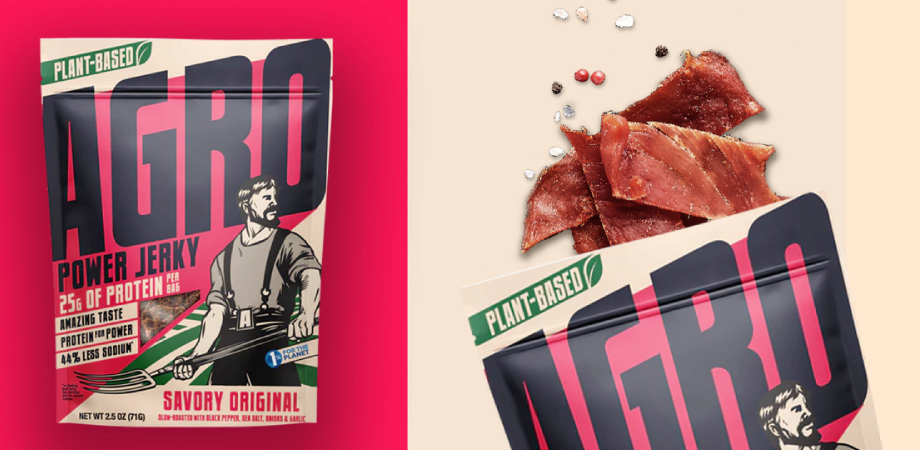
Agro pioneered a solution: Power Jerky: high protein snacks with lower salt levels.
Thanks to the Sprint Mode™ tool, developed by CBA’s USA-based teams, our teams and AGRO’s worked together to develop a striking graphic system and a solid marketing strategy in just 6 weeks! The graphic system resonates with the product’s ethos and founders, aiming to tackle concerns about the environmental impact of meat production.

Product innovation is constantly growing and evolving. By proposing a new way of consuming, brands seek to stand out from the crowd and carve out a solid place for themselves in the food market, while responding to today’s challenges such as the climate emergency and animal welfare.
Product innovation is constantly growing and evolving. By proposing a new way of consuming, brands seek to stand out from the crowd and carve out a solid place for themselves in the food market, while responding to today’s challenges such as the climate emergency and animal welfare.
Credit: Jiminis
Jiminis offers protein-rich insect-based foods. These include bars, granolas, and crackers. This new form of insect-based food provides many essential nutrients, while diversifying taste experiences thanks to new food textures and shapes.
Unlike Danone with its Hi Pro brand, Jiminis opts for a different approach, displaying the words “Rich in protein” on the front of its packaging and detailing the nutritional percentages on the back. Jiminis relies on colorful, peppy packaging to attract the eye and curiosity of consumers and encourage them to find out more about the product and the brand.
Unlike Danone with its Hi Pro brand, Jiminis opts for a different approach, displaying the words “Rich in protein” on the front of its packaging and detailing the nutritional percentages on the back. Jiminis relies on colorful, peppy packaging to attract the eye and curiosity of consumers and encourage them to find out more about the product and the brand.
Unlike Danone with its Hi Pro brand, Jiminis opts for a different approach, displaying the words “Rich in protein” on the front of its packaging and detailing the nutritional percentages on the back. Jiminis relies on colorful, peppy packaging to attract the eye and curiosity of consumers and encourage them to find out more about the product and the brand.
Always striving to differentiate themselves from the competition, brands specializing in nutrition are seeking to win over customers by offering packaging that encourages interaction. As we already mentioned in our article on connected packaging, which you can read here, the packaging is a crucial point of brand activation, bridging the gap between the real and digital worlds and offering a differentiating and memorable experience.
Hux, which specializes in health and wellness supplements that cater to various nutritional needs such as hydration, sleep, and protein, has decided to introduce QR codes on its packaging, offering a more precise and exhaustive description of its products.
Credit: Hux
Always striving to differentiate themselves from the competition, brands specializing in nutrition are seeking to win over customers by offering packaging that encourages interaction. As we already mentioned in our article on connected packaging, which you can read here, the packaging is a crucial point of brand activation, bridging the gap between the real and digital worlds and offering a differentiating and memorable experience.
Connected packaging offers transparency and reassures consumers about their consumption choices. Additionally, it serves as a powerful tool for gathering data and consumer information, enabling brands to adjust their strategy in real time to reach their target audience.
Connected packaging offers transparency and reassures consumers about their consumption choices. Additionally, it serves as a powerful tool for gathering data and consumer information, enabling brands to adjust their strategy in real time to reach their target audience.
Connected packaging offers transparency and reassures consumers about their consumption choices. Additionally, it serves as a powerful tool for gathering data and consumer information, enabling brands to adjust their strategy in real time to reach their target audience.
As you can imagine, consumer habits are constantly evolving. It’s crucial to meet consumers’ dietary objectives while respecting their values, from the environment to animal welfare. Packaging is the key to clearly conveying nutritional attributes and illustrating your transparency to your consumers.
As you can imagine, consumer habits are constantly evolving. It’s crucial to meet consumers’ dietary objectives while respecting their values, from the environment to animal welfare. Packaging is the key to clearly conveying nutritional attributes and illustrating your transparency to your consumers.
To discover more trends, download right now our 2024 Useful Design Trends report.
To discover more trends, download right now our 2024 Useful Design Trends report.
Luxury brands face several design challenges that require them to balance their commitment to craftsmanship, aesthetics, and innovation with changing consumer preferences and market trends. One of the most significant challenges is maintaining exclusivity and uniqueness while reaching broader audiences. To address this obstacle, luxury brands must find ways to create products that are exclusive and accessible, such as developing limited edition products or offering personalized customization options.
Another challenge is staying at the forefront of design and innovation while maintaining the brand heritage. Luxury brands must be mindful of the fact that their products often carry a rich history and cultural significance, which must be reflected in the design process. At the same time, they must also embrace emerging technologies and design practices to stay relevant and competitive.
Luxury brands face several design challenges that require them to balance their commitment to craftsmanship, aesthetics, and innovation with changing consumer preferences and market trends. One of the most significant challenges is maintaining exclusivity and uniqueness while reaching broader audiences. To address this obstacle, luxury brands must find ways to create products that are both exclusive and accessible, such as developing limited edition products or offering personalized customization options.
Another challenge is staying at the forefront of design and innovation while maintaining the brand heritage. Luxury brands must be mindful of the fact that their products often carry a rich history and cultural significance, which must be reflected in the design process. At the same time, they must also embrace emerging technologies and design practices to stay relevant and competitive.
In a long-term partnership with the luxury group LVMH and video game/software developer Epic Games, Fendi, part of the LVMH group, creates a unique customer experience by introducing 3D technology into its boutiques for bespoke creations. Leveraging Epic Games‘ Unreal Engine 5 3D design solution, select boutiques will offer their clientele hyper-realistic previews of customized products on screens. This new service aims at ultra-personalization, optimizing consumer engagement and satisfaction by involving them directly in the creation process. This experience not only enhances customer relationships but also provides a privileged and memorable experience.
Credits: Fendi
Credits: Fendi
In a long-term partnership with the luxury group LVMH and video game/software developer Epic Games, Fendi, part of the LVMH group, is creating a unique customer experience by introducing 3D technology into its boutiques for bespoke creations. Leveraging Epic Games‘ Unreal Engine 5 3D design solution, select boutiques will offer their clientele hyper-realistic previews of customized products on screens. This new service aims at ultra-personalization, optimizing consumer engagement and satisfaction by involving them directly in the creation process. This experience not only enhances customer relationships but also provides a privileged and memorable experience.
Credits: Fendi
Augmented Reality (AR), with a market value expected to reach $88.4 billion by 2026, is a technology that allows designers to innovate by creating 3D models. This technology has the potential to revolutionize the shopping experience by offering personalized and engaging interactions, such as virtual product try-ons before making a purchase.
When fully utilized, retailers can harness AR to achieve business objectives. According to a Deloitte report, 71% of shoppers would likely shop more frequently when using AR-powered apps. Moreover, 40% of consumers are willing to pay more if they’re able to test a product in AR.
Credits: SnapInc
Cartier‘s collaboration with Snapchat exemplifies how a luxury brand can benefit from augmented reality technology to elevate customer engagement. Through this partnership, Cartier enabled the public to virtually try on their Trinity rings. The lens uses machine learning to accurately predict the 3D shape of each user’s hand, ensuring a personalized experience. Previously, the French luxury house had collaborated with Snapchat to create a similar experience around the Tank Française watch. These initiatives not only enhance the customer experience but also reinforce Cartier’s brand identity as a pioneer in luxury and innovation.
Credits: SnapInc
Cartier‘s collaboration with Snapchat exemplifies how a luxury brand can benefit from augmented reality technology to elevate customer engagement. Through this partnership, Cartier enabled the public to virtually try on their Trinity rings. The lens uses machine learning to accurately predict the 3D shape of each user’s hand, ensuring a personalized experience. Previously, the French luxury house had collaborated with Snapchat to create a similar experience around the Tank Française watch.
These initiatives not only enhance the customer experience but also reinforce Cartier’s brand identity as a pioneer in luxury and innovation.
Cartier’s collaboration with Snapchat exemplifies how a luxury brand can benefit from augmented reality technology to elevate customer engagement. Through this partnership, Cartier enabled the public to virtually try on their Trinity rings. The lens uses machine learning to accurately predict the 3D shape of each user’s hand, ensuring a personalized experience. Previously, the French luxury house had collaborated with Snapchat to create a similar experience around the Tank Française watch. These initiatives not only enhance the customer experience but also reinforce Cartier’s brand identity as a pioneer in luxury and innovation.
Credits: SnapInc
The metaverse, a rapidly growing virtual world, offers an immersive experience where individuals interact with people, products, and places through avatars. This digital realm includes virtual marketplaces where users can buy and sell goods, services, and experiences, providing brands with a unique platform to express their identities and craft differentiated experiences. Analysts project that the market for virtual luxury goods could soar to USD 50 billion by 2030, highlighting the vast potential of this virtual world.
For brands, the metaverse represents a new frontier to cultivate long-term customer relationships rather than focusing on short-term gains. Luxury brands can leverage this virtual world to offer experiences that transcend physical limitations, enhancing consumer loyalty and driving new revenue streams.
The use of this tool by prestigious shopping centers like Printemps and iconic luxury brands such as Tiffany & Co., Gucci and Givenchy, illustrates its potential. For instance, Givenchy has embraced the metaverse by partnering with Roblox to create an interactive virtual world. This space features a dance floor, ice rink, and virtual makeup area where visitors can engage in challenges and win branded products. These brands utilize the metaverse to enhance customer experiences and engage their audiences in innovative ways, adapting to new buying patterns and showcasing vast opportunities for growth and connection in this dynamic digital landscape.
Credits: Givenchy Beauty IG Account
The use of this tool by prestigious shopping centers like Printemps and iconic luxury brands such as Tiffany & Co., Gucci and Givenchy, illustrates its potential. For instance, Givenchy has embraced the metaverse by partnering with Roblox to create an interactive virtual world. This space features a dance floor, ice rink, and virtual makeup area where visitors can engage in challenges and win branded products.
These brands utilize the metaverse to enhance customer experiences and engage their audiences in innovative ways, adapting to new buying patterns and showcasing vast opportunities for growth and connection in this dynamic digital landscape.
Credits: Givenchy Beauty IG Account
The use of this tool by prestigious shopping centers like Printemps and iconic luxury brands such as Tiffany & Co., Gucci and Givenchy, illustrates its potential. For instance, Givenchy has embraced the metaverse by partnering with Roblox to create an interactive virtual world. This space features a dance floor, ice rink, and virtual makeup area where visitors can engage in challenges and win branded products.
Credits: Givenchy Beauty IG Account
These brands utilize the metaverse to enhance customer experiences and engage their audiences in innovative ways, adapting to new buying patterns and showcasing the vast opportunities for growth and connection in this dynamic digital landscape.
The metaverse is neither the only nor the most popular tool for adopting the codes of the digital landscape. Gaming has become more than just a trend; it is now an integral part of consumer habits.
Today, gaming is the leading cultural industry. It is as much a part of our cultural references and heritage as music, comics, cinema, and so on.
– Marie Bories, Director of Research and Marketing, Webedia Group
The central place of gaming in daily life makes it essential for luxury brands to quickly integrate their codes to reach a young audience, which is expected to make 25 to 30% of luxury purchases by 2030.
A study conducted by Dynata for Webedia among a sample of 1,005 respondents aged 18 and over found that 66% of 18-34-year-olds believe that integrating the gaming universe is a good idea for brands outside this universe. They see it as beneficial for making a product known (40%), recruiting new clients and/or rejuvenating a consumer base (35%), increasing sales (28%), and enhancing a product’s attractiveness (24%).
The expanding role of the gaming universe as a powerful medium is exemplified by the initiatives of numerous luxury brands such as Cartier, Burberry, Louis Vuitton, Hermès, Gucci, Dolce & Gabbana, and many more. For instance, Cartier introduced “The Fabulous Cartier Journey,” an interactive video game as part of its “The Fabulous Cartier House” end-of-year campaign, aimed at enhancing storytelling and engagement with its audience. On the other hand, Dolce & Gabbana collaborated with video game specialist Razer to create a collection of clothing and equipment dedicated to gaming, while Tiffany partnered with Pokémon to launch an exclusive collection of necklaces. These examples showcase the various ways in which luxury brands are tapping into the gaming universe to connect with younger audiences and adapt to current consumer habits.
The metaverse is neither the only nor the most popular tool for adopting the codes of the digital landscape. Gaming has become more than just a trend; it is now an integral part of consumer habits.
Today, gaming is the leading cultural industry. It is as much a part of our cultural references and heritage as music, comics, cinema, and so on
– Marie Bories, Director of Research and Marketing, Webedia Group
The central place of gaming in daily life makes it essential for luxury brands to quickly integrate their codes to reach a young audience, which is expected to make 25 to 30% of luxury purchases by 2030.
A study conducted by Dynata for Webedia among a sample of 1,005 respondents aged 18 and over found that 66% of 18-34 -year-olds believe that integrating the gaming universe is a good idea for brands outside this universe. They see it as beneficial for making a product known (40%), recruiting new clients and/or rejuvenating a consumer base (35%), increasing sales (28%), and enhancing a product’s attractiveness (24%).
The expanding role of the gaming universe as a powerful medium is exemplified by the initiatives of numerous luxury brands such as Cartier, Burberry, Louis Vuitton, Hermès, Gucci, Dolce & Gabbana, and many more. For instance, Cartier introduced “The Fabulous Cartier Journey“, an interactive video game as part of its “The Fabulous Cartier House” end-of-year campaign, aimed at enhancing storytelling and engagement with its audience. On the other hand, Dolce & Gabbana collaborated with video game specialist Razer to create a collection of clothing and equipment dedicated to gaming, while Tiffany partnered with Pokémon to launch an exclusive collection of necklaces. These examples showcase the various ways in which luxury brands are tapping into the gaming universe to connect with younger audiences and adapt to current consumer habits.
Credits: Razer
Credits: The Fabulous Cartier Journey
Credits: Razer and The Fabulous Cartier Journey
The new opportunities of design present new avenues for luxury brands to innovate and differentiate themselves in the market while maintaining their commitment to exclusivity, craftsmanship, and tradition. By leveraging these new technologies and practices, luxury brands can create personalized and immersive experiences that resonate with consumers and establish strong brand identities that stand the test of time.
The new opportunities of design present new avenues for luxury brands to innovate and differentiate themselves in the market while maintaining their commitment to exclusivity, craftsmanship, and tradition. By leveraging these new technologies and practices, luxury brands can create personalized and immersive experiences that resonate with consumers and establish strong brand identities that stand the test of time.
To discover more trends, download right now our 2024 Useful Design Trends report.

To discover more trends, download right now our 2024 Useful Design Trends report.
Gyms are reinventing themselves and seeking to innovate with new concepts. As you may have noticed, a new lexicon has appeared over the last few years: pilates, reformer, indoor cycling, infrared-heated workouts …
These workout spaces present a new, innovative approach to exercise, where fun and self-improvement are at the heart of their concept. Immersion is the new keyword, and the spaces are designed to immerse athletes in a stimulating scenography and motivating group atmosphere. With music and dynamic lighting, these new spaces are extremely popular!

Credits: One Yoga NY and Power+Flow studio.
Even crazier concepts are now on the market. How about classes under 95 degrees Fahrenheit with 40% humidity? One Yoga NY, a gym located in the heart of lower Manhattan’s, offers group workouts focusing on controlled breathing and a balanced muscle workout regimen, enhancing both strength and flexibility.
Power+Flow studio provide a unique workout experience by offering an indoor cycling experience with upbeat music and a vibrant and energetic atmosphere, motivating its client to push beyond their limits.
The uniqueness of the concept attracts people who are seeking a different way to experience fitness.
Even crazier concepts are now on the market. How about classes under 95 degrees Fahrenheit with 40% humidity? One Yoga NY, a gym located in the heart of lower Manhattan’s, offers group workouts focusing on controlled breathing and a balanced muscle workout regimen, enhancing both strength and flexibility.
Credits: One Yoga NY and Power+Flow studio.
Power+Flow studio provide a unique workout experience by offering an indoor cycling experience with upbeat music and a vibrant and energetic atmosphere, motivating its client to push beyond their limits.
The uniqueness of the concept attracts people who are seeking a different way to experience fitness.
Beyond the curiosity and attraction surrounding these new concepts, these « group workouts » are experiencing significant growth as consumers once again need physical interaction, after a long period of lockdowns. Social medias are having a strong impact, highlighting this notion of well-being, which involves sport, food and even cosmetics.
Beyond the curiosity and attraction surrounding these new concepts, these « group workouts » are experiencing significant growth as consumers once again need physical interaction, after a long period of lockdowns. Social medias are having a strong impact, highlighting this notion of well-being, which involves sport, food and even cosmetics.
Your prospects and customers are seeking to live an experience! Sport must be seen as a fun and attractive activity. Spaces are therefore being completely redesigned, focusing on experience and immersion. The environment you offer them, and the layout of your spaces are therefore of crucial importance.
Your prospects and customers are seeking to live an experience! Sport must be seen as a fun and attractive activity. Spaces are therefore being completely redesigned, focusing on experience and immersion. The environment you offer them, and the layout of your spaces are therefore of crucial importance.
The last Stylus report Combat Sports, Leisure’s New Obsession highlights the growing popularity of martial arts adoption. Many gyms specialize in these combat sports. A trend confirmed notably by the number of searches on Pinterest:
+ 200% « Mixed Martial Arts Training »,
+ 265% « Kick-boxing aesthetics»,
+ 30% « Qui-jitsu ».

Credit: Rumble Boxing
The last Stylus report Combat Sports, Leisure’s New Obsession highlights the growing popularity of martial arts adoption. Many gyms specialize in these combat sports. A trend confirmed notably by the number of searches on Pinterest:
+ 200% « Mixed Martial Arts Training »,
+ 265% « Kick-boxing aesthetics»,
+ 30% « Qui-jitsu ».
Credit: Rumble Boxing
This growing adoption highlights the desire of certain communities to learn combat techniques to better arm themselves in public and private. Among the first to be affected are women and the LGBTQ+ community.
Martial arts are highly prized today and are put in the spotlight. YouTubers, streamers, and media figures have also shed light on certain practices, such as boxing, by organizing tournaments, accumulating millions of views on social media.
Martial arts bring together a strong, committed community. It is an interesting niche market that is growing all the time and brings together a vast number of passionate people. Teaching martial arts to your customers gives them the weapons to defend themselves, and thus strengthens your relationship with them. It’s also a significant commitment on your part to their safety and well-being.
This trend also offers the opportunity to design sport clothing and equipment specifically adapted to these practices. For many people, sportswear is more than just functional clothing. It becomes an important source of motivation. It acquires a fashion dimension .
Martial arts bring together a strong, committed community. It is an interesting niche market that is growing all the time and brings together a vast number of passionate people. Teaching martial arts to your customers gives them the weapons to defend themselves, and thus strengthens your relationship with them. It’s also a significant commitment on your part to their safety and well-being.
Numerous fitness applications based on AI have appeared on the market. AI opens up an unlimited field of possibilities, for both individuals and professionals.
Numerous fitness applications based on AI have appeared on the market. AI opens up an unlimited field of possibilities, for both individuals and professionals.
It enables you to personalize your workout in real time, based on precise data (age, body mass, fitness level, hydration level, sporting objectives etc.). Recommendations are made in terms of exercise, level of difficulty, number of repetition or even duration of training.
It enables you to personalize your workout in real time, based on precise data (age, body mass, fitness level, hydration level, sporting objectives etc.). Recommendations are made in terms of exercise, level of difficulty, number of repetition or even duration of training.
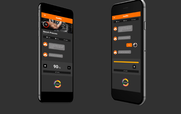
Gymfitty, for example, offers intelligent and ultra-personalized workouts based on complex algorithms. Users interact with a chat bot that personalized their workout in real time, based on their goals, heart rate and anatomy, feedback during the workout …
Credit: Gymfitty.com
Gymfitty, for example, offers intelligent and ultra-personalized workouts based on complex algorithms. Users interact with a chat bot that personalized their workout in real time, based on their goals, heart rate and anatomy, feedback during the workout …

Credits: Gymfitty.com
IA offers innovative possibilities, enabling the creation of differentiated sports experience based on tangible data, factors that reassure consumers. However, be careful not to lose the human and emotional aspect, which we know can be a very important subject for the new generations.
IA offers innovative possibilities, enabling the creation of differentiated sports experience based on tangible data, factors that reassure consumers. However, be careful not to lose the human and emotional aspect, which we know can be a particularly important subject for the new generations.
To discover more trends, download right now our 2024 Useful Design Trends report.
Foodtech has revolutionized the culinary industry, transforming not only our eating, cooking habits but also our mindset. The constantly evolving sector offers numerous opportunities for brands looking to stand out in the market. According to Emergen Research, it is estimated that the global Foodtech market could climb up to $342 billion by 2027. However, it’s important to understand that Foodtech is not just about food, but also about the overall consumer experience. And this is where design comes into play.
Foodtech has come a long way since its inception. From simple innovations like canned goods and refrigeration to more complex ones like molecular gastronomy and plant-based meat substitutes. Food technology has continually pushed the boundaries of what’s possible in the culinary world. Today, it involves creating sustainable, healthy, and convenient food options that cater to the needs of modern consumers.

Credit : Rebellyous Foods
This topic is gaining importance, now touching a wide range of players including schools, thanks to the expansion of foodtech. Rebellyous Foods, a company specializing in plant-based nuggets, is expanding its influence, with more and more educational establishments opting for its products. According to this Seattle-based company, this trend reflects a growing movement within US schools, aiming to offer a greater variety of plant-based options.
Design plays a crucial role in this evolution. By integrating a design approach into the development of new food products and services, Foodtech companies can create solutions that are not only functional but also aesthetically pleasing. For instance, the packaging design can make or break a product’s success in the market. By using environmentally friendly materials and attractive designs, brands can attract environmentally conscious consumers while standing out on the shelves.
Credits: eat meati ig.
Take the exemple of Eat Meati, a brand specializing in providing mushroom-based alternatives to meat. Their aim is to shift perception about vegan dishes, and to achieve this, they have developed fun and colorful packaging that is both attractive et positive.
Take the exemple of Eat Meati, a brand specializing in providing mushroom-based alternatives to meat. Their aim is to shift perception about vegan dishes, and to achieve this, they have developed fun and colorful packaging that is both attractive et positive.
Credits: eat meati ig.
By placing consumer needs and preferences at the forefront of product development, Foodtech companies can create solutions that truly resonate with their target audience. This approach involves conducting in-depth research and gathering consumer testimonials until the final product genuinely meets customer needs.
Meal kit delivery services are an excellent example of consumer-centered design. These services eliminate the daily hassles of meal planning and grocery shopping by delivering proportioned ingredients and recipes right to our doorstep. Catering to busy professionals and families who want to eat healthy meals at home without spending hours in the kitchen, meal kit delivery services have become a popular choice for many consumers.
Moreover, Foodtech doesn’t just meet our food needs; it also tackles broader issues like food waste.
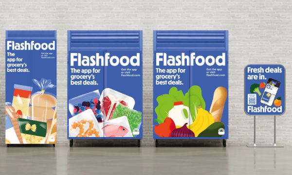
Flashfood is a US app that enables users to purchase unsold food at reduced prices. By partnering with grocery chains, the company facilitates the sale of surplus food via its app, providing users with substantial savings while addressing food waste at the store level.
Credit : Flashfood
Moreover, Foodtech doesn’t just meet our food needs; it also tackles broader issues like food waste.
Flashfood is a US app that enables users to purchase unsold food at reduced prices. By partnering with grocery chains, the company facilitates the sale of surplus food via its app, providing users with substantial savings while addressing food waste at the store level.
Credit : Flashfood
Credit : Midjourney
The future of Foodtech is promising, with endless possibilities for innovation and growth. One particularly interesting area is the use of technology to enhance the culinary experience. From augmented reality menus to smart kitchen appliances, technology is changing the way we interact with food. Moreover, as consumers become increasingly aware of the environmental impact of their diet, food technology companies are exploring new ways to reduce waste and promote sustainable practices. This ranges from using biodegradable packaging to developing plant-based alternatives to traditional meat products.
The horizon for Foodtech seems bright. This growth would primarily be driven by a steadily increasing demand for healthier, more sustainable, and convenient food products. However, Foodtech still has several hurdles to overcome, particularly regarding regulations and financing. It’s also crucial to ensure that these technological innovations do not create new disparities, such as favoring a wealthier clientele.
Foodtech has revolutionized the culinary industry, transforming not only our eating, cooking habits but also our mindset. The constantly evolving sector offers numerous opportunities for brands looking to stand out in the market. According to Emergen Research, it is estimated that the global Foodtech market could climb up to $342 billion by 2027. However, it’s important to understand that Foodtech is not just about food, but also about the overall consumer experience. And this is where design comes into play.
Foodtech has come a long way since its inception. From simple innovations like canned goods and refrigeration to more complex ones like molecular gastronomy and plant-based meat substitutes. Food technology has continually pushed the boundaries of what’s possible in the culinary world. Today, it involves creating sustainable, healthy, and convenient food options that cater to the needs of modern consumers.
This topic is gaining importance, now touching a wide range of players including schools, thanks to the expansion of foodtech. Rebellyous Foods, a company specializing in plant-based nuggets, is expanding its influence, with more and more educational establishments opting for its products. According to this Seattle-based company, this trend reflects a growing movement within US schools, aiming to offer a greater variety of plant-based options.

Credit : Rebellyous Foods
Design plays a crucial role in this evolution. By integrating a design approach into the development of new food products and services, Foodtech companies can create solutions that are not only functional but also aesthetically pleasing. For instance, the packaging design can make or break a product’s success in the market. By using environmentally friendly materials and attractive designs, brands can attract environmentally conscious consumers while standing out on the shelves.
Take the exemple of Eat Meati, a brand specializing in providing mushroom-based alternatives to meat. Their aim is to shift perception about vegan dishes, and to achieve this, they have developed fun and colorful packaging that is both attractive et positive.

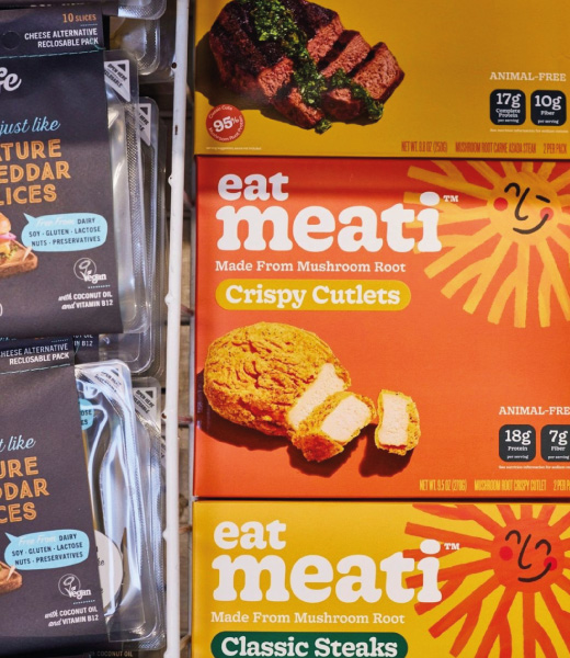
Credits: meatifood ig
By placing consumer needs and preferences at the forefront of product development, Foodtech companies can create solutions that truly resonate with their target audience. This approach involves conducting in-depth research and gathering consumer testimonials until the final product genuinely meets customer needs.
Meal kit delivery services are an excellent example of consumer-centered design. These services eliminate the daily hassles of meal planning and grocery shopping by delivering proportioned ingredients and recipes right to our doorstep. Catering to busy professionals and families who want to eat healthy meals at home without spending hours in the kitchen, meal kit delivery services have become a popular choice for many consumers.
Moreover, Foodtech doesn’t just meet our food needs; it also tackles broader issues like food waste.
Flashfood is a US app that enables users to purchase unsold food at reduced prices. By partnering with grocery chains, the company facilitates the sale of surplus food via its app, providing users with substantial savings while addressing food waste at the store level.
Credit : Flashfood
The future of Foodtech is promising, with endless possibilities for innovation and growth. One particularly interesting area is the use of technology to enhance the culinary experience. From augmented reality menus to smart kitchen appliances, technology is changing the way we interact with food. Moreover, as consumers become increasingly aware of the environmental impact of their diet, food technology companies are exploring new ways to reduce waste and promote sustainable practices. This ranges from using biodegradable packaging to developing plant-based alternatives to traditional meat products.
The horizon for Foodtech seems bright. This growth would primarily be driven by a steadily increasing demand for healthier, more sustainable, and convenient food products. However, Foodtech still has several hurdles to overcome, particularly regarding regulations and financing. It’s also crucial to ensure that these technological innovations do not create new disparities, such as favoring a wealthier clientele.
Holiday seasons like Valentine’s Day stand as pivotal moments for brands to cultivate consumer engagement and drive sales, leveraging the emotional resonance inherent on such occasions. Once a simple celebration of affection, February 14th has evolved into a grand marketing spectacle, wielding immense economic influence across diverse industries.
In fact, in 2024, Valentine’s Day expenditures in the United States are projected to soar to a staggering $26 billion (Statista, 2024). These figures underscore the burgeoning opportunity that this day represents for brands.
Therefore, it is legitimate to ask, how brands can leverage design strategies to maximize consumer engagement and drive sales during Valentine’s Day, as an opportunity to forge deeper connection with their audience.
In today’s dynamic landscape of relationships, the concept of “situationships” has emerged as a prominent phenomenon, especially among younger generations. According to a 2022 survey conducted by YPulse, 20% of Gen Z and 16% of Millennials report they have been in a situationship. And 35% of Gen z say they prefer to have an undefined relationship rather than one with a label, highlighting the evolving nature of modern love dynamics.
The campaign quickly gained traction on social media platforms, garnering over 1.2 million views on TikTok and sparking engagement from users who resonated with how confusing situationships can be. The brand’s website further extends the campaign’s reach with downloadable e-cards bearing phrases like “Do you know how much you mean to me? Because I don’t.” adding a touch of humor and authenticity to their Valentine’s Day strategy. This approach exemplifies how brands can adapt to evolving consumer behaviors and cultural trends, infusing their offerings with relevance and resonance.
Today’s romantic landscape is inseparable from dating apps. With 2.3 million daily unique visitors to these platforms in France in 2023, dating apps have become an essential aspect of modern romance. Consequently, they represent a significant business opportunity for brands aiming to expand their audience reach, enhance visibility, and engage users in meaningful ways by addressing real-life challenges.

For example, Adidas and Bumble have collaborated to introduce a Gym Buddy Interest Badge on the dating app. This badge simplifies the process of finding potential gym partners who share a passion for staying active. The collaboration is in line with the launch of Adidas’s Spring/Summer 2024 Strength collection, showcasing the boundless potential of brand partnerships.
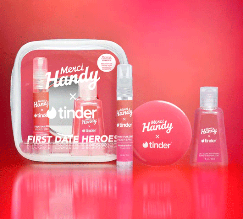
In another partnership, Tinder and Merci Handy have unveiled a capsule beauty collection named “First Date Heroes“. Inspired by an IFOP study for Tinder, which revealed that 74% of 18-25 year olds in France feel stressed before a date, this kit aims to ease the anxiety of first encounters. Additionally, 10% of proceeds from the collection are donated to Consentis, an association advocating for a culture of consent and combating sexual violence in social settings. This collaboration leverages Valentine’s Day as an opportunity to raise awareness of relevant issues and offer solutions that resonate with contemporary dating culture.
The increasing impact of AI is transforming how brands operate, presenting a new frontier in personalization and connection for both audiences and marketers. In the United States, 81% of consumers are open to AI providing personalized communications, underscoring the validity of its integration into communication and marketing strategies, especially evident during Valentine’s Day campaigns.
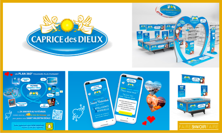
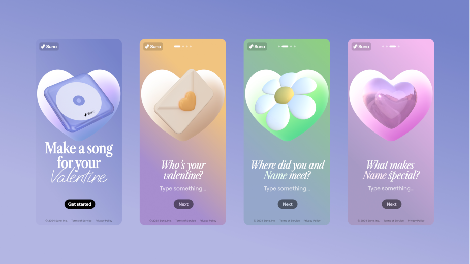
As for holiday season, Valentine’s Day is an opportunity for brands across all sectors to capitalize on the festive spirit by releasing limited edition products and redesigning their packaging. These special releases, ranging from beauty to food items, serve as simple but effective ways to engage consumers and drive sales.

For instance, Babybel celebrates Valentine’s Day with a heart-shaped mini variant of its iconic cheese. However, this special edition isn’t available for purchase in stores; instead, consumers must participate in a sweepstake on Babybel’s Instagram page to win it. This approach not only generates excitement but also amplifies the visibility of the limited edition.
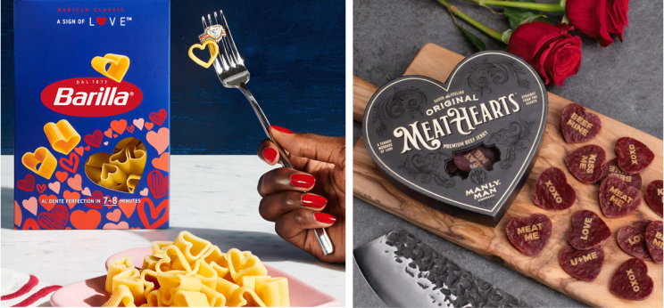
Barilla celebrates Valentine’s Day by introducing heart-shaped pasta, accompanied by special recipes for a romantic evening. Meanwhile, Manly Man Co.‘s Meathearts puts a savory twist on the sweet candy hearts with playful messages like “MEET ME”.
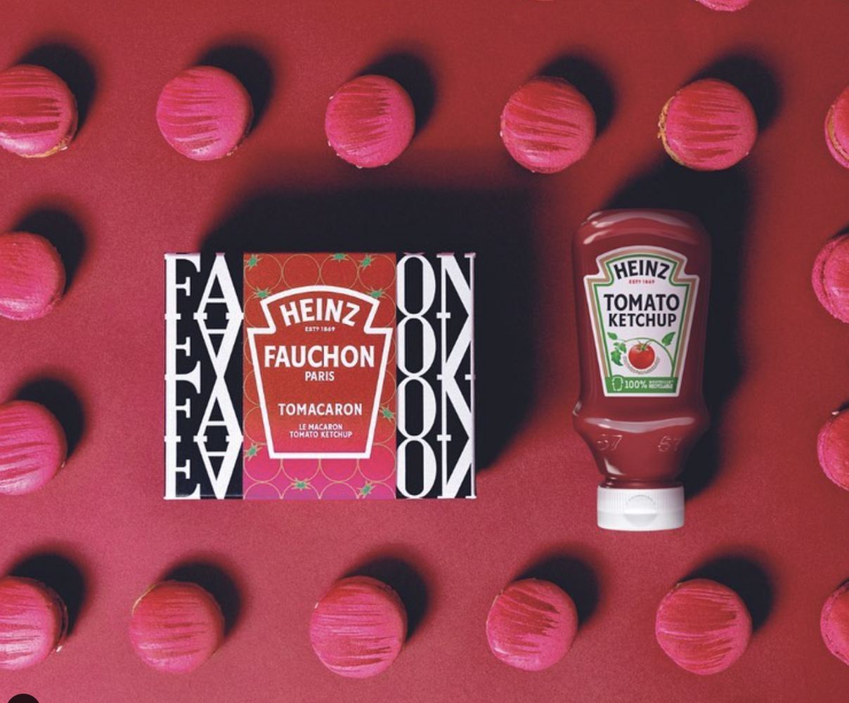
Heinz celebrated the attraction of opposites with Fauchon Paris through the introduction of the Tomacaron: a macaron with ketchup. This limited edition isn’t just a culinary collaboration; it’s a testament to the power of collaboration that unlocked new opportunities to showcase their respective strengths, broaden their audience reach, and unveil a product that captures the imagination of consumers.
Thus, with the constant evolution of trends, technology, and consumer behaviors, brands have a wide range of options to capitalize on Valentine’s Day. They can leverage the latest technological advancements and emerging trends such as “situationships” and artificial intelligence, or opt for more traditional strategies like limited editions. By integrating these approaches in innovative and thoughtful ways, brands can strengthen their position in the market and foster lasting relationships with their audience during Valentine’s Day and beyond.
Holiday seasons like Valentine’s Day stand as pivotal moments for brands to cultivate consumer engagement and drive sales, leveraging the emotional resonance inherent on such occasions. Once a simple celebration of affection, February 14th has evolved into a grand marketing spectacle, wielding immense economic influence across diverse industries.
In fact, in 2024, Valentine’s Day expenditures in the United States are projected to soar to a staggering $26 billion (Statista, 2024). These figures underscore the burgeoning opportunity that this day represents for brands.
Therefore, it is legitimate to ask, how brands can leverage design strategies to maximize consumer engagement and drive sales during Valentine’s Day, as an opportunity to forge deeper connection with their audience.
In today’s dynamic landscape of relationships, the concept of “situationships” has emerged as a prominent phenomenon, especially among younger generations. According to a 2022 survey conducted by YPulse, 20% of Gen Z and 16% of Millennials report they have been in a situationship. And 35% of Gen z say they prefer to have an undefined relationship rather than one with a label, highlighting the evolving nature of modern love dynamics.
The campaign quickly gained traction on social media platforms, garnering over 1.2 million views on TikTok and sparking engagement from users who resonated with how confusing situationships can be. The brand’s website further extends the campaign’s reach with downloadable e-cards bearing phrases like “Do you know how much you mean to me? Because I don’t.” adding a touch of humor and authenticity to their Valentine’s Day strategy. This approach exemplifies how brands can adapt to evolving consumer behaviors and cultural trends, infusing their offerings with relevance and resonance.
Today’s romantic landscape is inseparable from dating apps. With 2.3 million daily unique visitors to these platforms in France in 2023, dating apps have become an essential aspect of modern romance. Consequently, they represent a significant business opportunity for brands aiming to expand their audience reach, enhance visibility, and engage users in meaningful ways by addressing real-life challenges.

For example, Adidas and Bumble have collaborated to introduce a Gym Buddy Interest Badge on the dating app. This badge simplifies the process of finding potential gym partners who share a passion for staying active. The collaboration is in line with the launch of Adidas’s Spring/Summer 2024 Strength collection, showcasing the boundless potential of brand partnerships.
In another partnership, Tinder and Merci Handy have unveiled a capsule beauty collection named “First Date Heroes“. Inspired by an IFOP study for Tinder, which revealed that 74% of 18-25 year olds in France feel stressed before a date, this kit aims to ease the anxiety of first encounters. Additionally, 10% of proceeds from the collection are donated to Consentis, an association advocating for a culture of consent and combating sexual violence in social settings. This collaboration leverages Valentine’s Day as an opportunity to raise awareness of relevant issues and offer solutions that resonate with contemporary dating culture.

The increasing impact of AI is transforming how brands operate, presenting a new frontier in personalization and connection for both audiences and marketers. In the United States, 81% of consumers are open to AI providing personalized communications, underscoring the validity of its integration into communication and marketing strategies, especially evident during Valentine’s Day campaigns.


As for holiday season, Valentine’s Day is an opportunity for brands across all sectors to capitalize on the festive spirit by releasing limited edition products and redesigning their packaging. These special releases, ranging from beauty to food items, serve as simple but effective ways to engage consumers and drive sales.

For instance, Babybel celebrates Valentine’s Day with a heart-shaped mini variant of its iconic cheese. However, this special edition isn’t available for purchase in stores; instead, consumers must participate in a sweepstake on Babybel’s Instagram page to win it. This approach not only generates excitement but also amplifies the visibility of the limited edition.
Barilla celebrates Valentine’s Day by introducing heart-shaped pasta, accompanied by special recipes for a romantic evening. Meanwhile, Manly Man Co.‘s Meathearts puts a savory twist on the sweet candy hearts with playful messages like “MEET ME”.


Heinz celebrated the attraction of opposites with Fauchon Paris through the introduction of the Tomacaron: a macaron with ketchup. This limited edition isn’t just a culinary collaboration; it’s a testament to the power of collaboration that unlocked new opportunities to showcase their respective strengths, broaden their audience reach, and unveil a product that captures the imagination of consumers.
Thus, with the constant evolution of trends, technology, and consumer behaviors, brands have a wide range of options to capitalize on Valentine’s Day. They can leverage the latest technological advancements and emerging trends such as “situationships” and artificial intelligence, or opt for more traditional strategies like limited editions. By integrating these approaches in innovative and thoughtful ways, brands can strengthen their position in the market and foster lasting relationships with their audience during Valentine’s Day and beyond.
Holiday seasons like Valentine’s Day stand as pivotal moments for brands to cultivate consumer engagement and drive sales, leveraging the emotional resonance inherent on such occasions. Once a simple celebration of affection, February 14th has evolved into a grand marketing spectacle, wielding immense economic influence across diverse industries.
In fact, in 2024, Valentine’s Day expenditures in the United States are projected to soar to a staggering $26 billion (Statista, 2024). These figures underscore the burgeoning opportunity that this day represents for brands.
Therefore, it is legitimate to ask, how brands can leverage design strategies to maximize consumer engagement and drive sales during Valentine’s Day, as an opportunity to forge deeper connection with their audience.
In today’s dynamic landscape of relationships, the concept of “situationships” has emerged as a prominent phenomenon, especially among younger generations. According to a 2022 survey conducted by YPulse, 20% of Gen Z and 16% of Millennials report they have been in a situationship. And 35% of Gen z say they prefer to have an undefined relationship rather than one with a label, highlighting the evolving nature of modern love dynamics.
The campaign quickly gained traction on social media platforms, garnering over 1.2 million views on TikTok and sparking engagement from users who resonated with how confusing situationships can be. The brand’s website further extends the campaign’s reach with downloadable e-cards bearing phrases like “Do you know how much you mean to me? Because I don’t.” adding a touch of humor and authenticity to their Valentine’s Day strategy. This approach exemplifies how brands can adapt to evolving consumer behaviors and cultural trends, infusing their offerings with relevance and resonance.
Today’s romantic landscape is inseparable from dating apps. With 2.3 million daily unique visitors to these platforms in France in 2023, dating apps have become an essential aspect of modern romance. Consequently, they represent a significant business opportunity for brands aiming to expand their audience reach, enhance visibility, and engage users in meaningful ways by addressing real-life challenges.
For example, Adidas and Bumble have collaborated to introduce a Gym Buddy Interest Badge on the dating app. This badge simplifies the process of finding potential gym partners who share a passion for staying active. The collaboration is in line with the launch of Adidas’s Spring/Summer 2024 Strength collection, showcasing the boundless potential of brand partnerships.

In another partnership, Tinder and Merci Handy have unveiled a capsule beauty collection named “First Date Heroes“. Inspired by an IFOP study for Tinder, which revealed that 74% of 18-25 year olds in France feel stressed before a date, this kit aims to ease the anxiety of first encounters. Additionally, 10% of proceeds from the collection are donated to Consentis, an association advocating for a culture of consent and combating sexual violence in social settings. This collaboration leverages Valentine’s Day as an opportunity to raise awareness of relevant issues and offer solutions that resonate with contemporary dating culture.

The increasing impact of AI is transforming how brands operate, presenting a new frontier in personalization and connection for both audiences and marketers. In the United States, 81% of consumers are open to AI providing personalized communications, underscoring the validity of its integration into communication and marketing strategies, especially evident during Valentine’s Day campaigns.


As for holiday season, Valentine’s Day is an opportunity for brands across all sectors to capitalize on the festive spirit by releasing limited edition products and redesigning their packaging. These special releases, ranging from beauty to food items, serve as simple but effective ways to engage consumers and drive sales.
For instance, Babybel celebrates Valentine’s Day with a heart-shaped mini variant of its iconic cheese. However, this special edition isn’t available for purchase in stores; instead, consumers must participate in a sweepstake on Babybel’s Instagram page to win it. This approach not only generates excitement but also amplifies the visibility of the limited edition.

Barilla celebrates Valentine’s Day by introducing heart-shaped pasta, accompanied by special recipes for a romantic evening. Meanwhile, Manly Man Co.‘s Meathearts puts a savory twist on the sweet candy hearts with playful messages like “MEET ME”.

Heinz celebrated the attraction of opposites with Fauchon Paris through the introduction of the Tomacaron: a macaron with ketchup. This limited edition isn’t just a culinary collaboration; it’s a testament to the power of collaboration that unlocked new opportunities to showcase their respective strengths, broaden their audience reach, and unveil a product that captures the imagination of consumers.

Thus, with the constant evolution of trends, technology, and consumer behaviors, brands have a wide range of options to capitalize on Valentine’s Day. They can leverage the latest technological advancements and emerging trends such as “situationships” and artificial intelligence, or opt for more traditional strategies like limited editions. By integrating these approaches in innovative and thoughtful ways, brands can strengthen their position in the market and foster lasting relationships with their audience during Valentine’s Day and beyond.

In a world where change is the only constant, the ability to discern fleeting fads from enduring trends is more crucial than ever.
We have highlighted 15 trends that promise longevity and sustainability, transcending the ephemeral nature that characterizes the world of brands, with a focus on positive impact.
Our report, covering over 40 industries and 90 case studies, revolves around 5 pillars derived from our Critical Imprint utility map:





Reinventing raw materials and everyday consumer products is a necessity: we must consider material innovation and reorient product life cycles.
Ancient wisdom is increasingly acknowledged for modern environmental solutions.
continue to gain ground. Brands are increasingly rejecting binary gender norms and traditional aesthetics.
are increasingly adopted by brands for holistic well-being.
… while increasingly, brands integrate behavioral design into their strategies, thus promoting spaces of connection and shared experiences against digital isolation.
Brands are adapting to the rising cost of living by prioritizing cost-effective solutions, while cities worldwide adjust to environmentally friendly micromobility.
As we step into 2024, the question arises: “New year, new trends?” The answer leans towards continuity rather than a complete overhaul. While some fresh trends are set to emerge, the design environment will continue to sustain many of the existing ones.
So, as we step into 2024, what emerging trends will the world give birth to, or which existing trends will it continue to embrace?
As we navigate a rapidly changing world where environmental issues have become more fundamental than ever, sustainability touches every sector, emphasizing its importance in the face of an ever-expanding threat. In the face of this growing threat, design emerges as a key player in the battle against climate change.
Sustainability is no longer just a buzzword; it has become an integral element of both daily consumer life and corporate policies. This serves as the driving force behind the surge of alternative material development, particularly in retail and packaging.
According to Ipsos (2022), almost 60% of the French population intends to ditch excessive packaging in the fight against climate change — a compelling percentage that encourages brands to integrate more eco-design into their production methods. The growing consumer demand for environmentally conscious choices is compelling more and more brands today, and will continue to do so in the future, to commit to responsible packaging design.
Sustainable material choices coupled with responsible manufacturing processes will continue to play a key part in design for 2024.
Chris Wilson, STCKMN

In 2024, biodegradable, compostable, and recyclable packaging, providing alternatives to single-use items, is likely to gain a more prominent role.
The Scotch Malt Whisky Society exemplifies this trend with its handcrafted paper-pulp bottle outer. By making eco-friendly material choices and employing handmade production methods, the bottle not only achieves a luxurious aesthetic but also avoids the greenwashed approach to sustainability.
Design provides a unique opportunity to reconsider our consumption and production patterns. The retail sector is undergoing a significant transformation, adapting to the growing ecological awareness by incorporating environmentally friendly practices into all aspects of the retail process.
Sustainable retail design is now a crucial player in shaping our world’s future. It authentically addresses environmental concerns and aligns with the corporate social responsibility (CSR) initiatives of brands that adopt it.
Examples such as Nescafe’s eco-friendly store in São Paulo, built with biodegradable materials and utilizing algorithmic 3D printing, and VALRHONA’s Parisian store, exclusively crafted with eco-responsible materials, showcase how retail design can innovate spaces while minimizing ecological impact.
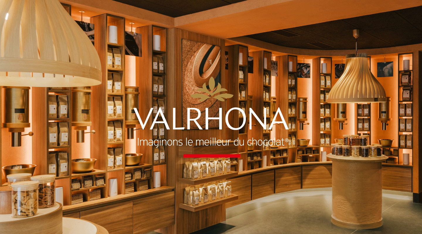
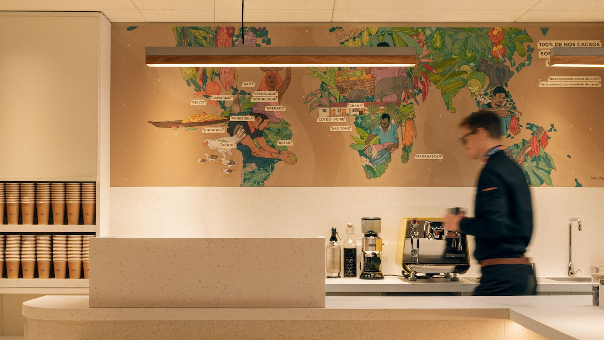
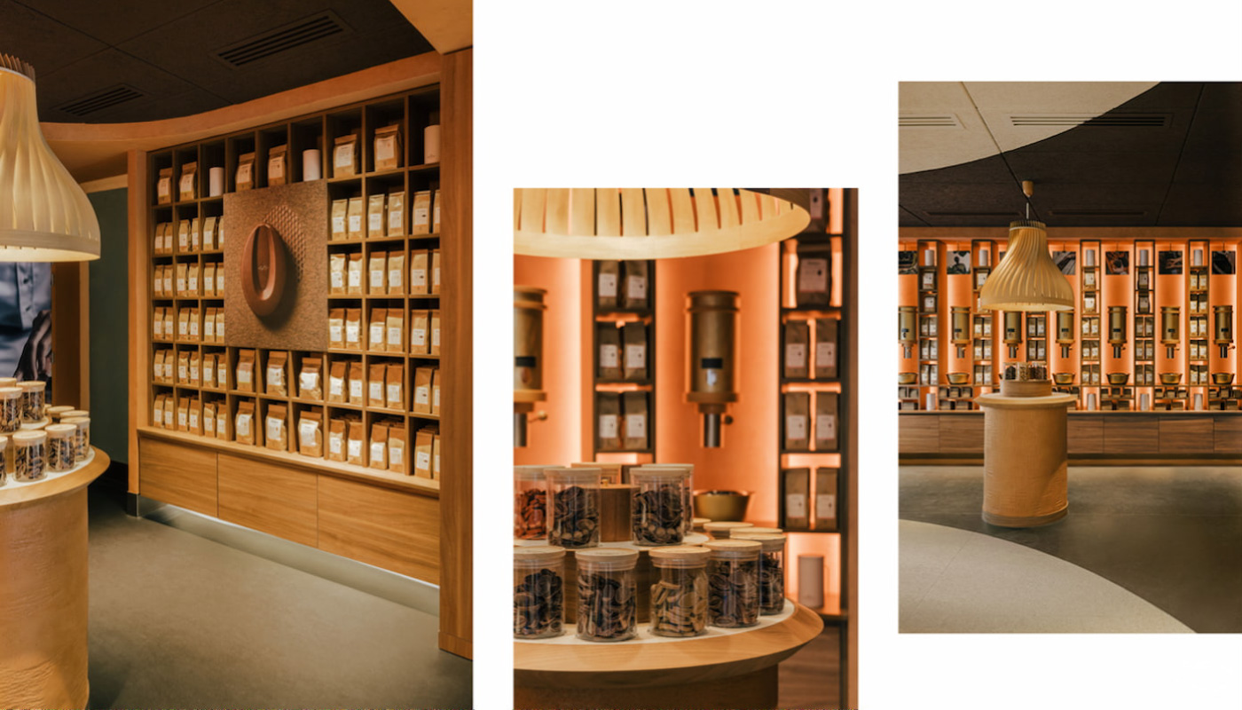
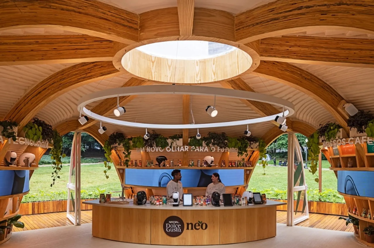

Sustainable retail not only touches brands but also shapes the future dining experience. Practices in the food industry are evolving beyond reducing food waste, with circular design in restaurants representing the next step in eco-friendly dining. Zero Waste Bistro, a pop-up restaurant featured in New York, constructed from recycled food packaging and composting all its leftovers, epitomizes this trend.
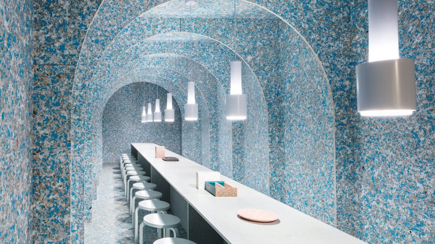
Brands have a powerful role to play, from shaping culture and society to actively creating opportunities for everyone, regardless of age, physical ability, gender, or ethnic origin. Today, designing for accessibility and inclusion transcends ethical considerations; it’s also a lucrative business move, particularly in the technology sector. With more than 1 billion people worldwide estimated to experience disability and over 5 billion internet users, there is a big opportunity for brands to enhance their products and services to be more accessible.
Design is a powerful tool for breaking down barriers, and an increasing number of brands are recognizing its potential. For instance, the MouthPad, developed by Augmental, allows hands-free control of digital devices using the tongue. This inclusive design innovation not only opens new possibilities for people with disabilities to interact with the world but also proves to be useful for enabling high-end multi-tasking for everyone.
Inclusive design is better design, and these technology considerations have the potential to be just as useful to both disabled and non-disabled people.
Josh Loebner, Global Head of Inclusive Design at Wunderman Thompson
Numbers don’t lie: 86% of consumers say a brand’s authenticity impacts their purchasing decision, and a whopping 73% are willing to pay more for products when a company promises transparency. Furthermore, 94% express loyalty to brands that provide transparency.
Today, customers are increasingly drawn to brands that align with their values. Authenticity, as defined by a brand’s openness in showcasing its actions, has become a defining factor. Consequently, transparency is more critical than ever.
Packaging goes beyond mere aesthetic appearance; it’s a powerful tool that communicates a brand’s identity and values. Packaging that includes information about material sustainability, origin transparency, and supply chain traceability enables brands to have transparent communication.
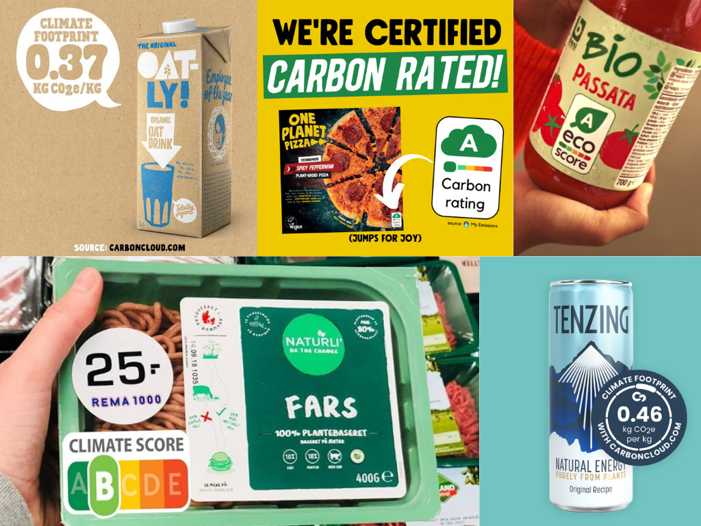
Companies like Oatly, Allbirds, Tenzing, Innocent are actively responding to the demand for transparency by adopting Ecolabels. These actions are becoming the norm, especially among younger consumers. In 2024, we can anticipate seeing even more carbon labeling on shelves as brands continue to prioritize transparency.
Thanks to advanced technology and data analysis techniques like artificial intelligence, brands now access much larger and more detailed customer data. This enables the creation of hyper-personalized consumer experiences, making customers feel valued and understood.
76% of consumers prefer purchasing from brands that personalize user experiences. Brand satisfaction sees a notable 52% increase due to personalization, resulting in an average revenue boost of 10% to 15%. As the numbers clearly indicate, personalization emerges as a highly effective strategy to enhance satisfaction, foster customer loyalty, drive sales growth, gain a competitive advantage, and improve overall brand image.
All the signs point toward a future where hyper-personalization becomes omnipresent. Most of the love brands have already embraced hyper-personalization in their marketing strategies. Therefore, it is crucial for brands to think about how they can outperform competitors and stand out in a competitive market.
Spotify is a perfect example of how a brand can leverage hyper-personalization. Introduced in 2015, “Spotify Wrapped” rapidly evolved into a yearly social media phenomenon. This strategy not only enhances customer loyalty but also significantly boosts brand visibility. The #SpotifyWrapped hashtag has amassed 72.2 billion views on TikTok. Moreover, in the last quarter of 2023, Spotify introduced “Daylist”, an AI-powered playlist that updates multiple times a day to align with the moods and activities of consumers. This continuous evolution highlights Spotify’s unwavering commitment to hyper-personalization, solidifying its position as an industry leader.
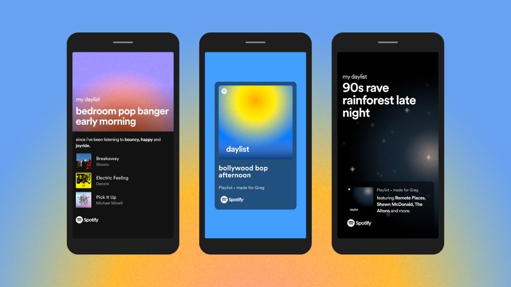
As there is a significant shift towards hyper-personalization, it is essential not to overlook the fact that today, we operate within a privacy-first marketing ecosystem. Zero-party data, referring to information willingly shared by customers with a brand regarding their intentions and preferences, plays a pivotal role in this system. It fosters greater trust with customers, leading to better experiences for them. Therefore, in 2024, with hyper-personalization continuing to surge, zero-party data will be indispensable for any brand’s marketing, personalization, and experience strategy.
Generation Z represents the future of consumers, with an estimated purchasing power of $44 billion. Brands seeking to connect with this generation must understand their tendencies, expectations, and needs.
For Gen Z, gaming isn’t merely entertainment; it’s a way of connecting with friends. Recognizing the potential of video games as a powerful medium to engage with the younger generation, brands are actively leveraging it.
For example, Fortnite stands out as one of the most popular video games among them. In a bid to raise awareness among the younger audience on the International Day of Indigenous Peoples, Fortnite, SOS Amazônia, and the Federation of the Huni Kuĩ People of Acre have partnered to launch “The Originary Map,” which challenges players to protect forests and indigenous peoples.
Throughout this year, a lot of brands, from organizations to luxury houses like Balenciaga, Cartier, and Hermès, have embraced gaming as a strategy to amplify visibility, foster engagement, and establish stronger connections with Generation Z. It is certain that gaming has a significant role to play in 2024.


This year has truly been the year of artificial intelligence (AI), emerging as the central force driving innovation across diverse industries. The profound impact of AI on the creative industry cannot be overstated, as it reshapes the strategic thinking of companies and clients in their pursuit of efficiency and better results. While AI opens a new world of possibilities for the creative industry, it also prompts questions about the future landscape. As we look ahead to the trends of 2024, it is clear that the proliferation of generative AI will continue and solidify its position as a transformative force.
In a world characterized by perpetual change, the ability to distinguish fleeting fads from enduring trends is more crucial than ever. For that, we are more than pleased to announce that the third edition of “Useful Design Trends”, our annual exploration of the movements shaping the future of design across a multitude of industries and global markets, will soon be released.
Privacy Overview
| Cookie | Duration | Description |
|---|---|---|
| aka_debug | This cookie is set by the provider Vimeo.This cookie is essential for the website to play video functionality. The cookie collects statistical information like how many times the video is displayed and what settings are used for playback. | |
| pll_language | 1 year | This cookie is set by Polylang plugin for WordPress powered websites. The cookie stores the language code of the last browsed page. |
| Cookie | Duration | Description |
|---|---|---|
| _gat | 1 minute | This cookies is installed by Google Universal Analytics to throttle the request rate to limit the colllection of data on high traffic sites. |
| YSC | session | This cookies is set by Youtube and is used to track the views of embedded videos. |
| Cookie | Duration | Description |
|---|---|---|
| _ga | 2 years | This cookie is installed by Google Analytics. The cookie is used to calculate visitor, session, campaign data and keep track of site usage for the site's analytics report. The cookies store information anonymously and assign a randomly generated number to identify unique visitors. |
| _gid | 1 day | This cookie is installed by Google Analytics. The cookie is used to store information of how visitors use a website and helps in creating an analytics report of how the website is doing. The data collected including the number visitors, the source where they have come from, and the pages visted in an anonymous form. |
| vuid | 2 years | This domain of this cookie is owned by Vimeo. This cookie is used by vimeo to collect tracking information. It sets a unique ID to embed videos to the website. |
| Cookie | Duration | Description |
|---|---|---|
| IDE | 1 year 24 days | Used by Google DoubleClick and stores information about how the user uses the website and any other advertisement before visiting the website. This is used to present users with ads that are relevant to them according to the user profile. |
| test_cookie | 15 minutes | This cookie is set by doubleclick.net. The purpose of the cookie is to determine if the user's browser supports cookies. |
| VISITOR_INFO1_LIVE | 5 months 27 days | This cookie is set by Youtube. Used to track the information of the embedded YouTube videos on a website. |
| Cookie | Duration | Description |
|---|---|---|
| CONSENT | 16 years 7 months 21 days 10 hours | No description |
| cookielawinfo-checkbox-functional | 1 year | The cookie is set by GDPR cookie consent to record the user consent for the cookies in the category "Functional". |
| cookielawinfo-checkbox-others | 1 year | No description |