Business need / Challenge
With a complex brand architecture and fragmented visual expression across regions, Wild Turkey sought a unified identity system that would enable them to project a more consistent brand impression to a global audience.
Brand Strategy
It began with a trip to Kentucky, and a story. Using what we saw, heard, felt and tasted while exploring the grounds of Wild Turkey’s unapologetically beautiful Lawrenceburg property, we distilled the brand’s most compelling attributes and values into a singular brand narrative.
The narrative provided a foundation on which to build a visual language that could feel ownable to Wild Turkey and give way to a more premium perception. In the execution of this narrative – its translation to a design system – it was crucial that there exist a ‘thread’, a common element across touch-points that makes each piece distinctly recognizable at a glance.
Building a BVI
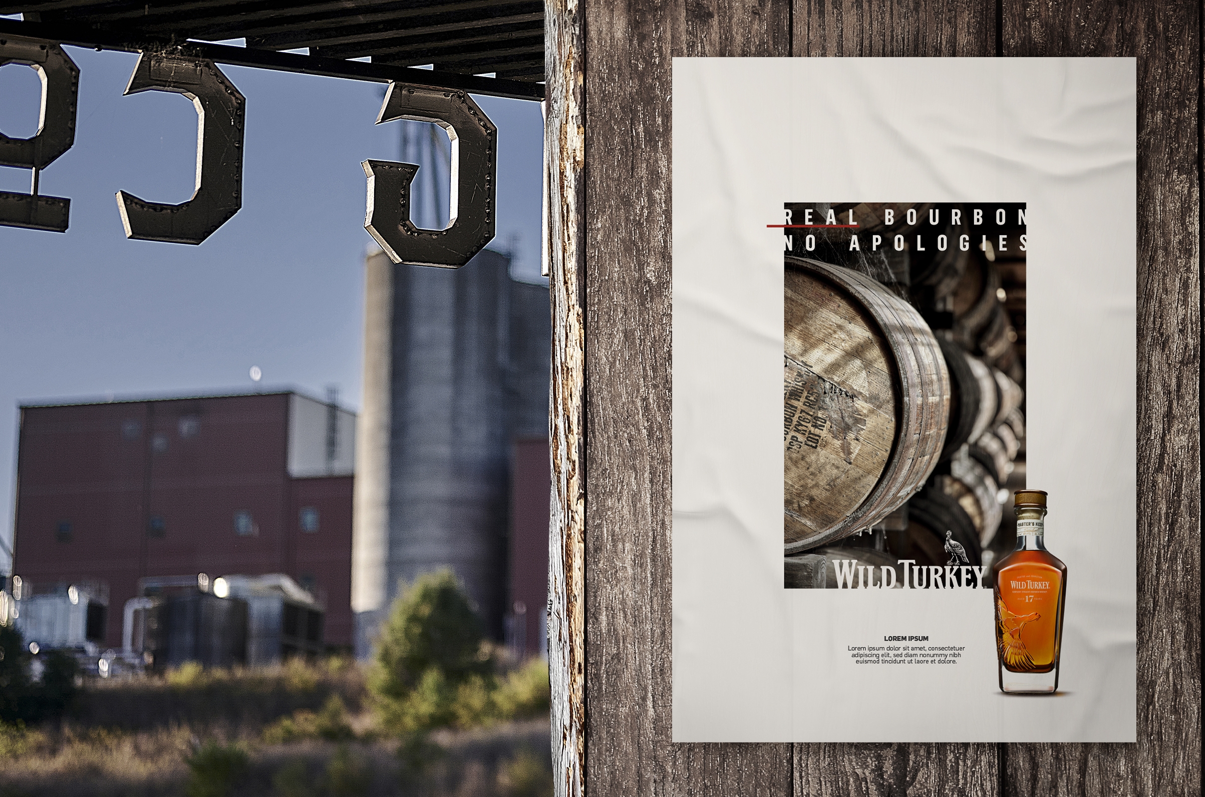
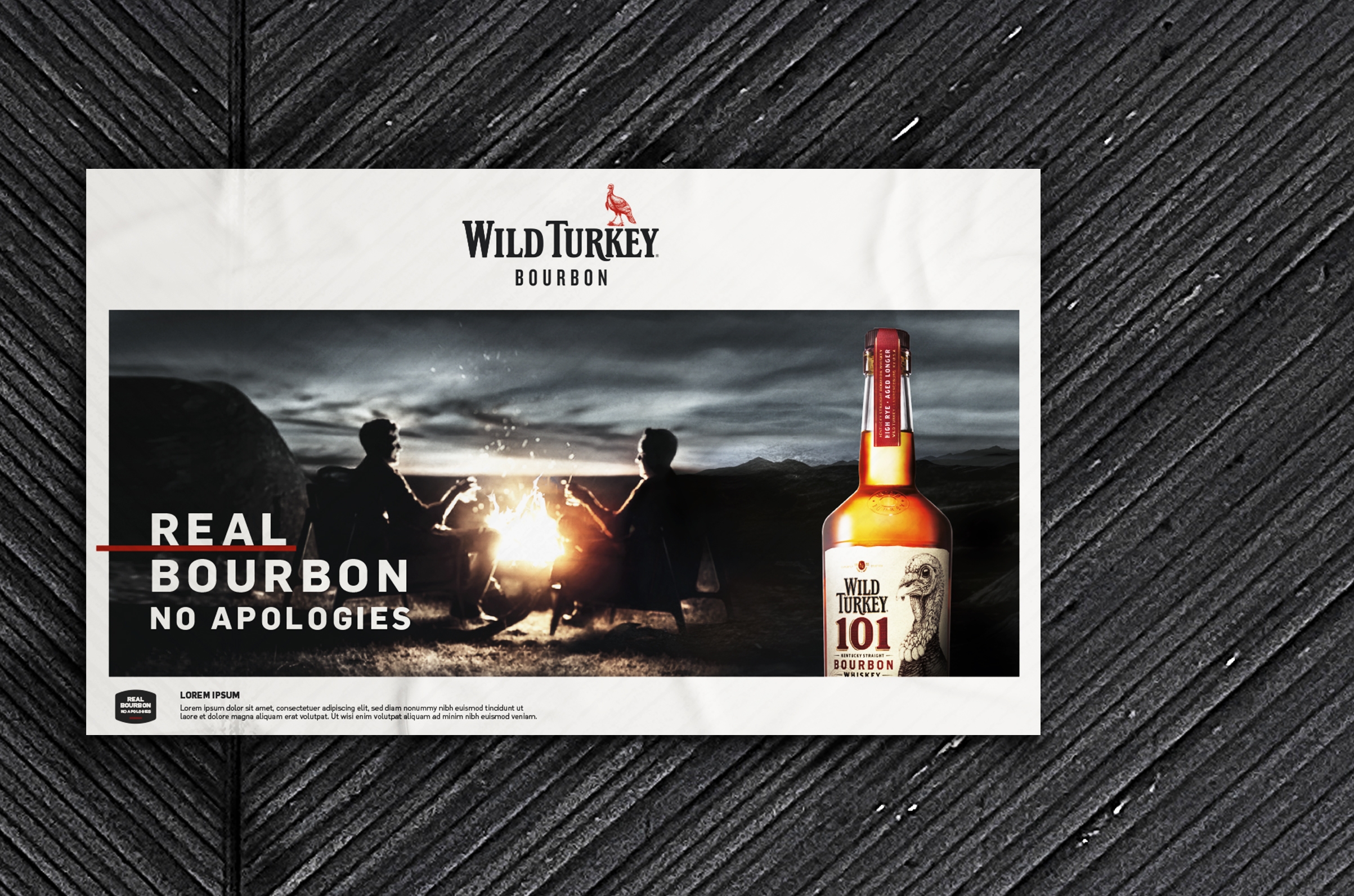
Our ‘thread’, the Red Line, not only symbolizes the line that appears inside each aged barrel of bourbon, marking the liquid’s deepest level of absorption into the white oak; it also represents the brand’s enduring conviction, the passion of the masters that craft every batch of Wild Turkey. It emphasizes our most important messages and draws the viewer from the rugged wild into the world of refined whiskey.
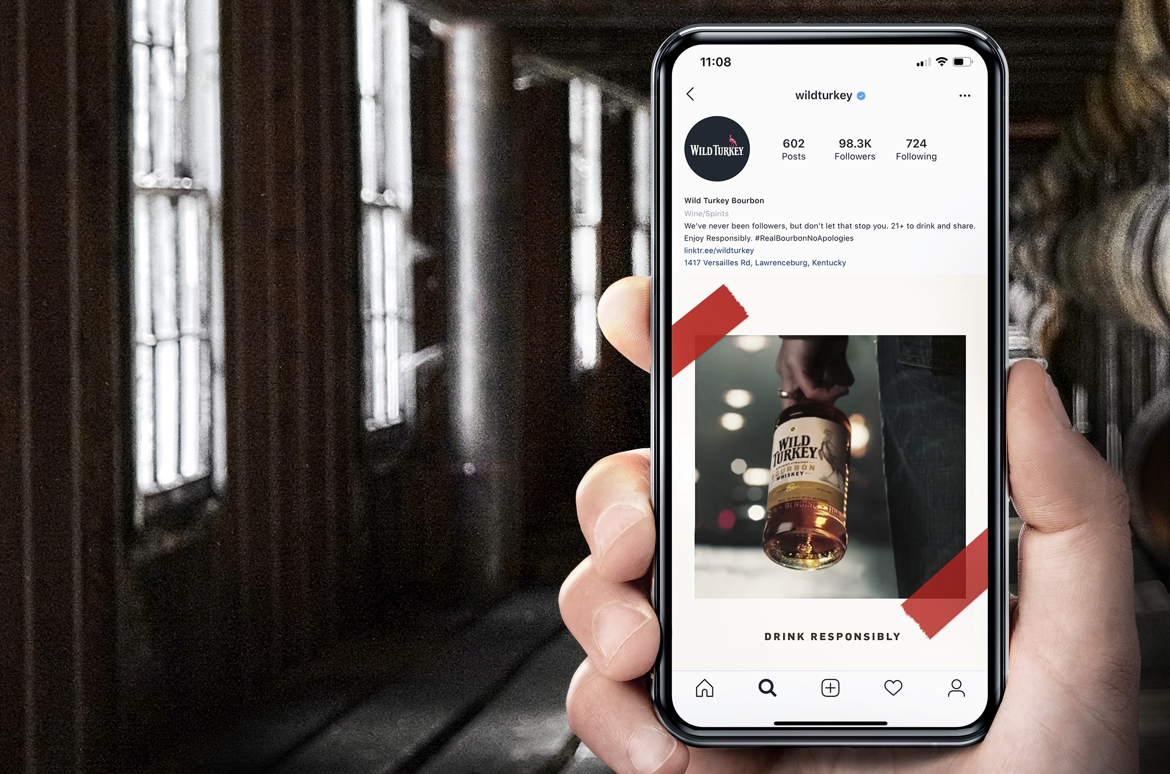
A framing device also offers a simple graphic solution to visually harmonizing the brand. It frames the Wild Turkey perspective, offers structure and focus, and elevates the importance of the contents within. The high-contrast, high-detail desaturated photography style underscores the brand’s pride in the real unapologetic beauty of the Kentucky landscape, their distillery, and their people. The photography is offset by hints of an amber glow, reminding consumers that the brand exists to spark conviviality and warmth.
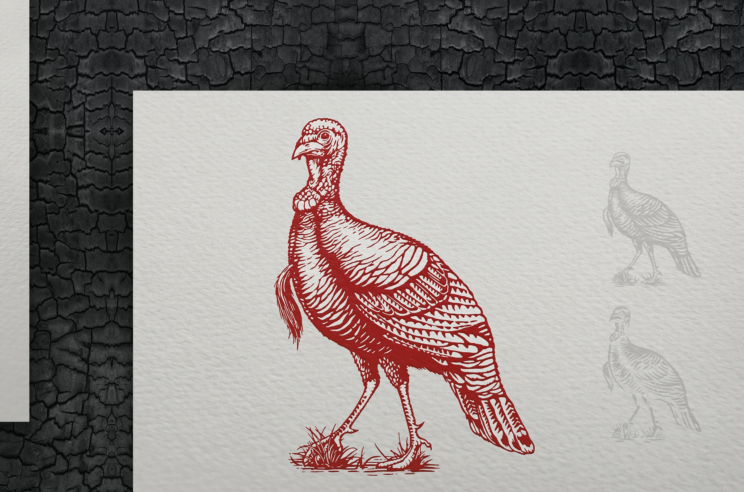
The wordmark and iconic turkey illustration, always important assets for the brand, now come together to create a dynamic logo, exuding pride in the bold realness that the brand embodies. On one line, the wordmark is modern and premium, yet true to the Wild Turkey we’ve always known. And in the spirit of evolution, a simplified turkey illustration was carefully crafted to convey premium regardless of print limitations, while usage guidelines were established to ensure brand consistency.
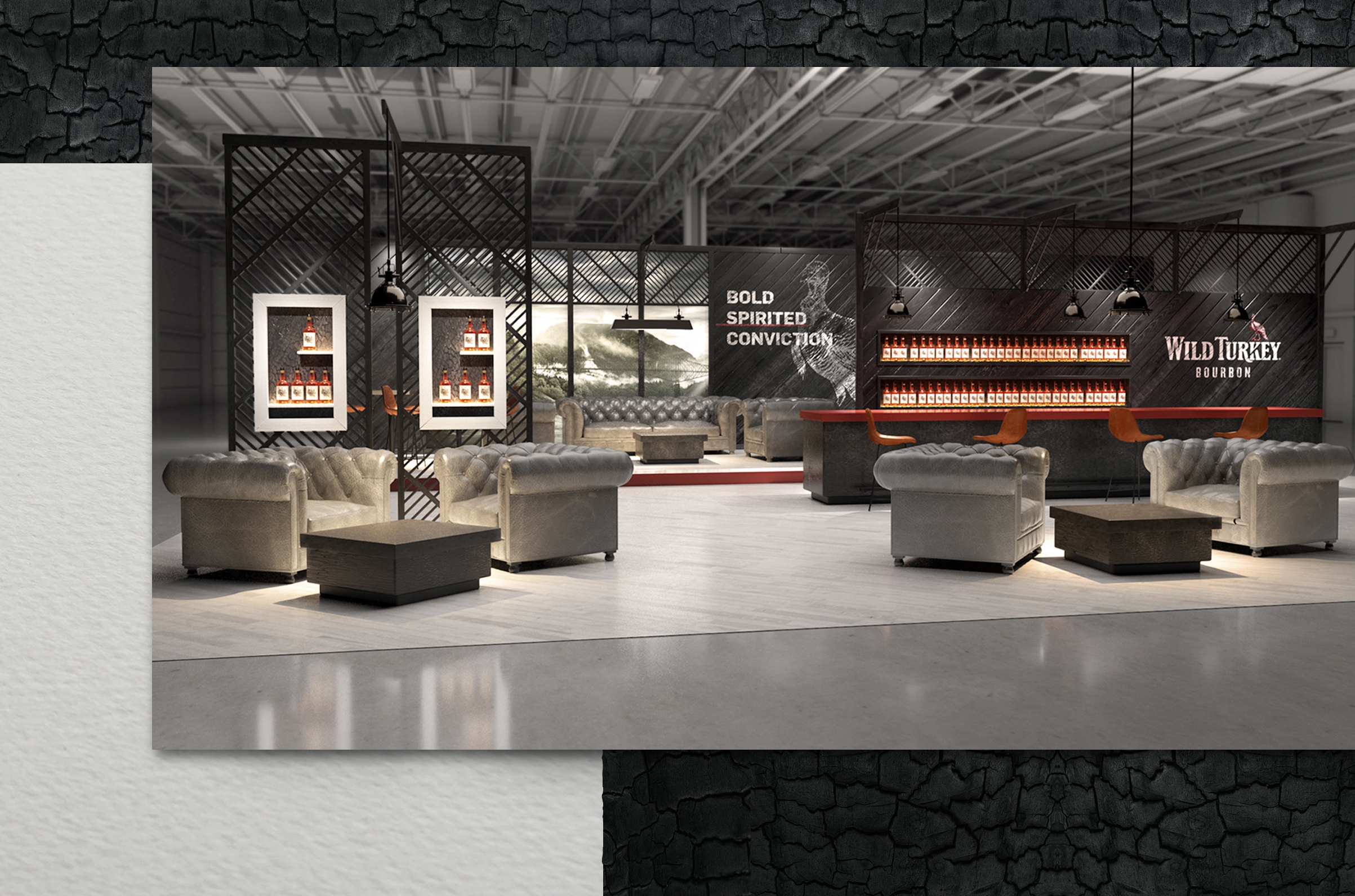
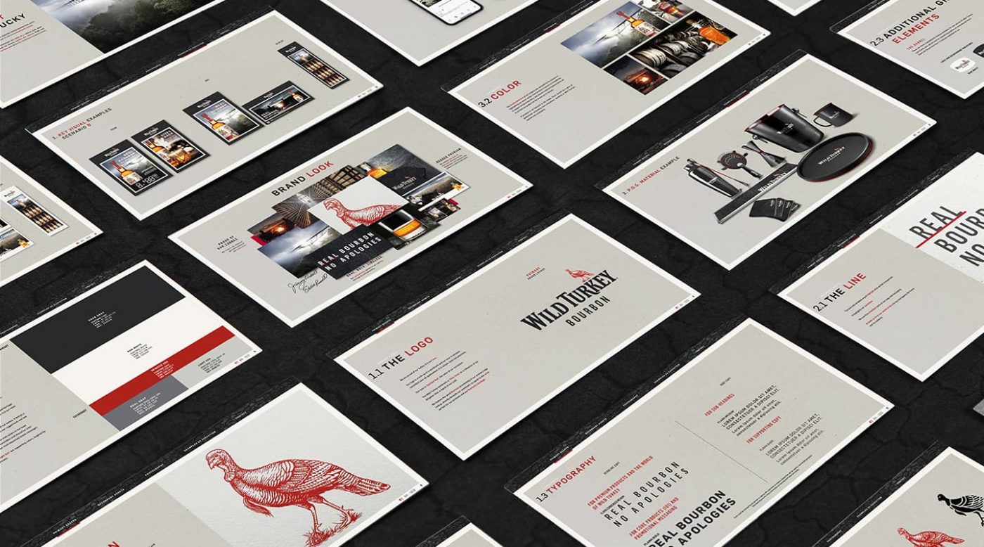
Together these elements form the foundation for a strong Brand Visual Identity manual that not only provides guidance for system navigation, but also demonstrates application across a range of touch-points. From classic point of sale materials (POSM) and quality barware to branded trade show environments and social media posts, the manual features an array of visual executions designed to support rollout on a global scale. Every page is thoughtfully designed and copywritten as an expression of the brand’s core values and embodies how Wild Turkey should look, act and feel.
Campari America is a leading spirits company in the US, boasting a rich, comprehensive portfolio of more than 20 brands, including award-winning vodkas, whiskies, rums, gins, cordials, and liqueurs.

